The overall process was definitely a journey in which I have learnt new skills with not only animating but working within a team. I found that I didn't have to make compromises with my team as we were all on the same page with the use of narrative, the style of animation and most importantly, an idea for a final outcome. With having constant feedback from each other we were able to compare research and develop ideas further to ones that were final and would work well for the target audience.
Through this progress I found that time management was a huge problem for me. With the responsive module being so difficult, I didn't have a chance to work on our animation, as well as my other team mates who were in the same boat. Due to this problem we ended up revising the schedule and starting a good month after when we were supposed to. This meant that the animation was produced later and as I was the editor, I had to wait for quite awhile for some of the animation to be completed with line, in which I then had to colour, import to after effects to animate with backgrounds, to then animate in premiere. I then had to add audio and sound effects to the animation as well as slow down some of the animation due to it being too fast for the audio, some of the lip sync was out by quite abit. This became quite a stressful task as it felt that I was suddenly given everything at once and had to edit a day before the deadline. I was gutted as I wanted to be able to create something finished for my group as I have loved working with them.
I did however enjoy the storyboarding process in which I was able to test my skills and adapt them to the target audience.
Friday, 15 May 2015
Food Module: Post Production Stage (Premiere and After Effects)
For the editing process, I mainly used After Effects for editing the animations, such as animating the icing in which I used the pen tool to create a mask that I used for a motion path for the hand to follow the icing. This was difficult due to the speed of the animation in which I had to double frames for it and then paste over the animation path. I also used after effects to animate the movement of the backgrounds using offset, which allowed the backgrounds to continuously move as the rest of the animation played on top. I did find After Effects frustrating in that fact that every change I made in the composition had to be ram previewed for it to work properly, however the key frames where a big advantage to animating.
Using Premiere was very easy and allowed me to merge the audio and the videos together as well as slowing everything down. I did find that when rendering out the animations I had to use the Media Encoder as the quality from premiere was at such a low quality when it rendered. Premiere also allowed me to easily listen to the audio and the video together without waiting forever for it to ram preview compared to After Effects.
Using Premiere was very easy and allowed me to merge the audio and the videos together as well as slowing everything down. I did find that when rendering out the animations I had to use the Media Encoder as the quality from premiere was at such a low quality when it rendered. Premiere also allowed me to easily listen to the audio and the video together without waiting forever for it to ram preview compared to After Effects.
Thursday, 14 May 2015
Food Module: Visiting Professionals - CBBC
CBBC Talkers - Sarah Muller
I gained quite a lot of insight to the animation industry through how animations are chosen for television, the regulations and process that goes with it. With British Animation obtaining more funds, animations now have extra money for production - Sarah explained that now is the time to get your ideas out there as more channels and companies will want innovative animation. It was interesting to hear her tips on submitting animations, especially towards the backgrounds and the narrative. She explains that - It must be different, avoid paranormal story lines as there are too much that are submitted much like Adventure Time - They want something like Family Guy, The Simpsons or Futurama, largely in 2D with realistic esk backgrounds with straight lines, no photo realistic styles - Focus on family comedy however there is room for drama comedy (it would have to be extremely good to be chosen).
Boys are interested in animation for longer compared to the Girl audience - you need to consider how kids would think - if you find something funny then they will most likely will too. The kids are your boss - they are smarter than you think - shorter animations, other channels add fighting animation aimed at the boy audience.
All rules can be broken - remember the premise, character and narration etc:
+ Premise - could this story be done in any other medium? It needs to be a good reason for it to be animation - what does it enhance?
+ Characters - you must love your characters! There needs to be a connection - characters can be flawed, its how you control this.
+ Worlds - are really interesting. The weirder the world the simpler the stories will be.
+ Storytelling - Follow the character and the story - 3 act structured character driven.
This talk made me think more about the animation we were creating for this module. I felt that we had quirky and memorable characters that the audience would remember as well as the world that the story is situated in being one that is mysterious with the use of the Cake Man Character. With this premise, as a group, we all agreed that this could be a taken into a series of short animations that reveal more facts on all types of food, not just desserts, with the possibility of more characters being introduced. Storytelling wise, I felt that the narration and the use of Johnny helped to tell the story and with this visual storytelling, this could work really well with a young audience and would hopefully work well after animations that would be played on the CBBC channel.
Food Module: Poster Research
For the poster design, we needed something simple, with the imagery being the biggest part of the design, as ultimately this will attract the audience. The title needed to be simple with the font, as it needed to be legible for all ages to be able to read, I felt that the font should either be the same as the dvd cover or the title cards to tie the designs together. In order to inform my layout ideas for the posters I researched into popular children's cartoons, such as Adventure Time, Scooby Doo and Looney Tunes.
The Adventure Time poster was quite simple with its structure, through the use of the two main characters, the title and the logline. However the background made the design more complex through the addition of all the other characters included in the show put depicted in a montage with a lowered opacity so that the main characters and the title would not sink into the image. I felt that this worked worked well as it not only appeals to a young audience but an older range through the use of the aesthetics. The poster for Regular Show does not have the same impact as the Adventure Time poster purely for the imagery used and the size of the title. I felt that the title needed to be lower with the main characters standing out more from the background. I preferred the imagery in the Regular Show poster however I felt that the program was aimed at a slightly older audience than Adventure Time which I believe is the reason for the placement of the text and the use of the imagery.
Scooby Doo has been a children's classic for quite a few decades, and looking through the posters and dvd cases for inspiration, the main structure was always the same, the main two characters from the group, Shaggy and Scooby, are always in the center with the iconic text and name of the film placed in the top center of the design. It was quite interesting with how much the posters throughout the years have a distinctive connection with the structure of the designs. Looney Tunes was another inspiration I found through the use of the floating heads of the characters, the more popular posters however depict the characters walking out of a circle which I felt would work well but for our animation we only had two main characters so the effect would not be the same.


Food Module: Poster Layout

For the main poster design I quickly sketched 6 designs that could work well with advertising our animation, so that Anna would be able to take the layouts and develop/refine into the final poster. I began with incorporating screenshots from the animation but slightly changing the design by zooming in or adding the cart in front of the screenshot. I felt that the idea of using the cart to add the title of the animation would work well especially with the use of the cakes in the foreground which would work well with the theme. However the only problem that could arise from this design is how much the audience would be able to see Johnny. Due to the cake stands on the counter of the cart, Johnny's face would be hidden slightly, which could make it difficult to see the expression of the character. The next layout design would work quite well through the Looney Tunes aesthetic of floating heads of the main characters and would appeal to the young target audience that we want the animation to be aimed towards. I felt that the background of the poster could be the background used in the title cards to link the animation with the poster.
I immediately fell in love with the following two designs, through how they both connect to each other, with a simple and aesthetically pleasing structure. I also felt having a poster for both of the characters would not only appeal to the target audience but work with in a professional manner in which most films played at cinema have posters that single out characters to advertise the film.
I immediately fell in love with the following two designs, through how they both connect to each other, with a simple and aesthetically pleasing structure. I also felt having a poster for both of the characters would not only appeal to the target audience but work with in a professional manner in which most films played at cinema have posters that single out characters to advertise the film.
Food Module: Final opening title card and credits title card
The final title cards work well as they merge nicely together with the use of the cupcake as well as the background and font. The font is legible for the audience and works with the theme of cake and the light hearted tone that we wanted for the animation.
The credits worked well with the kerning and the leading of the font as well as the spacing between the role and the name. I wanted the names to be in the same general area of the space so that the text didn't look as if it was jumping around, using the guidelines on photoshop I was able to ensure that this didn't become a problem. The only thing I struggled with was the placement of the title on the opening card, I had quite a few variations of where the text could be placed however each of these didn't work with the background texture due to the pink of the background. If the text was too much to the left the pink took over the composition and made it difficult to read that part of the title. Therefore leaving the text within the white space of the image with only a slight overlap of the text worked the most successfully.
The credits worked well with the kerning and the leading of the font as well as the spacing between the role and the name. I wanted the names to be in the same general area of the space so that the text didn't look as if it was jumping around, using the guidelines on photoshop I was able to ensure that this didn't become a problem. The only thing I struggled with was the placement of the title on the opening card, I had quite a few variations of where the text could be placed however each of these didn't work with the background texture due to the pink of the background. If the text was too much to the left the pink took over the composition and made it difficult to read that part of the title. Therefore leaving the text within the white space of the image with only a slight overlap of the text worked the most successfully.
The audio for the title cards was another track from Cyril Watters who created the main soundtrack we have used for the animation. The use of this soundtrack for just the title cards which helped to not only differentiate from the animation but also enhance the quirky and cartoon style that we wanted for the overall appeal. To make the audio fade in and out, I used the key frames on Premiere to alter the levels of the audio track.
Food Module: Title Card (Making the cupcake)
For the title cards, we wanted them to link through the use of the cupcake, the opening card being a full perfect cupcake, to then the ending title card with one that had been half eaten with crumbs around it. This touch brings something new to the design, and making it more interesting for the viewer to watch as well with the ending credits. To make the cupcake I used the colour scheme from Johnny's character design as I felt it would be a nice link to the main character of the animation. With this use of colour scheme, if another cupcake was needed, I could use the colour scheme from the Cake Man to further link the characters with the designs.
To make the cupcake I used Photoshop purely for how easy and simple it is to draw lineart and colour the design with. I could have used Illustrator, however the style would be very vector based meaning it could possibly not work with the rest of the aesthetics within the animation. I mainly struggled with the design of the sprinkles, it took awhile of changing the shapes from narrow rectangular shapes to circular ones, however with feedback from my group and other peers, I finally found a solution to the sprinkles with both the shape and the colour. The colour became shades of the blue icing leading up to white, and depicted as round sprinkles. I felt that this worked well as it wasn't too subtle or too loud against the icing and helped to enhance the aesthetics.
The half eaten cupcake took me awhile to design, I found it difficult with trying to judge how the icing would react, whether it would slide down or simply stay in the same place, only sloping down with the teeth marks. Through feedback from my group we came to the conclusion that the icing would have collapsed and sloped down with longer marks of teeth within it. I used the different shades on the icing to make the teeth marks stand out against the main structure on the icing, and with the added shading on the sponge beneath it, it gave depth to the design. For the shadow I used a more saturated and slightly darker shade of the hues so that it would work with the rest of the title card, as well as make the cupcake stand out more.
I felt that the design had to have a cherry on top to complete the design, it was something that was small but helped to make the cupcake standout more with the red hues.
 |
| Using transparency lock to colour the lineart |
 |
| Example of different sprinkles |
 |
| Half eaten for the end title card with final sprinkles |
 |
| Shadow |
Food Module: Title Card Development Continued (Textures)
I can safely say that I detest making textures. I just physically cannot use different photoshop brushes to create textured backgrounds. I think this is mainly due to how I only own the original default brushes on photoshop, and I needed to find different styles of brushes that held a traditional media approach to the stroke to be able to create a texture that works successfully. I had quite a few attempts but they looked like a child had made them, so I asked Rebecca for her to quickly make one for the background. She created a really nice textured background which worked really well with the composition, it helped to make the font and the cupcake stand out with the use of the white space. I also deleted the banner at the top of the frame which helped to make the design look less cluttered. I left the banner at the bottom of the design as gave something for the cupcake to be resting on rather than it seeming to float in the image, this also allowed me to shadow to give more depth to the cupcake. To make the banner merge even more with the background I used the blending mode multiply, which allowed the banner to absorb the texture, giving it a tactile approach. The placement of the text within the new textured background works well as it slightly overlaps into the blue with the white making it stand out to the viewer.
Feedback from my team suggested that the pink textured background with the blue text was the most successful and will translate well with the opening title card, with the imagery and amount of text.
Feedback from my team suggested that the pink textured background with the blue text was the most successful and will translate well with the opening title card, with the imagery and amount of text.


Food Module: Title Card Development
After creating the cupcake, which will be the main focus of the design apart from the text, I began to add the font of the title along with the background and border. I wanted to keep to the colour scheme of the cupcake running through the title card, being either a lighter or darker shade for the background colour. I felt that adding the icing border I made for the group presentations would work well as it gave it that fun appeal to the border compared to a scroll style which I felt wouldn't work as successfully with the target audience that we wanted the animation to appeal towards. The first three designs of the colour scheme did not work well, the pinks either faded to much into the background or stood out to much to the point that it felt as if it was in your face. I also felt that the top of the title card with the banner and the 'CLAPRW presents' did not work well either as it made the design look squashed and quite confined within the space. I required the style of fonts from DaFont, a fantastic site that designers upload fonts that they have created in which the public can download and use for non-profit purposes. I font a lovely bubble font which I ended up using for the entire title, as I mixed it with another font for the 'History of' part to the title and I didn't like how different it looked together.


Food Module: Working in a Group
Working within a group towards creating a final 2 minute animation has been very interesting and a lot of fun through how skilled and dedicated everyone was towards the same goal. The communication between us was constant, in which we used mainly Facebook to communicate over. We created a group on Facebook so that it was easier to share files and screenshots of work in progress, this way each of us were able to gain instant feedback and improve our work from there. The only problem with Facebook was the fact that we were not able to share bigger files, such as the psd files that Rebecca had made for the animations. In order to ensure that each of the group were able to receive the files, we shared these over Dropbox. Dropbox was very easy to use and for multiple files we were able to download them as a zip file, the only problem was that we couldn't upload too much as we were only allowed a certain amount of space; there was still a substantial amount of room compared to Facebook.
To present our work to the public, Rebecca made a Tumblr page to showcase our development work as well as the finished designs. I really liked this idea of being able to see how the final design came to be, I felt that it worked well with showing the public the journey of the design. We also used this page to show each other gifs of animation or edits, due to Facebook not being able to upload gifs, as they would become a still image. To be able to see Rebecca's working process it was more efficient to see her animation so far in gifs so that we could give instant feedback, if Rebecca had made each of these tests into videos it would have taken longer for the animation to render, upload and then wait for our feedback.
Anna also made a Behance group to showcase our work within a portfolio standard; Behance is used as a site where people can view professional online portfolios/projects that artists are working on. I felt that we should only upload final designs to this group, due to it being a portfolio site, which may mean that this group won't have a lot of work till near the end of the module.
For research, we all made individual boards to inform our personal parts of the project on Pinterest and then included everyone to add anything they would find whilst researching for themselves. This form of research really helped our progress, having different ideas and takes on the research from other members helped to inform varying designs and perspectives on work.
 |
 |
| Dropbox |
 |
| Tumblr |
 |
 |
| Behance |
Wednesday, 13 May 2015
Food Module: Analysis of Text - Absence, Excess and Epistemological Expansion: Towards a Framework for the Study of Animated Documentary
Absence, Excess and Epistemological Expansion: Towards a Framework
for the Study of Animated Documentary - Annabelle Honess Roe
This journal was quite a different and
intriguing read. I quite liked the correlation of animation and documentary
presented within a chronological manner as it helped me to gain a better
understanding of the subject matter and how it evolved/adapted over the eras.
I agreed with the basis that animation is
a substantial aid to documentation when reconstructing historical
events/environments to allow the audience to be immersed within the facts.
However I felt that it needed to mention how animation has provided an insight
to medical procedures and the impact of diseases/other aliment, which was not
visually possible before within a moving 3D perspective; apart from sculpture
diagrams. Although these medical animations are not technically a documentary
as such, these are informative and educate the viewer with a deeper
understanding. These medical animations however can be translated to a
documentary format easily with the use of added interviews about certain
procedures alongside facts and figures.
Through Paul Wells work on defining the
production of documentaries, I found it interesting with the
difference/reference to parts of documentaries that I would not necessarily
link together. For example with one of the modes he defines, 'The Fantastic
Mode' changes perspectives of already known and accepted modes of documentary
depictions by 'presenting reality through the lens of surrealist animation that
bears little or no resemblance to either the physical world or previous media
styles.' With this description I personally felt that this would further link
well to avant guarde animations, through how they pioneer innovative media and
narrative which other animators take as inspiration and develop further. This
form of animation often warps the sense of reality to one that is surreal and
makes you question the movement and action within the scenes; it makes you
question the message that they want to portray to the audience. An example of
this can be seen in Stan Brakhage’s work, Mothlight,
in which he takes a stunning mixed media approach to his animation. It
makes the viewer question the message behind the imagery, what significance of
the wings and other insect parts have? There are several interpretations of his
work, with the most common suggesting that life is ever so short, to the extent
that it is like the attraction of a moth to candle light.
I found it intriguing with the documentary
animations that substitute/warp the characters within the animation to not
relate to the interviewee in appearance at all. I felt that this form of
depiction worked well as animation is an art form itself and using this
portrayal of designs not only aids the aesthetics but also creates a form of
censorship; hiding the appearance of the interviewee. One of the examples that
is described in the text, It's
Like That, shows young asylum
seekers as knitted puppets of birds to portray the people who were recorded for
the animation. This works successfully this form of animation makes the viewer
connect to the characters more, making an emotional impact on the audience with
the use of the interview and the appeal. Depending on how emotional and mature
the recordings are this could work with presenting to a younger audience than
the animation was originally intended for, creating a bigger range of
awareness.
Monday, 11 May 2015
Food Module: Johnny and Ice Cream Stand Man Dope Sheets
With the dope sheets for Johnny and the Ice Cream Stand Man, I used the same process as the Cake Man dope sheets, ensuring that I used the audio file for reference for the lip sync rather than the animation/animatic so far; due to the arrangement of the animatic with the additions and the exclusion of scenes. Feedback from my previous dope sheet for the Cake Man stated that parts of the dope sheet were a second out, which I believe could be due to the audio file I had used, as there were two versions. I ensured that I noted down which file I was using as reference for the next dope sheets; hopefully this has solved the problem of the dope sheet being a second out in some places.
Creating Johnny's dope sheet was only difficult with the scream that he makes as he first sees the cake rolling after him. It was difficult to find the right shapes that would go with the accent of the scream, as the scream gradually and unsteadily wavered in parts, which worked fantastically for the character; more of a believable scream as you can hear the disbelief in his voice before screaming as he runs away. I was able to solve this problem by using the extended phonemes as a reference for the shape and note how wider or narrower the shape needed to be.
The Ice Cream Stand Man's dope sheet was quite easy to complete through the experience I had learned from the character and narrative module as well as the dope sheets I created for the Cake Man. Using these skills I was able to easily figure the accent and the change of mouth shapes to suit the dialogue. For example with his pronunciation of 'history', I had to use other phoneme shapes to work when translated into animation.
 |
| Ice Cream Stand Man Dope Sheet |
 |
| Johnny's Dope Sheet |
Food Module: Considering shadow for the colouring of the animation (characters)

After the feedback from the final crit, I experimented with the shading on the character as well as adding shadow to the ground. I purposefully added a minimal amount of shading on the character so that this addition didn't take over the character, subtly giving it some depth. I felt this worked successfully with the background and made the character aesthetically pleasing however the design seemed to sink into the background compared to the original non shaded design. I did add a tint to the characters hair which worked well with the shading, however it still didn't make the character stand out as much as the original.
When researching into character designs, Anna purposefully made designs so that they would suit cartoon network/nickelodeon content, and the majority of programs never shaded the characters unless it was to give a bigger impact on the scene/gag. Some of the cartoons however do add tints to the hair or accessories depending on the character design. I felt that the shading would work successfully if we were making an animation that was aimed at an older audience, however for the audience that we wanted to aim for the use of no shade suited the target market.
For the shading on the ground I felt that this worked successfully however I think I still need to experiment with the shade of the colour as with other cartoons the shadow is normally a solid block of colour rather than semi transparent. I made the shadow transparent as to work with the cobbled path, which does work with the aesthetics however I didn't think it worked as well with the colouring of the character.
 |
| The Grim Adventures of Billy and Mandy |
 |
| Danny Phantom |
 |
| The Powerpuff Girls |
Sunday, 10 May 2015
Food Module: Title Card Research
For the title card we researched into old and new popular cartoons, to gain a wider range of ideas with the styles of the title cards. We wanted to use something that would work well with the theme of cake and work with the overall theme/humour. Originally I felt that a traditional type of title card, something with a script like font and shading on the characters.
With the Adventure Time titles I found that they held a traditional appeal through the tactile appearance to the shading, but with a twist through the structure and content of the image. The title cards held more characters and backgrounds, giving more depth to the image compared to title cards such as Danny Phantom and Fairly Odd Parents. I felt that the Adventure Time title cards would work well through the use of how simple but aesthetically pleasing the designs were attracting older audiences as well as the primary audience. The Danny Phantom title cards work well with the horror theme that the narrative holds and works with the main target audience that the show is aimed at. I quite liked the old 1950's form of horror image with the poses and the use of colour. The Fairly Odd Parents title cards differ through how the use of the structure is simple with the use of hardly any imagery at times as to fit with the target audience. It was interesting to see this comparison as they were made by the same studio.
Over the Garden Wall title cards focuses on the black letter font suiting the overall theme of the Victorian stylised cartoon. As much as I liked the title card with how simple the format was, this form of title card would not work with our audience for the animation. The visuals for the title card need to be bright and have some imagery on the title card that would appeal to the viewer. Teen Titans Go title cards incorporated the use of a simple font with the characters sat on the sofa. I felt that this worked well as the title scene was always the beginning of the episodes, and was a nice link with the following episodes.
 |
| Title Card Mood board |
 |
| Example of shading |
 |
| Example of shading |
Food Module: Rough Crit
For the rough crit, we made a presentation, that consisted of the final backgrounds and the final character outfits for Johnny, as well showing the shortened rough animatic that I had cut down to 2 minutes. We also showed a mock up of the cart and characters along with the background so that the peers would gain an insight into what the finished animation quality will look like. The feedback we gained from this was extremely positive and helpful through how Johnny needed to be taller and the Cake Stand needed to have some form of shading on it so that it did not look like a cardboard cut out. I agreed with this feedback however I debated about adding shade to the cart as we wanted the style of the cart to match the character designs, adding shade to the cart might look out of place compared to the backgrounds and characters.
With the height of Johnny, we and the peers debated how tall Johnny would need to be compared to the cart and to the Cake Man. In the storyboards I had drawn the cart differently purely because the cart had not been designed at that stage, so I drew a generic stand that would be a place holder and show how tall Johnny would be compared to the cart. However as the cart Anna had designed was lower, it was difficult placing Johnny correctly in the mock up. We all agreed that Johnny needed to be at least half a head taller to work with his age and the placement of the cart.
With the height of Johnny, we and the peers debated how tall Johnny would need to be compared to the cart and to the Cake Man. In the storyboards I had drawn the cart differently purely because the cart had not been designed at that stage, so I drew a generic stand that would be a place holder and show how tall Johnny would be compared to the cart. However as the cart Anna had designed was lower, it was difficult placing Johnny correctly in the mock up. We all agreed that Johnny needed to be at least half a head taller to work with his age and the placement of the cart.
 |
| One of Anna's Outfits for Johnny - shown at final crit |
Food Module: Final Crit
For the final crit I added the finished animation on top of the animatic, so that the audience would have an understanding of what the final animation would look like as well as watch the rest of the narrative play out with the use of the animatic. I felt that this worked well as the finished animation was joined with rough line animation which also showed the progress and development of the animation so far. On top of which I added the final voice acting in time with the rough lip sync and actions in the animatic, this worked well as it enhanced the gags and the visuals with emphasising the characteristics of each of the characters. I also added placement title cards with their own soundtrack which Rebecca researched into different tracks for me to choose for the crit. We wanted this track to sound different to the main soundtrack as to make it standout and be quirky.
Feedback from the Crit:
+ The turn at the beginning of the animation, that shows Johnny looking up and behind his shoulder before it cuts to the tree, needs to be cut out or just changed to him looking up as it is confusing - I personally believe that cutting out this animation would work more successfully as it would transition more smoothly to the next action and give more time for the Cake Man to climb out of the tree.
+ The walk cycle needs a shadow on the ground.
+ Consider the use of adding shadow to the characters, it gives it that much more depth and it makes it more aesthetically pleasing.
+ The walk cycle past the stand needs to be quickened as it takes to long to happen - I think this will work well with it being cut as there will be more time for important scenes later on in the animation.
+ The entrance for the huge sponge rolling after Johnny is confusing, consider adding the Cake Man as the cause for the sponge to roll after him rather than it appearing from nowhere. Feel like you're missing a gag here - Originally we all wanted the sponge to appear from nowhere to appeal to the silliness of cartoons, however I do agree with the feedback as I believe that this will work well and add extra gags to the animation. For instance the Cake Man could be leaning on the finished cake from the industrial revolution and then push it slightly so that it chases Johnny.
+ Add sound effects - there are so many places with opportunities to add sound effects which will enhance the gag. For the sound effects I researched through the Hanna Barbera Sound Library Discs and have chosen a few which could work for some of the actions, however I still need to narrow this down and ensure that Rebecca and Anna like the sound effects as well.
Food Module: Colouring in the Animation Sequences
After Anna had completed the line work for the animation sequences that Rebecca had made, I began to colour the files using Photoshop. I used Photoshop as the animation sequences were made in psd files as well as the ease of adding colour to lineart using the program tools. I mainly used the wand tool and bucket tool to fill the lineart with colour, extending the selection by 1 pixel to ensure that there would be no pixelation with the fill. The only problem I encountered whilst colouring in the lineart was the position of the star on his top. As the animation was quite smooth and the lines grew as he takes a deep breath, it was hard to figure out whereabouts the star should be as the collar of the t-shirt was positioned differently in each movement. I was able to solve this problem by exaggerating the placement with the more exaggerated movements of the shoulders and used the onion skinning option to be able to see where the previous star was placed on the top.

Food Module: Walk cycle
After colouring in the walk cycle animation, I imported a PNG image sequence of the sequence and put it together on After Effects. However as I put this footage onto the timeline, the pace of the walking had quickened and didn't work well with the relaxed pose that we wanted for the beginning sequence. In order to solve this problem I had two options to slow down the pace:
+ Photoshop - To slow the pace down, I needed to double up the frames on Photoshop. In order to do this, I would need to extend the duration of each frame on the timeline so that the walk cycle would be slower. After ensuring that the animation was slower I would then need to export the file into a PNG sequence so that the background would be transparent for the animation to easily work with the After Effects file.
+ After Effects - To slow the pace down, I would need to use a time wrap effect on the footage. The most efficient effect would be the 'time stretch', in these options you can change the overall duration that it is on for in the timeline. However using this effect can sometimes alter the quality of the animation file.
I decided to use the After Effects option as it was the most quickest and easiest method. This worked well as the movement of the walk cycle worked with the speed and the quality. In comparison the original speed of the walk cycle, which can be seen on the video (left the edited walk cycle, right the original speed), the edited animation worked successfully within the composition. The only edit I needed to include was the shadow on the ground as he walks.
Food Module: Dope Sheet for Cake Stand Man
For the dope sheets I had to alter the way to create them by using the seconds on the audio file rather than the frames with in the animation duration and the scenes that the dialogue would be situated in. The reason for changing this method was due to the editing of the animation sequences and animatic that had been completed so far, I found that I had to make some of the audio begin at an earlier stage of the scene so that it would suit the animation made so far, I think this was due to my judgement when putting the animatic together, I didn't take into account that some scenes may be a second longer than they were originally going to be. (In order to create the dope sheets, I planned them using the seconds on the original audio file, this way if the audio has to be moved to be played slightly before or after the original placement, the animation will still work with the audio.)
Creating the dope sheets was difficult at first as the reference I used, Preston Blair's phoneme sheet didn't work as well as I had hoped with some of the shapes, I found that a few of the mouth shapes needed to be altered to suit the accent that the voice actor used. In order to accommodate these changes I noted that a few of the shapes needed to be slightly wider or a merge between two to work successfully.
Creating the dope sheets was difficult at first as the reference I used, Preston Blair's phoneme sheet didn't work as well as I had hoped with some of the shapes, I found that a few of the mouth shapes needed to be altered to suit the accent that the voice actor used. In order to accommodate these changes I noted that a few of the shapes needed to be slightly wider or a merge between two to work successfully.
Food Module: Storyboard Edits to Translate to Animation
Due to lack of time for the animating production stage the storyboards have been cut down slightly with a few scenes as well as a change of perspective, high angles and low angles, so that the animation could be made more efficiently. However the change of perspective should not change the theme or the way the gags are portrayed with the scenes still looking interesting to the target audience that we want the animation to be suitable for. Here are the main edits that Rebecca has made:
Sheet 2: Edits on this board consist of Johnny just having one expression on the glass scene rather than having him giggling. Instead of a high angle on frame 3, it has been changed to a medium shot which works better with merging with the last few frames that are also in a medium shot. I think for the target audience this is more suitable as it is simpler for the viewer to understand the direction of movement. Frame 6 needs to be flipped so that he looks directly at the tree, however this may change to him just looking up at the tree instead of looking up over his shoulder.
Sheet 3: Frame 3 needs to be cut out so that the main movement of Frame 2 can have a longer duration, showing the follow through of the Cake Man falling through the roof of the cake stand. I designed the storyboards to show the beginning of the fall and the aftermath, as I wasn't sure if animating the actual crash from the tree into the stand would be difficult to animate, however I didn't realise how difficult the way I had planned the storyboards with portraying this action would be as well to animate. I think this decision works well as it can all be within the same shot and we would then be able to use the puppet tool to move his legs in After Effects. Along with these changes frame 4 has been cut as there is no need with the new shot that we have made. Frame 6 has been cut out with the use of the audio recording as there is no need for this coughing sequence, we both agreed that it would follow more smoothly to the next scene without this frame, which would still show his personality.
Sheet 4 and 5: The only changes for these boards are the gestures for Cake man as he talks to Johnny and how he would continue to talk in sheet 5 right after “Say! How about~” and as well as moving Johnny to be in the same position as through the ages sequences in frame 4 before this sequence begins. This would work better with frame 5 being cut as well as I originally drew him turning at the bottom of the screen before walking into the position he would stay in through the next couple of scenes.
Sheet 6: Possibly changing Johnny’s reaction depending on time.
Sheet 9: The first 2 frames will absorb the same medium shots as the last frames of sheet 8 with the ‘piece of cake’ pun. The high angles work with the sponge falling out of the sky however with lack of time the perspectives would be a challenge. However this change of shot will still work well as long as Johnny turns to look to his side instead of looking up; the sponge would enter from the left side of the frame much like the running sequence following this.
Sheet 10: The perspective of Johnny will turn slightly into a ¾ pose so that it is not a front view.
Sheet 11: Cutting a few of the frames in-between the first and the last frames so that the action of the Cake Man grabbing Johnny’s cheeks happens faster.
Sheet 12: Frame 2 has been cut out to merge straight to frame 3, with the possibility of the prancing twirls of the Cake Man being cut due to lack of time.
Sheet 13: Frame 3 will continue to frame 5 and 6 as don’t need to show the Cake Man in the background still talking and prancing as Johnny is purposefully leaving the Cake Man to talk to himself.
Sheet 14: The shots are going to be changed to a long shot so that the walk cycle will merge straight into the frames on this sheet rather than cutting directly to a medium view of the cart. As well as the Ice Cream Man appearing instantly rather than being a mysterious figure before which.
I believe this changes work well as it allows more time for important gags and scenes to have a longer duration, as when putting the animatic together felt that the ending with the cake man was rushed, and I felt that I may have forgotten in some parts that the target audience needs simple scenes and animation, so the use of varying perspective was not needed. I believe these changes work well as it allows more time for important gags and scenes to have a longer duration, as when putting the animatic together felt that the ending with the cake man was rushed, and I felt that I may have forgotten in some parts that the target audience needs simple scenes and animation, so the use of varying perspective was not needed. This module has helped me with the consideration of angle and perspective within storyboards as before I had only drawn storyboards that were for an older audience that needed different angles and perspective to enhance the visuals, so translating this form of visual narration into one with a younger audience was difficult, as I love adding different angles to the imagery.
Saturday, 9 May 2015
Food Module: Final voice recording for Cake Man
After gaining the final voice recording from James Wood for the Cake Man, we found that his voice worked perfectly for his character. His voice matched the american sales man accent that we wanted and the quirkiness/emotion was added to the puns and gags. James also recorded his version of Johnny and the Ice Cream Man. His take on Johnny worked really well, he added a higher pitch and less american accent to his tone and it matched the character successfully. Before hearing his Johnny recording I wasn't sure if his voice would work, as I was worrying that his scream in the run scene would relate to the Cake Man's accent, as well as James being able to perform a higher pitch for the young character. However his voice worked perfectly with his recording for the Cake Man. This saved us a lot of time, as we still needed to find a voice actor for Johnny, in which Rebecca didn't mind being the voice actor for. The Ice Cream Man recording worked successfully as well as it was a slightly higher pitch than the Cake Man, which we wanted to be able to hear the accent of the Cake Man as to link the characters together; We wanted to leave the audience with the impression that the Ice Cream Man and the Cake Man were the same person.
Food Module: Finding a voice actor for Cake Man and consideration of the soundtrack
For our animation we were struggling to find a suitable voice actor that had that american salesman appeal to his voice, and it was becoming less and less likely that we would find someone, to the extent that we may have had to have reconsidered the voice for the Cake Man character. For example a 1920's British accent, it would still be quirky, suiting the characters personality but not the ideal voice that we all agreed upon for the character.
Amazingly, Rebecca found a voice actor, James Wood, who sent an audio sample of his take on the Cake Man. His voice suited the character well, depicting the american salesman accent that we all wanted for the character. However his audio sample wasn't as energetic and full of emotion that we wanted for the Cake Man, especially for the puns and gags which were too monotone for the scene. Rebecca asked for another version with the full script and edits that we wanted for the audio, as well as his take on Johnny's character and the Ice Cream Man.
For the soundtrack we wanted something fun and light hearted that would work with the visuals and theme of cake. Rebecca found a few samples of audio, which worked but were lacking in something vital that was needed to add that extra something to the animation. Rebecca then played 'Willy Nilly' from the animation Ren and Stimpy, and it was perfect. It worked so well with the animation that we decided to use this for the final soundtrack, until we could find someone to make soundtrack for us. Researching into the music from Ren and Stimpy, we found that we would avoid copyright issues as the majority of the production music was made publie domain. However we would only avoid copyright issues as long as it was used for non-profit purposes.
Food Module: Poor Us - An Animated History of Poverty
This animation is made with the use of 3D and 2D animation techniques that work aesthetically well together with the silhouette characters. The theme of the animation reveals the history of poverty, the facts and revolutions that took place. I really liked the character design for the animation, the use of matte colours and simple shapes worked well with an infographic like style, even though this was not an infographic, I felt that it could easily be translated to one. The information was quite interesting and educational, and the narration worked well, it stated the facts but in a more story manner, making it interesting to younger viewers. However the narrative sometimes lacked too little emotion which I felt didn't work well with some of the animation that was played at the same time. This can be seen with the industrial revolution sequence in which the boy working on the wheel is told that he is fired, the boy is shouted at and jumps in fear. I felt that the narration here could have held more emotion, but the narrative was still monotone.
Inbetween the silhouette animation and narrator, interviews are entwined with the narrative, along with live action and old wood block prints within pages of a book. These interviews go into depth about the era, what action took place and how it stemmed into other eras. I found this quite interesting as I wasn't expecting any live action inbetween the animation, however it works well with the added information that links to the narrator's script. With these live action additions, the interviews, I felt that the young audience I first thought would suit the animation, would possibly find the documentary quite boring due to the added information, therefore the target audience would need to be more mature, high school students studying History and Religious Education.
Inbetween the silhouette animation and narrator, interviews are entwined with the narrative, along with live action and old wood block prints within pages of a book. These interviews go into depth about the era, what action took place and how it stemmed into other eras. I found this quite interesting as I wasn't expecting any live action inbetween the animation, however it works well with the added information that links to the narrator's script. With these live action additions, the interviews, I felt that the young audience I first thought would suit the animation, would possibly find the documentary quite boring due to the added information, therefore the target audience would need to be more mature, high school students studying History and Religious Education.
Food Module: Children of the Holocaust
Fettle animation are a Huddersfield based animation company that have produced a new series of short animations,suitable for young audiences, Children of the Holocaust. The team worked with the Holocaust Survivors Friendship Association, and a broadcast journalist Liz Molyneux, to record interviews for the episodic animations. I felt that these episodes worked successfully with the primary audience that were their main focus, 13-14 year olds. This use of educational material works well, as the emotional impact from the interview will be easily remembered through the visual imagery use within the animation, especially for the younger band of the target audience who find it hard to concentrate on these forms of subject matters. I found that even though these episodes were aimed at a younger audience, the information and facts of what happened during the Holocaust was not 'dumbed' down.
The animation works successfully with the dark and educational theme as well as being suitable for the target audience. The interview audio works well for the narration of the episodes, the storyline for the animation sequences work well and are aesthetically pleasing with the 2D animation. The use of each short showing a different perspective of the Holocaust from different countries and cultures work well as the audience learn the hardships and how much this difficult time effected different people.
Children of the Holocaust Trailer from Fettle Animation on Vimeo.
Source(s):
https://animateddocs.wordpress.com/tag/holocaust/
http://www.fettleanimation.com/ourwork/childrenoftheholocaust/
https://animateddocs.wordpress.com/tag/holocaust/
http://www.fettleanimation.com/ourwork/childrenoftheholocaust/
Food Module: Ryan
Ryan is a 3D animated documentary made by Chris Landreth in respect for his hero, Ryan Larkin, a Canadian animator whom is famous for his animations Walking and Street Musique. This animation shows a series of interviews between Landreth and Larkin, as the audience learn about Larkins profession and how he fell from his fame into a vicious cycle of drugs and alcohol. The audience learn how much his addictions took a toll on him, to the extent in which he became homeless, begging on the street. The interviews are very informative with an informal tone to the questions and answers, which give a relaxed appeal to the information however the story that Larkin retells becomes emotional as he almost relives his hardships as he retells his life.
The animation for the interviews enhance the deterioration of Larkin's state of mind. This can be seen with the use of 3D animation that reveals the inside of the characters heads as they talk and move. This aesthetic can be quite cringe-worthy with the movement of the head and limbs, with being able to see bone and missing parts of his head/body. However I felt that this worked well, it depicted how much damage his addictions had taken on him, merging well with his voice as he forgets and trys to remember what he was trying to say. I also liked how it was not just Larkin that had this appearance but also Landreth. Landreth's appearance was full of less missing parts to his body and head, however pieces of colour were revealed from gashes on his face and arms. I felt that this effect showed that not everyone is perfect, everyone has had their hardships. This significance of colour worked well with the use of the missing parts to the body as it almost seemed to suggest the moods and emotions that each character would go through.
I found it quite emotional through how Larkin found inspiration to move on and go to through rehabilitation to work on a new animated film, all because of Landreth's love for this work and interest with his life. Unfortunately as soon as his new animated film, Spare Change, was under production, Larkin died of cancer before completing his work. I found it quite sweet that students took it upon themselves to finish his film using the storyboards and audio that Larkin had made.
Source:
Cavalier, S. (2011) The World History of Animation. Great Britain: Aurum Press Ltd.
Food Module: Persepolis
Persepolis is a 2-D animated feature that follows the main protagonist, Marjane as she grows up within the Iranian Revolution and how her family life changes with the take over of the Islamic Fundamentalists. The animation is adapted from Marjane Satrapi's autobiographical graphic novel. I found this animated documentary to be very inspiring, emotional and eye opening with the struggle that Marjane went through as she lived through these changes. As Marjane grows up, her parents send her abroad to study so that she could have a chance at a better life. This is difficult for her as she struggles to fit in with the differences of cultures and religion. She discovers freedom as she is not tied down by her country or religion, and once she returns to her family after studying, she struggles with whether her country is right for her.
.jpg)
Marjane is an interesting and funny main character, when she was younger she loved Bruce Lee, learning martial arts and was extremely curious with her family. Unfortunately her uncle, Anoush was executed for his beliefs as the Islamic Fundamentalists win the election, forcing the rest of the country to follow with strict regulations. The scene leading up to her uncles death was very emotional through how she visited him in his cell moments before his death. As she grows up with the strict rules of the new politics in place, she tries to find her own identity, with buying cassettes of Iron Maiden from shady dealers, through how anything western was against the law. After standing up to her teacher against the events that took place with her uncle, her parents send her abroad to Vienna in fear that she would be imprisoned and executed.
 |
The animation is beautiful, the use of the simple structure to the figures with the black and white appeal merge successfully with the theme of the biography as Marjane tells the story of her life. The audience see Marjane and the rest of the environment in colour when the story cuts to an older version of herself who has been narrating the flashback. I quite like this mix as it defines the timeline of her life well to the audience. Interestingly the author of the graphic novel, Marjane Satrapi, felt that the use of the graphic style like the novel, made the animation universal. The added humour in the narrative works well with Marjane personality as she gets used to the growing up within a new culture that has so many new experiences that she eventually gets used to, finding herself along the way.
Overall this feature reveals the truth of Marjane life, through how hard it was to tell people from where she came from with the stigma of her culture and living through a war and revolution. I found that this documentary animation is quite powerful through the use of the emotion in the narration and through how the audience become attached to Marjane as we follow her as she grows up. The ending of the animation shows the audience how the war in her country ended, the cruel facts of people being executed for their beliefs and the audience see Marjane overcome her depression and find some to spend the rest of her life with. However her marriage falls apart, and a friend is killed trying to escape authorities for their standing in politics, from these results her family tell Marjane to leave the country again, cutting back to modern day Marjane . The animation ends with Marjane still unable to come back to her country.
Source (s):
Cavalier, S. (2011) The World History of Animation. Great Britain: Aurum Press Ltd.
Persepolis. (2007) Film. Directed by Vincent Paronnaud and Marjane Satrapi [DVD]
Wednesday, 6 May 2015
Food Module: Final Animatic
Using the completed and refined storyboards I had created, I began to design and plan the timing for the new animatic, using the Cake Man voice recording as a basis. The previous animatic that I had cut down to 2 minutes and 5 seconds worked well with the main scenes for the timing however the ending of the animatic needed to be longer in the new version through the addition of dialogue that the voice actor had added to the recording. The main cause for this problem was the Ice Cream Man recording in which played straight after the Cake Man had finished talking. I felt that adding an extra five seconds to the end of the new animatic worked well as it allowed the frames more time on scene compared to zooming through each frame to fit within the duration of the previous animatic.
I wanted to add slight movement within the animatic, in which I used key frames of the transform animation and the puppet tool. For the key animation I mainly moved the position of the frame to follow the movement of the action or to pan across a frame to show the direction of the camera. I felt that this worked well for the audience to gain a better understanding of the final animation, along with the action and camera movement. The use of the puppet tool allowed me to show the movement within the scene where the Cake Man struggles to get out of the tree. I was able to move the leg in the scene by dragging on the puppet pin and recorded it by holding down the Ctrl button. This worked well as the audience were able to see the main action that was in the scene. To able to create this movement I found it easier to import the photoshop file to be able to manipulate only the layer which had the detail of the leg, this stopped the possibility of the background moving whilst animating the leg.
I had a few problems with the animatic through how the image files I wanted to import ran an error through After Effects, it kept giving me a message describing that it could not parse the file. I discovered that the reason for this message was that the files were in CMYK not in RGB which is the format that it needed to be, to work with After Effects. In order to change the mode for each of the images, I recorded an action of changing the mode to RGB and ran an automate - batch. This allowed photoshop to change the files I had chosen to RGB without me having to open each file myself and save each individual one again in the right colour mode. Using this process saved me time and allowed me to continue with creating the animatic straight away.
Food Module: Anna's Character Designs - Cake Man
Anna's character designs for the Cake Man work well with the aesthetics of the overall theme of the animation. The height and proportions of the figure help to enhance the quirky personality that we wanted to get across to the audience. These elements are heightened with the use of the shape of the face with the square chin which works with the stereotypical american sales man that we wanted to show through the voice and the looks. We felt that this type of character would work successfully with the overall aesthetics of the animation as it gave the animation personality and gave a light hearted humour to the narrative.
The colour scheme of the character contrasts well against the colour scheme for Johnny through the complimentary colours of the hair which is enhanced more through the height differences. The use of the characters height being considerably taller than Johnny works well with the quirky aesthetic that we wanted for the character, especially through how his body language will be portrayed when animated. I also really liked the colour scheme of the characters clothing through how well the shade of the green and purple worked.


The colour scheme of the character contrasts well against the colour scheme for Johnny through the complimentary colours of the hair which is enhanced more through the height differences. The use of the characters height being considerably taller than Johnny works well with the quirky aesthetic that we wanted for the character, especially through how his body language will be portrayed when animated. I also really liked the colour scheme of the characters clothing through how well the shade of the green and purple worked.
Food Module: Anna's Designs - Carts
Anna's final cart design works really well with the style of the characters, The use of the additional wheel and the leg stand help to bring character to the stand, making it look different and intriguing, something that holds a modern twist on a traditional wooden cart. The use of the tall purple cake stands works with the Cake Man character through how quirky and tall they are, they almost seem to resemble the Cake Man's appearance. The roof of the cart works with the rest of the composition through the colour and lines, it also helps to bring depth to the cart through the added shadow at the bottom of the design. I quite like how the purple flows through the cart design and the Cake Man as it enhances his personality more, making him more mysterious and quirky.
The carts body with the cake stands works successfully with Johnny's height and with the storyboards through how he peers through the glass and looks over the cakes as he doubles back to the stand. The added illustrations of the desserts on the side boards of the carts work well as the audience can immediately tell what the cake stand sells without being told by the narration or with an additional sign.

Food Module: Rebecca's Backgrounds - Cake stand backgrounds
Rebecca's final background for the cake stand scene worked successfully as the painted style worked aesthetically with the character designs. The backgrounds helped to make the characters stand out to the audience as well as adding to the overall theme of the animation. It suits the target audience with the colour scheme and the shapes that she has used for the trees and stones in the cobbled path. The use of the cobbled path and trees remind me of a park which was the main background that we wanted for the beginning scene. The position of the tree works well as in the beginning sequence of the animation the Cake Man falls out of the tree and into the roof of the stand. The shapes of the trees remind me of the backgrounds from the cartoon, Powerpuff Girls, through how the distinct shapes of the background define the overall style of the animation, and the trees take round appears with added solid lines to show branches.
The way the background has been structured with the layout works well through how we will be able to offset the design on After Effects when putting all the completed elements together for the final outcome. However there could be a potential problem with the half tree on the left of the composition as this might not blend well into the right side of the image when it is set to offset. The best way to fix this if there is a problem, would be to move the tree further into the design and show all of the tree, or the delete the tree from the composition.
The way the background has been structured with the layout works well through how we will be able to offset the design on After Effects when putting all the completed elements together for the final outcome. However there could be a potential problem with the half tree on the left of the composition as this might not blend well into the right side of the image when it is set to offset. The best way to fix this if there is a problem, would be to move the tree further into the design and show all of the tree, or the delete the tree from the composition.
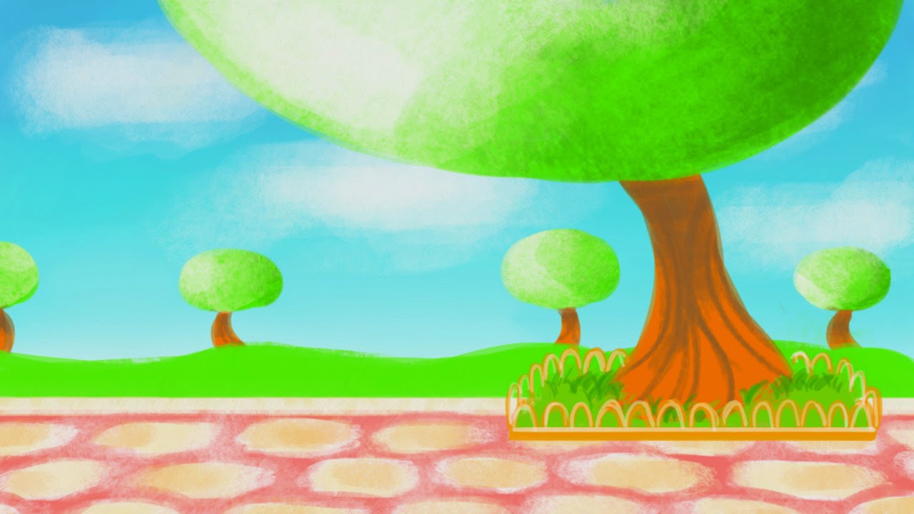
Food Module: Rebecca's Backgrounds - Through the ages
Rebecca's backgrounds are aesthetically pleasing with the use of colour that enhances the era that it takes influence from, it helps to set the atmosphere well and works with the characters that are based in the frame. I really liked the link through the placement of the ovens which are consistent and help to make the transition of the frame run smoothly when the backgrounds change from one and other. This link was enhanced with the use of the angle of the room and horizon line being kept at the exact place, helping the perspective of each design to work well with the following background. The use of the painted backgrounds help to give it that tactile appearance, giving it depth and character.
My favourite background is the Industrial Revolution design which works incredibly well together with the sepia tones, the use of the lights and the distant background. I loved the element of the window in the scene as it reveals and enhances the architecture of the era. It helped to give the audience some context within the scene and enhance the atmosphere of the piece, working successfully with the character designs.


My favourite background is the Industrial Revolution design which works incredibly well together with the sepia tones, the use of the lights and the distant background. I loved the element of the window in the scene as it reveals and enhances the architecture of the era. It helped to give the audience some context within the scene and enhance the atmosphere of the piece, working successfully with the character designs.
Subscribe to:
Comments (Atom)