Wednesday 29 January 2014

Visualising sound - Joelle Snaith


Visualising Sound - Audio Responsive Generative Visuals | Made with Processing from Joƫlle Snaith on Vimeo.

This animation is made through the use of sketches and angular shapes in a jagged and distorted format to portray the beats and instruments with in the music track. Each part of the shape moves differently to the other, some parts grow larger and flash with the crescendo of the audio.
It gave me inspiration through the use of layering with shapes as it builds up and moves together to create a certain part of the audio. I found this animation interesting through the use of the 3-D modelling and how linear lines were merged with this to create the crescendo and shapes were constantly expanding as to represent the loudness of the audio.

Visualising sound - 20 Hz


20 Hz from Semiconductor on Vimeo.

To gain more inspiration for visualising sound, I began to branch out of researching into animations and looked into other ways that people have portrayed sound. 


This video was really inspiring through the shapes and distortions that a geo-magnetic storm created in the Earth's upper atmosphere. I found this video interesting through how this process of using data from a radio array that was captured at 20 Hertz, created these surreal formations. It reminded me of Mikhail Tsekhanovsky's animation, Pochta 1929, through how the monotone format melded into surreal shapes and perspectives. The sound reminds me of sand, and also the imagery reminds me of a changing landscape as it moves and takes forms of water through the ripple like portrayal it takes shape as the audio increases. The actual shape of the audio near the end of the video takes on a icicle format as it rises with the audio.


Visualising Sound


Three Sounds Visualised from Simon Russell on Vimeo.

I was finding it difficult to animate the sketches I had done for the shapes and colour format I had portrayed the five sounds with, I couldn't visualise its movements, apart from simply moving the shape across the screen. I researched into examples of other works that animators had experimented with sound and I found Simon Russell's work. He experimented with three different sounds that lasted for about 10 seconds each, with each sound using colour, gradients and shapes. It inspired me through how he used the triangular shapes as a representation for the exploding sound and the lines wobbling to show the descent in the audio.


Visualising Sound: Volume from Megan James on Vimeo.


I researched more into visuallising sound and found this video that used water with in a speaker to show the shapes of the audios vibrations. The purpose of the installation was to create interaction with the audience as it relies on the audience to create sound to view the shape of the audio.
I found this really intriguing through the shapes that the water made, it reminded me of a mountain landscape and it inspired me through the waves it created with in the liquid, how as the crescendo increases, the water becomes violent.


Wednesday 22 January 2014

The Walk Home

Here's my final animation which has been tweeked through feedback I gained in the group Interim presentation. With this feedback I edited the glow and shadows of the fire, which I moved with the fire and embers, and I added the titles which I used a still image with the title of the animation. I then removed the song at the end of the animation as I felt this part of the audio did not suit the animation, so I left the animation with just an audio track of sound effects. The song felt wrongly placed as only 4 seconds of the song could be heard and I believe it would have worked better if it ran for the duration of the animation if added.


The mother at the end of the animation still feels like she is sliding in which I need to improve on in my next animation. I need to consider arcs and different perspectives to show the movement of an action, which I can gain through researching into animators and referencing.


Chosing Audio and Copyright


Audio is essential for my animation, as not only is it required, but it will make the animation seem less empty, pulling all the elements together.
I could visualise straight away that I wanted sound effects in my animation, however through group feedback, I was told to consider adding an ending song, as to show that the character has arrived home and to emphasise the comfort of the fire compared to the harsh coldness outside. Choosing a song that had that warm feel to it was hard to find, I found it difficult as the ending song would only last for 4 seconds, so whatever I chose and thought might fit, would still need to be faded in and out, meaning only 3 seconds of the music would be heard.


I decided to take the ending audio away from the final animation as I did not think it suited the animation, and believed that the sound effects of the fire would work better than the current ending theme.

For the audio in this animation, I first recorded the sound effects myself, such as the wind, sigh and the sound of the fire. However all of these were not good quality but I did manage to save the sigh sound and use it in my final animation. In future I need to use equipment that will give me a good quality recording such as a digital recorder or recording in the sound booth.
I needed to find the rest of the sound effects, so I looked on Youtube, and sites which offered free audio such as Free Music Archive. Using audio from Youtube required for me to ask permission to use the audio if used commercially and in mass distribution of the audio that would be used, whereas the Free Music Archive uses a Creative Commons Copyright, which allows the user to share and reuse.

Tuesday 21 January 2014

Ryan Larkin and Emile Cohl


Ryan Larkin is a Canadian animator who was taught how to animate by Norman McLaren, in which he used his teachings to create his well known 'Walking' and 'Street Musique' animations that involve characters morphing into another portrayed in different media, shapes, angles and line.

Larkin's first animation was called 'Syrinx' and was made using traditional pose to pose in black and white media, and by erasing the frame to then draw another on top of which. His animation was influenced by Greek Mythology, which is seen in the character design, however the audio twists and distorts the animation through how the imagery shown eerily makes the flute like music seem haunting and foreboding compared to the playful audio and animation at the beginning of the short.

'Walking' is an animation that uses ink, watercolour and sketchy lines made with pen and graphite which form to depict characters walking, all merging into another as they all partake on a journey to a destination. I loved the introduction walk cycle as the whiteout of the character made the outline of the characters shape made with ink or watercolour, look like an aura or an atmosphere of the characters mood, and moved along with the pace of the walk and inverted to engulf the whole shape of the character, eventually forming detail.
The animation uses traditional pose to pose animation, and takes influence from what Larkin has seen in surrounding environment and as he travels. The animation was nominated for an Oscar in 1970 for the best animated short.


The morphing of characters reminds me of Emile Cohl's work, such as Fantasmagorie which was made in 1908. The purpose of the animation was for pure entertainment, and was presented in the style of the Magic Lantern. The film contained over 700 drawings and it is interpreted that it can be considered as one of the first fully animated films. To create the appearance of the animation, Cohl used negative exposure as to gain the quality of it looking as if he had drawn it on a chalk board. In order to gain the smooth inbetweens of the morphing in the animation, Cohl would trace over the original image and change small parts of the image until it had completely changed into a new shape.
Cohl was actually a member of an art movement called The Incoherents, who were deemed as the predecessor of surrealist art movements such as Dadaism. This influence of the art movement gave inspiration into including these surreal and distorted characters into his animations, through the morphing movement and the underlying comedy.


Chris Landreth later made an animation dedicated to Ryan Larkin, who inspired him throughout his career. The animation used CGI to portray the emotions and the overtake of addictive substances much like the ones which consumed Larkins animated career and made him paranoid, in which he ended up living on the streets. After this animation Larkin went back to creating animations but sadly died from cancer before he was able to complete it. It was continued and finished using what Larkin had drawn in his storyboards and was aired on MTV in 2005, an ident named Spare Change. 

Source: The World History of Animation, Public Domain Review

Monday 20 January 2014

The Blackheart Gang: The Tale of How

The Blackheart Gang are a group of South African animators, consisting of three people. Each given a specific task, for example, one being the main concept artist and illustrator, another composes the script and audio, and the other makes the illustrations move adding CGI parts which he further blends with the traditional style of the illustrators work.
  
"The Household" is a world/landscape that they have created for their animations, poems and art to take place. The groups description of The Household - "The Household is a magical world of mayhem and madness, of intrigues and impossibilities", reminds me of my favourite book as a child "The Edge Chronicles" which depicts a world built on a flat piece of land, where the sea falls over the edge of the flat plane.


The Tale of How was created in 2006, and tells of a story which takes place on the back of an octopus, where a tree has grown and happens to be the home of these dodo like birds, which the octopus feds on, until eventually they are rescued by a mouse named Eddie. The animation holds an underlying theme of lost and power, through the dominance of the octopus and the lost of the dodo birds as the monstrous octopus engulfs them.

The Tale of How is a bizarre animation that holds beautiful visual aesthetics, through the mixture of CGI and traditional processes. The blend of both techniques work well through how the CGI has been made to look like the traditional animation style.
The animation depends on the audio, which is presented in a operatic narrative that is eerie and works with the dark and foreboding atmosphere of the plot.

The surreal landscape is based on the plane of The Household and gains influence from a traditional Japanese art, through the use of line and shape with in the waves and wind shown in the animation.


Ringo is the first animation the Blackheart Gang made together and holds the same feel of the surrealist style as the Tales of How, however the CGI character, Ringo, doesn't seem to fit with the rest of the environment as I feel that they clash. The CGI looks harsh compared to the beautiful illustrations of the surroundings through the use of the colour and shading of the character, and as Ringo does standout, it doesn't compliment the rest of the animation. You can see the development of the CGI within the Tales of How animation which works better when blended in with the illustrative style used. The animation does look like an advertisement for a game through the platform based portrayal of the scenes that Ringo runs through and the actions that the character makes whilst he is in that environment.


They later made a commercial for the United Airlines, which incorporates the same stylisation as The Tales of How.  The insanity of the animation is down played compared to the previous short, although the sea creatures still hold that bizarre twist to them, for example the fish that open their mouth where more fish appear in the same fashion with smaller fish with in its mouths and so on. The animation uses alot more CGI processes for the characters and other parts of the scenery that move. I believe this is due to the type of motion that is used and the lack of the illustrative style seen in the water and the landscapes.

The animation that the Blackheart Gang use reminds me of Terry Gilliam's work, influenced through the cutout animated movement and the surreal landscape that the plot is based on. The exaggerated movement of Gilliams work is seen through the Dodo creatures when they talk and teeth are seen with in their beaks.
The style also relates to the game design of Amanita Design games, such as Machinarium, the first full length game that they have created. The game is based around a puzzle plot and the movement and animation around the main robot character is subtle with a surreal landscape influence much like ones depicted in The Blackheart Gang work.


Sources:
Book -The World History of Animation by Steven Cavalier,
Online - Motiongrapher, Short of the Week, DontPanic, The Blackheart Gang , Amanita Design


Tuesday 14 January 2014

Gorillaz Animations

Jamie Hewlett was known for his comic tank girl before he become known world wide with his character design for Gorillaz. Gorillaz is a cartoon British band who's music has an urban rock feel and are well known by the public. Not only are their music videos always animated but animated shorts of the band members have been made as well, which has lead to merchandise and more fans internationally.
The animation style is set in a traditional cel animation style, holding the illustrative quality of Hewletts work.

In the animated music video 'Dare', it merges both live footage and cel animation layered on top of which. This works well as the footage is minimal, Shaun Ryders head, with the animation been the main focus of movement. The video only shows one of the cartoon band members, Noodle, who's animation is smooth and considers the 12 disciplines of animation. For example, the arcs with in her limbs, anticipation before she jumps, and the use of secondary action.


In 2011, the single 'Do ya thing' held a different animation style than the previous music videos, it used CGI mixed with footage of a house, as the audience follow the cartoon vocal singer, 2-D, on his daily morning routine. The blend of the footage and the CGI works well as the lighting and textures used on the design blend with the light of the room, giving depth to the animation as well as the walk of the character which gives a sense of weight and volume, suggesting a more realistic approach to the animation compared to the previous cel animation. The software used to create this could be Maya, which is popular for its 3-D animating qualities.
The characters look different through the realistic approach that the animation has gone for, however the characteristics of the cartoon band are still shown and the audience can immediately tell who the characters are. With the CGI used, I would imagine that the use of motion capture technology would have been used to be able to make the movement and height of the characters appear realistic, and they could have also used animatronic like arms or machines in the first scene of the video with 2-D tossing and turning in his bed.
The animation was made by Passion Pictures and Jamie Hewlett, Animation directors being Arnaud & Jerome, who have created other animations for Riot Games, Coca Cola and MTV.
The video also serves as a promotion for the new Gorillaz line of Converse shoes, where the product is shown near the end as Murdoc hits 2-D with one of the Converse.


Len Lye

Len Lye was an experimental artist and animation pioneer who spent his life trying to animate motion, through which he used mixed media and techniques such as direct animation and sculpture. Direct Animation is a form of animation which involves the artist to draw directly on the film strip using paint, or dry point means.
His first film was created using cel animation, "Tusalava" which was self funded and did not gain as much popularity as hoped however the animation was set in a monotone wash and had an organic feel to it through the shapes, variation of thickness in line and slow movement of the animation; originally it was accompanied with live music at the screening in 1929, however the original score was lost. The film held a surrealist atmosphere to the animation details, which later Lye joined a art group with other surrealist/abstract artists, including Henry Moore, Ben Nicholson and Baraba Hepworth.

One of his well known animations "A Colour Box" was commissioned by the General Post Office Film unit in 1936, that wanted to advertise to the public how affordable, reliable and fast service which they offer. It was the first direct film to be shown to the public in a cinema and is regarded as a pioneering piece through popularity in abstract film. The film was also voted as one of the top 10 most significant animation films of all time at the 2005 Annecy Film Festival.
The animation shows vivid and desaturated colours move and collide with lines and shapes portrayed in both hues and whiteout, as if drawn with his finger as the lines curve and contour into the next part of the sequence.
It is interesting to see the animation promote the postal company without the use of objects, character or landscape but a beautiful abstract depiction of which.

Lye has influenced many animators such as Norman McLaren, who decided to become an animator after being so inspired with Lyes work.


source: The World History of Animation by Stephen Cavalier

Futurama (Rough Draft Studios)

Futurama is a sci-fi cartoon comedy that was created by Matt Groening who also created the international hit cartoon series "The Simpsons". Futurama follows the main character Fry, who has been frozen for a thousand years and wakes up in the year 3000, where the whole world has advanced in technology and found alien life forms that live with them on Earth. From there Fry meets his soon to be best robot friend, Bender and Leela, a female mutant cyclops.
The appearance of the characters are different from the "The Simpsons" series, through the colour, the amount of detail with the backgrounds as they travel to different worlds, and the introduction of alien species.
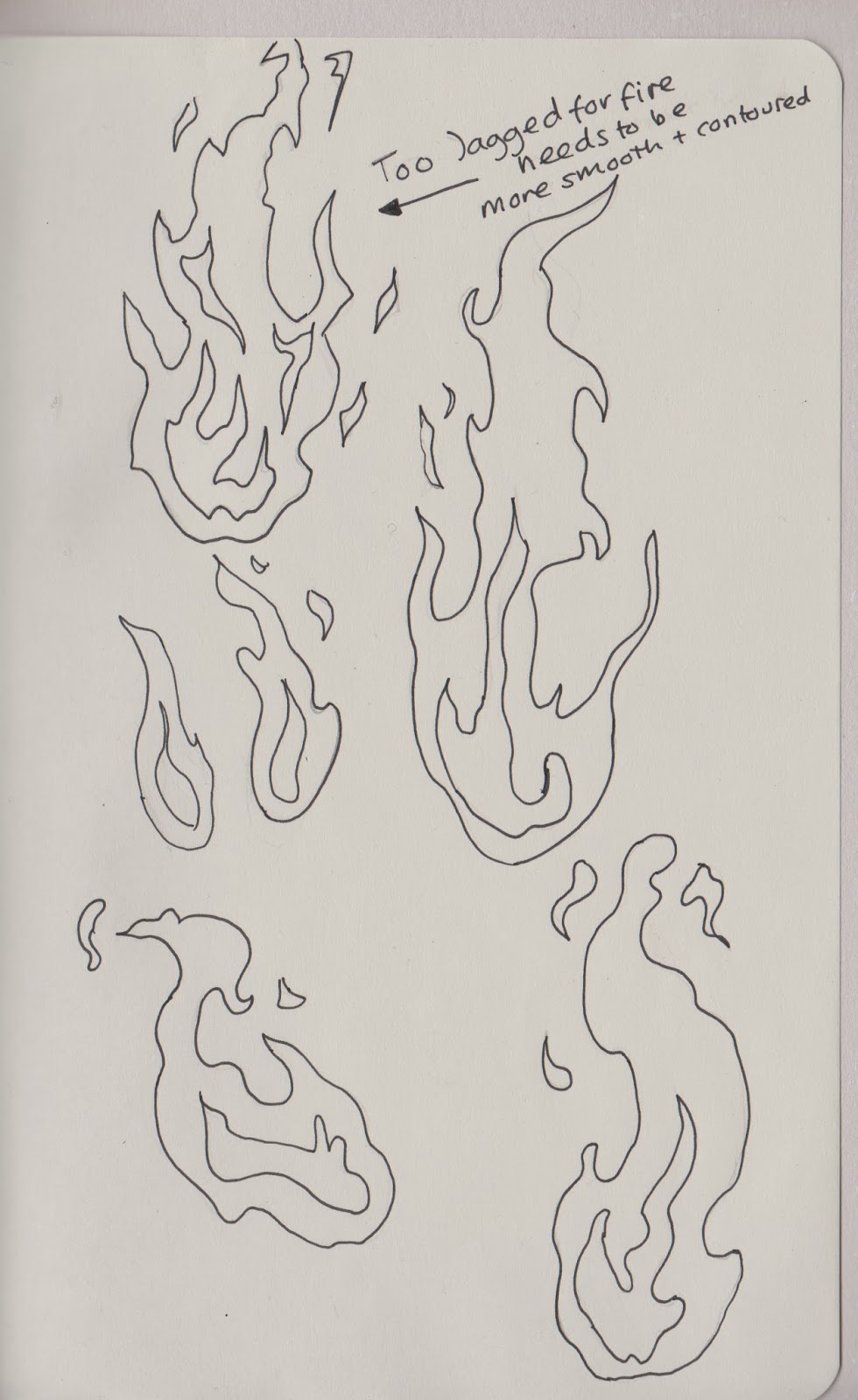
Groening first creates rough sketches of the characters which he would then pass on to be developed, corrected and neatened in lineart, which he would then redesign and the process would continue until Groening had the result he wanted for the character.


Futurama was created in the late 1990's and was first aired in 1999, it was a new form of animation through the comedy storyline and how much it contrasted with other popular series at the time, Family Guy, King of the Hill and South Park; the first episode had millions of viewers.

Futurama is created by Rough Draft Studio's who are located in America and South Korea. Rough Draft Studio's have created animations for programs such as Looney Tunes, The Simpsons Movie and Napoleon Dynamite. The Studio won Emmy and Annie awards for their work on the Futurama episodes and movies.

Rough Studios began to animate Futurama by first creating a pencil drawn animatic containing 1000 frames, which the South Korean studio then takes and makes it into a 30,000 frame finished episode.
The quality of the animation has increased since the first pilot episode, through the thick lineart, the colouring and the movement of the characters. The anticipation of the main action of a character is done well as it emphasises the humour used, alongside with the arcs and volume of the movement.

They use software such as Toon Boom Animate and PowerAnimator software, which are used for both the digital 2-D animation and the CGI space ship, Nebulae and explosions with in the episode. The Toom Boom software is used in alot of cartoons such as Happy Tree Friends, South Park and Family, and used in other animations studios, such as Warner Bros, Walt Disney and 20th Century Fox.
The software resembles a mixture of Flash and Photoshop, through the use of a timeline, layers and tools, with the added ability to rotate the canvas, using multiplane camera and kinematics (mechanics of motion points with in the characters key points).


In special one off episode in season 6, "Reincarnation", the animation style changed, into three main appearances, one portraying the early Disney style seen in Steam Boat Willie, another taking influence from a low resolution platform video game and an anime style format compared to the original animation.
For example in the Disney approach to the animation, it redesigns the characters into making them look more adorable and appealing to a younger audience, using emphasised movements, e.g. a heat beating out of a chest and the bouncing walk cycle, matched with the traditional sound effects, e.g. twang and booiiiinngggg. This stylised animation episode was set in a monotone format and used audio that would fit with the time period of Steam Boat Willie, late 1930's, through the vocabulary and the background music used. The Animation appearance also holds lack of shadows on the characters and also takes influence from Max Fleicher's Betty Boop and Pop Eye.


Disney's Steam Boat Willie style animation


Sunday 12 January 2014

Snow test


I wanted to see whether After Effects would be better for animating the snow that occurs during the animation sequence; I quickly tried with Photoshop frame by frame process but I wanted to experiment with After Effects to see if it would be a more sufficient technique.
The Photoshop Frame by Frame process would work well however with my initial attempt I knew that I would need to slow down the snow and create more on separate layers to stop it feeling so uniform.


However on the program After Effects, it was easier to create the snow shapes and move the snow in overlapping directions, covering the all of the frame with snow. It felt less jagged and random in movement compared to the Photoshop version.


I created the snow by first importing the video through the Edit menu and adding it to the composition, where I then created a shape layer through creating the snow shape, an ellipse shape with a 6 pt grey stroke.
I then duplicated the shape with in the same layer by holding down the alt key whilst dragging the shape with the arrow key, (shortcut - hold down v ) I then grouped the shapes together using the short cut Ctrl + G, which made it easier to manage my layers. Using the transform options, I was able to use the position option and move the anchor point of the group, which will move the group gradually down the frame during the duration of the start and end key point of the position transform tool.


Monotaro Vs Mickey Mouse 1936

The animation Momotaro Vs Mickey Mouse was created as propaganda to manipulate the Japanese public to be motivate the military forces to invade America.
Momotaro is a beloved character from a Traditional Japanese folktale, Momotaro Peach Boy, who was portrayed as a hero and dedicated his life to ridding the world of demons with the help of his friends. In the Japanese propaganda, Momotaro was often the main character, the hero and the Americans being the demons that Momotaro takes care of. However in some interpretations Momotaro is said to portray the Japanese government and the cute animals and dolls being the Japanese public. The idea of these cartoons were to show the public how Japan would get rid of the wicked, Momotaro being the perfect mascot for which.


In the animation Mickey Mouse, a famous and loved children's character from Disney, was used to portray America and given a vicious portrayal through the use of jagged teeth and glaring eyes as he flies through the sky on these monster like bats, which an army of crocodiles and snakes with him. Momotaro appears from a book and manages to beat Mickey Mouse by opening a box, which turns Mickey old and ancient as as he walks away, the characters laugh at him.


The animation itself is set in a monotone and lineart fashion using pose to pose to create the movement, and
was animated by Yoshitsugu Tanaka, who is better known for his postwar animations. The frames are used more than once and is quite primitive however it was created to make the public to motivate the military against America. Some of the movement is jagged, for instance the movement of the wings on the bat that Mickey uses to shoot bullets at the main character. There isn't alot of thought with the anticipation of the characters action, which needs to be shown before the main action, for example the battle scene with Mickey and Momotarto.


Lotte Reiniger

Reiniger is a pioneer in the technique of cutout animation and her most well known animation "The adventures of Prince Achmed"  which is regarded as the earliest surviving animated film. All original copies of the animation were destroyed during World War II, however a print was later found in the British Film Institute archive in 1954. This then resulted in further prints being made but the original colours where lost as they were originally hand tinted, and was finally restored in 1970.
Reiniger was heavily influenced by the traditional Asian shadow puppets, which she used her inspiration to create these intricate and delicate cutout silhouettes.

I found it interesting that her animated film did not find a distributor for a year until it was shown at a film festival which gained an immediate following by the public. Her film was also the first to use a form of multiplane camera, 10 years ahead of Disney. Multiplane camera is a technique used to give the illusion of depth to a traditional 2-D animation. This can be achieved by using different distances from the camera, for example one silhouette could be right next to the camera in the foreground and another in the background. Another way to achieve the illusion of depth is to use vanishing points with in the background image or even making the background image slightly transparent to show more silhouettes behind the main focus.

I love Reinigers use of detail through the whiteout spaces of the silhouette which leaves you imagining what colour the world she has created could be, what colour and pattern the characters clothing could hold. I love the design in one of her shorter animated films, 'Daumelinchen', which holds more detail with in the background and whiteout of the silhouettes.


(source: The World History of Animation by Steven Cavalier, Page 88-91)

Animation work in progress

I created my character for the fire animation and tested out different colour variations that could work well with the lineart. I was immediately drawn to the top left (1) and the bottom right (4) compositions, which both held different qualities. For instance 1 contained bright yellow and blue hues and 4 contained subtle sepia tones which worked well mixed with the dark blue of his coat and the light blue of his eyes.
The top right composition doesn't work well with the hues used as the magenta and red colours do not merge and and give this harsh quality to the image, I believe this is due to the intensity of the magenta colour, however the green coat does contrast with the red but not with the magenta. The bottom left design worked well as the orange and red blend, linking with the colours used for heat. I preferred the top left design however as the blues were more subtle than the reds which would work well with the rest of the background compositions of the animation; I decided to go with the top left design as I felt it would contrast better against the mostly white background due to snow. The blue hues linked with the snow like qualities and are known for resembling cold weather.


When creating the fire,  at first, I only made 2 different images, which made the movement of the flames extremely jagged. I solved this by adding more images inbetween the 2 images, a total of 8 all together, which made the flames flicker and move smoothly from one image to another. At the current speed of the fire moving, I felt it worked well however after some peer feedback I was told to experiment with the speed to see if the fire would work better at a slower rate. I slowed the fire section down by duplicating the same frame. When comparing both the original and the slower version, I decided that the slower version was not successful as it did not run smoothly as the movement of the fire seemed to stagger as it went to the next frame.

These images show the process of drawing the inbetweens between the 2 original images of the fire and debating with colour and placement of the frames:


I drew frames inbetween by lowering the opacity of the layer and on a new layer designed the inbetween.
I drew the inbetween slightly overlapping and slightly moving the body of the flame away from the previous,
to link the images together and not create a lurch as the frame plays.

I filled the fire with a red hue at first adding flickers of flames rising into the top of the screen, to give the
illusion of the flames rising higher.


I then added orange and yellow tints and small lines to symbolise embers emitting from
the burning logs. I added large parts of yellow and orange tints with in each image in varying images
as to portray the heat of the flame as it moves decreases and increases in height.


As each image was different I needed to move the tints of the flames as well as move the whole body of the fire slightly as it eats away at the wood.

Example of one of the images. I still need to add a yellowy glow around the fire and more shadows to emphasise the light from the fire.


This video is the fire sequence so far. After watching the sequence I realised that I need to move the embers along with the fire as it doesn't fit with the movement of the flames.

A Trip to the Moon and Terry Gilliam


Georges MĆ©liĆØs was a pioneer in film making, his combination of special effects and multiple exposure in his footage, alongside with introducing colour to the film by painting the film reel was revolutionary.
This film always inspires me through the use of the props and the form of acting without any use of dialogue to tell the story. The film itself does not contain any animation as such however I wanted to note how inspirational and how much impact this short film has had on many animators today.
In films such as Harry Potter and Rush, Double Negative, the main visual effects and animation studio used in the films, use mainly animation alongside with special effects to achieve actions that wouldn't necessarily be safe to produce. For example in the film Rush, the crash of Niki Lauda, was too dangerous to re-enact with a stunt double due to the black smoke that would be emitted from the petrol and materials that would have been used in the frame of the car.


The scene of the moon can be seen in the smashing pumpkins and the Mighty Boosh, both using the image in their own interpretation and to fit the setting that it is placed. The clips of the film are shown in the film Hugo, which also uses the iconic scene of the moon and tells in-depth knowledge about the film and the maker.


Terry Gilliam uses cut out animation which reminds me of  'The Trip to the Moon', through the stylised appearance to the props, how it is shaded and presented with in the scene.
He is known for his animations with in the Monty Python films and Flying Circus episodes. His most famous and loved animation being 'The Christmas Card'.
Gilliam creates his cut out animations by using imagery from magazines, old photographs and other paper resources which he then cuts out with a scalpel, and overlaps other images to create a character, object or landscape. He then further edits these by merging and separating the original image with other images and colours parts of the cut outs as well.
He creates his frames by first setting out the first key frame, including the background and other characters, and creates a template with black marks on which, to tell him how much he needs to move the character or object per frame.
A problem which he encounters with cut out animation are the shadows which are formed from the individual layers of paper that he uses with in the frame. He solves this by moving the lighting directly above the frame to minimise the amount of shadows that could be created, he also holds the cut out imagery down with a plastic sheet to keep it together as another precaution towards shadows and ease when taking photography of it.
I could recreate the process of cut out animation through a digital means through the program After Effects, where I would cut images into sections and then animate on different layers using the transform option.


Wednesday 8 January 2014

Spaces & Places task

Where are you drawing?
I chose Leeds Christmas Market, York Christmas Market and Pickering Castle as my three places to observe and draw. 

Why have you chosen these places? What are you expecting to see, What is of interest to you?
Leeds Christmas Market - I chose this place as it is a market that only appears for one month every year and I wanted to document it before it would be taken down. I find the individual stalls with in the small house like structures interesting with their stock that are like trinkets, made of glass and very christmas orientated.
York Christmas Market - I chose this place as I have never been to the York christmas market before and wanted to compare the different visual outlook with the Leeds Christmas Market.
Pickering Castle - I have never been to this castle before and have always loved visiting places such as this as I love the unique look of the structure, how the once magnificent architecture has crumbled and decayed, with nature growing and engulfing it. I love the history behind the architecture and the Gothic structure to the arches of the doors.


What do you think you are going to draw there?
I want to draw detail, the mould on the bricks, the rust on the exterior of a door, the perspective of the scene that I can see.


How are you going to draw?
I want to draw with graphite, to sketch what I can see and interpret it into my style with as much detail as I can.


What media are you going to use?
I feel that watercolours will definitely be one of the main media for its subtle and soft texture that it adds to the object, it brings the sketch to life, gives it definition and a personality whether its through small cracks of ware and tear or mould that has begun to cover and engulf the object.
I will use other media such as fineliner and colouring pencils to add a different view on the image.


What about light, shadow, colour, texture, shape and perspective? How can these be used as storytelling devices?Light and Shadow are a necessity to add volume and depth to the object, and the aid of colour and texture can help to give a tactile appearance which becomes aesthetically pleasing to the viewer. Perspective has always been a challenge for me, so I want to try to draw the surroundings in different perspectives to try and grasp a basic understanding.


Are there famous/infamous stories about the spaces that you already know?
I don't know any stories about the Leeds Christmas market which I have already been to, neither the York Christmas Market which I have yet to go to, however I researched into Pickering Castle which I have yet to visit.  Pickering Castle is a 13th century motte and bailey castle and was apparently founded by William The Bastard during his campaign in 1069 -1070 in order to control the local population as well as defend his territory. And his son, Henry I, lived in the castle. (source - http://news.bbc.co.uk/dna/place-lancashire/plain/A2350090)


Monday 6 January 2014

Gertie the Dinosaur (considering animation with footage)

Gertie the Dinosaur - Winsor McCay - 1914


Gertie the Dinosaur was a key frame, pose to pose animation created by Winsor McCay in 1914, which involved both footage and animation. The animation is inspiring through how well it moves, and functions as a whole, the animation runs well through the consideration of the perspective and arcs within the dinosaurs movement.  In my opinion this animation is timeless and will always inspire other animators, films have been greatly inspired and involved animation such as, Mary Poppins, Cool World, Space Jam and Who Framed Roger Rabbit?.


Mary Poppins - The Penguin Dance - 1964


The Penguin Dance uses animation drawn in the famous Disney style, following the moves of the character Bert as he dances for Mary Poppins. The animation works well with the background and interacts with the footage through the use of the arcs, secondary actions, emphasis on the squash and stretch as the penguins copy what Bert does, and slide towards him. 


Who Framed Roger Rabbit? - 1988


Who Framed Roger Rabbit is a film which references characters from different animation studios, such as Disney and Looney tunes with Max Fleischer's Betty Boop. The film was successful through how well the film was planned and structured, with the actors working well with the animation addition.
In the making of the film, they used a model which Bob Hoskins would use when he was holding the rabbit, to ensure that the angle and height related to the animation. The angle would be measured and eventually Bob Hoskins was able to determine and imagine where Roger Rabbit would be in correlation to himself.
Using mechanical arms helped with bringing realism to the animations, such as when Roger Rabbit smashes plates on his head, the use of a mechanical arm worked well with the animation and for the other actors as they focus on the arm and the animation would be drawn over.
For the car chase scene with the cartoon cab, Bennie, the real driver was behind Bob Hoskins and as they drove through the traffic, and the animation was drawn over the top, so the driver was hidden in the boot.
It was really inspiring and interesting to see the making of Roger Rabbit as it took so much time and doing scenes repeatedly until the scene was right with the animation.


The Magic Lantern

The Magic Lantern was not a moving image as such, but it was an image that was projected which Christian Huygens created in 1650, a huge revelation which I felt lead to the recording of the moving image and making moving images.  (The first Magic lantern was a device that projected images via candlelight)

My favourite Magic Lantern Slides are the Alice and Wonderland scenes hand painted by W R Hill in 1876. The imagery is just beautiful in both composition and colouring, which holds a painted and dip pen quality of line. 


In my opinion the first moving image was the Victorian toy, Thaumatrope, which when flipped fast gives the illusion of both sides of the toy merging together. The Thaumatrope was created by John Paris in 1824 and the most common one being of a bird and a cage. This then lead to the invention of the Phenakistoscope.

The Phenakistoscope was invented by two people at the same time in different countries in 1831, Plateau and Von Stampfer. The device functions by drawing the stages of the animation around the edge of the circular plate, which would then be spun to show the movement of the imagery. 
My favourite is the Phenakistoscope that contains mice running from the centre and crawling over the edge of the disc, I feel that this design is so innovative and uses a less circular shape than the rest of the Phenakistoscopes as to show the mouse crawl underneath the disc. 


Sunday 5 January 2014

Adobe After Effects Notes


Composition Menu

Using the composition menu, allowed me to open a new composition, in which I could begin to make an animation, through this menu I can change the settings of the composition, such as frame rate, ratio and background colour.

 Using the layer menu, allowed me to create a shape layer, which would hold basic shapes that I would later animate. The other layer options allow you to add text, perspective and level editing to the composition.

Transform options

The Transform drop down option, allows you to actually move the object in the layer using key points, to determine when the movement starts and finishes.


  • Anchor Point - Moving the Anchor Point of the object determines what angle the shape will rotate and move, when using the rest of the transform points.
  • Position - This changes the location of the object, making it move from one side to the other, regarding the location of the last point. 
  • Scale - This increases or decreases the size of the object with in the layer, which changes gradually over the space between the start and end point. 
  • Rotation - Moves the shape in the angle you set, and repeats more than once if set. 
  • Opacity - Changes the transparency of the object, good for fading the shape into black.

Example of the Key Points
The speed graph allows you to alter the velocity of the selected layer, by dragging the point further up the graph, increasing speed, or lowering the point, decreasing the speed.

Different Animatic's


Looking at other animatics for music videos and cartoons, gave me inspiration through how the timing of each frame was portrayed and slight parts of the video were animated, this can be seen in the Avatar animatic.

The Gorillaz animatic gave me inspiration through the transitions of the frames, the movement as it zooms into a close up, the use of onomatopoeia for the actions and the audio that is played throughout to see how it fits with the music track.


The Adventure Time animatic gave me inspiration through the slight movement of the characters but using still images to determine when the character would speak and move. This helped me to think about the timing of my animation and how I would incorporate my movement with the audio track I would eventually use.


The Avatar animatic was more detailed in animation through how every action moved and showed a rough draft of what the animation would look like. Even though the animatic animation was more complex than my own it inspired me through how the movement of the flames and the action of the debris from the rocks helped to emphasise the strength and power of the force behind the element.

Initial animatic vs Final animatic

I quickly created a 7 second animatic of the initial storyboard with colour and audio as to see the function of the audio with the frame in which portrayed the sound, in this case the wind and the fire in the fireplace.
This helped me with my final storyboard as I was able to see what I needed to add inbetween the initial storyboard frames, such as adding a scene of the character walking across the frame and adding movement in the background of the frames.


The final animatic contains just my storyboard but in the duration of how long I want each frame to last for. This really helped me whilst I was working on the final animation as I find it hard planning the time and space of the action within the frame, the action ends up being faster than it should be.


Initial storyboard vs Final storyboard

I created four initial storyboards, one for all of the four elements, using one initial idea from each. I made a storyboard for each element as to make sure that I would definitely want to take a certain idea on and that I would enjoy making it.

The idea needed to be expanded through more content to give
the animation more of a aesthetic appeal and for the audience to
understand the plot. 20 seconds would be too short for the story.
This storyboard works well with room to add more scenes.
I feel that this would also work with being able to develop my style of drawing with in animation.
This story is simple and has room to add more scenes to the animation
 and to improve my digital style of drawing with in animation.
I feel that this storyboard would work well for all ages of audience.
This storyboard is too complex for 20 seconds of animation.
 As the story holds delicate and detailed illustrations as well
as the story portraying the dream of the girl underwater.


The final storyboards are of the fire element, in which I developed with more detail and more thought about the angle and secondary movement of the character.
I felt creating the storyboard again helped me to create a more solid storyline in which I could add more frames of the character walking, or losing his hat for a slight second as the wind becomes more violent on his walk home.


I began to think about how the wind would react with the character, such as the hair, scarf and clothing moving along with the wind direction. I thought about the angle in which would be best to portray the character in the frame and what line would be best to show the movement of the fire.


Friday 3 January 2014

Initial Sketches

I began to draw water and fire as to understand the movement of the element more, in a hope to gain more inspiration with the ideas that I had created.
I enjoyed sketching these and taking notice of how the shape of the water moves and how it splashes when something is dropped into it. The book Elemental Magic by Joseph Gilland helped me to gain a better understanding of this fluid movement.


I went back to my earth initial ideas and I fell in love with the concept of a character waking up in a white space, and as the character begins to walk forward the landscape slowly appears and gains colour. I was so inspired that I began to sketch as I wanted to get this character on paper before I started to design anything else. I was more inclined to draw a female character rather than a male as a female character is more delicate and to create this character I felt I needed to try different illustrative styles to compare against as to make a good character for the earth idea.


To further inspire myself, I stopped sketching and created more detailed art as to know for myself whether or not to carry on with the idea. The idea itself has been done before however I wanted to run with this idea as to make myself focus more on the art of the background and create a simple yet delicate and slightly detailed character. After looking at the concept art, I knew I would want to make the earth animation far too detailed in illustrative style so I didn't continue with the idea as it would be too time consuming and the duration of the animation would be longer than 20 seconds.


I then went back to look at the initial ideas and one of the fire ideas just stood out for me. The idea was of a character getting off a school bus and walking the long distance home through the snow and cold wind, and as he opens the door he sees the fire and warms up to it as his parent gives him a hot drink. I felt I could merge both the fire and the air ideas through the use of the freezing wind and the comfort of the fire within the animation. I created concept art for this and I knew I wanted to continue with this.