Showing posts with label OUAN504. Show all posts

Sunday, 10 May 2015

Food Module: Storyboard Edits to Translate to Animation

Due to lack of time for the animating production stage the storyboards have been cut down slightly with a few scenes as well as a change of perspective, high angles and low angles, so that the animation could be made more efficiently. However the change of perspective should not change the theme or the way the gags are portrayed with the scenes still looking interesting to the target audience that we want the animation to be suitable for. Here are the main edits that Rebecca has made:

Sheet 2:  Edits on this board consist of Johnny just having one expression on the glass scene rather than having him giggling. Instead of a high angle on frame 3, it has been changed to a medium shot which works better with merging with the last few frames that are also in a medium shot. I think for the target audience this is more suitable as it is simpler for the viewer to understand the direction of movement. Frame 6 needs to be flipped so that he looks directly at the tree, however this may change to him just looking up at the tree instead of looking up over his shoulder.

Sheet 3:  Frame 3 needs to be cut out so that the main movement of Frame 2 can have a longer duration, showing the follow through of the Cake Man falling through the roof of the cake stand. I designed the storyboards to show the beginning of the fall and the aftermath, as I wasn't sure if animating the actual crash from the tree into the stand would be difficult to animate, however I didn't realise how difficult the way I had planned the storyboards with portraying this action would be as well to animate. I think this decision works well as it can all be within the same shot and we would then be able to use the puppet tool to move his legs in After Effects.  Along with these changes frame 4 has been cut as there is no need with the new shot that we have made. Frame 6 has been cut out with the use of the audio recording as there is no need for this coughing sequence, we both agreed that it would follow more smoothly to the next scene without this frame, which would still show his personality.

Sheet 4 and 5: The only changes for these boards are the gestures for Cake man as he talks to Johnny and how he would continue to talk in sheet 5 right after “Say! How about~” and as well as moving Johnny to be in the same position as through the ages sequences in frame 4 before this sequence begins. This would work better with frame 5 being cut as well as I originally drew him turning at the bottom of the screen before walking into the position he would stay in through the next couple of scenes.

Sheet 6: Possibly changing Johnny’s reaction depending on time.

Sheet 9: The first 2 frames will absorb the same medium shots as the last frames of sheet 8 with the ‘piece of cake’ pun. The high angles work with the sponge falling out of the sky however with lack of time the perspectives would be a challenge. However this change of shot will still work well as long as Johnny turns to look to his side instead of looking up; the sponge would enter from the left side of the frame much like the running sequence following this.

Sheet 10: The perspective of Johnny will turn slightly into a ¾ pose so that it is not a front view.

Sheet 11: Cutting a few of the frames in-between the first and the last frames so that the action of the Cake Man grabbing Johnny’s cheeks happens faster.

Sheet 12: Frame 2 has been cut out to merge straight to frame 3, with the possibility of the prancing twirls of the Cake Man being cut due to lack of time.

Sheet 13: Frame 3 will continue to frame 5 and 6 as don’t need to show the Cake Man in the background still talking and prancing as Johnny is purposefully leaving the Cake Man to talk to himself.

Sheet 14: The shots are going to be changed to a long shot so that the walk cycle will merge straight into the frames on this sheet rather than cutting directly to a medium view of the cart. As well as the Ice Cream Man appearing instantly rather than being a mysterious figure before which.

I believe this changes work well as it allows more time for important gags and scenes to have a longer duration, as when putting the animatic together felt that the ending with the cake man was rushed, and I felt that I may have forgotten in some parts that the target audience needs simple scenes and animation, so the use of varying perspective was not needed. I believe these changes work well as it allows more time for important gags and scenes to have a longer duration, as when putting the animatic together felt that the ending with the cake man was rushed, and I felt that I may have forgotten in some parts that the target audience needs simple scenes and animation, so the use of varying perspective was not needed. This module has helped me with the consideration of angle and perspective within storyboards as before I had only drawn storyboards that were for an older audience that needed different angles and perspective to enhance the visuals, so translating this form of visual narration into one with a younger audience was difficult, as I love adding different angles to the imagery.

Wednesday, 21 January 2015

Final outcome

For my final outcome, I made a few changes to the animation sequences, as some of the movement appeared jagged. For example in the first scene where Moom talks to the camera, the head movement jumped to the next turn of his head, which made the animation feel jarred. I solved this by removing the key frame that made his head move up, making a smooth transition to his head moving to the right.

Overall I feel that my animation was successful through both the narrative and the movement. The narrative worked with a young audience through the presentation and phrasing of the dialogue and the props in which Moom interacted with. I felt that the audio was the most successful part of the narrative as it sounded like a young child which the target audience can relate with.

I felt that the animation was successful through the use of the exaggeration that I added to the key poses, which helped with the humour that was incorporated into the narrative. I felt that the majority of the movements were smooth and were positioned well with the sound effects included in the scenes. For future projects I know that I need to concentrate and consider the secondary motion alongside with the overlapping action, to make the act seem more believable.

Tuesday, 20 January 2015

Making titles and credits for my animation

I wanted to add a title and credits to the animation so that the final composition felt completed alongside with the added sound effects and audio. I wanted the titles to also be situated in a white environment to go alongside with the animation, to have a running theme. I felt that the text that would be included with the title and credits, not only needed to be the same font, but needed to hold a vintage or handwritten quality to the aesthetics. The handwritten quality would work well with the child like characteristics to both the narrative and the actions of Moom, whereas the vintage appeal would work well in a more professional aesthetic and work with pre production sketches. I decided to run with the vintage font, being a typewriter esk style, which I felt worked with the imagery that I added into the composition. I then created a few different designs of both imagery and layout for the title and credit images, which I managed to narrow down to two designs for each.


Credits 1

Credits 2
 For the credits, I narrowed down the designs to one which included Moom and Mother Moom set in a digital illustration format, and the other being a scan of an initial sketch in which I added desaturated colour through the use of the software Photoshop. I quite liked the appeal for the Moom design as it worked with the use of the characters being in the animation, however I liked the sketchy appeal to the second credits image with the green bear toy, so I asked my peers for feedback for the design. The feedback was very positive, with the green bear sketch being more favourable with it working with the style of the text and the image doesn't stand out as much as the other design.

Title 1

Title 2
For the title I created two designs much like the credits, one being digitally created and the other being a sketch that I had scanned in, drawn with fineliners and marker pens to create that vivid appeal to match the style of the narrative. I asked for feedback from my peers, and the feedback was aimed at the digitally designed composition, through how it would match with the green bear toy with in the credits design. The text was simpler than the other design as 'Mooms adventure' doesn't work as well, due to the audience who are not familiar with the name of the rig would possibly be confused as to who or even what the word Moom is/means.

Examples of 3D in 2D animation

For weekly cartoon shows, and the high demand for episodes, the use of 3D models and animation has become more involved with in these animations. For example with in the cartoon series, Futurama, the model of the ship was changed from 2D animated to a 3D model with a 2D texture placed over the design. This use of 3D works through not only saving time and expenses with animating different perspectives of the ship but also aesthetically pleasing to the eye. Due to the use of the cartoon 2D texture, it works with the 2D characters that mainly interact with the show; It blends in with the general aesthetics of the animation. goes with the future scientific theme, goes with the stylisation of the animation. Even though the ship does not hold alot of animation with in the scenes as it travels space, apart from the movement of the engines, the animation is still smooth and runs well with the secondary animation with in the scene.


Futurama

Another weekly cartoon show, Legend of Korra, began to incorporate the use of 3D to show the advancement in technology for war intent with the other nations that were set in the world of the animation. However the use of 3D was poorly merged with the 2D animation and pastel backgrounds that the animation was saturated in. For example there was no texture that was layered over the top of the model to try and make it absorb a 2D form, much like the 3D used in Futurama. This made the 3D animation stand out from the rest of the scene and makes the audience purely on the model which detracts the main narrative of the scene as the 2D characters fight against the machines. The animation for the characters are stunning, the smooth movement as the main characters use martial arts as a reference to use their elemental powers. Whereas the robot holds a jagged step by step formation of movements, which does work with the robot theme however it still needed some smooth arcs or turns and even heavier steps to feel the weight.

Legend of Korra

Using Premiere and adding sound effects using Audition

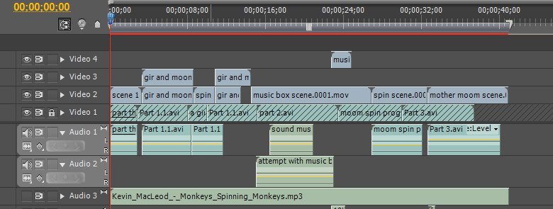
For the post production process, I purposely used Premiere to edit the playblasts and rendered sequences of the animation, due to the ease of merging both audio and video together in the work space. Even though, much like after effects, you can import image sequences, I found it easier to use Quicktime 7 to put the sequential imagery together and import the saved mov file into Premiere, as it would be easier to edit and effect later in the work sequence compared to the imported image sequence straight from Premiere. The workspace is much like After Effects with the stacking of files and rows, but the video and audio files are separated into clear sides of rows which makes it easier to match to the correct video, with the opportunity to open the audio files into Audition to edit further.


I found that in some parts, when matched with the video files, the audio was too loud for scene. I was able to solve this problem by using the audio mixer, in which you can manipulate the levels of the sounds on each track that you have made for your audio. This menu helped me to merge more than one sound effect on the same scene that would slightly overlap, making the audio work rather than the sound confusing to the audience.


Another effect that is helpful for merging the video tracks together, are the use of blending modes that are located in the sequence effects. Under the opacity effects, you can change the blending modes, to overlay, multiply etc much like the software Photoshop when stacking and using layers. These blending modes are helpful when you want the visuals to merge with one another, or add a texture over the top of the video to make it appear aged or have a grunge like appearance to the aesthetics.


With the sound effects,  I researched into different sounds that would suit the animation and narrative, using sites such as Free Music Archive and Free Sound. Both of these sites took the sound effects with a twist, a different route compared to each other. For example the free music archive contained a sound track and a fuller breath of a musical track, whereas the free sound website contained sound recordings of different audio, being a few seconds long at the most. I felt that the best site to help me with the sound effects that I needed for my animation. For my animation I needed to obtain a sound that would work for the squeak of the green bear, the music box and the slam of the lid from the music box. I couldn't exactly find the right sound that I needed for the sound of the music box and the slam of the lid, so I tried to find the closest audio to what I wanted it to be, and opened it with in Audition. 

Example of stretched and pitched audio file
The Audition software allows you to manipulate, the audio clip that you have imported, by editing the pitch, speed, and overall appearance of the sound wave.  I found that I mainly used the pitch and stretch effect to the audio clips, to get the correct depth that I needed to the sound effect. For example, for the music box sound effect, I selected part of the sound wave and heightened the pitch as well as speeding the audio up. I found that this worked well for the music box audio as it worked with the movement of the doll, leading up to the lid being closed upon it. Whereas with the sound of the lid closing was a bit harder to create as the closest sound that worked towards the ideal audio that I wanted was the sound of closing a book. I felt that I needed to make the audio ever so slightly sound echoey/hollow, to go with the volume of the music box, which I achieved with one of the distortion effects. With the added distortion effects, I then edited the audio by lowering the pitch slightly with the pitch and stretch effect. 


Post production - Cutting scenes

I heavily edited the animation compared to the final crit animation I presented to my peers, the main edit being the removal of a scene. I felt that the main problem with the animation that I presented at the final crit was that the duration of the video, as it was too long and too much narrative happened for the length of the animation. After being extremely critical to my own animation, I decided to remove the scene that involved Moom spinning onto the screen and then encountering the green bear, before moving onto the music box scene. I felt that the narrative was confusing with this scene included with in the animation through how Moom goes to the green bear, then to the music box and then back to the green bear, which I intended the effect to be that he preferred the green bear more than the music box. However I didn't feel that the audience understood that narrative as well, therefore I cut the scene out and let the animation continue straight onto the music box scene, which worked well through both narrative and aesthetic visuals.

Even through I won't be using this scene with in my animation, I felt that this scene helped me to develop my animation skills to further improve the scenes that I had kept with in the edited version. For example with this scene, I discovered that I could move Moom across the plane by selecting the controllers group in the outliner window. However at times a problem with the controllers would happen, which involved the body parts being left behind as I moved Moom. I found that pressing undo and re selecting the controllers solved this problem. I also discovered little helpful tricks with the lighting of the scene, by pressing the key 't' whilst selecting the light, it creates a pivot in which the light would move around, this helped me to create lighting that emphasised the shadows cast by the light, and create a form of ground in which Moom is standing upon, rather than seeming that he is floating in the scene due to the white of the environment.


Editing my animation further - post production

Using the feedback from my peers at the final crit, I edited the camera scenes for the majority of the animation, which helped the video run smoothly. An example of this can be seen in the first part of the animation, with how I removed the camera action, and added movement to the last part of the scene with Moom turning his shoulders, as he lip syncs 'whats this'. I felt that the movement of him moving of screen and then popping back onto the side of the frame was too much and this subtle movement that I have added works better in this respect, showing the child like mannerisms that I wanted Moom to adopt for the animation sequence. I added subtle movement to the turn of his head whilst he speaks, which I believe shows Mooms being bashful before he turns into the energetic side of a child. I left the camera perspective at a straight point and close shot, as the original movement was confusing and the still camera helped the viewer to understand what was happening in the scene.


I then used the peer feedback to edit another scene in the animation, which involved Moom interacting with a music box. I mainly edited the camera angle as the key frames went through Moom which wasn't aesthetically pleasing to see, and the change of angle from the back of Moom to the profile to be able to see him interacting with the music box, was too harsh of a change for the movement to appear smooth to the audience. I found that leaving the camera perspective on a profile point of view on the scene worked well as again it was clearer to understand the movement and narrative that was occurring in the animation.

Editing the camera and environment of the frame

For my animation I wanted a white background that took influence from the childrens animation, Pocoyo. I felt that this worked well through the theme of my animation that would appeal to the younger audience. I wanted the objects in the scene to be the main focus, along with the character, in which the white background works well to emphasise this attention; As my animation environment is situated in a toy shop, it would be difficult to create so many items and props for the background as well as animating the whole scenes within this environment.


To create the white environment, I edited the hue of the floor panel to a colour that was whiter than white. This was to ensure that the floor panel merged smoothly into the white background created by the camera environment. For the whiter than white hue, I created a new Lambert shade, changing the colour attributes to RBG, with each channel being set at 1.25. In addition, the changes in the render settings effect the lighting and shadows of the environment, to make the render work with the white background, I turned the indirect settings off and then added the final gathering to the render.

For the camera shots, I edited the settings to resolution gate as to see how it would look rendered, gaining a better shot with in the frame, and using the rule of thirds as a basis. I found that I had to change the focal point of the camera when animating as the lens would zoom in to the scene too much, depending how far I moved the camera across the scene.  I solved this by editing the attributes of the camera and widening the lens, and changing the aperture in some cases.


Monday, 19 January 2015

Double Negative

At the Bradford Animation Festival, Chris McLaughlin, talked through the problems and advantages of the software used in the production of the film 'Hercules', 2014. The work that Double Negative contributed to the film was the environment extensions, digital doubles of the characters, crowds, model animations from the provided material from clients.

The main problem they encountered during production was the hair and fur, as a lot of the close ups of the camera perspective incorporated a large about of fur or hair, which is something that they had not done before. To help the movement of the hair/fur they created a groom tool, Furball, which aided the fur simulation, creating a more natural appearance to the movement. This tool was a hair shader and helped with rendering the fur, it included over 4,000,000 hair curves which was highly memory heavy, causing high render times which was a problem with ensuring if the movement of the hair/fur worked well with the final lighting and textures. The Furball render helped to create randomized clusters of hair, to further create a realistic appearance. Although the render type slowed down the production slightly, the end result worked well in the feature film.

With the Hydra model, they made a few changes to the initial model, mainly around the mouth, in which they made wider and sharper teeth as the initial model did not look menacing enough. The Hydra model was a mythical creature, in which took influence from serpents, with its scales and vertebrate, however as it is a fantasy based creation, there is room for exaggeration of its proportions and movement to make it bizarre and mythical esk.

 For the textures they added a displacement to the base texture, which helped to aid extra detail and adding sub surface patterns to the scales. For the water they used just a shader with noise to try and make water, which worked really well for their first attempt. For all the textures they kept to three steps, creating the base, midtones and highlights, which helped to create a shimmer to the Hydra model, making it relate to a serpent type creature.

As most of the environment was created by the use of 3D software, the main actor was also replaced with a digital double when interacting with the CG models. For example when the main character was attacked by a wolf, the arm which the wolf had sunk its teeth into was digitally replaced so that the bite would be able to sink into the flesh more than if it had been the original arm. This was due to having the CG wolf interacting with the original arm, the arms skin needed more pull and tear from the bite, which is why the CG replacement limb helped exaggerate this action.


Sunday, 18 January 2015

Rending using Mental Ray - light and shadow problems

As I was nearing the completion of my animated sequence in Maya, I wanted to test the rendered appearance of the scene so far by previewing a single frame. However my first attempt for my rendered image portrayed Moom in a luminous purple and a dark background, even though I set the specifications for the environment and plane to be white. I soon noticed that the lights were the main cause of this problem, including the shade of the camera environment which was set at a grey shade, instead of white.

The main light was set at 'illuminates by default' which created the bizarre appearance of Moom, matched with the settings of the shadows in the rendering settings. After initially finding the causes to these problems, I deleted the light and made another light, ensuring that the attributes where correct, with both the defaults and the shadows. This seemed to solved the problem, however there were no shadows on the scene.


I thought the cause of the lack of shadows could possibly be due to the floor panel being whiter than white, so to eliminate this from one of the possibilities, I changed the floor panel to just white. The white however seemed to be tinted with blue, and the shadows did slightly appear under the table. However I didnt like the appearance of the tinted blue floor panel so I went back into the material attributes and changed the hue back to whiter than whiter. I then noticed that the transparency for the floor had been increased, which I then realised was the cause of the problem, as when I rendered the scene with the transparency set to 0, the shadows were visible. 


Apollo

Whilst working on the first How To Train Your Dragon animated film, the animators used a software called 'Emo' which had been used since the 1980's. This software allowed the animators to manipulate the 3D models by using a spreadsheet which would manipulate parts of the character. However there were many disadvantages to the software, for example, when you wanted to edit a characters animation you would have to hide the other characters that were in the scene to begin working on the character, the render time could be anything from 20 minutes to 2 days and at times it would be guess work with the spreadsheet numbers, as the number may not match up with the manipulation of the cg character. This in effect created a demand for a new software, one that would allow the artists to manipulate the character by moving the limbs directly with in the scene alongside the characters that would also be situated in the frame. 

Software used for the first How To Train Your Dragon film, 'Emo' 
This software platform was created and named Apollo, with an animation software called Premo. The creation of this software took five years to make, due to the extensive research and attention to detail with what the animators wanted from this software. This helped the artists reduce an exponential amount of time and focus on create a battle scene with an army of both humans and dragons, which would have been impossible to envision with with previous software.

"The result, with Premo, was a tool that cut down on eye movement, arm strain, eye strain, and time. It used to take weeks to train artists. Now the artists can learn how to use Premo in a couple of hours." - http://venturebeat.com/2014/07/25/dragon-making-premo/

The Premo software allows you to pose using tablets, gain a high resolution image instantly, and allows you to edit frame by frame, manipulating the character in realtime. To create the Premo software, Dreamworks team collaborated with Intel, to create a cloud system that would help the render process time run faster than the previous software, and to store more data that the scenes would create. With the creation of this new software, the limits are near invisible with the advantage to improve and update the software as the advancement of technology continues.

The 'Torch' renderer, is a lighting package, that allows the animator to create in depth lighting that thinks outside the cartoon lighting, absorbing light that seems more natural and would not have been possible with the predated software. Including these elements it has room for complex imagery and aids the process in creating the overall look of the animation.


The apollo software used for the second film

The Stats for the final movie rendered outcome. 


references used, venturebeat, indiewire

Saturday, 17 January 2015

Uncanny Valley

3D animated films do absorb a sense of realism into their aesthetics but keep that cartoon like appearance to suit the child audience. The animated film 'Polar Express' took this further and made realistic 3D models for their animation, using motion capture and modeling the characters close to their actors. The film itself held a good narrative but personally I don't find the realistic approach to the models that aesthetically pleasing; I prefer the cartoon inspired 3D animations, much like Megamind and The Lorax. The amount of realism added to the models gives a lifeless expression to their faces, the eyes seem void of any emotion compared to other popular 3D animations. 

"There is a theory to explain people’s strange dislike of artificial characters which look too real, called the ‘Uncanny Valley’. Basically the idea is that when a doll, or a CGI character, looks too much like a human, viewers notice small differences which distinguish it from a genuine living thing, become disgusted by its artificiality" - vividscribe.com

The Uncanny Valley hypothesis is used to describe the viewers distaste in 3D animation or robotics when they look too realistic, it causes some viewers a sudden reaction of disgust. However there is no extensive research on this to prove whether there is a solid basis for this to be recognized.
The Uncanny Valley hypothesis does explain why this perception of thought towards 3D animation is depicted; a sense of identity towards the characters are lost through how the audience see through the artificial quality of the animation, purely for the amount of realism the animation has taken. I believe that the motion capture of the movements do give characteristics and a sense of personality to the characters animations however the expression, the eyes of the models stop us from connecting with the character. 


Polar Express

Scooby Doo

Scooby Doo is a beloved and nostalgic cartoon created in the late 1960's, which involves five main characters who travel around America in their mystery van solving mysteries. The characters incorporate different personalities which are very stereotypical however they work well together for the young target audience that watch the program, and for the aged story line. The characters were presented in this way due to the influence of the era that it was created in:

+ Fred - The main leader of the group and is resembled as the hero.
+ Daphne - The main female role in the group and is resembled as the damsel in distress.
+ Velma - The brains of the group and helps them put the clues together to find the bad guy.
+ Shaggy - The jester of the group, always hungry and always ends up in trouble.
+ Scooby Doo - The main character, a lovable dog who will do anything for a scooby snack.


The original series held a good simple narrative that worked for both the older and the younger audience, with Scooby Doo and Shaggy being chased by the villain and accidentally capturing them as they run away. The series developed as technology advanced in both visuals and character development, the characters became less stereotypical, and gained more depth with the personalities. For example Daphne became a stronger character, able to defend herself and stopped being the damsel in distress as often as the original. This can be seen in the movie, Scooby Doo on Zombie Island 1998, Daphne becomes the main focus who brings the gang back together and finds them a new mystery.

The narrative is quite different to the regular mysteries, in which they catch the bad guy who is dressed up as a monster or ghost, in this instance the monsters are real. I quite liked this twist of narrative as it was something that they hadn't done before, and the reactions of their realisation of them encountering monsters that are real feels genuine through the facial expressions and the body language; An exaggeration is used as they use their arms to protect themselves with, shielding their eyes and slowing walking backwards as to try to escape the monsters. The colouring of the animation fitted the dark atmosphere, adding black fills for shadows and using desaturated tones to make it feel foreboding.


In the live action version of Scooby Doo, the characters are exaggerated more through their actions, as they feel as if they have taken influence through the walk cycles that each character obtains and makes it more unique. For example with the character Shaggy, emphasises his strides and shrugs his shoulders down, and as they sneak around, taking the most delicate footsteps by first lightly touching the floor with his toes and then turning his body to see if anyone is around before proceeding to move forward. I found the movement of his arms quite humorous with them being at his side but bent at the elbow and his hands forming a claw like shape, making him resemble a scared t-rex.


Father Ted

Father Ted is a comedy series that first aired in 1995 on channel 4 that follows the daily lives of three priests who live on a small island that isn't included on any map, Craggy Island, with its landmarks being 'the field' and the holy stone of Clonrichert. The narrative does not include plot heavy story lines, instead it shows the routines and reactions that the three priests and Mrs Doyle face everyday, no matter how small the problem may be. Father Ted, the main character, is seemingly the only normal character with in the household, with one priest, Father Dougal McGuire who doesn't really know what is happening all the time. With Father Jack Hackett, a drunk elderly priest, who's dialogue consists of as little syllables as possible, drinks and sleeps everyday, and Mrs Doyle the housekeeper who always asks if they want a cup of tea, forcing them to have beverage even if they don't want to.

The programs humour is based on the reactions of the main character and trying to solve the problem that he or the other priests have caused. For example, in one episode, Father Ted tries to raise money to repair the leak in the roof by arranging a raffle, in which the main prize would be a car. However as Ted notices a small dent in the car, he tries to fix it and ends up making the car worse and barely driveable. The reaction that Ted has as he realises what he has done to the car is what makes the scene for the audience. As the camera changes from Dougals face to a close up of Ted as he continues to try and hammer out what began as a small dent in the car, being as delicate as possible, it then zooms out to show the whole of the cars appearance. He slowly walks to Dougal, gazing at the cars appearance, muttering he'd sleep on it. It then cuts to Father Ted screaming in the night, as he realises that he has destroyed the car. This delayed reaction works well with the main characters personality, he tries to fixes things and in the end, he always somehow makes it worst, no matter how had

Episode 'Think Fast Father Ted'

The appearances and expressions of the characters help to build the personalities of the roles compared to the body language which is not as exaggerated compared to most comedy shows, instead it relies on the small actions, the twitches or characteristics that each character portrays. For example the appearance of Father Jack Hackett, depicts warts, boils and gnarled teeth, which resembles a filthy and non healthly lifestyle to the audience, it is not until the character creates a hostile expression towards Ted for not giving him a drink that the viewer sees that he is a grumpy old man, who would do anything for a drink. I personally love how when an alcoholic beverage is either poured or clangs slightly as it hits the table away from him, he moves his head from left to right, much like a dog that can smell his dinner and is then able to say the name of the drink. This small action shows how much he needs this form of drink to the extent he even knows the smell and sound of the bottle from a distance.

Another example can be seen in Father Dougal McGuire's reactions when Father Ted tries to explain something to him, in the episode that involves them going on holiday. Ted holds a miniature figure of a cow in his hands and holds it up to Dougal, explaining that the ones outside where very far away, which was they they looked small like the figure, Dougals expression is a mixture of thinking and confusion as he tries to wrap his thoughts around this concept, his body language leaning towards Ted as if to try and absorb the explanation, his armed crossed to show how he still doesn't understand what is being said.


Laurel and Hardy

Stan Laurel and Oliver Hardy created a comedy series, Laurel and Hardy, that was aired during the late 1920's, in the early american cinema. The show was set in black and white, including no sound with dialogue represented with text frames in amongst the scenes. This was due to lack of technology with in this era, and this form of film and projecting it in cinemas was revolutionary for the time. However as technology advanced, sound was included in the later series of the show.

The comedy of the Laurel and Hardy series is emitted from the body language and expressions that the pair portray as the narrative of the storyline starts to unravel, and they soon realise that they have mistook their fortune for something entirely different. For example in one of the episodes, Laurel receives a letter inviting him to collect his fortune left from a distant relative, the catch being that they had to spend a night in the mansion that the relative died in. As the night continues, the plot unveils one of the characters, a man dressed as a woman fortune teller, was slowly trapping one relative at a time, so that he could steal the fortune for himself. At the end of the show, the audience then realised that it had been Hardys dream all along.


The expressions that Laurel makes are iconic for the comedy duo, his expressions paint the predicament of the scenario that they are currently facing. This can be seen in the episode in which Laurel and Hardy are commissioned to move a grand piano to a house that is situated on top of a very steep hill. As the piano travels up the hill, Laurel lets go of the piano and it rolls back down the hill; Laurels expression is one of frustration but also sheer fear of what Hardy will say to him if the piano crashes into something as it races down the steep. The audience have a good idea of what Laurel will do next to save his skin, try to grab the piano in humorous ways. Another example can be seen when Laurel believes that he has done something good and shown Hardy that he can do something on his own, he depicts a smug look on his face as he twists his hat slightly in his hands and looks down at the floor as he awaits Hardys praise, that unfortunately never happens.

The body language is highly emphasised and exaggerated through the use of raising their arms higher or taking longer strides as they act, adding subtle movements such as holding on to their hat as they run, or holding their braces and playing with their tie as they feel embarrassed or praised for their work. These slight movements in their actions help to describe the atmosphere and the personality for the character on the screen. The audience can tell what form of character that Laurel and Hardy are, Laurel being clumsy, lovable but sometimes stupid, and Hardy being too selfish, vain and clever for his own good.


Friday, 16 January 2015

Emperor's New Groove

Emperors New Groove follows a spoilt young emperor as he sets his eyes on a small village to build a resort as a present to himself, meanwhile the emperors advisor is planning to take his thrown by making the emperor disappear for good. Her plan involved poisoning the emperors food however Kronk, the emperors advisors assistant, mixed the bottles and instead turned the emperor into a Llama. A villager from the village that the emperor plans to tear down, helps the emperor to turn back to human, with the condition that he leaves the village alone.

The narrative works really well for the family audience through the use of humour, appealing to both the parents and the children, and the simple plot that involves the characters. If the Emperors New Groove had a complex storyline, the audience would be restricted to an older target market, rather than a family based target market; the narrative has to be simple and clear for the younger audience to understand the story. I quite liked the addition of the monologue, where the animation is seemed to be put on pause and the main character in his llama form talks the audience at home. This touch makes it seem as if the characters are real to the younger viewer, making the story more believable to them.


The personalities of the characters are emphasised with the mood that each character portrays with the action in the narrative. For example, as the emperor likes the idea of being a llama, he skips and struts with a bounce in his hooves, and the next scene shows him miserable and crying as he his shoulders droop and his head is lowered, realising that he wants to be human again. Some of the characters can be identified through certain characteristics that they make as they perform different poses or dialogue. For example the character Kronk, after he says his dialogue, that the emperors adviser believes to be stupid, he grins smugly creating a humorous scene; the smile becoming iconic to that character.

The visuals of the animation obtain a stylised character design that is set with a mayan setting and works with the family audience through both the use of colour and the cartoon esk appeal to the figures.


Final Crit Feedback

For the Final Crit, I rendered the scenes and progress that I had done so far with the animation, so that the peers would be able to see the environment that Moom would be interacting with and any textures that I had added to the scenes.

The feedback was positive with good criticism on my progress, with the audio and some of the camera animations, so that I can improve my animation further.  The main criticism was the movement of Moom, he wasn't alive enough, movements were not as believable; through the lack of relaxed movement in the spins. To solve this problem, I need to add more key frames with in the inbetweens to add subtle movement, and look over my primary reference for influence. Using overlapping action through out the editing of the actions, will help to create the relaxed movements.

The movement of the camera was another criticism that was raised, the camera moved too much, which took the viewers attention away from what was happening. To solve this problem I need to cut out the panning of the camera and leave the changing of perspective with a clean cut. I believe this will work better with the piece through the amount of movement that happens in the scenes; will make it less confusing to watch for the audience.

Looking through my animation again, I believe that the duration was too long, too much happened with in the video. Cutting out one of the scenes such as the introduction of the green bear or the music box scene would aid how smoothly the animation would run, and focus more on the short narrative.


Tuesday, 13 January 2015

Mocap and Motion builder

Colin Graham - Director of animation, notes on his talk about Watch Dogs at Bradford Animation Festival.

+ In the game, Watch Dogs, everything was 100%  recorded with motion capture, with most animators adding their own key frames to situate the footage with in the animation and game data. All motion was delivered in this process, saving time with trying to create natural movements that would occur as the covering and fighting scenes would take place, each needed an iconic movement that related to the character. The expense of the motion capture was budgeted with in the increase of their budget as they were progressing with the project. From this the program, Motion Builder, from AutoDesk, was used to connect the dots that were on the actor for the motion capture, the only connection to this actor were the dots that were recorded, so the dots had to be in the correct place to be able to see the movement and use it for their game models. Each of these dot markers are tracked and the challenge is to find out which marker is which as they cross over. The animators job is to reshape the data, starting from the rig the retarget man has done and editing it. Actor tool is an accurate, virtual mannequin of the actor, with the in game skeleton connected through the infamous t-pose. Using that as a basis, the retarget tool is used for the connection relationship between the in game character rig and motion capture. Most animators begin the motion builder experience with control rigs.

+ The pivot points are essential, these will cause problems in the future, such as if the characters shoulder pivots are too close then you will either get too much or too little rotation than you actually need to be able to animate. An example of this can be seen in Arkam Asylum, there was no shoulder movement at all due to this problem, which was caused early on in the animation process and wasn't fixed due to the time that was left to complete the game. With hand contact - when making contact you want to use reach and pull, the gesture being FK, this provides better rotation. The role of gameplay animators are more technical, as everybody is the director, what it means to the gameplay and how it fits; reactions, how long does the character have to be distracted. When shooting the motion capture, learn to interact with the actor, able to put in your input directly rather than relaying messages through people to eventually get the scene redone.

Motion capture studio

+ The new role of gameplay animators have tools that are specifically aimed at animators, able to create new software for specific needs and to save time. Animators now have usual interfaces that was only available to programmers, now you can do it yourself with out asking anyone. The speed and the responsiveness of animation is now determined by the animators not the game designers; game designers are more the lead on the responsive time and reactions. Timing is not just the length but the frames between the key animations. Animators now have the responsibility to learn game design.

I believe that this is quite an interesting statement through how the advancement of technology has progressed so much that there is more for the animator to learn, to develop and have key skills in other areas of disciplines than the one that they originally intended to stick with. I also feel that this creates alot of pressure to understand this technical side more, meaning a few limitations can be made through the lack of skills in this area of programming, especially whilst working on a game animation and at the same time trying to learn the programming yourself, to then further edit your sequence. However cutting out the middle man, the programmer in this case, could essentially be easier for the animator to work, rather than waiting for feedback and for the revised scene to be sent back for you to edit, you can directly do that yourself and get feedback directly from the animation director etc. This can be seen as a double edged sword through the loss of jobs that this could possibly make, for instance if you have an animator that can program as well, do you need another programmer?

Wednesday, 7 January 2015

Character expressions and poses

I researched more into visual imagery of body language and expressions on a character to emphasise both the personality and the emotion that is perceived on the character.

In the popular Japanese animation, Naruto, his character design is exaggerated dramatically with facial expressions. For example when his character is shocked his eyes disappear and are replaced with white circles and distressed outlines, matched with a mouth that is wide and jaw dropped, the teeth portrayed as blocks. I find that this expression works quite well as the viewer can tell that it is a shocked expression, and it creates its own stylisation with in the illustrative style of the show. Another interesting expression is one that shows a disgusted look, his eyes narrow dramatically and his mouth nearly becomes a wide line, with his eyebrows close to his eyes. I find this quite humourous but also inspiring as it takes a subtle approach to the emotion of disgust rather than it being the typical, hands in front of face with a shocked expression and angled eyebrows.

Naruto character sheet
I then stumbled across some poses for one of the characters in the Disney animation, Black cauldron. I found them influential through the use of line, the extended stretch and elongated legs that emphasised the characters run. The slumped poses worked well with his head resting in his palm as his body is leant forwards and slouched, contrasting with the happy demeanour portrayed in a stretched form with his body leant slight back with his head held high.

Black Cauldron


Space Dandy

Narrative: An alien hunter in space, Dandy, who searches for rare aliens with his friends, Meow, a cat alien, and QT, a robot. The narrative is aimed at an older audience with the sense of humor that is entwined with the adventures that they face each episode. Each episode is different to the next with what seems to be no inkling of linking to the plot of the series, however after watching the series again there are parts which foreshadowing the finale of Space Dandy. The plot can alter from being comedy based with characters and themes of episodes, which are evidence of this, to being dark and emotional themes that works well to portray the personalities of the three main characters. For example, the episode 'A World Without Sadness, Baby' focuses on the main character, who awakes on a strange dismal planet where everything is portrayed in mainly grayscale and desaturated colours. The episode touches on the theme of limbo and death which is quite subject heavy for the light hearted episodes that came previous. However this episode helps to build his personality and portray this to the audience, through showing how he tries to escape to get back to the life that he loved and to join his friends that he travels with.


Character: The character design for the show is a mix between a Western and Japanese style through the portrayal of the angular jaws and small eyes compared to the stereotypical anime eyes that take over most of the facial features. The design is quite intricate with clothing and proportional figures, that depict the characters personality, for example with the main character Dandy, he wears a baseball jacket that is related to the popular high school baseball team, which does reflect well on Dandys ego. His body language helps to portray his 'cool' demeanour' as he interacts with characters, head high, winking and snapping his fingers at characters. It also helps to portray his cowardly side, hands in pockets with small steps, hunched shoulders and looking at the ground, or even running away as fast as he can with his arms swinging high in the air and his legs barely skimming the ground as he dashes away. I feel that not only does his body language make the show with the comedy moments but his facial expressions are a key part in this. Dandy's facial features are enhanced with the position of his eyebrows that makes his eyes look clueless, confused and scared with a comedy appeal; his mouth expressions are exaggerated from normal expressions to emphasise the emotion that is depicted.