Sunday 11 May 2014

Final animation


I believe that I have achieved my initial plan for the animation however I had to make a few changes since the layout of the storyboard. The storyboard originally fitted with in a 40 second animatic but if completely animated it would have lasted for longer than 40 seconds as I realised that each section of the storyboard would have at least been 4 to 5 seconds and needed an extra 5 seconds for the animated title at the end of the animation so before I started animating the final animation I knew I had to cut a scene from the animatic. I decided to cut the scene were the character engulfed by a cloak reading from a book should be taken out of the animation as the gate scene would work with transitioning into the girl turning scene, through the movement of zooming into the gate and having the following scene fade in.

I also changed a few scenes in design for example the girl turning should have been with in a portrait on an aged stone wall  however I found it more visually appealing with the landscape to be encased within the silhouette with a black background as to link with the rest of the animation sequence.

I also changed the ending title animation slightly through changing the font of the 'overture' to Times New Roman and having the text fade in. I changed the font as I felt that the script did not match with the animation however it does match with the aesthetics of the comic book, but for my animation it needed something that would like to the font of the text that ran throughout the animation. I felt that this worked better with the fade in animation and the fonts' kerning and tracking were equally spaced as to make the word easier to read.

Overall I enjoyed this project as I experimented with different techniques and processes, rotoscoping and After Effects, in which I became more confident with both and I made a title sequence that matched with the comics audience, mature audience, and the theme of the comic as well.

Making of The Eagleman Stag

Mikey Please created the stopmotion The Eagleman Stag in 2011 using stunning models created out of polystyrene and a material that he found from the back of an old couch.

The whole set of the stop motion is bathed in white with lighting that makes the atmosphere turn with the slightest shadow or tint. Interestingly some of the models also use the same type of armatures that I made during the ceramics workshop, while others were made surprisingly huge to get the detail of a zoom in and were moved with a more complicated design of an armature.

One of the scenes involves the character in a long shot running, the character ran by having three pieces of wire attached to it, one to each arm and another at its neck connected to the torso. Please moved these limbs by using this hands to move the arms and his mouth to move the last one, I found this really intriguing as the movement of the character worked really well and felt realistic with the emphasis and characteristics to the run.


Zero

Zealous Creative are a stopmotion/puppeteer company that create beautifully stunning short films, and advertisements and are well known for their piece "The Maker".

I particularly found their piece "Zero" interesting as the armatures for the models were different compared to the ones that I had made during the ceramics workshop. They first created clay prototypes using a polystyrene ball to create a perfect circular head, this prototype was then used as a mould for a cast for the rest of the armatures. The final puppets were created using the same process as the prototypes but wrapped in thread to create the rag doll/voodoo doll characters. As more than one model was created different versions were created as well, as for the walking scenes and main movement of the characters the models needed to be able to move, so they used clay for the main body and wire for the limbs. 

I found it interesting as the beginning scene of the short film used the same process as the task we were given, making one shape turn into another. The task given was really helpful as it aided me when thinking about animating and drawing, making me break down the stages and inbetweens of when a shape would turn into another.


Model armature

Before starting to create the model, I was first set the task to make one object turn into another. I decided to make an apple into a pear, however it took alot of trial and error to think of a sequence that would work with just 12 pieces. I decided to work with a sequence which would seem to squash and then stretch back into the final shape, the pear. I really enjoyed this task but it made me realise that I need practice with smoothing out the plasticine as I could it difficult to keep the plasticine smooth as I was shaping the design. To solve this problem when I begin to create the model I could use a pen or one of the tools to smooth the plasticine.


I really enjoyed creating the armatures and the model and found it more fun then I thought I would have as I have never made one before. Creating the armatures were difficult as I found it hard to ensure that the model would not collapse or bend when I added the milliput, the milliput ensures that the part which is covered would not bend. To fix the problems of the wire bending I also used thicker wire so that it would be harder to move, I used this wire for the spine of the armature.


I added the milliput to the hands, feet, head and parts of the legs and arms to ensure that the joints would only move. I added milliput in the head so that it would be easier to create the shape of the head when adding the plasticine.

I then drew sketches and designs of how I would want the model to look like. At first I wanted to create a model that looked like a character from my Tale in the Sting brief however I made the hips of the armature too wide and as I was adding the plasticine I realised that wouldn't be able to cover this up and the armature would have to be a female character.


I designed a simple character with simple clothes but with the room to add detail to the clothing such as pockets and patches, with laces on the shoes. I felt that this design would work well with the armature, and the face would be easy to create as well with the small detail tools.
Before I added plasticine to the model, I first made a stand for the model to be fixed to with wire, this aided the process of the modelling as I was able to turn the model without having to place the character down as it was always suspended.


With the first layer of the plasticine, the model looked extremely thin and elongated and reminded me of Tim Burton's models such as Jack Skellington from Nightmare Before Christmas or Victor from The Corpse Bride. As I added the clothing to the character the model began to look bigger and in proportion to itself and I was able to add spikes of hair for the fringe and parting.

Unfortunately I realised that I had used too much milliput for the models hands meaning that I wouldn't be able to add fingers and the character would have to have mitten like hands. To solve this problem in the future, I know to add the minimal amount of milliput to make sure that there would be enough room to add to the joints.


I after adding the basis for the character design on the model, I started to add detail to the model by adding shoe laces, pockets and a patch on the dungarees. Unfortunately I couldn't add the milliput eyes, as I had made the milliput fill for the head too big meaning the eyes would stick out too much from the head. To solve this problem in the future I know to add less milliput to allow further developments and additions to the model.


Premiere adding audio


When adding the audio I encountered a problem with it syncing to the right movements of the animation, the gate creak started after the gate was opening and the swoosh of the audio started after the hand of the ending sequence had finished. As the audio was 43 seconds long, I trimmed 3 seconds from the beginning and moved the audio to the start of the animation, it worked for the syncing of the swoosh movement but not for the gate scene. I then imported the audio again and this time trimmed the part with the gate creak from the main audio; also trimmed the swoosh from the main audio as well.

I then expanded the beginning of the audio towards the gate scene and placed the gate creak that I trimmed into the timeline so that it synced with the gate moving in the animation. I did the same process with the swoosh audio however after the swoosh, the audio abruptly cuts. To fix this I used key points to fade out the audio so that it would run smoother with the animation.


Premiere Process - new title

I found using Premiere to add text to the animation was easier than after effects, as Premiere allows me to edit the characteristics of the text more efficiently, as well as matching well with the audio, which I will add via Premiere as well.

To add text to Premiere, I first created a new title - default still - I chose default still so that it would be easier to add a fade in and out key points to the text, using a default roll makes the text move vertically across the screen and default crawl makes the text move horizontally.


The title window helps with deciding what font, editing the characteristics of the font, eg the kerning, tracking and height of the font, and adding strokes or different fills etc. I was inspired by the True Detective opening sequence with the thin simple font they used for the text, which I wanted to incorporate in my animation. I decided to go with the default font, as I tried American Typewriter, Selfish, Tahoma, but they didn't hold the same properties as a thin and simple font. I altered the default font by editing the kerning, tracking and leading of the font, making it slightly wider and narrower than the original default font.


I was able to add the fade in and out key points through the effects control menu, using the opacity for the key points. I thought about having the text move in  position as the animation moved but it seemed too cluttered and too much to concentrate on among the animation of the characters and the movement of the landscape beneath it.


After adding the title to the timeline I was able to ensure that the text would fit into the frame, however the font was huge and took over the frame, I solved this by scaling the title down by dragging down one of the top corners of the selected piece and held down the shift button to ensure that the scale would be in proportion. Adding the opacity key points however was difficult as for the duration that the text would be shown the opacity effect made the text appear to flash. To solve this I had to increase the duration of the text and move the key points further apart and closer to the edge of the start and end of the composition.

Animating with after effects - editing the Gate scene

As I was adding the landscapes to the animation, I encountered a problem with the gate scene, the mask was lost and was replaced with the landscape layer, as I had used the multiply blending mode.

I thought that creating another mask would work however it did not, instead it replaced the landscape with just black. Another thought was using the paint tool to fill in the black but I would have to use the paint tool all across the time line of the gate moving. I then thought about using a shape or solid layer to try and cover the landscape.

I copied the key points over to the shape layer and tried to make the shape of the covered mask, however the movement of the shape layer didn't match the main action and I couldn't get the correct shape.
I then realised that it would be easier to copy the mask on the layer where the mask was covered by the landscape and copy this on a solid layer, using the subtract mode for the mask. This worked really well as it did not cover the landscape or the spikes with in the gate, and I only had to move the anchor point to ensure that the key points would be matched with the main movement.


Saturday 10 May 2014

Deciding on the title animation

For the title I first looked at the comic title which incorporated Victorian banners and various script fonts. I thought about having the script being animated as if it was just being written and then have the banner slowly fade in with the opacity key points in After Effects. However I didn't think it would work well with the ending scene where the character disappears as his hand moves, I wanted the text to appear as the character disappears and to go with the style of the character, it needed to be thicker, and tall to match with the font that would be used for the copy amongst the animation.


I created the text of  'Sandman' in Photoshop using rough guidelines and imported the file into After Effects which would allow me to animate the text easier and more efficiently. I originally had the text fade in and follow the movement of the hand in the ending sequence of the animation, however it didn't work well the composition as it look to stationary and placed, so I thought of other ways to animate the title.
I first faded in the text and then zoomed into the text, having the rest of the text appear as if it had been written. I felt that animation of the the text of 'sandman' worked really well, working with the fading appearances of some of the scenes in the animation however I didn't like the 'overture' animation. I thought it was too slow, so after speeding up the animation of the 'overture' and moving the overture slightly more to the left, I still didn't think that it worked with the animation of the 'sandman'.


I decided to leave the after effects text animation for now as I really wanted the text to appear as the hand in the end sequence moves across the screen. I thought about adding fragments as if the text would be appearing alongside with the disappearance. I animated a few frames with this idea to see if it would be worth carrying on however I really did not like the effect, it moved too fast and the text was too stationary compared to the rest of the animation, making it not aesthetically pleasing to the eye. I removed the wisps, to see if having just the text appear would work well, however again the text was too motionless and felt like it had just been placed, not working well with the whole composition.


Progress so far and True Detective title sequence

Through the feedback from the Interim Crit, I added the textures and backgrounds to the outlines which worked well with both of the landscape and character moving at the same time. It gave it that distressed and eerie feel to the design that matched with the surreal theme of the animation. I also edited the turn of the girl which ran and looked more aesthetically pleasing than the previous version of the movement, the addition of the landscape worked as it gave depth and colour to the composition making it more interesting to the viewer.

For both of the beginning animations I was going to add landscapes to them, however it looked to cluttered and complex with the lack of white with in the outline and I thought about having the black background as the landscape however it wouldnt transfer well into the next following scenes, so I decided to use just the watercolour wash as the moving background with in the character. I felt this worked really well as you could see the watercolour moving in the lineart which worked as the character moved and it complimented the scene rather than cluttering it.


I recently watched True Detective which was an amazing show and became really inspired by the opening through the use of the multiple exposure like designs with in and surrounding the outlines of the figures. It reminded me of the style of animation that I was trying to achieve and it helped me with thinking about timing and space for the inclusion of text and the addition of a vignette to tie a focus to the animation.
I really liked the use of the subtle movement of the character and along with the movement with in the landscape, it made it seem quite surreal and distorted which matches well with the theme of the show.

Animation so far - Interim Crit


For the interim crit I managed to be near completion with the main animation parts, apart from a few tweeks such as transitions and the movement of the girl turn, addition of landscapes and gate. I added the audio that I had collaborated with Harry Bates, who is studying Music at York St Johns university. Adding the audio made the animation tie together, with the movement with in the animation and the swoosh sounds with in the audio as it matched the ending disappearance movement.


I wasn't too sure with the addition of the landscapes so I only had one scene where the landscape would be involved to ask peers what they thought of the landscape. Feedback from peers thought that the landscape was a good addition as it worked well with the scene however the landscape was abit too vibrant to contrast with what was happening in the scene and lowering the opacity of the landscape would solve this problem.
Another scene I wasn't sure about was the girl turning as her torso seemed to be growing and then decreasing in size, which I solved through feedback by making the torso extremely small to begin with to make the turn run more smoothly.

Landscape development

For my animation, I wanted to add backgrounds with in the outlines of the characters, these backgrounds relating to the character in a particular setting that they have been in, or are first introduced to and the additional eerie landscapes from primary photography that I have taken to add to the surreality of the animation.

I decided to use a ink brush pen to draw the backgrounds with as I needed a medium that would hold a variation of thick to thin lines with a solid block fill, as to still show the thin lines of the character outline, for instance if I was to use a fineliner the lines would be too thin and could merge with the character outline.


I merged the pencil and fineliner to make the composition standout more but I felt that it would be lost with in the animation as the character outline moves, I could use a thicker fineliner however I would not be able to add as much distressed lines as I can with a 0.1 or 0.3. I also didn't like the pencil shading as I wanted colour in the landscapes to add more emphasis to the surreal dream like quality to the animation.

I then moved to the ink brush pen which worked well however I couldn't add as much distressed lines as I wanted to due to not being used to the pen. As I began to draw more landscapes with the pen, I was able to draw more thinner and distorted lines to help with the distressed and aged appeal that I wanted to include within the landscapes. 


I experimented with the first landscape that I designed with the brush pen and added colour to the piece by merging a page that I had added watercolours too via photoshop. I didn't add watercolour straight to the piece as the water from the watercolour would have made the ink run, which could have worked with the surreal theme of the animation however, it would also become harder to depict behind a character outline, and I want the audience to be able to see vivid colour with parts of the landscape.
I chose to use watercolour as I liked the quality of how the paint drys, how the watercolour edge drys more vibrant than the rest when overlapping on other parts of the watercolour, which worked well as a textured background for the landscapes. I debated with using pastel and acrylic paint, however the pastel colour is not as vivid and has a soft approach to the hue and would also lighten the outline, applying the pastel first would make it hard to apply the ink for the design. Acrylic paint would be too thick and I would have to use black acrylic for the outline of the composition which I felt would standout too much compared to the watercoloured version.


To gain idea of how the landscape would appear behind the character outline, I imported the merged watercolour and ink outline to after effects and quickly made a rough outline on a shape layer.
I then used the position transform key points to animate the landscape to move from behind the rough outline. I felt that this worked well especially when the outline would be moving as well as.


The only problem that could arise would be trying to get the finished outline to show the landscape. At first I thought about using the Keylight menu, using the colour white as the image that would be the landscape, however I could not get this to work as the landscape would not show. Instead I used the blending modes to show the landscape, multiply was the best mode as it showed the image only in the white space of the outline.

I then drew the rest of the landscapes that I would be using for the animation, and used both the comic and the environment around me for influences, for example with the distressed bricks, I gained influence from the Abbeth Staithe in Selby, an aged building that used to be used as a warehouse in the 18th century.


For the last design I wanted to use a photograph that I took when I went to visit Pately Bridge in Harrogate, an old decaying hut like structure, that seemed eerie and surreal and thought it would work well with the theme of the animation.


With the watercolour, I wanted to have a surreal wash of colours, to give emphasis to the dream like state of the theme and thought that a purple like hue to the paint would work well and make the landscape seem more duanting and distressed.

Monday 5 May 2014

Audio development

For my audio I collaborated with my friend Harry Bates who is studying a music course at York St John University. Harry made my audio by using sounds that have a creative common copyrights that allow the use of the made audio and to edit the sound. I kept up to date with Harry through email and text, in which I sent him my animatic of my animation as to give him an idea of the timing and spacing of the scenes. I felt that the finished audio worked really well with both the appearance of the animation and the theme of the comic in which it was based on. The theme of the comic is haunting, eerie in the sense of the illusionary and dream like state that the comic dwells in, which the audio shows through the echo and distortion of the track.

He kept a development record in how he created the audio:

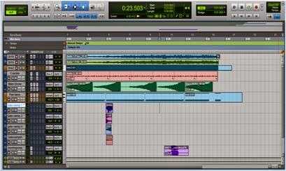
Finished version of the soundtrack
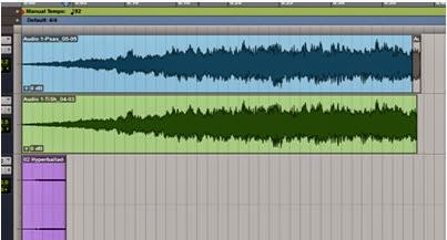
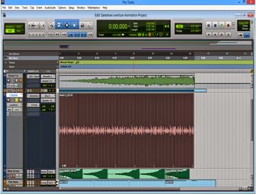
First, I started the piece by creating a drone. I did this by taking a short clip from the Bjork track "Hyperballad” the clip is just a 4 second rising string note. I then pitch shifted the clip several octaves. This both reduced the Pitch of the clip and extended its length. This screen-shot shows the difference, thepurple track is the original and  the blue and green are pitch shifted. After doing this the level were barely audible, so I added a compressor to the track and added make up gain. This boosted the level but also added digital modulation and distortion; but this was the intended result as it created a harsh timbrefor the clip.

I then re-recorded this loud & harsh version and then copied it so I had two identical tracks: Drone 1.0 & Drone 1.5. On Dr 1.0 I added a large hall reverb with a unrealistic 30 sec decay time. This removed the harshness and replaced it with a more ethereal sound. By now I had noticed that the clip sounds faintly of a passing fiery object. I felt this was relevant to the video so I accentuated this by adding an automated, Eq which increased the mid frequency band gain from 0DdB gain to + 15dB on both drone 1.0 and 1.5.


For the second drone I used a preset voice from the xpand2 synth called “jet lord” in the ambience folder. I chose this as it adds a haunting kind of feel to the track. Its not meant to be noticeable like the other drones instead its supposed to lay in the background. To get the sound from the synth I simply wrote in a single C note in midi into the track. And stretched it to my desired duration. On this I added a large church reverb which added to the haunting, unnerving sound.


I wanted to give the track the effect that it was been played on a gramophone as I thought It added to the alternative, dream idea of the video. To get the desired effect I used the vacuum plug-in which has a Gramophone preset. I recorded that by bus routing the track with the synth on to another audio track and recording while playing the synth for 5 seconds and then looping this7 times. I did this instead of just using midi as I did quite a lot to this after recording and wanted to see a waveform. What I did to it was first I added makeup gain using a compressor to boost the levels then I added artificial distortion to dirty up the track finally I added a small plate reverb to personalise the sound to the alternative, dream idea I had originally.


Possibly the most noticeable sound of the track is this drone. It slowly develops as the track goes on and by cleaver use of reverb sound like a single long developing note when its actually several different notes played backwards. To achieve this sound I D/I'd my fretless bass into my computer and recorded my self tapping in A minor the root note and the 3rd then while holding the note sliding my finger up the neck till I reached the top of the bass. I did this four times playing an A-minor 7 arpeggio so I played the root note & 3rd then root & 5th then root & 7th and finally root & octave.  I then cut these up and duplicated the root & 3rd.  Next I ordered the clips I the way I wanted them to be heard. Then I reversed the clips to give me 5 reverse loops
 that each started quiet but quickly build. You can hear the sound of my fingers clashing with the metal strings giving a large low rumble to the clip. At this stage its not fitting in with the track as it still has characteristics of the fretless bass sound which doesn’t fit in with the agenda of the final track I'm going for.


To amend this I added a low pass filter that I set to attenuate any signal above 500hz by -18dB. Then I add a large church reverb with a 30sec decay, this lets the individual clips mould into one and gives the feel of  development to the sound. Finally I added a flanger that modulates the sound adding a high-end rattle when the clip begins to boost and distorts and helps bring the metallic rattle of my finger forward slightly.


To achieve the large gate sound I used multiple samples each included individual characteristics of a opening gate such as creaking, rattling of chains etc. I organised each sample removing any unwanted sound and add the sounds I wanted, then I ordered them to the times I wanted them to play to gives a realistic representation of a iron gate opening. To get the samples to sound similar I bus routed them all to the same
reverb which was a large hall to accentuate the desired sound.


I needed a sample for the effect of something passing at speed in the distance so I got a sample which had the passing at speed element so I added reverb to give it distance and automated it to pan from the right to the left to follow what happens in the video.


Finally I added I bass drone that held for 10 seconds and then plays again. This continues until the end when
a character waves his hand across the screen. When this happens I boost the level and quickly pan left right to mirror the actions of the character on screen. Before this the loop slowly creeps from hard left to hard right. The synth voice comes from the Xpand 2 folder “brightpads” and is called “beneath the waves”, and I played a sustained E and A note I chose this interval “diminished 5th” as it fitted the sound I wanted. To this I added artificial reverb and distortion as the original voice was to clear and pure and didn't layer well with the rest of the drones. I choose this sound for the layering and sound fx of the character as it fitted well with the overall sound and was not to obtrusive but still noticeable when I wanted it to be.

After Effects - the shatter tool

I wanted to see if I could create a better disappearing transition on one of the character movements rather than one which I would create on photoshop. I decided to look at the effects on After Effects the Shatter tool could work with my disappearing effect.

Using the shatter tool allowed me to select the part of the image that I wanted to fragment and in which direction the segments would be thrown into. The amount of force and size of the shatter could be easily changed and a texture could be added. It was easier to see this in the wire format as to see what would be affected. By moving the direction of the force I would be able to change the appearance of the shatter, so that it would resemble something that would look as if the character is breaking apart and disappearing.

I used an image from google images to practice the shatter tool and to see if I would get the disappearing effect that I wanted. I wasn't sure whether the shatter tool was right as it seemed to distort the image at an angle and isolate parts of the image and break them away, which I wanted all parts to move at the same time.


Sunday 4 May 2014

Audio for titles

For my titles animation, I wanted a sound that would work well with the ambiance of the comic theme, but something that would not emphasise too much as to sound like a horror genre.
My main inspirations for the audio where from the television series, Hannibal and Luther. Both of which held a thriller atmosphere to the plot and I felt that the audio to the opening titles would work well with the theme of Sandman Overture, with dream like visions, illusionary etc.


The Hannibal title holds more of a soundscape like track, seeming eerie with the lack of striking sounds as it fades and stays at a varying low pitch and then slightly crescendos to high pitch. I felt that this could work with the animation due to the imagery and the use of outlines rather than detail and facial features within the character.


The Luther title is completely different to the previous as it incorporates more of a tune in the sense of lead instruments and vocals. I took influence from this audio through the introduction of the track with the xylophone, I quite liked the gradual increase in the pitch, it made it seem eerie but surreal.

Friday 2 May 2014

Animating with after effects

To make the gate move with in the outline, I used the program After Effects (AE) as I would be able to use the transform option to easily move part of the image, compared to Photoshop, in which I would have to move it ever so slightly higher in each frame.

Duplicating the image
I first imported the image into AE, adding it to the composition and duplicating the image. With the duplicated image, I used the pen tool to create a mask that would only show part of the bars from the gate. This would allow me to move the bars separately on the original image.

Using the pen tools to create a mask, isolating a part of the
image.
I then created another mask that was just black, to hide the bars on the original image, so this mask would grow in height, in sync with the gate bars mask moving with the position key points.

Gate moves.

I then made the gate zoom in, by increasing the size of the image using the scale transform points and fading the image by using the opacity point. I wanted to fade the image out as to transition well into the next part of the animation. 


Orginally I used the paint tool on AE to hide the bars in the background, in which I had to scroll across the timeline, open the layer and add the paint and then repeat the process. This was very time consuming and I kept thinking that there had to be an easier why, during the interim crit, I found that to solve this, I could use the pen tool as a mask and hide and grow along with the movement of the original animation. This made the animation run smoother and took less time than the paint tool method.