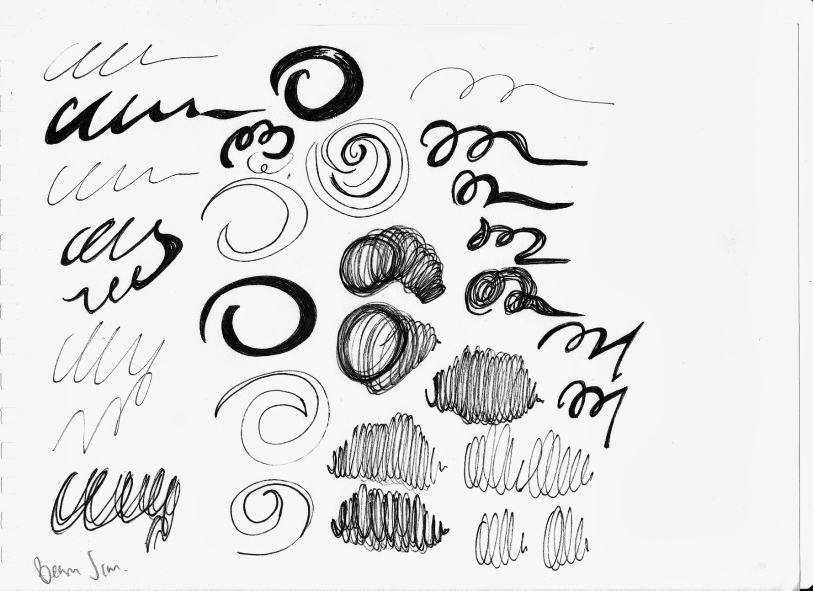
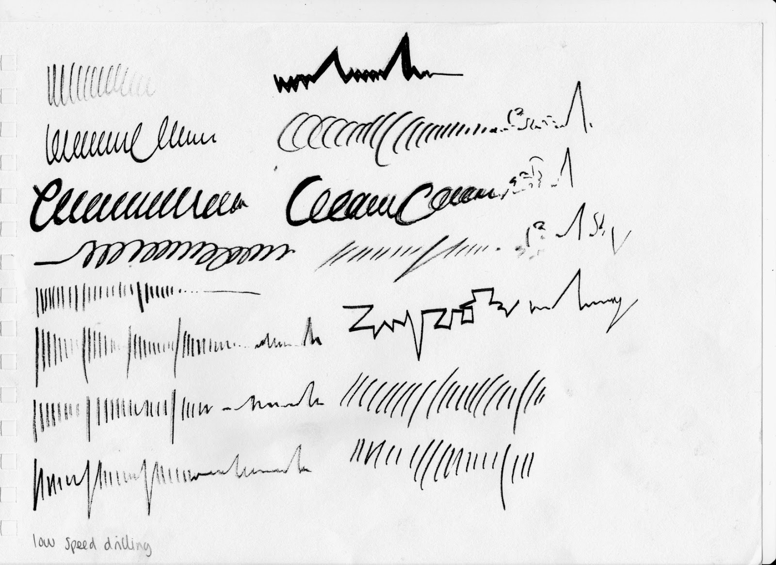
To gain an understanding of the sound recordings, I chose ten of these sounds, and quickly sketched shapes and lines that I felt represented the track, as I listened to them on Loop. I found it useful to draw sketches of each sound in small and in one medium as it allowed me to create different marks, shapes and lines of the sound rather than pondering what media to do as well as; I wanted the main structure before I developed it with media.
Summary of the design pages:
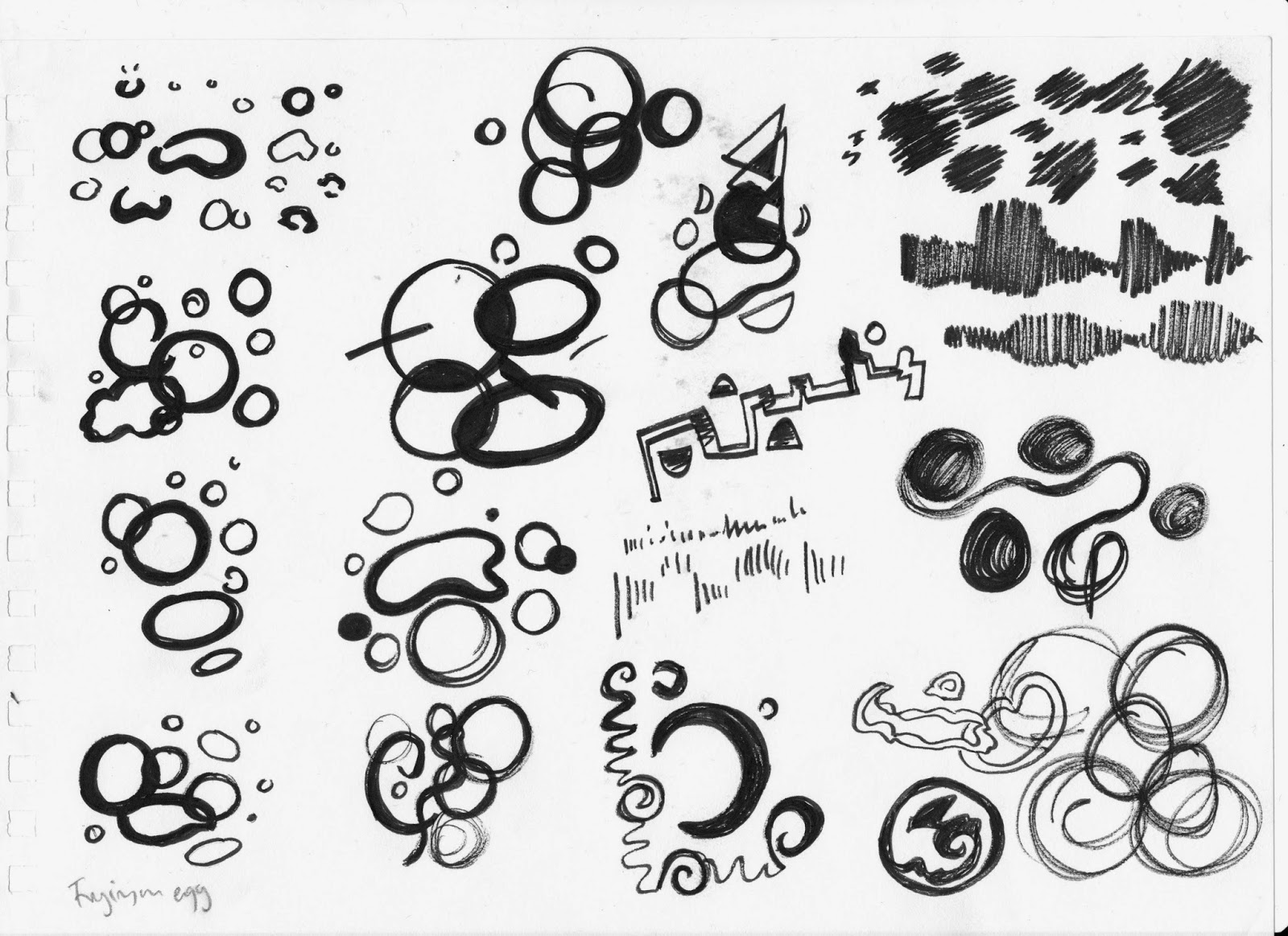
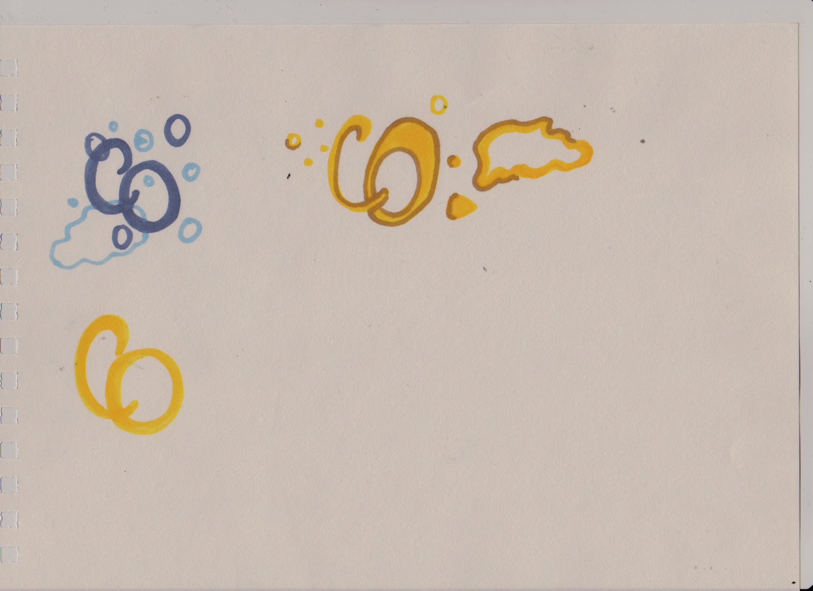
- Frying egg - the bubbly and greasy appeal to the audio reminded me of bubbles, circular and semi-circular shapes with various thickness of line depending on how deep the frying sound of the egg was. I began to experiment by merging contoured and sketchy lines alongside the circular formations, however I felt that it did not work well with the original circular images as the lines did not fit with the audio track, however I made the contoured lines more curvier and smaller which worked well when surrounded with the circle shapes.
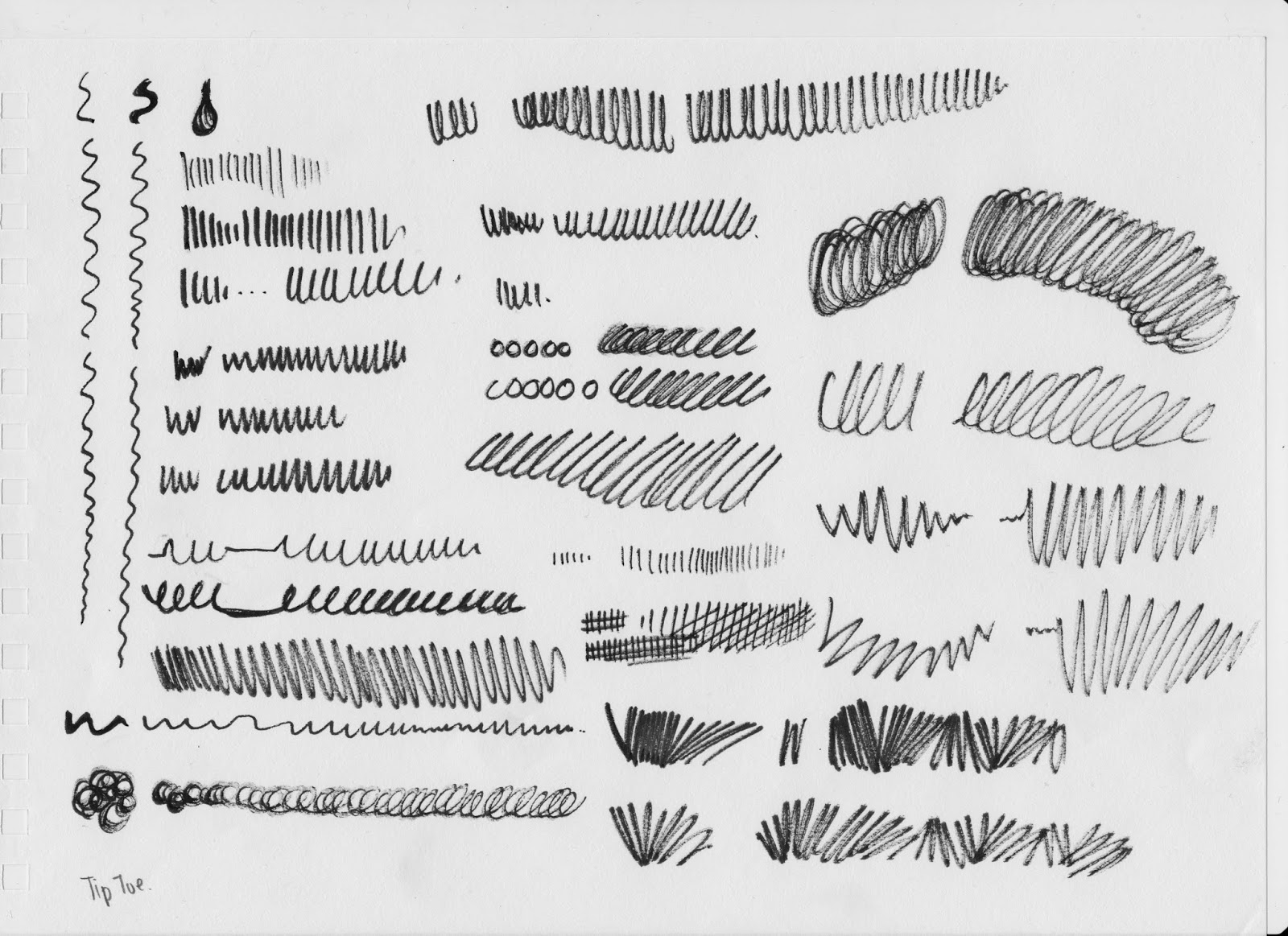
- Tip toe - this was a hard sound to define, originally I first thought of just filling the page with small dots from the fineliner as the tip toe sound was quite loud whereas I would have thought that the tip toe sound would have been purposefully quiet through the act of tip toeing is to be as silent as you can. I eventually managed to record the sound through the use of continuous lines, as the sound was continuous itself.
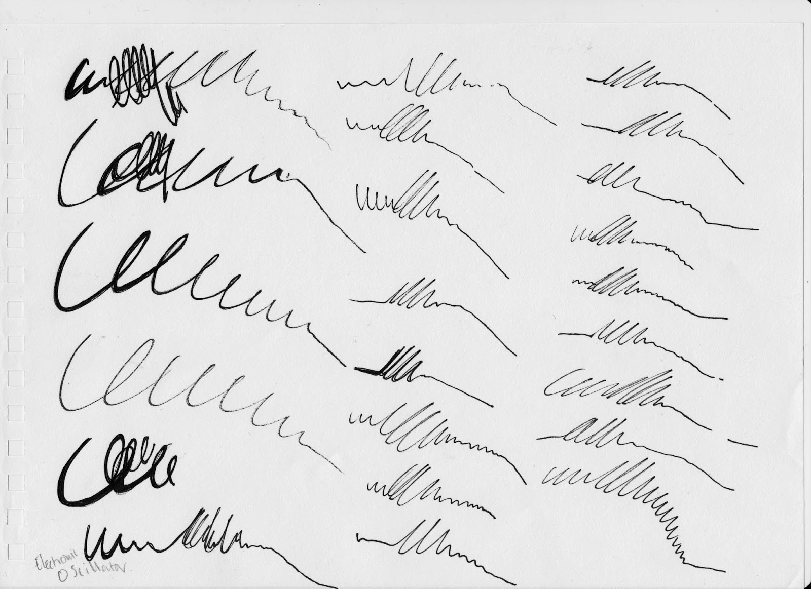
- Electronic oscillator - this sound was hard to represent in any other way than portraying the fade of the audio with a spike downwards, it felt like it matched the audio well, it was depicting the beginning of the audio which was hard to determine. I felt that a continuous loop entwined with the spike that lead downwards worked the best as the audio seemed to take back on itself as I listened to it on loop.
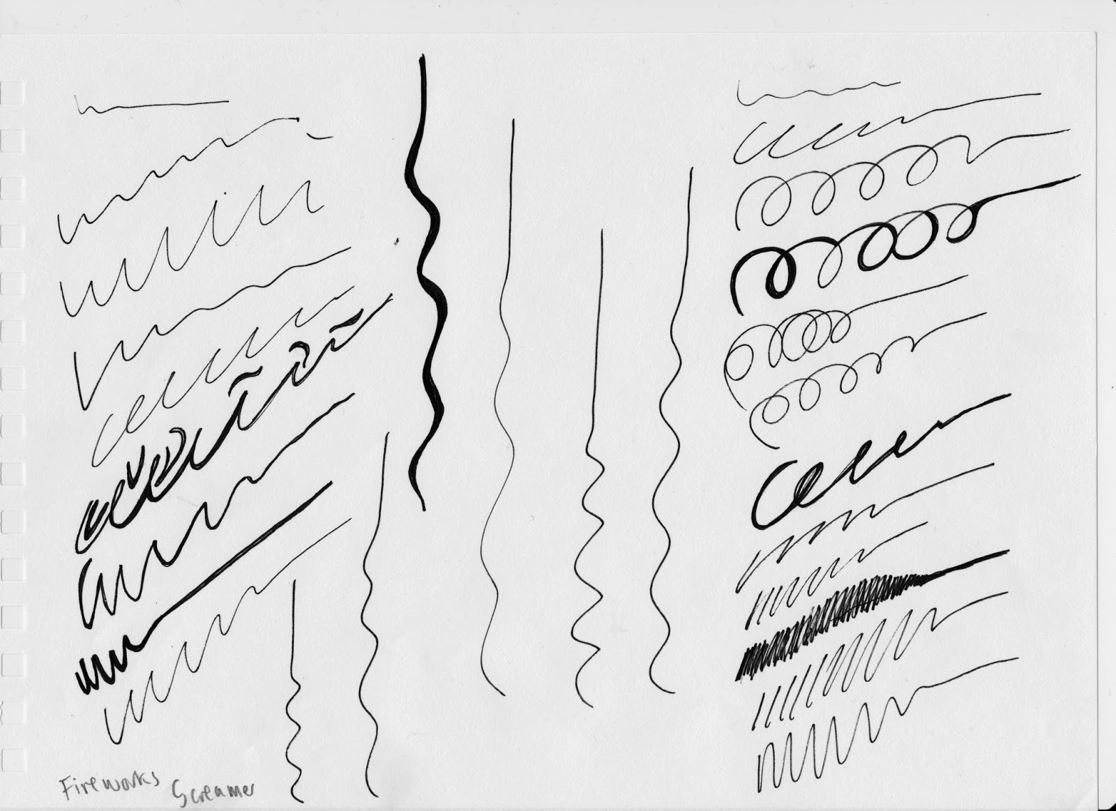
- Fireworks - I could only visualise another loop like line that faded out to a straight line as the audio came to a stop. However I found that a variation in thickness of line worked well with the differing warble in the audio.
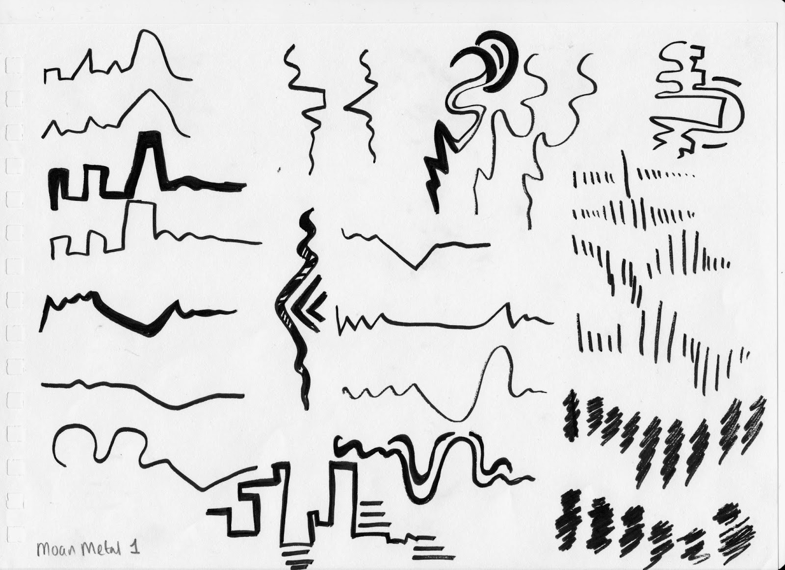
- Moan metal 1 - I first thought that a more geometric structure to the line was needed through the angular depiction of the audio but as I continued to listen to the sound I found that quick sketchy shade of line captured the track better than the geometric structure as it could record the duration and gaps with in the audio more evenly.
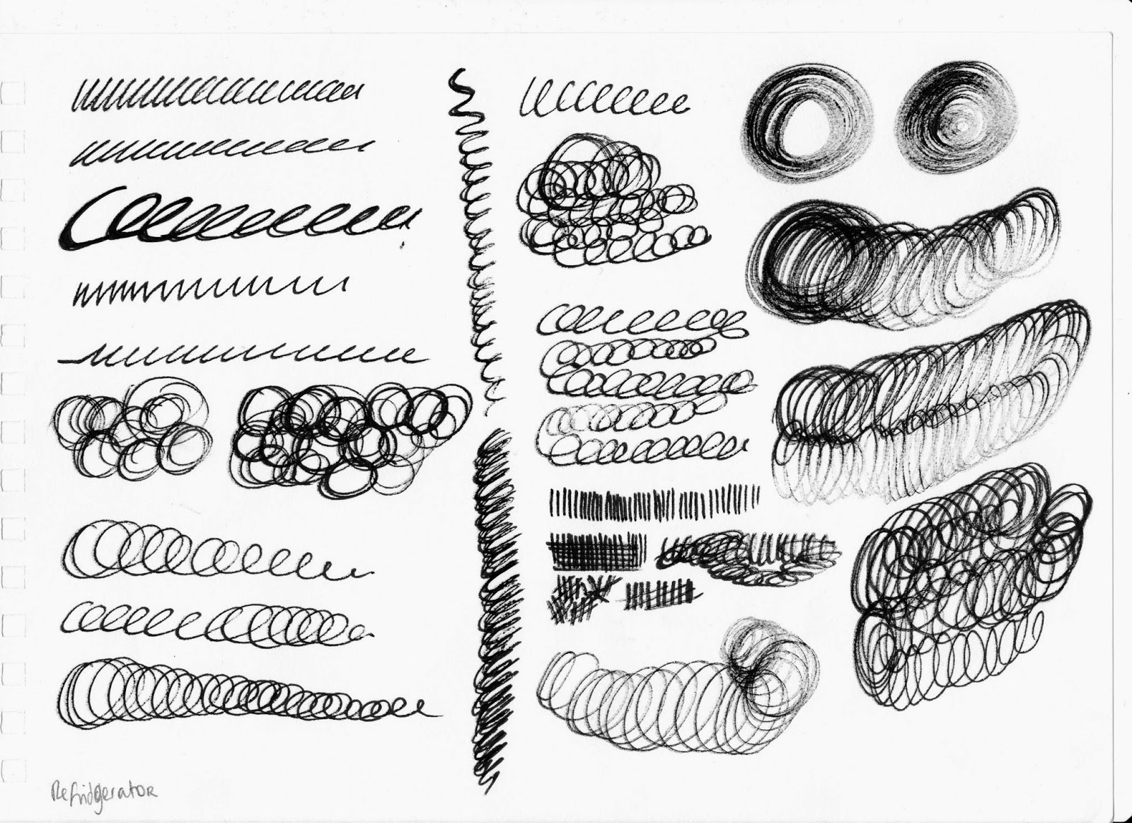
- Refrigerator - the refrigerator was hard to depict as there was more than one underlying sound captured with it, so I first began to to create continuing lines that would signify the main loud hum of the audio, I developed it more using a fineliner that had nearly ran out of ink to resemble the other sound with it, as it was quieter and softer compared to the main sound. I felt that this worked well as it was held a distressed appeal which worked with the disruptions in the track.
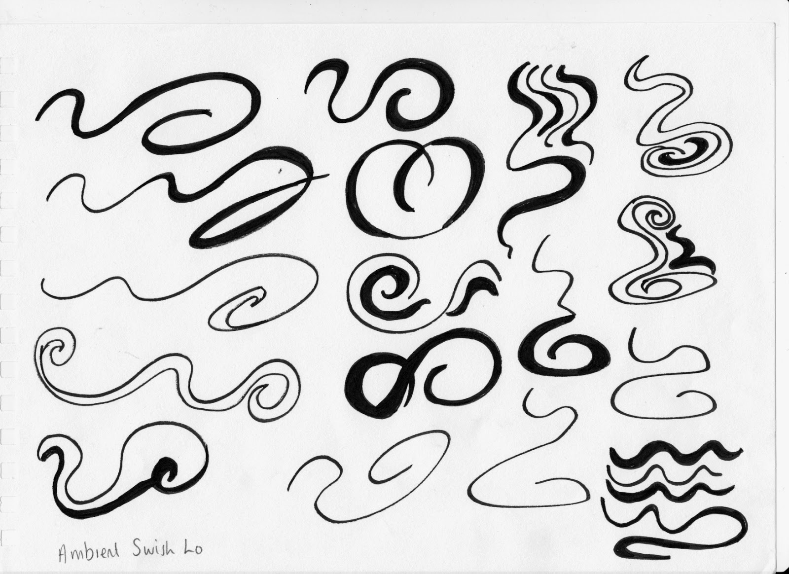
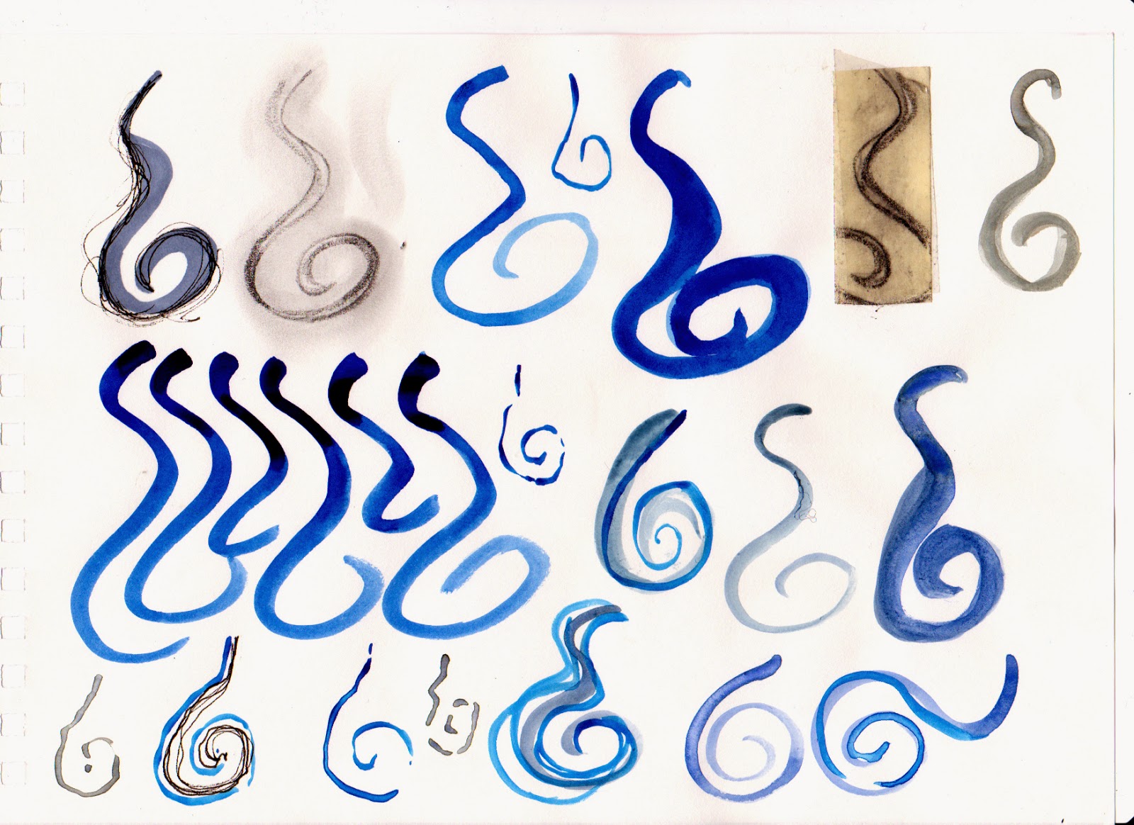
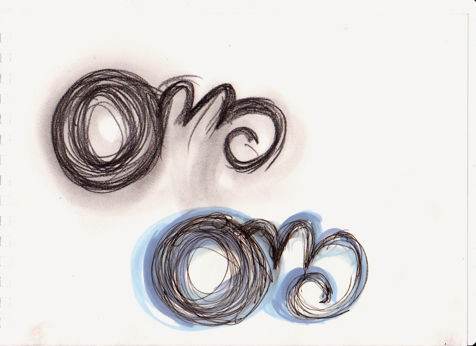
- Ambient Swish - these compositions were easier to portray than the other nine sounds, as the sound was immediately categorised into a quick contoured line that worked well with the nature of the track.
I felt that a thicker use of line was needed to match with the depth of the audio and it needed to almost revert back on its self as the swish sound comes to a halt.
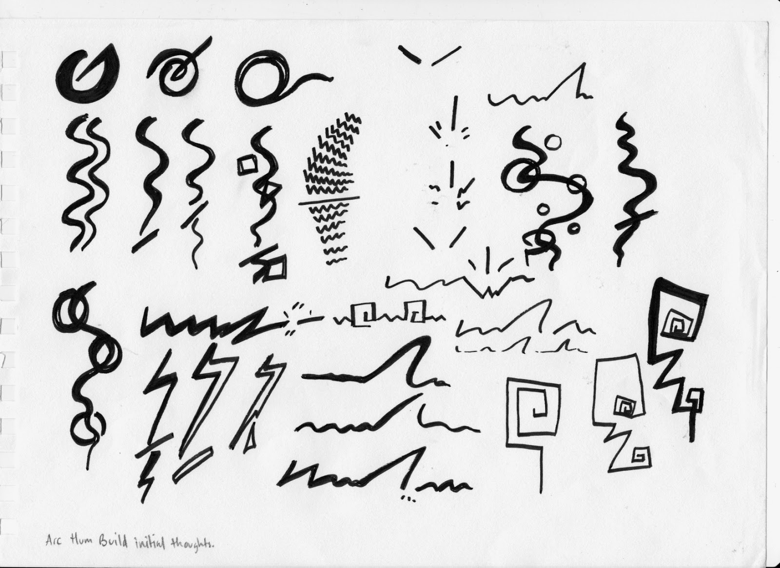
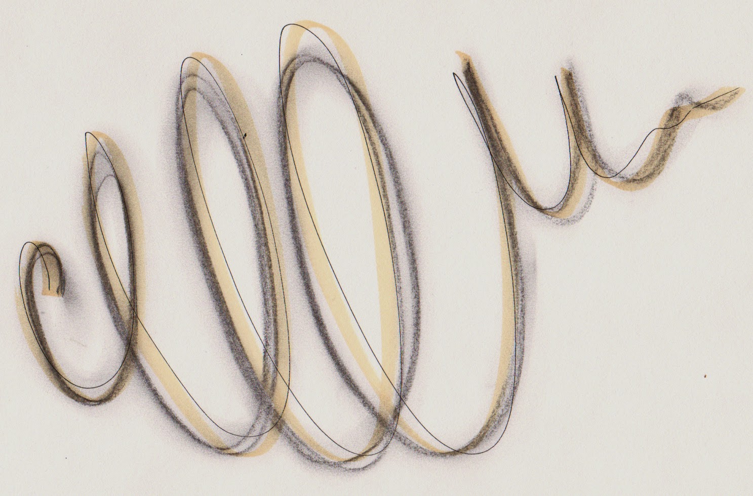
- Arch hum build - my initial thoughts for this sound was a circular depiction and waved lines that involved elongated structures to match with the sound duration, however as I listened to the track more, I automatically created angular structures to the waved lines which reminded me of a Tim Burton like design on his Nightmare Before Christmas stop motion animation.
- Beam Scan - I initially designed jagged yet contoured line structured that worked well with the audio however as I kept drawing the design began to change much like the refrigerator designs, using a continuous line, looking distressed. I preferred the previous designs as when thinking of an animating point of view, there was more to work with and develop in terms of movement and additional lines.
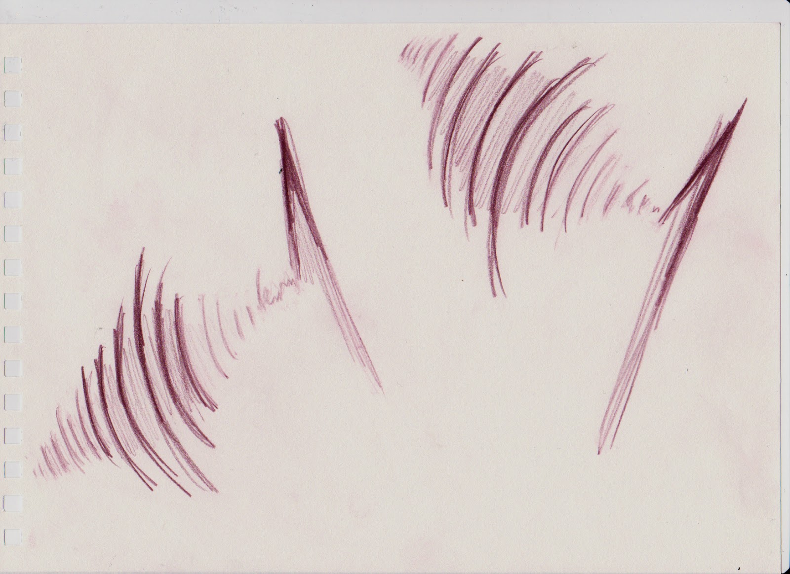
- Speed drilling - these designs reminded me of the jagged lines you would see on a heart monitor, as it was hard to depict the sound with out using jagged or a series of differing length of line. I developed the image to a series of slightly curved lines that matched the speed and depth of the drill.
 |
| Frying egg - ten sounds development |
 |
| Tip toe - ten sounds development |
 |
| Electronic oscillator - ten sounds development |
 |
| Fireworks - ten sounds development |
 |
| Moan metal 1 - ten sounds development |
 |
| Refrigerator - ten sounds development |
 |
| Ambient swish - ten sounds development |
 |
| Arch hum build - ten sounds development |
 |
| Beam scan - ten sounds development |
 |
| Speed drilling - ten sounds development |
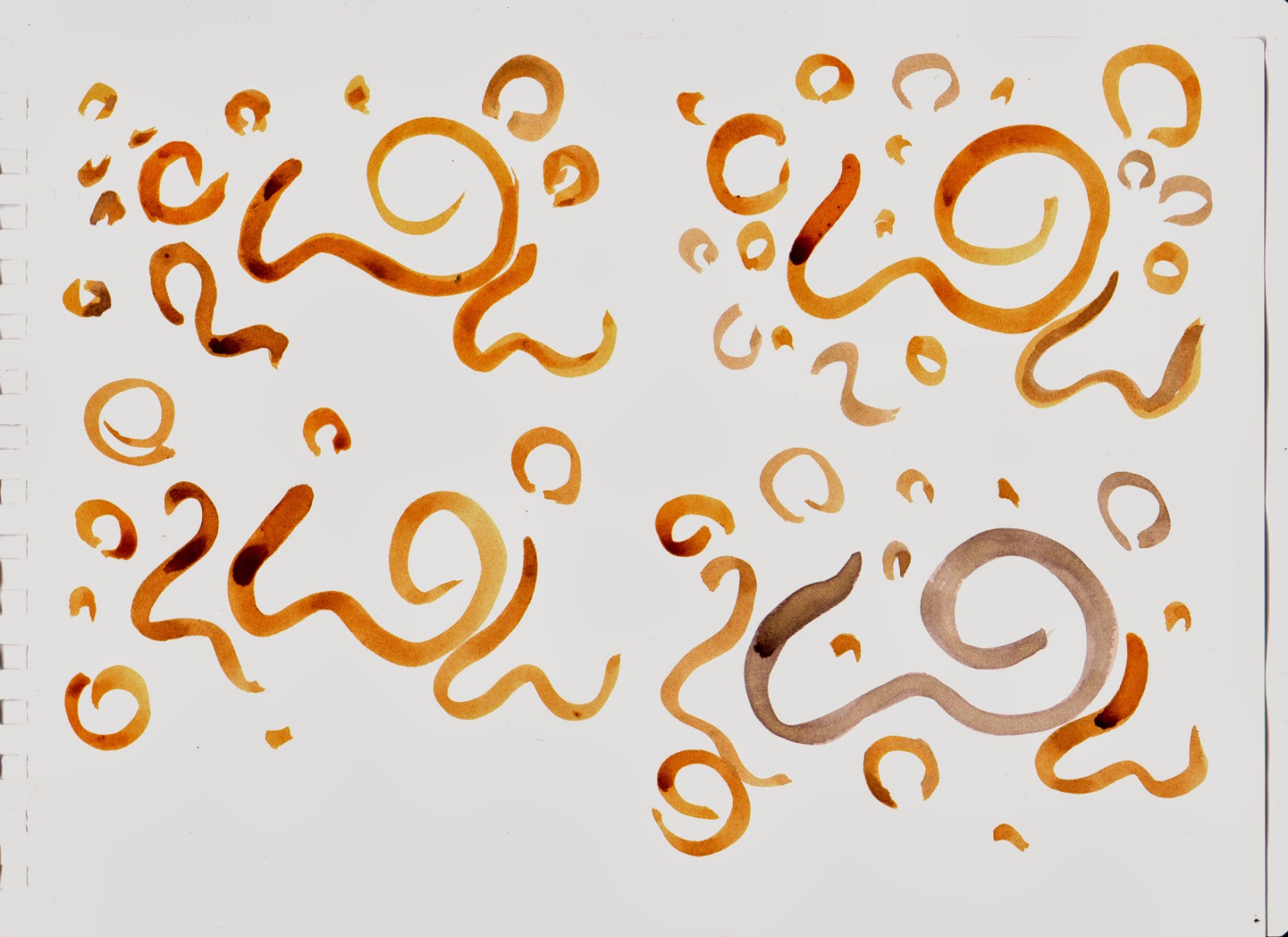
I then chose five of my development sketches, frying egg, speed drilling, ambient swish, arch hum build and beam scan to experiment with each design in media and shape. I found that some sounds were easier to design as I had a clear visual of what that sound would look like and what colour it would take, however the beam scan and frying egg were harder to design as it took me awhile to consider and determine whether or not the composition would fit with the original audio track.
 |
For the frying egg track, I imagined flowing marks with a solid fill
which I first
designed in marker pen, but as I continued to redraw the
composition in different variations,
I decided to use watercolour and
ink as I could easily create a
sweeping stroke with a vibrant fill. |
 |
Preferred this page of design through the colour and
the compositional structure of the designs, and carried
this design on to be animated. |
 |
Preferred working in ink as it was a stronger vibrancy to fade approach
which worked with the audio track, the last design on the page,
I rotated which I felt worked better in appearance and visualising the
animation, the landscape version seemed to work better with in the
frame. |
 |
The last design held more of an appeal to me, through the incorporation
of the scratchy lines and the soft colours of the marker pen which resembled the
background track that accompanied the loud electronic hum. |
 |
I preferred this design as it held more than one line which resembled
the accompanying audio with the main loud sound. I took this design
to be animated as I could visualise the each of the lines moving to
create the finalised composition. |
 |
I chose this design as the boarder and darker strokes of the hue resembled the
loud audio of the drill and the softer fill being the backing audio. I chose this colour as
the audio track was cringe-worthy and reminded me of flesh, this tonal value of the hue
was more desaturated and became more of a past thought of the drill, like remembering
a past thought in this case you went to the dentist and you had a filling
which involved the use of the drill. |
Using the developed media designs of five of the selected sounds, I created animations using Photoshop, frame by frame process. The animations needed to be 1-4 seconds long, with the audio track added with it, I added the audio track and edited the animation in Premiere as it was easier to ensure that the track matched the movements of the animation than using After Effects.
I was pleased with my finished animations as I found the development process of the sound hard to achieve through trying not to fall in the stereotypical imagery which appears when you listen to each sound, so when I began animating, it took me awhile to consider which shot and angle the composition would need to be in to match the audio. For example, I purposely made the ambient swish hard to determine what shape it was as the swish sound was fast and I could imagine not being able to fully focus on the shape, I didn't want to begin to motion blur the shape so I made the shape bigger so that the audience could still follow the movement of the design. I found that my favourite animation was the arch hum piece, which involved more colour than the other animations, and it represented the static and jagged sound of the hum, and I also like the movement of the lines as it broke into a spark before it came to a halt. I found it difficult to animate the frying egg animation as I came across multiple problems, one of which was as I moved composition, it would alter the previous frame, which became time consuming when trying to create inbetweens to make the animation less jagged in movement. I solved this problem by placing the main image into the document again and separating the image into each individual shape which seemed to stop affecting the previous frame as I moved the composition again.


