Saturday 30 January 2016

Extended Research: Dofus - Book 1

I recently researched into Cartoon Movie, a pitching event where animation projects from around the world have a chance to pitch to potential buyers. Whilst researching this further in PPP, I discovered an animation that was greenlight at the event, Dofus - Book 1. I was captivated by the character and background design, it looked stunning with the 2D painted backgrounds and the adorable main character. The plot line had everything that I loved, adventure, magic and fighting. I cannot wait for this animation to be released later on in 2016.

From the animation in the teaser trailer, the animation works really well, its stunning with the style and movement of the characters; taking advantage of squash and stretch for the main character. Compared to the animation in a previous project the team Ankama created, Wafku, the animation fits nicely into the backgrounds. I found that with Wafku, the animation was too much like the game that it was based on, it obtained too much gradients and stiff movements so it stood out alot from the environment. However in later episodes the animation becomes nicer and the actions follow through smoothly. The comedy becomes fantastic as more characters are introduced.

I am heavily inspired with the whole aesthetic that Anakama use in their work, you can clearly see how much time and effort was put into designing and the story, which makes me love it even more.


Friday 29 January 2016

Extended Design: Making the Troll King

After creating the goblin design for Becky's Stopmotion, I started to draw a King character for her project. This King needed to have authority, a mischievous smile and be quite fat. I quickly sketched a rough body shape for the King and sent it to Becky over Skype. Skype has been extremely useful through both working on this and the goblin design, it has made it easier to revise and edit my designs with instant feedback from Becky. With Becky's feedback being positive with the body shape I took the sketch straight to photoshop and began to design digitally. I decided to go straight to digital, for the ease of drawing and sending the lineart to Becky. Whereas if I had drawn in my sketchbook it would have taken longer with the design process.

I first started with drawing the head, I was inspired by the goblin visual mood board I made on pinterest with the addition of Becky wanting the King to look trollish. The first few designs were very human compared to the end result. The initial head went from being thin faced and bearded to quite chubby cheeks, bulbous nose, bald, warts and pointed ears. I really liked the end result, it was quite extreme when you compare it to the initial head, but it works successfully for the character that Becky wants.

Quick body shape sketch


I decided to have the crown at a tilt on the head to add to the evil, mischievous, troll like King. It took awhile to get the crown just right as some of the designs I created looked alittle bit too much like an Ice Queens crown with the shape and amount of the points. After feedback from Becky the crown was chosen and I went straight to costume design. I preferred the left design with the cape over one shoulder as personally I felt it worked with the characters personality, however I felt that something was missing from the overall appearance. I asked Becky which design she liked and if I could refine it further, she liked the left design as well however she felt the same with something was missing from the costume. I decided to design again but with a more medieval king approach with a less cape like top. This worked successfully and gave the character a neck with the ruffle collar.

Costume design

Final costume design
I then began to add colour the design. Becky wanted a blueish tint to the skin colour as well as rosy cheeks and a rusty crown. I achieved the skin colour by using the multiply blending mode on a normal skin layer and over the rosy cheeks so that it worked with the overall complexion. For the rusted crown, I used burnt and desaturated tones of orange and used a distressed brush to apply on a multiply blending mode layer over the original hue of the crown. I then added additional distressed marks with my normal brush to add to the worn and rust appeal. Becky wanted to give the character yellow teeth, to add to the villain esk king appeal. This worked well as it emphasised the skin colour and worked with the crooked smile.


The final colours for the outfit differed from the original, its initial look was bright red and white however this didn't work with the skin colour or the personality of the character. I then desaturated the colours and changed the white top to a desaturated blue. This worked successfully with both the crimson and the skin colour. I was expecting the skin colour to blend into the blue top however the white collar stops this from happening and makes the face stand out to the audience. Overall I have really enjoyed designing this character. The body shapes and facial features were a lot of fun to draw, it was challenging at times, especially with the 3/4 pose on the final turnaround sheet however despite this I have learnt and developed my style further with these character designs.


Extended Research: Kyoung Hwan Kim

Kyoung Hwan Kim, a concept designer and illustrator, creates gorgeously detailed character designs, with a beautiful painted style to the colour. For my extended practice Kim's later and slightly simpler designs have influenced me with both the background and style of character. I love how simple, yet detailed the backgrounds are, particularly the bark on the trees and the light on the stone and leaves. I really want to absorb this style and develop it alongside with my own skills. I love these two designs below, the framing and use of power angles works so well, it incorporates visual storytelling as the audience wonder where these characters are travelling to.

The character design in these pieces look adorable, which is a trait I want in my designs, as well as to suit the young target audience. I really like the facial features in the human character, it absorbs a cartoony style that would work successfully for a young audience. I preferred the use of complete black eyes, initially I would avoid this as it can make the character look lifeless, however it works with the rest of the design. I think I will take this into my Hero design to make him look more western cartoon, and to stop myself from going straight into my normal style of illustration.
For my backgrounds, I need to make sure that the style and level of detail does not drown out the characters. Using a form of Kim's approach to the backgrounds, with the level of detail painted within the shape, should work successfully for my animation.


Extended Study Task 2: Presentation

The presentation was quite a relaxed crit, I enjoyed describing my ideas and story. Having this presentation reassured me into the progress I had made so far and what I needed to refine or add to my checklist. I asked if anyone had connections with parkour or karate groups so that I would be able to contact them for reference with my animation. Elyse said that she had a contact, Perry Flowers, whom I will contact soon in regards to the reference that I would need. 

Feedback was extremely positive which assured me that I was on the right track with my work progress so far. Everyone was very enthusiastic about my plans and what I wanted to make. I asked about my design of the shadow character as I wasn't sure if the appearance was too much for the young target audience that I was aiming for, however everyone agreed that the character was suitable. When looking at popular cartoons such as Adventure Time and Over the Garden Wall, some of their designs are very dark for the young audience. 

Example of Slides

Example of Slides

Example of Slides

Example of Slides

Extended Research: Over the Garden Wall

Over the Garden Wall is one of my, if not the most, favourite cartoon. I love the character and background design that is entwined with a beautiful dark plot. I love everything about this animation and even though there were only 10 episodes the plot ended successfully. Over the Garden Wall has heavily influenced my work through both design and storytelling.

The character design uses simple shapes which works for the main target audience of the show however the cuteness of the facial features aids the dark themes of the plot. With the character designs obtaining simple shapes, the detailed backgrounds compliments the character designs and vice versa. Having these characters stand out from the detailed background makes the scenario seem darker. I quite liked the combination of shapes for other characters in the show, it inspired me for not only the characters that I have created for my own extended practice but for Becky's extended practice as well, especially with the 'Goblin', I found it extremely difficult at first with the body shape.

Character Design by Mikkel Summer
The backgrounds are stunning. I love the use of the primary planes, the framing and awareness of space that each composition takes advantage of; the painted detail working with the aged theme that encases the whole animation. For my own extended practice I want to be able to absorb this use of composition, especially with the style of detail and use of primary planes that heighten the illusion of depth. I would love to absorb the painted style however in order to suit my own style I have to tone down and mix more strong lines with the composition.

Background Designs by Nick Cross
Over the Garden Walls animation works well with the theme and character design. The animation runs smoothly, taking into consideration of each characters personal traits, such as lingering on a pose for too long or subtle movements of the facial expressions. I really like this take on the character animation, especially with the features, which is something that I want to absorb with my main two characters. I want them to be able to communicate without the aid of dialogue, that will hopefully lead to humour. In particular I wanted to point out the animation for the Highwayman, the animation for this is extremely fluid, the impossible lens slightly added as the Highwayman leans into the camera. I love this motion it works well with the creepy character and works well with making the composition more interesting. 


Sources:

http://www.theconceptartblog.com/2015/08/13/personagens-da-minisserie-over-the-garden-wall-por-mikkel-sommer/

http://www.theconceptartblog.com/2015/07/11/artes-da-minisserie-over-the-garden-wall-da-cartoon-por-nick-cross/

Extended Design: Final Goblin Design

After mixing different parts of goblin designs from my sketch book I found one design which worked successfully, and I sent it to Becky for feedback. She loved the body proportions and the mischievous grin which was followed with stitches. I knew that near the end of Becky's Stopmotion, she wanted the goblin to tear itself apart, this idea of stitches should hopefully aid her with this action.

Once I had cleaned up the lineart, I started to add colour, I immediately went for the stereotypical green colour. When I asked Becky about colour she wanted to step away from the green and go to a light greeny brown. After a few attempts at getting the colour right, I finally obtained the right colour. This worked really well for the character and I'm glad that the shade isn't the green that is normally associated with goblins.

I then began creating the rest of the turnaround. I found the profile to be the hardest to draw correctly, it was the nose that was difficult as well as the pot belly. I didn't what the character to look too fat or just look like an unnatural bump. I overcame this problem by going back to my visual mood board on pinterest and asking for feedback from Becky.


Here are the final sheets of the Goblin. I really enjoyed designing this little guy. It was definitely a challenge compared to what I am used to drawing, especially the style. I loved making the different expressions and considering textures for the clothing. I thought the top could be made of hessian which would work well for the story that Becky has chosen. It would also be easy to make the hessian look worn by pulling parts of the thread in the material. Overall my most favourite part of this character design was the expression sheet, I loved designing different emotions for the goblin. I had fun moving the ears and pulling the mouth to extremes to create emphasised looks. 


Extended Design: Becky's Goblin Initial sketches

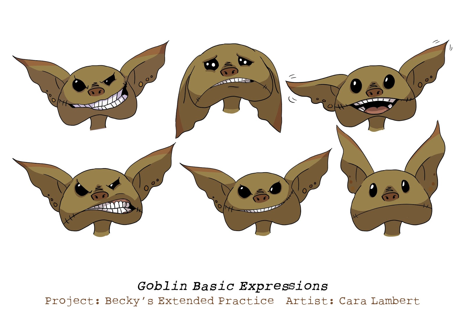
For Extended Practice I wanted to create a few different character designs for my portfolio. Becky Gilby asked me to design her a goblin for her stopmotion. This sounded like a great challenge as I don't normally draw weird and wonderful creatures like goblins. I first began designing by researching, gathering images on Pinterest to create a visual mood board for me to reference from. From this inspiration I found common shapes of the body, particularly with the head. The head was was always round or in the shape of a semi circle, these shaped heads were more common with small skinny bodies. Whereas with the bigger and fighter esk goblins, the heads were quite angular to match the body.

Goblin mood board
I then began to sketch different heads of the goblins first as to generate more ideas. I liked this exercise as it was fun experimenting with a mixture of shapes as well as the shape of ears and facial features. I took this further by drawing bodies as well but I wasn't too sure on some of the designs without a neck, I debated whether or not this would be difficult for Becky to animate with the puppets. However I did like one design in particular, to the point I got too excited and digitally coloured the design in, along with two others I quite liked. My favourite design is the goblin with the cheshire cat grin, he looks so mischievous and I liked the angle of the teeth. I drew one full body goblin, in which I was inspired by boar features, especially with the nose and mouth, I wanted this goblin to be quite greedy, eating anything it can get its hands on. I really enjoyed designing and colouring these designs, I experimented with colour using a multiply blending mode for the darker coloured shades. 

I sent these digital designs, as well as the sketches to Becky, to see if I had generated any ideas for her ideal vision of a goblin. She really liked the colouring and rounder heads, however none of the designs were quite what she wanted. 

Sketch page 1

Sketch page 2

Sketch page 3


Digital Version

I continued to draw different shapes and sizes of goblins, some with no neck, however this was the charm of the design, it made the goblins look more like a frog. It also made the designs look creepy, which would match the dark story that Becky wants to absorb into her Stopmotion. I then designed more body shapes, this time more skinny and human like, I added torned clothes which Becky wanted for the final design. She really liked the body proportions and the general shape of the heads on these designs, which I continued with until I drew a head that Becky really liked. She also wanted a pot belly for the goblin, and for the height to be quite short. With these elements in mind I scanned in the later sketches to photoshop and began to drag different parts together before starting to draw the goblin in digital media.

Sketch page 4

Sketch page 5

Sketch page 6

Sketch page 7

Sketch page 8 

Extended Tutorial: 3/12/15

In this tutorial I decided to change the teaser trailer to a pilot episode. This came to a conclusion with being able to submit the finished animation to competitions and if I wanted to, pitch to companies with my idea. However this will involve a lot of work to rewrite, to ensure that the plot was not only coherent but interesting enough. This will effect my overall schedule however I really want to try the best I can to make something amazing, and I think this project deserves more time spent on ensuring the story is coherent.

I immediately decided to focus on how the main character and Shadow first met, I felt that this was a good starting point and would allow me to focus on some points that I had already written about in my story development.

This would mean however that two characters that I had originally planned to include in my project would not have a role. I wanted these characters to be introduced gradually in the plot as the two main characters progressed. I asked Anna Picariello to design these companions, even though I told her of these changes, I still wanted these to be created so that I would be able to cameo them both in the background and use them after uni when I continue this project.

Extended Story: Companions

At a maximum I wanted two other companions that would join the main character on his journey. I immediately visualised a timid character, a 'scaredy cat' and had no fighting skill but made up for it with intelligence. I wanted this character to be the logic and conscious for the main character. The main character likes shiny things, he collects them, whether that is buying or from finding treasure, however he is quite naive. Often the main character will think something is amazing and rare, which in reality is a piece of junk, the sellers know this and take advantage of this. This is where the first companion helps the main character, as well as stopping the main character from blindly following a lead for possible treasure. The villain companion will always try to make mischief for both of these characters, making it harder at times for the first companion to help the main characters. I want the first companion to not only be shy but oddly boastful when people compliment him, which results in rash decisions that the main character trusts, and the villain loves to add more mischief.

I wanted the second companion to be a warrior, a female who is uninterested in anything until a fight appears. When she is faced with a fight she turns into the most excited and hyperactive character, instantly switching back to her uninterested personality as soon as she has won.  I wanted to ensure that the main character stood out from the rest of the personalities, I didn't want the companions to drown out the main character. Having stated this, I believe that the contrast of personalities work well together and the main character still stands out compared to the companions.

For the design of the companions, I have asked Anna Picariello to design these characters as well as a few background characters for the teaser trailer I want to make.


Extended Study Task 1: Rationale.

For the Rationale I needed to make sure that the main story theme I had in mind was described well and how this would be shown through the teaser trailer that I wanted to make for the final outcome. Having this overall plot planned out at this stage of the process will allow me to select certain parts to add into the teaser trailer to make a coherent summary in the animation.

I also wanted to use the skills that I had learned from COP3 and refine them further into an animation. However this will mean that I will not be able to focus on my storyboards as much as I was able to in COP3. I want to continue to focus on my storyboarding skills through PPP3.


Thursday 28 January 2016

Extended Design: Designing the Shadow Part 2

From the sketches I used I first took a different Shadow design and redrew it in Photoshop. I quite liked this design as it included curved shapes, looked mischievous and innocent. However It looked too much like a pokemon from the hit cartoon/anime Pokemon. I tried different hue combinations for the design but I still didn't prefer this design.

I then went straight to designing the other Shadow design that I liked from the ink sketches, I added more shade to this design as this would be the approach I would want to take in the animation if possible. I really liked the design. It worked well digitally and would work well with the main character. I struggled with colour design, I couldn't think of what hue I wanted. I think this was due to designing the character in complete black fill in the ink sketches. After trying a few different designs I found one that I really loved. The hues consisted a navy purple hue and yellow/amber eyes which worked really well. I felt that the navy purple worked with the wispy shadow spirit character instead of using just greys which a shadow would normally consist of, however I wanted the characters to be as bright as possible to work with the target audience. I am really pleased with my final shadow design.
First version of Shadow

Final Shadow design with different colours