Thursday 25 February 2016

Extended Design: Voice Actor and The Script

As I am creating a pilot episode, I wanted to include dialogue with the main characters as well as background characters voices. This immediately makes the episode feel more complete with the inclusion of voices, enhanced by the later inclusion of sound effects and backing track for the animation. I normally create a short story that doesn't need any dialogue, instead it relies on body language, the shot and facial expressions. I wanted to include dialogue as a challenge, to see how I would combine these elements together. Additionally I did look into voices and how it would work within a storyboard in the previous year with the applied module, A History of Cake.  I asked the same voice actor, James Wood to help me with my voice acting for this latest animation. Having worked with James on a module before, I know that he is reliable and hard working so I wouldn't have a problem later down the line of production with obtaining voice recordings. 

Using Facebook to communicate with James has been the most easiest form, of sharing files and giving each other feedback on the current work flow and managing time. I asked James to voice my main character, shadow ghost and thug characters in my animation. I knew James would be fantastic with the main character and shadow, however I wasn't sure with the thug character, purely for how deep I wanted the tone to be; James said that he would be able to distort it lower digitally which could be a possible future solution. 


Using Facebook

Originally I wanted this project to be storyboard driven to link to my COP3 theory and practice, however with the inclusion of dialogue and the form of communication with my voice actor, I needed to make a script so that James would be able to act for the characters. Having stated this I created the script from the initial storyboards that I had designed which helped me with considering the content of the script. As I had never written a script before, I treated it as more of a premise with the addition of dialogue, therefore I could describe the expression and body language that the character would have. This helps to describe the personality of the character as well as the tone and emotion. Critically reviewing my script, I preferred this form of a script/premise, it was not only easier to describe to James but also gave him room to tweak parts of the dialogue to what he felt would be more suitable to the character.

I have changed my script twice, mainly due to the dialogue, as I really struggled with this aspect. I prefer showing the atmosphere and action happening in the scene without dialogue therefore the addition of voices was quite bizarre. However after gaining feedback from James and fellow students I was able to cut out alot of the dialogue compared to the original amount, which worked considerably more successful as it allowed me to add the expressions and body language to depict most of the pilot with the added voice acting being more towards the ending of the animation.


Script page 1-2

Script page 3-4

Extended Design: Storyboards

Act One - Rough Market scene

I wanted to use the knowledge that I had learnt from COP3 within my work - so I immediately went straight into thumbnails to draw what I envisioned for the first scene. I wanted to slowly reveal the character, showing him walking past people that the camera focused on before turning to a full shot of the main character walking through the street. After this full shot holding for 5 seconds it cuts to a full close up as the main character turns his head as something catches his eye. I wanted this next sequence to show the characters personality, I wanted the character to be a travelling merchant who travels to collect and sell rare and shiny items. I decided to show this element of his love for shiny items by showing the character at a stall holding different items as he tries to haggle with the market stall merchant. This sequence was mainly in medium shots so it wasn't that visually interesting. So I quickly sketched another version next to it, using a range of long shots to a medium close up on one of the items. I preferred this second version as it was more interesting however I wasn't so keen on the character movement with him standing up - I decided to leave this part in for now so that I could focus on the rest of the sequence. The rest of the sequence was admittedly quite rushed, I wanted to stop focusing on the content/neatness of the frame so that I could draw the sequence of events more easily. However whenever I draw in this way my shots always keep to close ups which makes the following boards quite boring. I did however gain a better understanding of what I wanted to happen in this sequence so I went straight to redrawing the thumbnails again.


Act One - Market scene thumbnails


With the previous set of thumbnails in mind I decided to cut out the amount of time it took for the main character to be introduced in the animation. I liked the slow start but I knew that this would add unnecessary time to the length of the animation and it work more successfully with the flow of the animation. With the cut of this sequence, the storyboards begin with a slow pan into the main market environment to then cut to a 3/4 long shot of the main character walking down the market street. I then wanted a medium shot of the main character looking at the environment around him as something catches his eye. I kept the medium shot of the market stall as the main character inspects the wares, pointing at items he likes and haggling with the dealer before noticing something that he really wants to buy. As the main character steps back from the stall, getting carried away with haggling for the item he wants, a figure that is introduced in the background, runs into him, leaving the main character with a item. I wanted this sequence to be shown in close and long shots to add drama to the shot, I had intended for the main character to be knocked down however I didn't think this was needed with the following sequence. Before which, an over shoulder shot reveals a close up of the item that the character is left with, with another medium shot as he turns to shout to the figure that he left his item. Whilst he is doing so, an ominous shadow appears behind him, cutting to a close up pan of the main characters head turning to reveal a thug character looming over him.

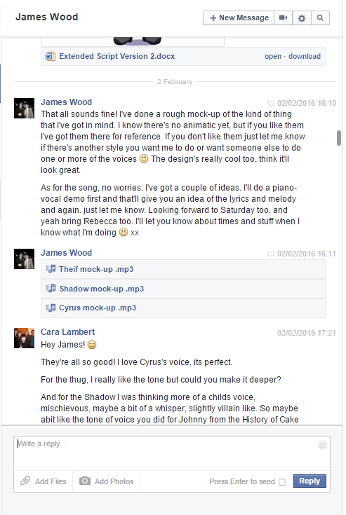
I then added a high angle shot of the main character looking up at the camera, as the thug shadow engulfs the frame before cutting to a close up of the thugs eyes. I didn't like this as much, it needed to be zoomed out slightly before going straight to the facial features, with the next revision I want to edit this possibly adding a low angle shot to show how vulnerable the main character is in comparison to the thug. The last few frames are not as interesting as I had hoped, the close up of the main character apologizing, a case of mistaken identity as the thug accuses the main character for theft, the item falls to the ground and it smashes. The shot then cuts to a close up of the thugs shoe before twisting out to reveal a canted angle of the thug - with another cut to a full close up of the thug pointing at the main character. I wanted to add a comedy moment where as the thug is pointing the main character has already ran away, which I really liked but the problem with this sequence of events is that the framing wasn't interesting. I need to revise these frames at a later date however I can still create a rough animatic with these boards so far to send to my voice actor and musician.


Act Two -The Chase Post it notes

After creating the first act in rough thumbnails, I decided to draw the rest of the scenes in post it notes first. Personally I should have done this for the first scene however I was too excited to start creating the story so I jumped head first to thumbnails, when in actuality I should have done post it notes then thumbnails.

Using post it notes is a beautiful process that allows you to quickly draw the camera angles and switch frames or easily tilt them to show the movement or express a different atmosphere with the composition. Even though this is an easy process, there is alot of thinking that goes into the framing - it took quite awhile for me to post it note this scene. It was more visualising how the jump over the kart would be done, I contacted Perry Flowers for possible reference who was recommended by a fellow student Elyse Jackson. Not only was I stuck on the strong action poses through out this small action, but how I would frame this movement. I wanted a mixture of camera angles to make the action flow successfully as well as interesting for the audience. I didn't want to stick to a boring profile view - I wanted a mixture of profile to high angles and possibly the camera following the main character running towards the kart before switching to the actual jump which could be a mixture of profile and extreme worms eye view. I actually drew this in the post it notes par from the worms eye view, I felt that this sequenced worked extremely well, I was really happy with the change of angles as well as the landing which was quite dramatic, switching to 'cute' as the character stumbles slightly.

After this sequence a low close up shot of the thug's shoe is shown before panning and zooming out to show a dynamic and threatening stance of the thug who has just knocked down the kart before continuing to chase the main character. The main character, over the shoulder shot, sees an escape root and continues, close up shot of hands, to slide over the stall to run into the alley way. I quite liked this sequence as the landing after slide worked quite well as there were quite a few strong poses in the movement. I wanted the camera to follow the movement as he lands, possibly a slight wobble of the camera to add to the movement however whether this would translate well into the animation in comparison to the storyboards is something I would have to test in the animatic.

I then went on to begin post it noting the next act quickly with the alley transition that connects the market background with the enclosure like area that I want to look completely different, as if the main character has stepped into a different plane. I wanted the alley to be quite dark and gloomy looking as the character stops to catch his breath with the walls seeming to never end - however with the way I have storyboarded this part, I really didn't like the angle of him bending down slightly as he catches his breath. It was only framed at a long profile shot but it wasn't interesting enough. I think this sequence would be more successful if the angle was kept at a slight low view with the character running towards the camera and filling the camera as he starts to slow down. I think this would be more visually interesting and help the transition from the bright market scene to the alley environment.

The following post it notes were quite jarring as I only did very key frames so there were no inbetweens to show how these would connect as well - however I really liked angle that I drew the main character, in a tilted medium shot, as it was quite dramatic with the hand and spyglass being so in the foreground and the rest of his body being slightly blurred to show this distance. 


Act Three - Enter the shadow

For the last act, I re drew the last few frames from the previous set of notes, which worked far more successfully with both the composition and the framing. I zoomed out the camera for quite a few of the frames and brought it back into close ups, which worked well with the introduction of the new environment and the detail of the spyglass. I wanted the following four frames to be angled differently purely for how close these shots were, the part were he bends down to pick up the spyglass works however when he throws the spyglass in the next two frames, the shot seems flat. I think it's the angle compared to the composition of the frame, that needed to be revised.

I love the next sequence, instead of showing the reaction shot of the main character smashing the spyglass, the camera stays stationary on the main characters shadow as the spyglass sinks into his shadow, lastly the camera twist pans into the shadow showing the last moments of the spyglass before it completely sinks into the shadow - cutting to a tilted long shot of the main character sat on the ground trying to see what happened to the spyglass. All of a sudden, in the same shot the shadow starts to gurgle and it dramatically cuts to the next frame, a medium shot of a figure darting upwards from the shadow - I want to change this shot to zoom out more so that the ground and shadow can be seen as it the frame doesn't seem to have that awareness of space compared to the previous frames.

The following shot is the same medium shot but over the shoulder of the main character as the figure is in shot - a pan into the face, a close up shot to introduce the shadow, Dusk. The next few scenes finally introduce more dialogue, so I purposely kept some of the movement in the same shot, or return to the same shot to add humour and interesting compositions for the audience to perceive.

The main sequence of shots that I didn't like on this next board was the medium shot of the main character standing up. It was not only the shot I didn't find appealing but the action as well. The action wasn't needed, in fact it could easily be done off screen with the next frame showing the main character brushing dust and dirt from his knees to show to the audience that he just stood up. Additionally the following post it notes were kept to an extreme close up and medium shots, making them quite flat. This can be seen in the last four panels which show the same angle and shot, I want to change this and add a low angle in to show how mischievous and cunning the shadow is.


Tuesday 23 February 2016

Extended Research: Eddie of the Realm

Eddie of the Realm is a cartoon pilot that was made for Amazon Studios alongside with other pilots to compete for public votes as to which would be given the green-light. Creators and writers Bob Roth and Bill Motz worked alongside with director Paul O’Muiris and Tomm Moore to create this gorgeous animation. Unfortunately I wasn't able to watch the pilot however I was able to watch sneak peaks of the episode, which showed off the detailed animation and overall aesthetic to the animation.

I love the main characters, Hobi and Eddie, the personalities work so well together and lead to hilarious gags. Their personalities in general has really aided me with my own characters for Extended. I wasn't entirely sure what strong personality I wanted for my main character, Cy, I liked how he could be mischievous, courageous and naive but picking the most defined element for the character was difficult. I didn't want Dusk, the shadow spirit, to be too strong of a personality so that he stood out compared to the main character. I decided to go with two of the personalities combined for Cy, especially for the pilot episode as it would help with it introducing the characters to the audience.

I love the design of the characters, Hobi's head is completely circular whereas Eddie's head is more shaped, this successfully depicts the difference between the Realms that Eddie travels between. I quite liked the shape of Eddie's hair and ears, they worked well with his character, and I was quite inspired with the rounded hair rather than spiky. I believe that spiky hair is linked to a Japanese esk style of illustration which I wanted to step away from and absorb a more Western approach. At first I found the body proportions quite odd with Eddie as his legs were extremely long, however after awhile with the animation I quite liked the proportion; it worked well in the action scenes and angles that were combined.

The animation for the cartoon is effortlessly smooth, full with anticipation, squash and stretch and secondary animation, that just brings the story and characters to life. The cinematography used really aids the animation, it makes it more interesting and dramatic which works so well, giving that movie quality to it. The gif images that I have added to this post do not give the animation any justice as watching the clips shows how gorgeous the animation is.


Hobi character sheet
Eddie character sheet


Monday 22 February 2016

Extended Research: Dreamworlds

Dreamworlds is a fantastic read for anyone who wants to learn more about composition, how the professionals frame their shot with flat colours, to draw the eye through the layout design. I wish I had read this earlier through my COP3 Module, however this has really helped me with my work in Extended with my storyboards. I struggled with trying to get the flow of the shot, how the audience reads through the frame. I think it was mainly due to how I had drawn the backgrounds in the thumbnail storyboards. Using guidance from Dreamworlds, I started to block out shapes first before totally deciding on the layout of the backgrounds, this is to ensure that the information within the composition is easy to read for the audience.

Not only has this book aided me with the layout of the backgrounds, but also the use of staging with the characters. I vaguely read through staging when researching for my dissertation, I had decided not to continue with this aspect through how it could have been a whole other essay in itself alongside more elements of Mise-en-scene. However for my animation the use of staging and blocking will be essential for dialogue scenes in my animation. Quite a few of the pages are just full of images but this is vital for examples and showing how these are applied in animated features such as Disney's Cinderella and Aladdin.


Extended Research: Bill Otomo

After researching into Dofus - Book 1, I discovered Bill Otomo, a visual development artist and comic book author, who created character sheets and concept work for the animation. I really admire the use of simple shapes within Joris's character, such as the hands and feet, and the detail on the clothing. Even though the clothing and shapes are simple, the character has a strong silhouette. Joris's character has inspired me with my own character design for the shadow spirit, Dusk. For Dusk I needed to create a shadow ghost esk creature with simple shapes as to suit the young audience; with the arms I made them longer, curvier with simple claw like hands, not too pointed as it needed to work with the audience.

The concept work really inspired me through the perspective of the shot. The use of foreshortening and power angles aided the shot successfully, enhancing the action further. I loved the exaggerated expressions and movements in the shots. These pieces helped me to generate ideas for my own work, especially with the market scene, I wanted a dramatic running pose as the main character, Cy, runs away from a thug character. This use of over exaggerating the shot, nearing the impossible lens should aid the animation and perception of the action well; animation is the only discipline that can use the impossible lens, with the moving image, to an aesthetically pleasing appeal.


Joris character sheet


Extended Research: Fabien Mense

Fabien Mense is a visual development artist and comic book author who creates stunning background and character designs. Mense has been a huge inspiration of mine, I love the style that he gives his characters, which really influenced my work for this module.

An example of his character designs that inspired me the most, is Arthur from the Ovalon animation by I Can Fly Studios. I really liked Arthur's design, especially the facial features with his big ears and round nose. The rounded nose made the rest of the facial features softer, which is what I would love to include in my own designs along with big ears. I found that bigger ears on a character makes the design look younger and cuter for the audience, which would work well with the young audience that I have in mind for my animation and designs. I also quite liked the shading on the hair, with the simple division of the tint and shade. Normally I would add more detail on the shading, adding two shades and two highlights to the original colour however simplifying this would aid my characters aesthetic.

I was intrigued with the animation that Mense had created these designs for so I found the animation of the Studio's website. I really liked the camera angles and the lighting in the shots, however some of the animation was a little jarred at times and the character models would be slightly off. I was inspired by the overall aesthetic but I was slightly disappointed that the colouring from Mense's work wasn't taken into consideration as well, as it would have aided the characters.


Particularly, his background work has been a huge aid with considering the use of line and placement within the composition. Even though I had researched into composition and cinematography in COP3, I was still unsure of what components to add into my backgrounds. To solve this problem I not only researched into different cultures of buildings, but also how artists use their lines to add detail to the backgrounds. Whenever I draw backgrounds I love to make it more distressed then it would normally appear; I would obtain this result by adding crosshatch and more lines to the shapes and detail of the building. However for my animation, I knew I needed to add less of this distressed approach in order to suit the young target audience. Mense's work really helped me with his use of lines and colour in his backgrounds. The lines were not black, which gave a softer appeal to the aesthetic, and the use of a soft brush to apply the colour emphasised this approach; it reminded me of a watercolour painting which I quite liked, as well as working with the overall theme and content of the piece. I want to try his approach to soft, sketchy lines within my work, however I would need to keep the black lines to link with my character designs, otherwise my characters would stand out too much from the background.


Sunday 21 February 2016

Extended Practice: Statement of Intent

Compared to my Rationale, I found it difficult to write the Statement of Intent with the amount of information that I could add to the sections. This was partly through how much information that I personally knew at this stage of the process as well as with the people that would be involved in the project. With the stakeholders I purposely left it vague just incase something was to happen in the unforeseeable future. For example the voice actor that has agreed to help me, may for some reason not be able to voice act for my animation, this could be through the amount of work he has for himself or he may have lost his voice. I would then need to find another voice actor which would clash against my Statement of Intent. 

I also changed the outcome that I would be making since I made the Rationale. In the Rationale I was set on making a teaser trailer however with tutorials and working on a coherent story, I am now making a pilot episode. 


Here is my Statement of Intent:


Extended Research: Hong Soonsang

Hong SoonSang has been a huge inspiration with my character designs, I love his use of facial expressions and the characters proportions. I especially loved his Robin Hood series of characters, the character sheets are gorgeous and show the characters personality well. I want to take his form of layout with the character sheet and the angle of the expression which would aid me with the final storyboard angles that I want to incorporate into my animation.

At first I really struggled with trying to draw in a more western style, and I soon found that the eyes were the main cause to this problem. Using SoonSang's work as an influence, I drew the characters eyes without any detail. It reminded me of a Disney-esk style which reassured me that the design held a more Western approach compared to the Japanese influence that I have absorbed into my illustrative style. I wasn't too sure about the rosy cheeks, however I quite liked the red nose, it gave it a cartoon look and reminded me of Gravity Falls. 


Shooting Star Works

Robin Hood  'Robin'

Robin Hood  'Will'


My first 'Hero' design using SoonSang as an influence

Monday 1 February 2016

Extended Design: Designing the Hero Part 2

After drawing with graphite and ink, I scanned in the designs and began to draw completed characters which were influenced from both my sketches and my research. I also added colour to the lineart as to generate ideas for a colour palette. Comparing the colour so far, I came to a conclusion that the character had to have red in the design in order for the character to stand out as a main character. This didn't have to necessarily be the prominent hue however after using blue and green with the character designs, the red dominated the colour scheme making him stand out. With the lineart I really liked each design, the one that stood out most to me personally was the last figure. I loved the cheeky grin the pose, the hair and jacket. However for the target audience it needed to be simpler with the outfit, even though I loved the jacket, I knew I would have to get rid of the jacket if I wanted to be able to animate well. I also liked the facial features however they were to much like my original style, which is what I wanted to stay away from for this project. I wanted a mixture of Western and Japanese illustrative style, which is why I decided to continue to develop the middle lineart. The middle design was muted because of the colour scheme I chose, but apart from that the design worked well, he looked heroic with the hair and head band as well as the simple costume. I decided not to continue with the first design as his outfit and hair looked more like a secondary character which I would love to develop for a companion character. 


First design
From the middle design I continued with testing both the costume and the hair. I didn't like any of the costumes so far, I loved the jacket and as I stated earlier, animation wise I wouldn't be able to animate the jacket that well. I continued to draw a slight jacket just in case it clicked with some ideas for the final design. I did however like the hair without the little flicks of hair near the neck. It made the character seem slightly older but more heroic, I found that the flicks made him seem less courageous. I also found that the boots and laces needed to be simplified, as much as I enjoy drawing boots like these it didn't work with his character. I will definitely consider using these boots in the human companion designs as I believe this would work more successfully with a secondary character.

My next set of designs included simpler designs and colours. I decided to get rid of the rosy cheeks as even though they were a design choice, it made the character seem embarrassed all the time and that was not the approach I intended. I kept the blushed nose as I felt that it worked quite well with the design and facial features. The simple shape to the shoes worked so well compared to the previous design; I tried to add different hues for the shoes but I preferred a navy/grey colour rather than red and brown. Out of all the designs I preferred the last figure with the baggy pants and vest top, however I didn't like the hair colour that much, I wanted to go back to the original hair colour as I did love that desaturated blue, it was different and I believe it would work with the red.


Considering costume

Costume, colour and hair experiments
Here are the final designs of the main character, Cy (full name Cyrus). I changed his design quite alot compared to the previous set of development. I made the bandana ties longer with the aid of feedback from my peers which stopped it merging with the hair design. I gave more detail to the vest, making it lighter and darkening the baggy trousers and desaturating the shoes. I really like the final design, with the final design I was able to add the bagpack to his design. I didn't spend too much designing the bagpack as I wanted to look plain and simple however absorbing a touch of supernatural aspects, hence the addition of the eye. I wanted the bagpack to be able to carry as much as possible, like a bottomless pit, where the zip would rip open into a mouth as it took items into the bag. I also lightened the skin colour as it was too dark when matched with the clothing, making it abit lighter helped the red and blue of the hair stand out more to the audience. In addition I added an iris colour to the eyes, it made the character look finished. As much as I liked the black eyes, it made the character look like he was day dreaming or just gormless, I wanted the character to have a spark in his eye which is why I needed the addition of the irides. 


Final three pose turnaround

New and Old design comparison

Overall I really like my final design, it worked well with the shadow character and I also preferred the type of shading I had used on the designs. I would love to add this to the animation however this depends on the appearance of the backgrounds and time left near the end of the production part to the module. 


Dusk (Shadow)  and Cy (Main Character)

Extended Design: Hero sketches - Ink

Whilst drawing the Shadow with ink to generate ideas, I did the same with the Hero character. I knew that ink wouldn't necessarily help me with the shape compared to the Shadow design however it did stop me from throwing away mistakes or drawings that I didn't like the look of, as I couldn't erase the ink like I would be able to with graphite. This made me continue with lines that I didn't like which helped me to continue with the main lines for the hero character. I grew more confident with the main lineart as I continued to draw the character. I still need to design the facial features to one that is more western influenced however I want to focus more on the aspect when I take the design to photoshop. I wanted this exercise to purely help me with the main lines of the figure, face and hair, almost like designing a strong silhouette for the character.

The last two images were originally drawn for the Extended Project however they were used in the COP3 Practical for the final outcome. Even though these two images were marked for the COP3 module I wanted to show the design process that was originally intended for the Extended Project.


Used in Cop3 Practical

Used in COp3 Practical