Using the techniques that I had learnt from the previous background, I began to draw the lines for the other two environments. In order to get the perspective correct, I created the environment in Maya. Using Maya really helped me to gain a better understanding of the angle and where I wanted the camera to be in the composition. From this Maya reference I used it as a draft for me to add more refined lines over the
With the perspective of the buildings, I did find it difficult to get the crosshatch to correlate with the dominant lines of the Alley - I wanted to show examples of the light and shadow in the environment however with the addition of colour and how strong it was shown in the market scene, I purposely added less crosshatch. In order to solve this problem with the perspective of the crosshatch I need go back to the original reference and redraw the crosshatch. I really want to add more tiny details to the environment, to make the background more interesting. This can mainly be seen in the poster - I wanted a cheesy poster, something that worked with the environment/culture, this could be a wanted add or advertisement that would work with the setting, or could be an advert for an animation that I have created previously, like a call back to work. This is something that I want to look into at a later date.
I wanted the Alley background to act as a transition to the 'enclosure', the environment where Dusk is introduced. I still wanted the alley to be seen in the perspective as the main character first sees the new environment. I wanted this background to be eerie and creepy to have a foreboding approach to the scene before the Dusk character is introduced. I loved the angular approach to the branches it worked with the atmosphere that I really wanted and with the space between the trees and the grass, there was enough space to show the spyglass. The only critical points that I have with this design is the alley wall and lighting. As the alley wall is in the foreground I need to make the lines more dominant in comparison to the trees. The lighting only needs to be a slight bit softer and tinted purple to work with the later addition of colour. I also want to use different photoshop brushes for ground as it worked quite well for the market scene ground.
I wanted to quickly test how I would move the jaw and animate the main mouth movements for my main character. I wanted to test this on after effects as I was curious to see if the puppet tool would work successfully on the jaw. In order to use the puppet tool, I separated the head onto a separate layer and imported the photoshop file into after effects so that I could manipulate each layer with ease. I found using the puppet tool quite difficult with moving the jaw. In order to key frame the puppet tool, I had to hold down the ctrl button and then move the pin on the chin to match the movements of the mouth. however I couldn't see the animation of the dialogue whilst I moved the pin, so I had to guess. This wasn't that successful so I key framed the main pin to match the switch between the mouth movements. This was very successful but time consuming with having to watch the mouth movement first to then key frame the puppet pin.
I really liked the movement on the chin, it worked nicely and I want to include this in the final animation however with the time it took on after effects, I may have to leave this extra movement.
For my animation I wanted to fit as much movement and action as possible in each scene, the main action being within the chase scene. I wanted to be as ambitious as possible with the chase scene however I needed some reference to ensure that the movement and action worked successfully. After a crit session, Elyse from my group suggested asking Perry Flowers for reference.
I mainly used Facebook to communicate with Perry for the ease of messaging and sending sketches of what I envisioned for the sequence. Perry was extremely nice and helpful, I told him what main action I wanted and to change this action to something different if he thought it would better suit the sequence. After sending him diagrams of what shots I wanted he gave me amazing reference the next day. He not only did the camera angles but different actions that could also work instead of the original action. I used Drop Box to share these video files as they were too big to send over Facebook. Drop Box is fantastic to share bigger files with more than one person as well as commenting on the file at the same time. I will be using Drop Box for most of the communication with my voice actor and musician for the backing tracks.
Using Facebook
Quick sketch of the camera and action
Quick sketch of camera and action
After watching all of the reference that Perry created, I decided to take alittle bit from each reference. I really liked the idea of the camera following the main character as he runs towards the kart, before cutting to a profile perspective of the main jump. As the main character jumps over the kart, a slow motion low angle shot, as if the main character is jumping over the audience, as the main character apologies - to then cut back to a profile shot of the main character stumbling slightly as he lands.
I also asked Perry for reference of sliding over a surface, as I wanted my main character to escape over a market stall into an alley way for his escape. Perry suggested that different types of vaults would be more suitable, and I really liked these actions compared to what I had originally thought. It worked with the main character, I didn't want the main character to be perfect with his movements and the vault actions worked with this in mind. I wanted the main character to stumble with quick movements to follow this.
Notes on Reference:
Side Vault finish
+ I really liked the head on shot of Perry running towards the camera before jumping over the surface, I loved the line of action as he put all of his weight on to his arm to then swing his whole body over the mat. It is such a strong pose and would work well with the animation. From this the landing is quite strong as well and can easily be adapting into the main character starting to run again after he lands.
+ I didn't think that the profile view of the vault worked as successfully. I don't think it would be suitable for the animation through the angle and environment that the main character would be running through. This would be appropriate if this action was used instead of the flip, over the kart, as the profile is needed to understand the action. The profile for this action would be lost due to the market stalls, in the environment being connected.
Side Flip Final
+ The third flip is fantastic for my animation, The strong key poses of the flip work more successfully than the previous variations, as well as being closer to the surface. Being closer to the surface gave me an idea of the main character knocking a few of the items from the kart with him, which would help the movement of the flip.
+ I loved the head on, running towards the mat before flipping over it. I wanted to mix this with the previous flip. This would work successfully and make the jump more dramatic especially with the camera following his run before cutting to the actual flip on a profile view.
Front Final
+ I really loved how strong these head on poses were, however I didn't think it was needed for the animation. I wanted a variation of camera angles to make the action more interesting and dramatic and the head on camera wouldn't work with what I had in mind.
+ The camera following his run before the jump were more successful in this reference video than the previous, I really loved the last run with the camera following him as it would work with a cut to the profile jump.
+ I really liked the low angle camera with him jumping over the camera, it worked well however if I was to use this shot I would zoom in slightly and cut to an extreme close up of the characters face to show the dialogue of him apologizing as he jumps. I think this would work really well and make the whole action flow better.
Cat Pass Final
+ These references were mainly for the slide type action I wanted, however I didn't like these as much as the previous videos. I believe these would have worked with my animation if I had more obstacles for my character to avoid however for the time that I have for my animation I wouldn't be able to add anymore in the scenes.
Final Additions
+ I really liked the first action with the 3/4 angle, I believe this would work really well with the slide movement. I would want to flip this action however so that the main character went from the right to the left. Even though this is a weird way to translate the action, as western culture read from left to right, I think having this would make the action more dramatic and work with when the main character stumbles as he lands and scurries to run further away.
+ I love the second action, even though Perry hits and knocks the surface down as he lands, Perry stumbles which works with how I want my character to react. I won't be using this sequence as reference but I will be using the stumbling for reference for the other two pieces of main action.
Check out Elyse's blog here and Perry's work here.
After cutting down the first act in the previous animatic, I created more in-between storyboards to connect the scenes together and to replace the stand in frames. However whilst I was drawing these frames I started to critically review the action that I had included. I found that even though I liked the slide into the alley way transition, it wasn't needed, as the more I watched this sequence the more jarred it made the sequence of events. It was how the main character is shown already running from the thug, to jumping over an obstacle that the thug crashes into and continues to chase the main character, who escapes by sliding over a market stall. Being extremely ruthless I cut out this slide action and re-framed the thug crashing into the kart but this time being stopped by the kart, with the main character running straight into the alleyway. I personally thought that this worked so much better, the sequence of events was easier and more enjoyable to watch.
I asked for feedback from a fellow student about the sequence as to which version worked more successfully. Feedback agreed that the cut version worked more successfully especially with the target audience that I wanted for my animation. The feedback also noted that there was room for comedy here from the kart owner, I really liked this addition and I wanted to add slight bits of humour throughout the animation.
Additionally I changed part of the ending sequence by re-framing the angle and space in the frame, I mainly changed the perspective to a 3/4 angle and changed most of the close ups to medium/long shots to add more visual appeal to the dialogue. I really like this animatic, I love the amount of movement that will be in each scene and with the knowledge that I have learnt from my theory in the Context of Practice 3 module, I have been able to mix angles and shots together to create something interesting and visually appealing with the composition in each frame.
For my animatic I used my storyboard frames to gain a better understanding of the timing with the story and script that I created for the animation. The first animatic was only a minute long as I wanted to quickly use my rough thumbnails for the first scene to send to my musician and voice actor. I sent this version as a quick up date so that there was something for them to both gain reference from.
As I continued to create my animatic with the rest of the acts, I realised just how much I had actually storyboarded. I had storyboarded over 5 minutes with the amount of interaction I wanted for the main character with the environment and the characters. However I loved the first act. The first act introduced the setting and the characters personality, how much he loves shiny things and how bad luck seems to follow him everywhere. I liked how the main character, Cy, stayed at one stall to inspect an object before realising how terrible the item actually was, this shows that he has knowledge of this and that he isn't a thief, he had a purpose for looking at the market stall, a traveling merchant.
Unfortunately I had to prioritize as I knew that the animation had to be 3 mins at the most in order for me to be able to animate it in time for the deadline. I wanted to be realistic with the amount of detail I wanted and action for the animation scenes, along with the colour schemes that I wanted the animation to look like. Even though I won't be using this scene I want to draw these boards again with different angles to show how I would have looked like in the animation, as it is scene that I really liked. Although I will be cutting this scene, this does not effect the rest of the animation, instead of a slow introduction into the setting, the animation goes straight into the chase scene, it starts with a fast pace which works quite well.
This leads to the second animatic - the second animatic was a quick edit for the time, at that moment I hadn't completely finished the additional storyboards so I had to use some of the previous frames as a stand in. I wanted to send this amended time to the musician as soon as possible so that the score would fit the animation well. However even with this amended time, I found that a few of the frames were flat, there didn't seem to be space in the composition, so I wanted to redraw them so that it flowed well with the rest of the animation.
With the feedback from the silent crit in consideration, I redrew the main building elements with more detail, I added small cross hatch elements and small brick details to the walls especially on the foreground elements as this detail would be seen more in the parallax animation. I also separated each building and signs onto separate layers so that each layer could be animated separately once transferred to After Effects; I wanted to animate the sign moving using 3D layers. Drawing this amount of detail on each building took awhile, it took less time than I had originally planned which was surprising as the amount of marks that I made on the wall surface and bricks seemed to take awhile. My tutor Annabeth suggested to make a stamp or brush to copy the marks, saving time on the process. I did try this with the clone tool as a quick test, but the marks felt out of place and I used the transform options to change the perspective, which felt that it took more time, so I decided to continue drawing the marks rather than copying them.
I really enjoyed drawing more detail on the buildings as it gave each element character in comparison to the previous version of the background. I felt that the previous background looked flat purely for the matte block shapes of the buildings that lacked any form of detail/distress. I still need to decide on the colour scheme for the market stalls, the red hue that I have chosen as a stand in doesn't clash with the main character as much, however it does blend slightly, so the only factor that makes the character stand out is the pale tone to his skin palette. I decided to leave this change for a later date as I wanted to test creating the parallex in after effects before painting more highlights or shadows in the image.
Example of lines
Finished lines for first market background
For my first test, I opened the photoshop layers into after effects, separating each element into its primary plane in another composition. This made it easier to organise the amount of layers and consideration of the movement within the parallax. I made the each plane 3D so that when I created a Camera layer the frames would work with the movement. I then used the position key frames to move the planes off screen as the Camera zooms into the composition. This worked quite well, however I wasn't sure about the timing for the elements moving, I initially thought that each plane needed to start and end moving on the position key frame at differing points.
I asked my tutor for advice on the timing of the movement in each plane. Feedback was positive however each element needed to start and end together for the movement to work successfully as the movement so far was quite jarring, which I agreed with. My tutor, Matt, also tried to help me with the 3D layers, as the way that I had animated it in after effects was the old fashioned way with moving each element as the camera zooms in. We tried to make each layer work with the 3D layers and camera, moving each layer on the x axis, however each layer wouldn't work as the layers were floating in the air in comparison to the actual bottom of the planes. Therefore the way that I had originally animated the parallax was the best solution as the 3D layer path would create too many problems that I wouldn't be able to fix. Additionally this means that I won't be able to create shadows on after effects, I would have to paint these elements in photoshop now that I can't use the 3D layers.
However I did experiment with the light layers in after effects. These layers highlighted the image, which worked quite well, and I was able to tint the image with a purple hue to work with the main colour scheme. Even though that I can do this in after effects I would much prefer to do this in photoshop so that I would be able to use more blending modes, gradients and adjustment layers.
The only problem that may arise from this parallax, is moving the signs using 3D layers. I still need to test this element in after effects however the most likely solution will be to animate this movement in photoshop timeline.
Testing different light and shadows in After Effects
For the group crit I mainly talked about my background that I had finished. I wasn't too sure on the colour scheme as I never really experimented with saturated colours or editing the colour balance to make the tone tinted towards a bright hue. I was given really positive feedback on the colour scheme, the use of the reds and purples worked well with the composition, however I personally wanted to add more shadow and highlights to the design as it felt slightly flat with the sky being so dim. Additionally I wanted to brighten and saturate the sky more to bring more light into the environment.
The purpose of this first background was for the opening of the animation, to introduce the setting. I just wanted to slightly move the camera into the environment which would most likely be 10 seconds on the screen whilst the crowd moves around the street. With feedback from the crit it was suggested to make a parallax of the scene, moving the buildings slightly to make the 'zoom in' feel more natural and interesting. I really think this would benefit my animation, as I could make the signs move as it zooms in using the 3D layers in After Effects. In order to make a parallax I would have to draw more parts to the buildings, making them longer so that the parallax would work once the a camera on After Effects moves through the scene. I wanted to add more detail to the design anyway so I didn't mind extending the elements further, however I was stuck with how much detail to add to the buildings. I personally draw most environments with distressed lines and shapes to make the building more detailed, however for this animation I didn't want too much of this as I was worried about how much it would stand out against the characters. After gaining feedback a lot of the group agreed that it needed more detail and to distress it slightly as it needs that texture to the matte walls and fabrics of the market stalls. In addition the proportions of the foreground need to be edited as the first building closest to the foreground needed to be closer and bigger so that the bottom of the building couldn't be visible; this is to work with the perspective of the composition.
I want to also change the colour scheme of the tents as it clashes with Cy (the main character), with the changes to the colour scheme. Feedback suggested making the tents striped to detract from the characters main colours, I think this will work successfully however I still want to change the colour of the stalls.
Creating the main characters turnaround was quite difficult with both the hair and the headband, I wanted to make sure that the key poses of the turnaround were strong but were correct with what parts of the body were shown. This leads me to the 3/4 pose of Cy, the main character. I found this pose the most difficult purely for the headband and what part of the bag would be seen. After drawing both of these elements and moving them behind the character, I came to the conclusion that neither of these would be seen. Even though this was correct with the perspective, I still felt that I needed to show at least part of the bag to connect with the profile stance. I subsequently considered making the bag bigger however not only would this become more difficult with the animation, it just didn't work with the size of the character unless I purposely made the bag extremely big, to the point where it was bigger than the character. This would work with a different shaped bag, more like a camping bag, but for my character I felt that this approach would not be successful.
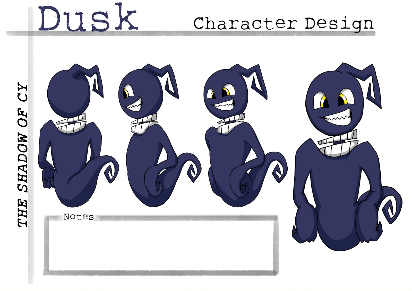
I decided to redraw my previous shadow shape for Dusk, I really liked the original long and angular yet contoured body however when I started to redraw him I automatically draw a circular head, and I quite liked this. It was more simple but it worked well for not only the design, the audience as well. The use of a circle shape for the head helps the shadows character as if we were to characterise a circle we would most likely associate it with a kind and soft demeanor in comparison with a square - the angles referring to temper/anger. Having this circle reassured me with Dusk's character it helped me to ensure that Dusk's personality wouldn't be taken as a villain or too evil, I wanted his character to be childish and mischievous.
I then went to drawing the expressions of my character, which I loved. I enjoyed making the expressions myself as reference and exaggerating them to work with the shape of the characters face. I also used influences from characters such as Darwin - The Amazing World of Gumball, Norman - Paranorman, Eddie - Eddie of the Realms Eternal. These expressions were fantastic with the exaggeration of the mouths, eyes and face shapes, Darwin's expression sheet was more helpful towards Dusk's expressions as the eyes were quite similar and both didn't have a nose so the eyes and mouth needed to be even more emphasised. I enjoyed drawing Cy's expressions more solely for the amount of elements that could be exaggerated, such as the nose, the jaw/facial shape and the eyebrows. A good example can be seen in the frowning/'unamused' face in the middle row on the expression sheet. I purposely squished his face slightly and narrowed his eyes, drawing in all his facial features slightly closer to enhance this emotion.
The Amazing World of Gumball
Paranorman
Eddie of the Realms Eternal
Additionally - since the last crit, I changed my main character design with the colour of the outfit from green to red hues. I changed this factor as my feedback for the green outfit, reminded people of Peter Pan and Robin Hood. These elements didn’t matter as such, as these characters kind of worked with his personality, apart from the green being so bright as well as his skin, which slightly clashed. Therefore I changed the hue to a red; in my opinion red is a colour that signifies the main character, which is why I immediately made the headband red. Making the top red as well actually worked successfully. I really liked how it worked with the headband. I did miss the contrast between the previous green top and red headband as it made the spectator immediately focus on the characters face.
With the additional frames and re-drawing the rest of the boards, I drew these on an A5 sketchpad so that I could easily tear the pages out and use a lightbox to draw the following action with ease. In COP3 I found it easier to draw digitally so that I could use the last frame as reference with lowering the opacity of that layer. Drawing digitally however took longer with how I needed to get the lines perfect. However with the use of these tearaway pages I was able to quickly draw frames and edit them again.
As I was storyboarding these new frames, I was making the animatic at the same time and discovered that the amount that I had drawn, was lasting for over 5 minutes. Subsequently I had to ruthlessly consider what scenes I really needed. Unfortunately this lead to cutting out act one and start with the run scene. I am really gutted that I had to get rid of the beginning sequence as it showed the characters personality well before the action and introduction of more characters are portrayed however cutting straight to the chase scene does draw the spectator into the animation. The ease of the environment before the crescendo of the main character running through the market works quite successfully, especially for my target audience.
Another major change was after the jump over the kart. Instead of the Thug continuing to chase the main character, the Thug crashes into the kart stand and is knocked out with the apples engulfing him. With this action I then cut out the slide over the market stall into the alley way with the main character running straight into the alleyway. This chain of events works more smoothly, especially with the angle of the movement. Previously it was quite jarring and I believe this was mainly due to the amount of action that the main character was doing and how I had pieced them together.
Other small changes:
+ I changed the angle of the main character throwing the spyglass to a full medium shot and at a 3/4 angle so that the action of him throwing didn't look so flat.
+ I changed the action of the main character standing up - instead of animating him standing up, it worked more successfully with showing him brushing dust from his knees to let the audience know that he has stood up. This way I was able to show the shadow spirit float around him before cutting to the next frame.
+ I added a low angle shot of the main character as he asks 'What do you mean being stuck with me?'. This made the scene more dramatic as the shadow begins to transform.
+ I added an action of the main character scratching his head and turning with the camera as he asks another question to the shadow. I felt that this worked well as it shows the characters personality and thought process as he turns to the shadow.