Thursday 23 April 2015

Module Evaluation

Throughout this module I wanted to challenge myself with learning new skills in which I could apply to the work that I would be creating for each of the briefs.  I was able to not only learn new techniques absorbing these into my already learnt skill set, but I was able to refine my illustrative skills with the proportions and style of character.  I enjoyed designing characters with elongated legs and angular faces that was a style that I am normally very comfortable with, however challenging myself to create this for the final outcomes in the briefs worked successfully for both my own development and the aesthetics of the piece.

I encountered a few problems with time management as I originally had planned to create work within a set period of time with extra work that I had set myself to take the brief further in order to refine my skills. I found that with each of the briefs that I undertook I had set myself hardly any time to complete these with the extra work that I had added. This 
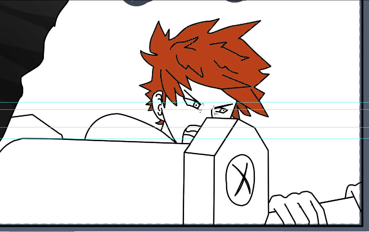
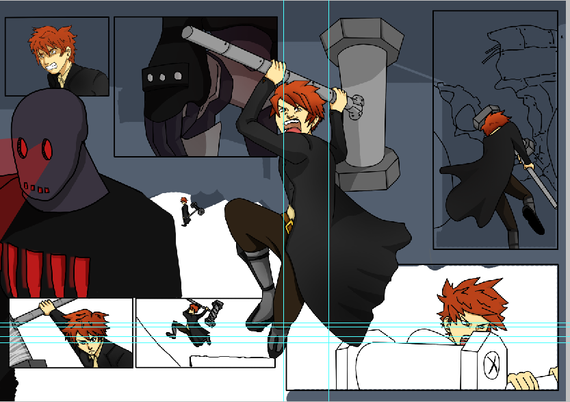
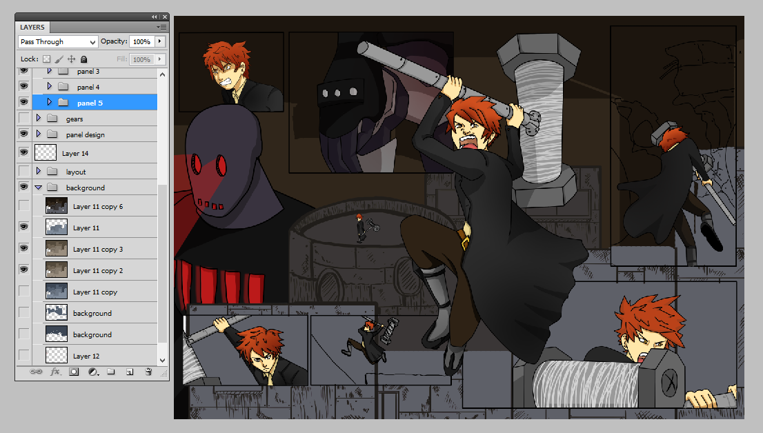
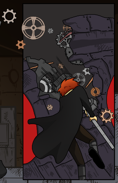
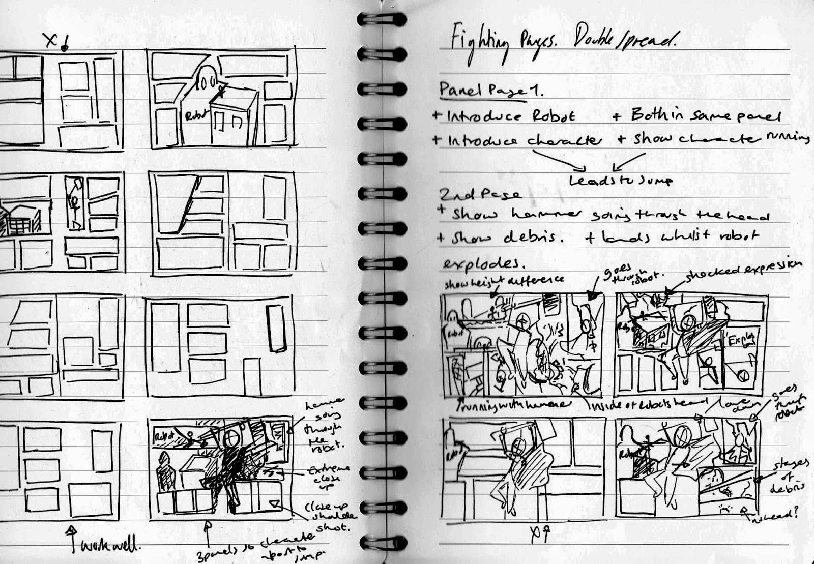
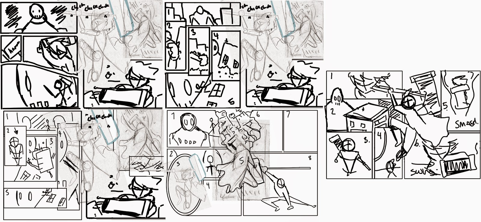
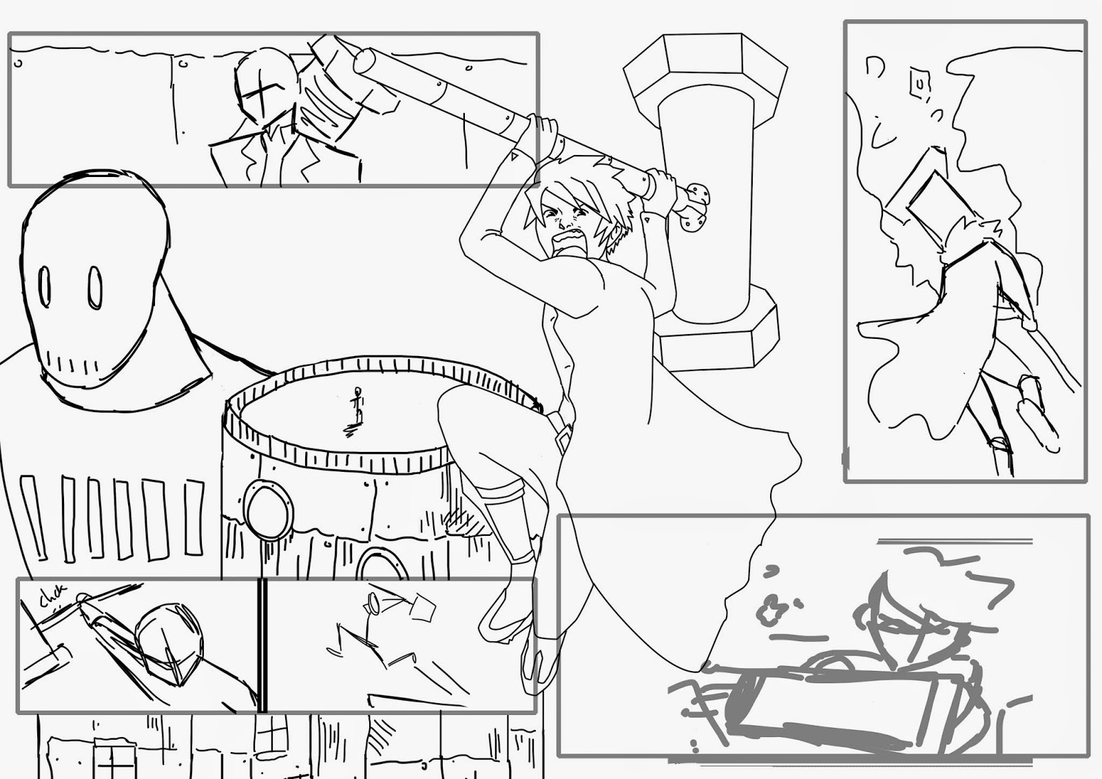
can be seen in the Webtoon brief in which I originally wanted to create a fighting double spread with a dialogue full page. When I began creating the double spread I didn’t realise how much time I needed to make the page. I had originally set myself 48 hours to be able to finish the narrative, layout, lineart and colouring, however when I began creating the page, it took me double the amount of time to complete through the perspectives and layout that I wanted to use for the panels. The layout alone nearly took me a whole days’ worth of work to complete through incorporating the sequential imagery that I needed to depict the narrative to the audience. Unfortunately I wasn’t able to complete the dialogue page that I wanted to create alongside the double spread due to the time that I had planned to create with the brief, as well as documenting the process of the page that I had completed.  I have learned that I need to improve my time management skills by giving myself more time to complete tasks than I normally would as to ensure the completion of the extra work.

Working collaboratively on a brief was a new experience for me through only focusing on one of the substantial aspects of the production, in this case the pre-production stage. I enjoyed designing for the brief as well as analysing different briefs with my collaborative partner as I was able to bounce ideas and create refined narratives that both of us agreed upon.  The communication of work that we had both completed for the brief was constant and made it easier to ensure that we knew what each other still needed to complete, giving feedback to what we had already done. However the time management for the brief was difficult near the end of the submission as we had realised that we had given ourselves too much work to complete for the final outcome with creating a 30 second animation with the narrative that we had produced.  Compromising on the work that we needed to create for the submission, my collaborative partner created a full length animatic and an animation sample for one of the scenes in the animatic being 15 seconds long. I felt that this worked successfully as the narrative could still be understood through the animatic and a higher quality of animation could be seen through the use of the animation sample.

The analysis for the briefs were difficult at times with the terms and conditions for the work that you submit however it made me realise what exactly you are agreeing to with the amount of ownership that the third parties would have compared to the original owner. I found this with the terms and conditions of the Webtoon brief in which you would create comic pages for the competition and win a cash prize with a spotlight for your comic on the website; you would have to continue creating pages each week if you won.  The terms and conditions revealed that they had the right to modify or change the content that you had created, along with the rights to redistribute your work on other sites without permission. Through these points alone I was uncomfortable with submitting the work that I would be creating for the brief.

Overall I enjoyed the module as a whole as I had created a huge amount of work towards the briefs that I had chosen compared to the amount that I had originally planned on creating for the tasks. I enjoyed analysing the brief as I was able to pinpoint problems before considering the solutions for the brief, how I could approach the work a­nd take the brief further.


Project Report


Tuesday 21 April 2015

Food Module: Animatic and Audio


To be able to determine the length of the animation and the points for the audio I used the rough thumbnails I had created as a basis for the narrative and general idea for the team, to create an animatic. I used After Effects to import the scans from my thumbnail storyboards and merge them together as a sequence on the timeline. Using After Effects made it easier to consider the duration of the frame with the movements that I had made for the characters, I find it easier to draw some of the movements of the character in sequential frames to help me to consider the time that the action would take whilst I quickly sketch the narrative. I realised that a lot of the frames overlapped and I was able to delete a few of the frames as the action within that frame could easily be explained with the following.  I also found that a few of the scenes, such as the running sequence would be difficult to transfer to animation through the 3/4 run that I had drawn. I used the audio as a basis for the imagery to follow the sample that Rebecca had quickly made for the animatic. This was extremely helpful as I was able to get a generalised idea for the timing and actions, especially with the emotion through the voice in the audio sample that gave me more inspiration for the actions I could edit in a refined storyboard later on.

The only problem I encountered through this process was the fact that the audio sample was 2 minutes and 40 seconds long, which worked successfully for the animatic but would not work with the final outcome. At a maximum the final animation had to be 2 minutes meaning we had to cut down 40 seconds of the narrative. I found that the audio could be cut with the run scene and the cake space continuum through the panting of Johnny after sprinting away from the cake which lasted almost 10 seconds, it worked with the comedy but as we needed to cut down the length I felt that this was a good place to start. Overall I felt that the animatic was successful as it showed the audience the rough timing and main narrative of the story, portraying the characters personalities, the comedy and the target audience.

Monday 20 April 2015

Webtoon: Final design

For the final composition I added a few extra gradients to the robot design to make it stand out from the panel as well as adding the lighting to the robots eyes and chest. I felt that this worked well as it gave a threatening appeal to the robot matched with the daunting size comparison to the character on the building situated next to the robot. I also changed the colour of the background to a darker shade that did not match with the middleground as originally the background was a slightly darker hue to the middleground and it was difficult to differentiate this elements. In order to solve this I duplicated the background layer and changed the hue using the hue/saturation panel to a navy colour before using the overlay blending mode to merge these elements together. I felt that this worked well as it made the background brighter and gave a blue tint to the background that merged well with the pale shades of grey and brown that were already in the background.

Overall I really enjoyed this brief, not only did I learn techniques and skills whilst working on this piece, I was given the opportunity to draw a comic page in which I have never really had the chance to do so before this brief. Unfortunately I had given myself too much work to complete for this brief as I wasn't able to complete the dialogue page. I didn't realise the amount of time that would be needed to go into this double spread. The amount of planning, research and character design as well as designing the final composition took over double the amount of time I had given myself to complete it. I will definitely be carrying on creating comics and hopefully have the opportunity in the near future to sell a completed comic at a convention much like Thought Bubble or Majikkon. 


Final Composition

Webtoon: Photoshop Process Fighting Page Double Spread - Colour and Detail

After completing the lineart I was able to add colour to the page, and consider the overall background to the panels and comic. I first began with colouring the content of the panels, starting with the lineart of the character. I based the colour scheme of the character on one that would contrast well with the overall colour of the background, I knew I wanted a blueish tint to the background so I decided that a brown or ginger shade would work well for the character. The rest of the outfit worked with the original colour scheme that myself and Roxanne Shanks initially planned when first debating on the characters for the narrative. I changed a few of the shades to work with the dark brown of the trousers however the overall colour scheme worked with the character and the rest of the composition through how the red of his hair stood out to the audience. I found that colouring the lineart to be tricky at first through how I was using the paint tool to add hues to the piece. I originally used the wand tool to select the area and add colour using the bucket tool however the edges of the selection were extremely pixelated, with the colour abruptly ending before the stroke of the lineart which left a hideous white space between the two elements. Even though this process was quicker I had to use the brush tool to fill in the gaps. When asking peers for advice I found that I could expand the selection made by the wand tool so that it would fill the entire selection, I found that expanding it by 1 pixel worked well and filled the area up to the lineart. Sometimes there would be small areas in the spikes of the hair that would not be filled but compared to the amount of time that I would take to colour the lineart with the brush tool, this technique aided me through out the rest of the production.

Matte colour
Overall colour so far

To add shading to the colour I first used the brush tool to add a darker shade of the matte colour to the hue to show the direction of the light. In addition to the shadow I then applied a gradient to selection in which the darker area would be relation to the direction of the light. The use of the gradient brought depth to the colour, making it stand out with the greater contrast between the tints and shades of the hue. I used a mixture of two gradients for the shade, the linear and radial selections. The radial gradient allows you to create a soft contour of shadow with the center being the darkest and slowly fading out the larger the path that you have stated for the gradient. The linear gradient is a gradual straight tone that starts from the darkest to the lightest shade of the colour that you have chosen. For both of these gradients I used a low opacity and set with the colour fading to transparent so that the colour underneath the gradient could still be seen.

Gradient

Adding speed lines to the panel for movement
After completing the colour for the last panel on the right page, I found that the movement still needed something to portray the action with the swing of the hammer. I decided to experiment and added speed lines to the panel overlapping the hammer.  I created the speed lines by using the pen tool and shaping the stroke using the brush presets. I needed a stroke that would end quite thin or slightly angular to work with the direction of the speed lines. In order to solve this problem I edited the basic brush preset by using the brush panel and changing the brush tip shape by altering the shape dynamics and the smoothing options. This worked surprisingly well and I obtained positive feedback from my peers when asking for advice on the movement within the composition. I decided to keep the speed lines as to enhance the action in the panel.

Overall colour so far - background
For the background I used different shades of the same hue to create the shapes and detail on the buildings. I felt that this worked well as the background did not stand out too much but the audience could see the detail and perceive that these were buildings. I layered the background into foreground, middleground and background before merging them together to create multiple shades on top of the original colour scheme using the blending modes. I mainly used the multiply blending mode to change the saturation of the composition however originally the blending mode made the background too dark and too blue. In order to solve this problem I used the hue and saturation panel to change the colour scheme of the layer. I changed the colour scheme to sepia tones which worked well with the underlying shades of blue as it created a grunge like tone of shade, this merged nicely with the rest of the composition. I wanted the background to be distressed with the materials that the buildings would be made from, most likely scrap pieces of material, which I portrayed through the use of the lines and crosshatch.

Adding detail - gears
Lastly I added gears on the top right panel to work with the destruction of the robots head, along with speed lines on the hammer to enhance the action further. I did debate with using motion or radial blur on the hammer to show the speed and power behind the blow but both were unsuccessful through how neither effect worked well with the rest of the composition, it looked out of place and didn't add to the aesthetic of the page. I then worked on the placement of the gears which I created using the pen and brush tool. I originally had the gear outlines with a darker shade of the fill however this didn't work well with the rest of the composition that used dark outlines. I changed the outlines using the 'lock transparent pixels' on the layer panel, this allowed me to only manipulate the outlines of the gears on the layer, making it easier for my to colour the gear outline to black. 

Webtoon: Photoshop Process Fighting Double Spread - Lineart

I first began to create the lineart and refined panel structure by sketching and completing the middle pose first. I purposely completed this lineart first as I would then be able to use this as a structure for the panels that it would be overlapping, I would be able to determine where the placement of the majority of the panel should be in order for the audience to understand the imagery clearly. Using the brush tool I was able to sketch the rough lines of action for the pose before lowering the opacity to create a neater sketch on a layer above it. Using this as a guide for the anatomy helped me to perceive the mistakes with the proportions and perspectives of the pose so far. I did find the perspective on this pose one of the hardest perspectives to create on the page through the position of the right arm on the figure. I needed to show distance but I found this difficult with his back and shoulder blades. I was able to solve this problem by asking feedback from my peers who gave me tips on the back and the arm perspective. I found that it was the length of the limbs rather than the angle of the body which made the lineart work unsuccessfully. After solving these problems I was then able to use the pen tool on a new layer to create the final lineart for the middle pose. To make this pose stand out from the rest of the double spread I used a 7 px stroke compared to the rest of the lineart which I wanted to be a mixture of  3-4 px.

Middle Pose Sketch

Developed Sketches

After creating refined sketches for the majority of the panels that considered the overlap of the middle pose, I began to create the final lineart. The main tool I used was the pen tool for the ease and quickness in creating neat and crisp lines, if I had used the brush tool I would have found it difficult to create neat lines as I would be drawing directly with the tablet pen. This would take more time as I would want the lines to be as neat as possible so I would be more considerate with the strokes that I make. The pen tool allows you to create contoured lines by manipulating the points you have made by moving the anchor as you go along the path that you make mixing contours and straight lines. Adding a stroke to the path can be difficult at times depending on the setting that you have the stroke on, I normally apply the stroke to be the same settings as the brush tool however there are other settings which the stroke can take but I find this setting to be the simplest.

I found that the comparison between my rough sketches and the refined lineart to be quite significant with the perspective of the body and the size of the head. I found that the perspective that I quickly sketched was always out due to the length of the body or limbs which made it difficult when I wanted to create the final lineart, I had to go back to the sketch to fix the main angle of the pose so that I could edit the original. The guide needed to be near the right perspective as it helps me to visualise and speed up my work process otherwise I find that I make more work for myself later on in the production process. With the difficulty of perspective I found inspiration and tips from my board in Pinterest, even if the angle was not exactly like my own, I was able to see how other artists had built up the body and angle that allowed me to apply this process to my own.

Using the pen tool

Final Lineart comparison to Sketch

Perspective inspiration - Pinterest board

After applying the same techniques and tools to the rest of the sketches I was able to complete the lineart for the double spread. I made a few changes to the panel sizes as I found that the left side had too much space with the overlap of the second panel which incorporated the robot and building. I separated the first panel into two and extended the second half into the original second panel. I found that this worked successfully as it did not feel empty and the transition through the imagery worked well, it introduced the robot more smoothly compared to the abrupt appearance of the robot in the original second panel the audience can see a small detail of the robot before viewing the menacing face of the villain.  I also changed the perspective for the very last panel on the right side to the double spread. I wanted to show movement however the previous sketch did not show too much of the hammer or the character which I felt didn't work successfully for the effect that I wanted. Changing the angle slightly worked well as the movement within the characters hair and body show the movement with the hammer that he is holding.

Final Lineart for page

Webtoon: Photoshop Layout

Before I began to continue with the comic layout I first needed to note down the contents of each panel in order to inform the amount and size of the panels. I found it difficult summarising the content without having visualised the movement that would refer to the narrative, I found quickly sketching the double spread with rough lines of the characters and movement helped me to generate ideas for the content. I separated the double spread into two pages so that I could plan both sides accordingly to the middle pose that I originally wanted to overlap both of the pages; to incorporate the rough full page into the comic layout. The left side to the double spread would include the introduction of both the robot and the character leading up to the main action, the overlapping pose, to then continue with the after math of the action on the right side. Knowing a more specific narrative for the panels, I was able to plan new layouts inspired by the sketchbook work that I had created for idea generation. I quickly sketched some new layouts before taking the layout to develop further on Photoshop. With these layouts I experimented with changing the overlapping pose with a different panel content which could have been successful if not for how much space and panels it would take up, this can be seen with the pose that shows the character smashing through the robot. I felt that this would have worked well however I had to enlarge the design so that it would work with the panels which became unsuccessful for the amount of the design that overlaps the panels; the audience wouldn't be able to tell what is happening within each of the designs.


Using the sketches of the layout as a main influence I developed the structure more in Photoshop. This allowed me to see the layouts that I had already created on the correct size canvas instead of thumbnail sizes, in order to see if it would be successful once applied. The first layout that I created worked successfully through how clear and simple the structure was, the audience could easily follow the direction of the images however I found that the left page was too large with the content and the form of the panels. The right page worked well through the use of the overlapping figure and the continuing action that took advantage of the larger panels. I liked the idea of the left side of the page using large panels as well but once placed with the right side, it was too much to the point that it looked cluttered and not very interesting; it became something that the audience would not be that interested with. In order to solve this problem I needed the left side of the page to have smaller panels that worked with the action previous or slightly overlapping a panel situated next to it, in order to bring something different and stylised to the aesthetics.

Possible Photoshop Layouts ( 1-5)

I continued experimenting with the layout for the left page so that it would suit the right side, I quite liked the over lapping panels on the second layout design. The only problem with this structure is that I wouldn't be able to move the overlapping figure too much onto the left page as the smaller panels would mainly be covered with the image. I carried on this idea of overlapping the contents of one panel over another, changing the size of the panels so that the covered panel could still be seen and understood by the audience. The fourth layout design was interesting to create as I thought about incorporating the middle pose into a panel that would refer to the robots eye, as if a reflection, with the overlapping design being the action of the character smashing the robot. I felt that this worked quite well however the use of the oval panel didn't merge well with the rest of the composition as it's appearance was too different compared to the rest of the design. I took this further and tried to incorporate the idea of a reflection in the robots eye within the fifth layout sketch which worked well in a square panel shape. I changed the pose of the character to one before the action portrayed in a high angle too make the character look small; I moved the original action pose back into the middle of the page. I quite liked the idea of the high angle however the panel next to this was boring, as it repeated the visuals but from a different perspective. Another panel that was successful was the second panel in which the robots head overlaps the first panel. I felt that this worked with the rest of the composition and brought depth to the structure, I wanted to make this detail bigger so that the buildings could be seen clearly and become part of the background.

Final layout

Using different elements from the photoshop layouts I created a refined structure which worked with the panel content and narrative of the page. I liked the idea of the overlapping panels with the second panel on the left side being the overall background for the comic to be situated upon. 

Thursday 16 April 2015

Webtoon: Character Designs

For the character designs I used the initial plans of the character designs that myself and Roxanne had planned as a basis for the characters appearance and weapons. I slightly changed these sketches to work with the characters proportions and weapons that they would be using with in the fighting panels. For example with the first designs I changed the style of the the hat and the hair to work with the tassels, as the hat before was too low for the head and the sides were too long. I also changed the shoes as I had to lower the boots so that the knee would be able to bend without going into the boot; I changed the sole of the boot as well as the spikes were too big for the shoe to be practical so I softened the sole slightly and merged the majority of the spikes together. I felt that this design worked well for the overall character with his main weapons being his fists; metal is hidden underneath the bandages. I really liked this character however I decided not to continue with this character as I felt a different character with a weapon that they could hold would be more successful in showing the destruction of the robots easily, such as the character with the hammer weapon.


Possible Fighting Character
Possible Fighting Character 
I really liked this character as the hammer weapon would work with the size of the robots, and would be able to work with the fighting scenes. I liked the idea that the hammer could be shortened into the head of the hammer by folding up the metal staff with the use of the hinges. The overall proportion of the character worked with the length of the hammer however I needed to practice drawing the hammer in the right perspective to work with the pose of the character when I transfer the character to the final comic layout. I quite liked how long and square the shape of the face is as it makes the character look older and less manga/anime stylised. I found it difficult to keep the hammer in the correct perspective to the character, I think this is due to the shapes that make up the weapons form. In order to solve this problem I can use the guidelines in Photoshop to draw the rough lines for the perspective, as when drawing traditionally it becomes harder to pin point the correct lines for the perspective. 

Fighting Character

Fighting Character
Fighting character possible face shapes

I then began to design the character for the dialogue page using Roxanne's feedback and initial designs for the characters as a guideline. I added a few changes to the design such as adding goggles and changing the hair slightly adding more flicks and curves to the hair. I felt that the hair worked well apart from the bottom right design of the character smoking as the hair needed to be shaped and defined more for it to work much like the previous sketches. I liked the main torso for the character however the arms appeared short and too thin to work with the rest of the body. In order to solve this problem I needed to elongate the arms and thicken the muscle to make it work successfully with the rest of the composition. I felt that the profile was the most successful design on the page as I preferred the shape of the nose and the size of the eye compared to the design above it in which one of the irises is larger than the other. I then started to sketch fighting poses for the main character in the fighting panels, I used quick sketchy lines to try and capture the movement which worked well as I was able to concentrate on the shapes and position rather than how neat the line is and missing the appearance of movement with in the stance. I preferred the jumping pose in the top center as I felt that it would work well with the weapon that the character uses, I also liked the bottom right pose as it could work well within the final layout of the comic with preparing to jump to attack the robots from a profile however in order for this pose to work I would need to make the figure jump slightly from the floor to give that impression and lead nicely to the next panel. 

Dialogue Character
Quick sketches of possible fighting poses for the characters 


Webtoon: Robot Design Sketches

I started to design the robots using basic shapes as a guide line for the main proportions of the character. I first quickly sketched some robots as a warm up before properly beginning the character design for the robot however I quite liked the middle robot with the pose and the shapes that I had used for the lineart. The angular geometric shapes worked with the hunched pose that the robot was given and looked intimidating through the use of the eyes and the jagged jaw. I found that the other two designs on the page were not successful due to the slender shapes that were used which made the robots seem friendly rather than threatening. I then carried on the designs using a mixture of shapes inspired by the designs that I had found and gathered on the site Pinterest. I found the character design using silhouettes as a basis for the shapes before taking one and adding detail, helped me to consider the shape of the robot before adding extra detail to the robot. I found this helpful in the last few pages in which I merged some of the previous sketches with new designs. I quite liked the left design on the second page through the use of the head and torso with skinny arms that made the robot seem creepy and daunting. I believe this was due to the overall stance of the robot and the expression on the robots face which helped with the daunting atmosphere. The design next to it held an interesting torso however the bottom half let down the design through the use of the hips and the extra metal parts on the legs.

Robot research


Warm Up Sketches of Robots

Second page 
On the third page, I preferred the right design to the left design as the design held interesting body shapes and I liked the form of the hands. I didn't think that the robot looked threatening with the use of the legs and arms however I felt that I could develop this further in the next few pages. The left design on this didn't look like a robot, it looked more like a monster which was not successful with the character design that I needed to create for the comic. Although these elements created a monster looking creature, I did like the shape of the arms which I could use for inspiration for the next designs. I really liked the first design on the fourth page through the use of the torso shape which I developed from the previous page however the robot felt short with the length of the limbs, in order to refine this design I would need to extend the arms and legs to work with the torso and head. I felt that the robot would work with elongated limbs that could possibly drag on the floor to give that threatening appeal to the design. I carried this design on to the page bringing the arms forward and making the stance more hunched to show the weight of the arms. I purposely made the fists larger as to make it threatening which I felt worked well with the overall composition of the robot. I really liked this design however I felt that the legs let the design down with the form of the feet, the feet needed to be bulky and jagged much like the previous page with the claw like feet. I did like the idea of using one eye for the robots face, it felt scarier than using two eyes as I found the majority of the robots faces that I had designed so far looked too friendly and cute to be an evil robot.

Third page

Fourth page

Fifth page
The last design was inspired from a mixture of the second page with the skinny limbs and the more bulky design on the fifth page which I separated into segments to show the slim proportions. I liked the position of the head on the torso which I felt worked well, if I had added a neck the composition would not have worked as well through how the lack of a neck makes the robot look lifeless and less human like. I asked for feedback from my peers, my feedback was very positive with the only criticism being the fingers on the robot which needed to be changed to a less pointed shape. Another idea was to merge this design with the robots head on the second page which I agreed with as I felt that this would make the design more threatening however I would merge the neck into the shoulders it will enhance the lifeless appeal to the composition.

Sixth page

Webtoon: Initial concepts and sketches

For this brief I wanted to use this opportunity to enhance my skills with a comic that myself and Roxanne Shanks were in the process of building ideas for the main structure of the narrative. I wanted to use this brief to be able to design possible comic pages that would show the characters and backgrounds that would be used within the narrative. The comic itself is set with in a post apocalyptic world where technology has evolved and is controlled by an unknown force. The last surviving humans have separated into five main regions each with their own style of coping with the dramatic changes with the weather. The humans are able to defend themselves against the technology which form themselves into robots, through the weapons that have been created by the main character. To be able to pin point the narrative for this brief I have decided to separate the brief into two themes. One part being focused on the fighting side to the narrative involving one or two of the characters and the other being dialogue based that focuses on one of the characters.

In order to plan how many pages which would work with the initial themes I first began to sketch layouts of the panels with quick sketches of the content of the page. I found that this helped me to consider the atmosphere of the visual narrative and capture the imagery that would enhance this further. I wanted to create the fighting page without any need for dialogue, apart from the occasional sound effect in the panels to describe the movement, as I wanted to challenge myself and portray the action without the use of words. I felt that this would help me to create poses and panels that the audience would be able to easily understand and enjoy aesthetically. I felt that the fighting theme needed at least 3 pages to show the action that is happening, I initially considered the use of one full page and two single pages, however as I kept developing the layout, I quite liked the idea of a double spread with the full page detail in the center of the page. I came to this decision through the appearance of the full pages which only depicted a few details which would easily merge with the double spread, making it feel tactile and more aesthetically pleasing. I also felt that this would help the motion of the action through how the audience would see a form of sequential imagery appearing through inside and outside of the panels.

Initial fighting layout

Initial dialogue layout

I moved onto designing the dialogue pages in which I felt a full page was needed to be able to view the imagery and read the text without it over crowding the panels. I quite liked the idea of using smoke from a cigarette as the text speech bubble as it worked with the character that I wanted to base the dialogue pages with and merge well within the pages composition. Another idea for the dialogue was to have the second page merge with the fighting pages with the main fighting character to be stood before the robots with speech bubbles describing the situation that he is in. I liked the idea for this page as I felt the merge would work successfully however I needed to think more in depth about the dialogue for this page as I didn't think that the audience needed that much description of the situation as the viewer can see from the imagery that he will be fighting the robots. 

Initial dialogue/fighting layout

Initial dialogue /fighting layout

Tuesday 14 April 2015

Animation Workshop: The final designs

I really enjoyed the Animation Portfolio Workshop brief, I was able to challenge myself with creating a character with proportions that I wasn't sure I'd be able to draw correctly however I have created a character that is recognisable through the proportions and the style of the facial features. I found that creating the expressions and the standing poses difficult at first through making sure that each of the designs would relate to the character and be the same in proportion and line. The most difficult of these was the 3/4 stance through how I had to ensure that this pose would work inbetween the face on and profile pose. After a few tries of sketching the perspective I was able to create the 3/4 pose which I felt worked quite well with the rest of the stances. The use of the pattern to depict the material of the jumper helped to not only enhance the aesthetic but bring personality to the character, I felt that using the diamond like pattern merged well with the fabric pattern giving a tactile appearance to the composition. For the final designs I ensured that each of the compositions were on 8.5 inches by 11 inches pages for the correct submission layout for the brief. I ensured that the four stances were set in the correct orientation, the profile facing left and the 3/4 facing right.


Four Stances

Four Expressions

Active pose 1

Active pose 2

Active pose 3

Active pose 4


Animation Workshop: Active poses - Photoshop development to final lineart designs

After scanning the sketches of the active poses into photoshop I used the scanned image as a reference before using the pen and brush tool to design the final pose. I found that the majority of the poses had short legs compared to the proportions that I had originally given the character, so I immediately elongated the legs to work with the rest of the proportions. For the dance pose I found it difficult to draw the hands as I needed to make them simple to work with the design, but I still needed to show the knuckles for the hand to work with the rest of the compositions. I found that the design that I changed the most was one of the running poses with the character running towards the right, looking over his shoulder. I found that the reference contained small body proportions compared to the proportions that the character needed, along with the torso being too short for the legs. I also didn't like how small the head was as the features felt like they were squished, the head needed too be widened. 


Example of  using the reference with the lineart. 

Example of using reference with the lineart 2

The final designs for the active poses worked well as each related to the theme of the poses through the movement, with feedback from peers the use of the movement worked as it showed the proportions well and you could tell that it was the same character. I found that I enjoyed designing the walking pose the most through trying to show as much movement with the design as I could. It was a challenge but I felt that both of the walking poses show movement as they are continuing to walk towards the left of the page. I felt that the use of colour would enhance the lineart by making the character come to life with the pattern and shading that would be added.

Final dancing lineart

Final jumping lineart

Final running lineart

Final walking lineart

Animation Workshop: Active poses - Sketches

For the next stage in the brief I needed to create three active poses that I first sketched traditionally so that I could quickly sketch the basic shapes for the action. I first started with the Jump pose, which I found quite difficult due to the proportions that I had given to the character, as the legs were more elongated it was difficult ensuring that the pose worked with the original proportions. The first page of the jumping poses worked successfully with the movement in the hair and the clothing and the perspective of the pose. I preferred the left design as I liked the movement and perspective of the pose as well as the facial features. I found that the second design did work with the jumping pose however I didn't like the profile of the characters face, I believe this was due to the position of the head, the face needed to be looking down like the previous design to follow with the jumping action. I carried on the jumping poses however I didn't feel like these designs worked as well as the first design was more of a running jump and the second looked like a jog/skip rather than a jump. I did however like the skip pose as the expression worked well with the movement of the arms and legs. 

Jumping

Jumping
Drawing the running poses was quite difficult with the proportion of the legs and the perspectives that I had drawn the character with. I found that the problem with the poses were the proportion, the perspectives worked well apart from the length of the legs. To solve this problem I can lengthen the legs after scanning the page into photoshop, using the marquee tool to move the legs and connecting the lines together with the brush tool before using it as reference. I found that the expressions I had used for the poses needed to be edited with the shape of the 3/4 being less curved and the other not including the contoured lines of the cheek to the point of the jaw. However I preferred the left design for the perspective of the run, I felt that this design would work once edited with the face and the length of the legs.

Running
The walking stance took awhile to draw through the perspective of the first pose, the shoulders were difficult to align with the perspective however the pose of the legs and arms worked well with the movement of the walk. I quite liked the expression of the face as well with the smile and the overall profile of the face. The second design did not work as well as I had hoped through the shortness of the torso and the angle of the shoulder and the arm. In order to solve this problem I would need to lengthen the torso and lower the shoulder to make the proportions work with the perspective.

Walking
Drawing the dancing pose was quite enjoyable through the movement and silly poses that I drew the character in, I quite liked the idea of the character holding a rose in his mouth whilst dancing. I didn't like the first page through the length of the torso and the poses that the character were in, so I developed the poses more on the second page in which I thought the first design worked really well. This can be seen through the movement of the arms and the addition of the rose which worked with the pose that the character was in. The second design on the page didn't work that well with the size of the hands and the angles of the arms however the stance of the legs worked better than the previous page that showed the same dancing move. The last design that I created for the dancing pose took influence from the pose from the second page with a rose in his mouth, through the movement of his hands. I quite liked this design as well through how the pose complimented the character and held more movement than the rest of the poses. For the active poses I decided to draw all four of the themes, each having two of the poses as I felt that this would complement the character and help me to improve my skills.

Dancing continued

Dancing continued

Dancing continued