Saturday, 9 May 2015
Food Module: Final voice recording for Cake Man
After gaining the final voice recording from James Wood for the Cake Man, we found that his voice worked perfectly for his character. His voice matched the american sales man accent that we wanted and the quirkiness/emotion was added to the puns and gags. James also recorded his version of Johnny and the Ice Cream Man. His take on Johnny worked really well, he added a higher pitch and less american accent to his tone and it matched the character successfully. Before hearing his Johnny recording I wasn't sure if his voice would work, as I was worrying that his scream in the run scene would relate to the Cake Man's accent, as well as James being able to perform a higher pitch for the young character. However his voice worked perfectly with his recording for the Cake Man. This saved us a lot of time, as we still needed to find a voice actor for Johnny, in which Rebecca didn't mind being the voice actor for. The Ice Cream Man recording worked successfully as well as it was a slightly higher pitch than the Cake Man, which we wanted to be able to hear the accent of the Cake Man as to link the characters together; We wanted to leave the audience with the impression that the Ice Cream Man and the Cake Man were the same person.
Food Module: Finding a voice actor for Cake Man and consideration of the soundtrack
For our animation we were struggling to find a suitable voice actor that had that american salesman appeal to his voice, and it was becoming less and less likely that we would find someone, to the extent that we may have had to have reconsidered the voice for the Cake Man character. For example a 1920's British accent, it would still be quirky, suiting the characters personality but not the ideal voice that we all agreed upon for the character.
Amazingly, Rebecca found a voice actor, James Wood, who sent an audio sample of his take on the Cake Man. His voice suited the character well, depicting the american salesman accent that we all wanted for the character. However his audio sample wasn't as energetic and full of emotion that we wanted for the Cake Man, especially for the puns and gags which were too monotone for the scene. Rebecca asked for another version with the full script and edits that we wanted for the audio, as well as his take on Johnny's character and the Ice Cream Man.
For the soundtrack we wanted something fun and light hearted that would work with the visuals and theme of cake. Rebecca found a few samples of audio, which worked but were lacking in something vital that was needed to add that extra something to the animation. Rebecca then played 'Willy Nilly' from the animation Ren and Stimpy, and it was perfect. It worked so well with the animation that we decided to use this for the final soundtrack, until we could find someone to make soundtrack for us. Researching into the music from Ren and Stimpy, we found that we would avoid copyright issues as the majority of the production music was made publie domain. However we would only avoid copyright issues as long as it was used for non-profit purposes.
Food Module: Poor Us - An Animated History of Poverty
This animation is made with the use of 3D and 2D animation techniques that work aesthetically well together with the silhouette characters. The theme of the animation reveals the history of poverty, the facts and revolutions that took place. I really liked the character design for the animation, the use of matte colours and simple shapes worked well with an infographic like style, even though this was not an infographic, I felt that it could easily be translated to one. The information was quite interesting and educational, and the narration worked well, it stated the facts but in a more story manner, making it interesting to younger viewers. However the narrative sometimes lacked too little emotion which I felt didn't work well with some of the animation that was played at the same time. This can be seen with the industrial revolution sequence in which the boy working on the wheel is told that he is fired, the boy is shouted at and jumps in fear. I felt that the narration here could have held more emotion, but the narrative was still monotone.
Inbetween the silhouette animation and narrator, interviews are entwined with the narrative, along with live action and old wood block prints within pages of a book. These interviews go into depth about the era, what action took place and how it stemmed into other eras. I found this quite interesting as I wasn't expecting any live action inbetween the animation, however it works well with the added information that links to the narrator's script. With these live action additions, the interviews, I felt that the young audience I first thought would suit the animation, would possibly find the documentary quite boring due to the added information, therefore the target audience would need to be more mature, high school students studying History and Religious Education.
Inbetween the silhouette animation and narrator, interviews are entwined with the narrative, along with live action and old wood block prints within pages of a book. These interviews go into depth about the era, what action took place and how it stemmed into other eras. I found this quite interesting as I wasn't expecting any live action inbetween the animation, however it works well with the added information that links to the narrator's script. With these live action additions, the interviews, I felt that the young audience I first thought would suit the animation, would possibly find the documentary quite boring due to the added information, therefore the target audience would need to be more mature, high school students studying History and Religious Education.
Food Module: Children of the Holocaust
Fettle animation are a Huddersfield based animation company that have produced a new series of short animations,suitable for young audiences, Children of the Holocaust. The team worked with the Holocaust Survivors Friendship Association, and a broadcast journalist Liz Molyneux, to record interviews for the episodic animations. I felt that these episodes worked successfully with the primary audience that were their main focus, 13-14 year olds. This use of educational material works well, as the emotional impact from the interview will be easily remembered through the visual imagery use within the animation, especially for the younger band of the target audience who find it hard to concentrate on these forms of subject matters. I found that even though these episodes were aimed at a younger audience, the information and facts of what happened during the Holocaust was not 'dumbed' down.
The animation works successfully with the dark and educational theme as well as being suitable for the target audience. The interview audio works well for the narration of the episodes, the storyline for the animation sequences work well and are aesthetically pleasing with the 2D animation. The use of each short showing a different perspective of the Holocaust from different countries and cultures work well as the audience learn the hardships and how much this difficult time effected different people.
Children of the Holocaust Trailer from Fettle Animation on Vimeo.
Source(s):
https://animateddocs.wordpress.com/tag/holocaust/
http://www.fettleanimation.com/ourwork/childrenoftheholocaust/
https://animateddocs.wordpress.com/tag/holocaust/
http://www.fettleanimation.com/ourwork/childrenoftheholocaust/
Food Module: Ryan
Ryan is a 3D animated documentary made by Chris Landreth in respect for his hero, Ryan Larkin, a Canadian animator whom is famous for his animations Walking and Street Musique. This animation shows a series of interviews between Landreth and Larkin, as the audience learn about Larkins profession and how he fell from his fame into a vicious cycle of drugs and alcohol. The audience learn how much his addictions took a toll on him, to the extent in which he became homeless, begging on the street. The interviews are very informative with an informal tone to the questions and answers, which give a relaxed appeal to the information however the story that Larkin retells becomes emotional as he almost relives his hardships as he retells his life.
The animation for the interviews enhance the deterioration of Larkin's state of mind. This can be seen with the use of 3D animation that reveals the inside of the characters heads as they talk and move. This aesthetic can be quite cringe-worthy with the movement of the head and limbs, with being able to see bone and missing parts of his head/body. However I felt that this worked well, it depicted how much damage his addictions had taken on him, merging well with his voice as he forgets and trys to remember what he was trying to say. I also liked how it was not just Larkin that had this appearance but also Landreth. Landreth's appearance was full of less missing parts to his body and head, however pieces of colour were revealed from gashes on his face and arms. I felt that this effect showed that not everyone is perfect, everyone has had their hardships. This significance of colour worked well with the use of the missing parts to the body as it almost seemed to suggest the moods and emotions that each character would go through.
I found it quite emotional through how Larkin found inspiration to move on and go to through rehabilitation to work on a new animated film, all because of Landreth's love for this work and interest with his life. Unfortunately as soon as his new animated film, Spare Change, was under production, Larkin died of cancer before completing his work. I found it quite sweet that students took it upon themselves to finish his film using the storyboards and audio that Larkin had made.
Source:
Cavalier, S. (2011) The World History of Animation. Great Britain: Aurum Press Ltd.
Food Module: Persepolis
Persepolis is a 2-D animated feature that follows the main protagonist, Marjane as she grows up within the Iranian Revolution and how her family life changes with the take over of the Islamic Fundamentalists. The animation is adapted from Marjane Satrapi's autobiographical graphic novel. I found this animated documentary to be very inspiring, emotional and eye opening with the struggle that Marjane went through as she lived through these changes. As Marjane grows up, her parents send her abroad to study so that she could have a chance at a better life. This is difficult for her as she struggles to fit in with the differences of cultures and religion. She discovers freedom as she is not tied down by her country or religion, and once she returns to her family after studying, she struggles with whether her country is right for her.
.jpg)
Marjane is an interesting and funny main character, when she was younger she loved Bruce Lee, learning martial arts and was extremely curious with her family. Unfortunately her uncle, Anoush was executed for his beliefs as the Islamic Fundamentalists win the election, forcing the rest of the country to follow with strict regulations. The scene leading up to her uncles death was very emotional through how she visited him in his cell moments before his death. As she grows up with the strict rules of the new politics in place, she tries to find her own identity, with buying cassettes of Iron Maiden from shady dealers, through how anything western was against the law. After standing up to her teacher against the events that took place with her uncle, her parents send her abroad to Vienna in fear that she would be imprisoned and executed.
 |
The animation is beautiful, the use of the simple structure to the figures with the black and white appeal merge successfully with the theme of the biography as Marjane tells the story of her life. The audience see Marjane and the rest of the environment in colour when the story cuts to an older version of herself who has been narrating the flashback. I quite like this mix as it defines the timeline of her life well to the audience. Interestingly the author of the graphic novel, Marjane Satrapi, felt that the use of the graphic style like the novel, made the animation universal. The added humour in the narrative works well with Marjane personality as she gets used to the growing up within a new culture that has so many new experiences that she eventually gets used to, finding herself along the way.
Overall this feature reveals the truth of Marjane life, through how hard it was to tell people from where she came from with the stigma of her culture and living through a war and revolution. I found that this documentary animation is quite powerful through the use of the emotion in the narration and through how the audience become attached to Marjane as we follow her as she grows up. The ending of the animation shows the audience how the war in her country ended, the cruel facts of people being executed for their beliefs and the audience see Marjane overcome her depression and find some to spend the rest of her life with. However her marriage falls apart, and a friend is killed trying to escape authorities for their standing in politics, from these results her family tell Marjane to leave the country again, cutting back to modern day Marjane . The animation ends with Marjane still unable to come back to her country.
Source (s):
Cavalier, S. (2011) The World History of Animation. Great Britain: Aurum Press Ltd.
Persepolis. (2007) Film. Directed by Vincent Paronnaud and Marjane Satrapi [DVD]
Wednesday, 6 May 2015
Food Module: Final Animatic
Using the completed and refined storyboards I had created, I began to design and plan the timing for the new animatic, using the Cake Man voice recording as a basis. The previous animatic that I had cut down to 2 minutes and 5 seconds worked well with the main scenes for the timing however the ending of the animatic needed to be longer in the new version through the addition of dialogue that the voice actor had added to the recording. The main cause for this problem was the Ice Cream Man recording in which played straight after the Cake Man had finished talking. I felt that adding an extra five seconds to the end of the new animatic worked well as it allowed the frames more time on scene compared to zooming through each frame to fit within the duration of the previous animatic.
I wanted to add slight movement within the animatic, in which I used key frames of the transform animation and the puppet tool. For the key animation I mainly moved the position of the frame to follow the movement of the action or to pan across a frame to show the direction of the camera. I felt that this worked well for the audience to gain a better understanding of the final animation, along with the action and camera movement. The use of the puppet tool allowed me to show the movement within the scene where the Cake Man struggles to get out of the tree. I was able to move the leg in the scene by dragging on the puppet pin and recorded it by holding down the Ctrl button. This worked well as the audience were able to see the main action that was in the scene. To able to create this movement I found it easier to import the photoshop file to be able to manipulate only the layer which had the detail of the leg, this stopped the possibility of the background moving whilst animating the leg.
I had a few problems with the animatic through how the image files I wanted to import ran an error through After Effects, it kept giving me a message describing that it could not parse the file. I discovered that the reason for this message was that the files were in CMYK not in RGB which is the format that it needed to be, to work with After Effects. In order to change the mode for each of the images, I recorded an action of changing the mode to RGB and ran an automate - batch. This allowed photoshop to change the files I had chosen to RGB without me having to open each file myself and save each individual one again in the right colour mode. Using this process saved me time and allowed me to continue with creating the animatic straight away.
Food Module: Anna's Character Designs - Cake Man
Anna's character designs for the Cake Man work well with the aesthetics of the overall theme of the animation. The height and proportions of the figure help to enhance the quirky personality that we wanted to get across to the audience. These elements are heightened with the use of the shape of the face with the square chin which works with the stereotypical american sales man that we wanted to show through the voice and the looks. We felt that this type of character would work successfully with the overall aesthetics of the animation as it gave the animation personality and gave a light hearted humour to the narrative.
The colour scheme of the character contrasts well against the colour scheme for Johnny through the complimentary colours of the hair which is enhanced more through the height differences. The use of the characters height being considerably taller than Johnny works well with the quirky aesthetic that we wanted for the character, especially through how his body language will be portrayed when animated. I also really liked the colour scheme of the characters clothing through how well the shade of the green and purple worked.


The colour scheme of the character contrasts well against the colour scheme for Johnny through the complimentary colours of the hair which is enhanced more through the height differences. The use of the characters height being considerably taller than Johnny works well with the quirky aesthetic that we wanted for the character, especially through how his body language will be portrayed when animated. I also really liked the colour scheme of the characters clothing through how well the shade of the green and purple worked.
Food Module: Anna's Designs - Carts
Anna's final cart design works really well with the style of the characters, The use of the additional wheel and the leg stand help to bring character to the stand, making it look different and intriguing, something that holds a modern twist on a traditional wooden cart. The use of the tall purple cake stands works with the Cake Man character through how quirky and tall they are, they almost seem to resemble the Cake Man's appearance. The roof of the cart works with the rest of the composition through the colour and lines, it also helps to bring depth to the cart through the added shadow at the bottom of the design. I quite like how the purple flows through the cart design and the Cake Man as it enhances his personality more, making him more mysterious and quirky.
The carts body with the cake stands works successfully with Johnny's height and with the storyboards through how he peers through the glass and looks over the cakes as he doubles back to the stand. The added illustrations of the desserts on the side boards of the carts work well as the audience can immediately tell what the cake stand sells without being told by the narration or with an additional sign.

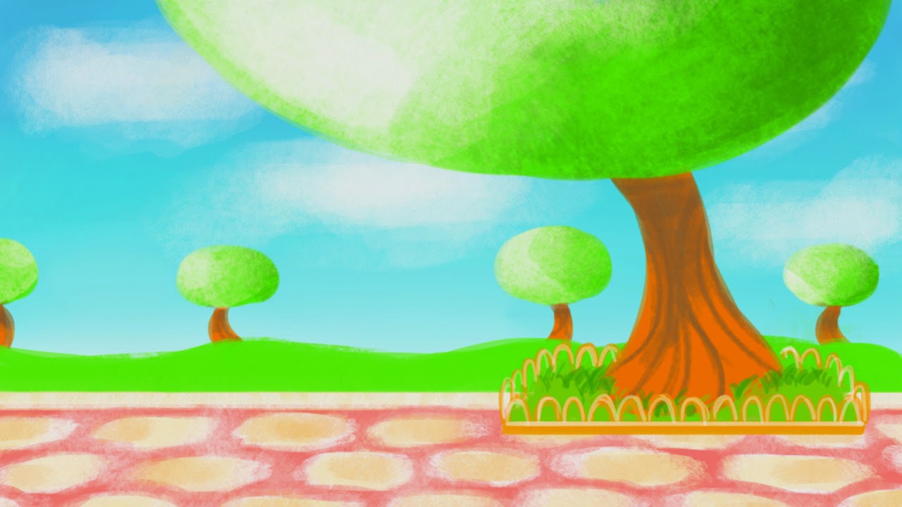
Food Module: Rebecca's Backgrounds - Cake stand backgrounds
Rebecca's final background for the cake stand scene worked successfully as the painted style worked aesthetically with the character designs. The backgrounds helped to make the characters stand out to the audience as well as adding to the overall theme of the animation. It suits the target audience with the colour scheme and the shapes that she has used for the trees and stones in the cobbled path. The use of the cobbled path and trees remind me of a park which was the main background that we wanted for the beginning scene. The position of the tree works well as in the beginning sequence of the animation the Cake Man falls out of the tree and into the roof of the stand. The shapes of the trees remind me of the backgrounds from the cartoon, Powerpuff Girls, through how the distinct shapes of the background define the overall style of the animation, and the trees take round appears with added solid lines to show branches.
The way the background has been structured with the layout works well through how we will be able to offset the design on After Effects when putting all the completed elements together for the final outcome. However there could be a potential problem with the half tree on the left of the composition as this might not blend well into the right side of the image when it is set to offset. The best way to fix this if there is a problem, would be to move the tree further into the design and show all of the tree, or the delete the tree from the composition.
The way the background has been structured with the layout works well through how we will be able to offset the design on After Effects when putting all the completed elements together for the final outcome. However there could be a potential problem with the half tree on the left of the composition as this might not blend well into the right side of the image when it is set to offset. The best way to fix this if there is a problem, would be to move the tree further into the design and show all of the tree, or the delete the tree from the composition.
Food Module: Rebecca's Backgrounds - Through the ages
Rebecca's backgrounds are aesthetically pleasing with the use of colour that enhances the era that it takes influence from, it helps to set the atmosphere well and works with the characters that are based in the frame. I really liked the link through the placement of the ovens which are consistent and help to make the transition of the frame run smoothly when the backgrounds change from one and other. This link was enhanced with the use of the angle of the room and horizon line being kept at the exact place, helping the perspective of each design to work well with the following background. The use of the painted backgrounds help to give it that tactile appearance, giving it depth and character.
My favourite background is the Industrial Revolution design which works incredibly well together with the sepia tones, the use of the lights and the distant background. I loved the element of the window in the scene as it reveals and enhances the architecture of the era. It helped to give the audience some context within the scene and enhance the atmosphere of the piece, working successfully with the character designs.


My favourite background is the Industrial Revolution design which works incredibly well together with the sepia tones, the use of the lights and the distant background. I loved the element of the window in the scene as it reveals and enhances the architecture of the era. It helped to give the audience some context within the scene and enhance the atmosphere of the piece, working successfully with the character designs.
Food Module: Mock up version 2
Having the completed cart and Cake Man designs, Anna put these elements together as to show what the final product would look like. I felt that it worked successfully with all the elements together, however the colour for the background and the characters seemed to clash ever so slightly with how vivid they both were. I felt that by desaturating the background slightly would make the image work with the colours. The other slight problem with the mock up was the height of Johnny, he needed to be taller, to be able to look over the glass however the proportion for the character was correct compared to the height on the Cake Man. We wanted the Cake Man to be quite tall compared to Johnny and making Johnny taller could ruin this image we wanted for the Cake Man. In order to solve this problem we could move the Cake Man closer to the stand or make Johnny taller in general despite wanting the Cake Man to be considerably taller.
I decided to make a quick mock up of Johnny within the Egyptian scene, I felt that the position and height of the character worked well relating to the storyboards, as the scene is a long shot focusing on Johnny and the backer that needed to be added. The colours of the background and the character worked well together as it made Johnny stand out well against the sandy shades of the wall and floor.
Overall I think these different elements will work together successfully and be aesthetically pleasing within the final animation.
 |
| Anna's Mock up |
Overall I think these different elements will work together successfully and be aesthetically pleasing within the final animation.
 |
| Egyptian Scene Mock up |
Food Module: Storyboard Inspiration - Seung Eun Kim
I found Kim's work to very influential with how he visually tells a story within this storyboards. I love the sequential imagery that absorbs the dynamic perspectives of the action, the change of the angle to portray the character to be vulnerable or powerful. I found that this storyboards he made for the cartoon, Young Justice, to be very inspiring through how he draws the follow through of each action with a range of different shots that works successfully with each character. I loved the aesthetics of the shading and line, both were clear and the use of the characters being colour coded worked well with defining each character for the animators. The tiny arrows that are added to the individual frames work successfully with showing the animator the direction of the movement and the action of the camera, without the use of annotations. I loved the close up of the characters faces through the angles and perspectives that Kim uses to enhance the emotion and atmosphere of the scene. In one of the frames an extreme close up shot of a character is shown looking over her shoulder, it made the character appear calculating and calm, considering the plan of action, following this action in the next frames.
I really liked the frames that involve the movement of the camera as it follows the action of the character. For example in one of the sequences it shows a roll that one of the characters performs to avoid a swing from the other character. This roll is shown overlapping the following two frames which I felt worked well with showing the camera movement. I took inspiration from this and absorbed it into my own storyboards, I wanted to show the Cake Man showing different cakes appear on the screen, whilst the camera pans from his left to the right, I felt that this technique would work well in these frames.
I really liked the frames that involve the movement of the camera as it follows the action of the character. For example in one of the sequences it shows a roll that one of the characters performs to avoid a swing from the other character. This roll is shown overlapping the following two frames which I felt worked well with showing the camera movement. I took inspiration from this and absorbed it into my own storyboards, I wanted to show the Cake Man showing different cakes appear on the screen, whilst the camera pans from his left to the right, I felt that this technique would work well in these frames.
 |
| Young Justice |
Food Module: Final Storyboards
Using the rough thumbnail storyboards as a guideline for the new amended versions, I considered the angle and shot in more depth as well as adding clear notes/annotations for direction and action. I added shading to a few of the frames as to ensure that the viewer would understand the distance between foreground and background. I found that in order to produce the storyboards to a high standard and at a quick pace, I had to adopt the character references into my own style of illustration, if I had drawn using the exact character references I would have taken double the amount of time to produce the final boards. As these are the storyboards and not the final outcome for the module the characters not being on complete model did not really effect the viewer, as long as I had produced the characters within the right height and proportion, the scenes would be able to easily be translated to animation.
Beginning Sequence:
- Boards 1-3
I edited the walk cycle to be able to continue for longer, if later on in the production stage, the opening sequence/title card could run as Johnny walks past people and other stalls. I wanted the introduction of the cake to be immediate after the first frame introducing Johnny, as to show the audience the theme of the episode, what information they would be discovering. I felt that this could be carried on with possible future narratives that would follow on from this, especially with the possible idea of introducing more characters like Johnny who would learn about different desserts or other foods. The actual view of the full cart is only introduced before the Cake Man falls out of the tree. I felt that this worked well as the viewer can see the height and distance of the cart compared to the tree, and once the Cake Man gets back to his feet the viewer can see the height between Johnny and Cake Man.
I wanted to make the animation for the Cake Man falling from the tree as easy as possible to animate for Rebecca, but still hold interesting perspectives. I decided to show the Cake Man falling initially out of the tree, with the following frame showing the Cake Man having already fallen through the roof. Using this method, it should make animation easier with not having animate the Cake Man crashing through the roof.
- Boards 4-5
These frames show sequential imagery of the character interactions as the audience watch the characters talk with each other, giving a proper introduction of Johnny's character as well as the beginning to the historical scenes. At the beginning of this module, we brainstormed as a group as to how the transitions between each background, from the original to each of the historical scenes. We narrowed down the choice of these transitions to the background sliding across with Johnny standing in the same place and the other being the Cake Man grabbing the corner of the page to turn to the next scene. I decided to use the transition of the backgrounds sliding across the frame as I felt it would work well with the quirkiness of the Cake Man character and the effect would enhance with the use of sound effects, possibly something resembling a conveyor belt or whirring machinery.
Through The Ages:
- Boards 6-10
Carrying on from the last few frames on board 4, I kept the same shot for each of the historical scenes as to show a link and work successfully with the transition of the backgrounds however in the medieval scene I added a close up shot of the gingerbread that is referred to in the narrative as a different transition, to make the visuals more interesting; in the Industrial Revolution I added a close up shot of the top of the cake that is placed down on the table by the baker, in which icing is added to the top to refer to the invention of railroads that is referred to in the narrative. I felt that his worked well as the the addition of the icing works with the imports of trades as well as the possible extra animation of the train clouds and wheels moving in the completed train shape. This scene then cuts to a medium shot of Johnny as he reacts to the 'piece of cake' pun. From this the following 2 sheets of storyboards, 9-10 show the running sequence of Johnny as he flees from a huge rolling sponge, as the narrative describes the reasoning behind the roundness of the cake. I wanted to link the sponge with the description of the sun and the moon in the narrative, in which both reside in the sky; I needed a reason for the sponge to be in the sky. I decided to go with the sponge rolling and bouncing off a rock, gumdrop or chocolate chip, so that it could be propelled into the air. I felt that this worked well as the following frames show the sponge turning into the sun and the moon with a long shot of Johnny looking up to the moon.
Ending Sequence:
- Boards 11-14
Cake Man appears in the scenes again instead of being the narrator and the audience can see the quirkiness of his character as he interacts with Johnny again, giving him more information on cakes. Board 11 mainly consist of medium shots and close ups, with the main action of the Cake Man pinching his cheeks. However on board 12 more interesting perspectives and movements are shown as the Cake Man forgets Johnny's name, calling him Billy, and replying with 'whatever' which I wanted to show an over the shoulder perspective, giving the main focus of the audience to Johnny. From this it cuts to a panning shot of the Cake Man being enthusiastic with giving more facts on cake and naming a few whilst he prances. Whilst this happens a medium shot of Johnny turning away to then cut to a long shot to show Johnny walking across the background to the original background. This walk cycle holds the same shot as to link with the distance and to make animating easier for Rebecca, I considered adding a front walk cycle showing the Cake Man in the distance continuing to talk and dance with cakes appearing around him, however I felt that this was too much for the young audience and animation wise. The last board shows Johnny stumbling across another stand, this time selling ice cream in which Johnny stops to look at the dessert. I wanted to reveal the ice cream seller gradually, as he steps from the shadows and leans into the frame, in a medium shot, showing his appearance to be much like the Cake Man. As soon as the audience see the ice cream seller his dialogue is cut off abruptly as the credits roll on screen.
Tuesday, 5 May 2015
Food Module: Anna's Character designs - Johnny
Anna's character designs started with simple lines that took inspiration from popular cartoon network and nickelodeon animations, which worked well with the target audience that we wanted to create the final outcome towards. I really liked the facial details as the use of the glasses and the cute small eyes worked successfully. The use of the glasses can be suggested to show intelligence, and can further relate to our animation through this character discovering knowledge on the origin of cake.
The colour scheme works successfully as it works with the theme of cake and desserts as a whole, with room for a similar colour scheme for new characters if the narrative was continued into more episodic animations. I liked how well the tones of the blue hair and pink sleeves contrasted against each other but worked aesthetically together; it reminded me of icing from a doughnut or cupcake.
The age of the character needed to reflect the main young audience that we wanted to aim the animation narrative with, especially with the colours and content of the animation. Having the character being male made the animation suitable for a male audience, normally cartoons that are themed around cake or cooking, only have a primary target market for the female audience. We wanted the character to be suitable for both genders to enjoy, and hopefully show that food is fun within moderation and that either gender can learn to cook; The stereotypical branding of only females being the cook for the family was not what we wanted the animation to hold, we wanted the animation to show that anyone can cook, not just girls.
Overall I personally found Anna's character to work well with the audience and to be iconic through the colour scheme and the appearance of his hair and glasses, which I found essentially made the character. The expression sheets work well with the character as it still held his iconic qualities and were enhance through the use of squash and stretch within the face shape.
 |
| Johnny's turnaround sheet |
 |
| Johnny's expression sheet |
Food Module: Revised Animatic
Before completing my finalised storyboards, I had to cut down the rough animatic to about 2 minutes as to fit with the main deliverable for the module, but also for reference for animation and for the voice actor.
I also edited the rough dialogue that Rebecca had made for the interim crit that I added to the animatic originally. The ending scene of the animatic was the main area that I cut the dialogue, for example the panting for Johnny after running away from the sponge took too much of the duration, round about 7 seconds which is a lot time especially when we come round to animating the scene I cut it down to 1 second. And the other main part part being the description of different cakes that the Cake Man squeals as he dances and prances around Johnny. I found it difficult to cut this as I thought this part of the dialogue worked well with the characters quirkiness and I liked how the names for different cakes were used. Cutting this part out however worked well for the dialogue as it ran smoothly to the next part in which Johnny walks away to the ice cream stand.
After cutting a few more little parts of long pauses that could be cut in half, I managed to reduce the duration of the animatic from 2 minutes and 40 seconds, to 2 minutes and 5 seconds. I tried to cut out another 5 seconds to hit the 2 minute mark, however the pauses that were left needed to be their for the transition of the scenes and rests for the voice acting.
Overall I felt that the cuts worked well with the rough animatic, even though the cuts were not always a smooth transition, it worked for a rough guide for the voice actor.
Monday, 4 May 2015
Food Module: Storyboard Content - Problems with Cooking Methods
I found a few problems when drawing the storyboard with a few methods of cooking that the eras have for baking. The most problematic era was the Egyptian period through the process of the bakers crawling into the oven to place the bread or cake into the oven, in which people would have to hold onto their legs to stop them from falling into the oven and being burnt by the fire. This method was not suitable for the target audience that we had chosen, if the overall theme was something much like the CBBC program, Horrible Histories, this method would have worked well as the script writers would have been able to portray this in a comedic manner. However as our main narrative was light hearted with a different theme of humor compared to Horrible Histories, the method of placing the dough into the oven needed to changed to one that would be more appropriate.
I researched more into the era and started to panic as I couldn't find any other cooking utensil that would not alter the background that Rebecca had drawn. After talking to Rebecca and looking through the research that she had found to inform her background designs, I found that there was a utensil much like a pizza peel that was used in the Egyptian Era. The information that I had originally researched was in the early ancient Egyptian era which was why I could only find the method of the baker climbing into the oven. I was relieved that there was a safer and more practical method for using the ovens in this scene as I did not want to add something that was not historically correct. Not only would it not work with the theme of the origin of cake, but also with the fact that the animation was a documentary and the content had to be factual.


 |
| Horrible Histories |


Food Module: Mary and Max
Mary and Max is a stop motion animation based on a true story; where the main character a young girl from Australia, Mary, decides to write to someone in New York, Max who suffers from Asperger's Syndrome. I found that this animation even though not labeled as a documentary itself, is in fact informative. It opened my eyes to Asperger's Syndrome, depicting the problems and habits that can stem from it, I felt that this was important for the audience to know the problems that people who suffer from it go through. Even though these problems were portrayed within a light-hearted manner, it helps to see Asperger's Syndrome with what it can do. These acts and emotions are shown extremely well through the use of body language that the animators perform through the model and are enhanced with the facial expressions. The lighting and tone of both point of views for the two main characters contrast, which work well with portraying their personalities and where they live.

I found the black and white depiction of Maxs' scenes to be fitting with the dismal city of New York and how much he hated the sounds and smells, it reflected his state of mind. I did like how the only colours that were shown in 'his world' were the colour red and anything that Mary sent him. I loved the merge of the colours when Mary finally met Max, and Maxs' 'world' became filled with colour, almost breathing a life into the atmosphere. This scene was also quite emotional through how the audience watch both of their lives unfold up until the point in which they meet. You become attached to both of the characters and you feel the emotions that Mary goes through when they finally meet each other. However as the camera turns to show Max, we discover that Max has passed away peacefully, with the letters from Mary near him.


I found the black and white depiction of Maxs' scenes to be fitting with the dismal city of New York and how much he hated the sounds and smells, it reflected his state of mind. I did like how the only colours that were shown in 'his world' were the colour red and anything that Mary sent him. I loved the merge of the colours when Mary finally met Max, and Maxs' 'world' became filled with colour, almost breathing a life into the atmosphere. This scene was also quite emotional through how the audience watch both of their lives unfold up until the point in which they meet. You become attached to both of the characters and you feel the emotions that Mary goes through when they finally meet each other. However as the camera turns to show Max, we discover that Max has passed away peacefully, with the letters from Mary near him.
I found one of the scenes in particular to be quite powerful with the message that it portrayed; Mary graduates from university and writes a book on mental health in which she is so extremely proud of that she sends it to Max. Having received the book, Max grows angry as he never saw Asperger's Syndrome to be a disability before, and in his rage he sends an important gift that Mary sent him back to her as a powerful answer to her book. The emotions and problems that Mary goes through from receiving the letter seems to continue to spiral downwards from that point. I found that this connection between the two friends that had never met each other to be so sweet and this scene pulled on the heart strings with their fight, through how the audience have this connection from the previous scenes in which both help each other in their daily lives.
I felt that the narrative worked extremely well with the added humor and notes on both of their lives, especially with Maxs' facts about having Asperger's Syndrome. This form of narration, even though the animation was aimed at an older audience, would work with children, through how information is translated to the audience through a story rather than an infographic.
Saturday, 2 May 2015
Food Module: Group Research Presentation Part 2 notes
Types of Documentaries:
Poetic - Early days of cinema involved a Russian montage, a montage of clips - these hold little dialogue - lets the imagery and visuals speak from themselves - this can be more emotional to the viewer through the lack of dialogue - a sense of tension and lack of power to change anything is evoked with in the audiences emotions.
Expository - Voice over - a narration takes over and explains the visuals
Observational - fly on the wall, editor is still shaping something, was quite popular in the late 60's and 70's - non interference - some just left a camera on a tripod and recorded everything - 'simply observing' - could be interpreted to be quite intrusive - audience knows that they are watching and the people on camera do not know they are being watched.
Reflexive - Documentary is aware of itself or process - relates back to Russian montage - Man with the Moving Camera - in animations, you would see the hand drawing the image.
Performative mode - experience by him or her - used as a device to understand a story
Research into different documentaries:
The Sinking of Lusitania, Winsor McCay 1918 - Considered to be the first animated documentary - due to the technology at the time, public believed that the animation was happening in real life - real recorded footage.
Educational Animation - A is for Atom 1953 - General electric company - narration over the animation - very desaturated - film grain quality to the aesthetics
I really liked the narration over the animation it worked really well, and I felt that this would work with a children's documentary with the tone of voice that could feed information to the viewers.
The overall appeal to the animation was quite dark, wasn't visually engaging with colour or shapes however it became interesting with the animation included. It needed to be educational, explaining what an atom is, ultimately selling the idea to young and old audiences.
War story - Aardman 1984 - channel 4 interview narration - real life stories - illustrated radio - relates to another one they did 'Thief' - interview a thief that was caught and animate his story with the same visuals - interesting view.
Studio AKA - Meth Project Campaign - Poetic visualisations - voice over being interviews with some of the young audience that it has effected - showing real life stories - more emotional, especially seeing their age.
Each interview tells the story of how each child started to take meth and what experiences they went through, with a narration of which over the top of each animation. The style of animation varies but each holds its own aesthetic not only complimenting the narrative but enhancing the atmosphere of the visuals, making it more engaging for the viewer. I quite liked the animation for Rochelles' story, it holds a grunge appeal with a digital paper animation technique. It reminded me of the animation style for the cut scenes in the game Madness Returns, with the paper animation that works with the theme of the game. I felt that the use of the paper like animation in Rochelle's story worked well as it emphasised the engulfing and toxic properties of the drug. To use these animation techniques in a possible food documentary, I would have to use a very dark theme for example slaughter houses, in which only mature audiences would be able to view.

Sensory Overload - interacting people with autism - no dialogue but making people aware of this problem - abstract way of portrayal - rotoscope - goes from back and white to vivid colours when it overwhelms the character - shows someone trying to help him at the end - a nice touch.
I loved the aesthetics for this animation, the use of style of animation merged with the use of line and lack of colour unless symbolising the affects of autism worked successfully in portraying this to the viewer. I really liked the use rotoscope for the animation technique as it made it feel personal as a form of connection is almost made with the main character as the audience see the trouble that he goes through. However no-one else can see the visuals of the sound. I have some experience with rotoscope from my applied animation from level 4, in which I created a title for a comic. I thoroughly enjoyed creating an animation with rotoscoped elements and with this documentary module it could be a good way to improve the skills I have already learned and refine them.
Invisible pictureshow 2013 - very web based and interactive - would be ideal for a young audience - keeps their attention - idocs - hosts lots of projects - interested in advancing software - allows you to thread sites into it - education starting to be more interactive - occulus rift - how can this be used for animation?
I really liked the idea for this campaign with the interactive elements that it contained. In felt that this would attract a young audience as well as an older audience through the game like aspect it contains, as well as it being educational. I found that this would work with a darker tone to documentaries with engaging the audience within the atmosphere with the aesthetics, but it would also work with a light hearted approach to a documentary however it would most likely only appeal to a young audience. I liked the idea of considering how this, and an animation could be translated to new technology, the occulus rift. This is brand new and the capabilities/limits to this technology still haven't been founded. The idea of an animation being immersive to the audience in which they become part of the action and the story sounds amazing, and something that would greatly effect the way we perceive animation today.
Poetic - Early days of cinema involved a Russian montage, a montage of clips - these hold little dialogue - lets the imagery and visuals speak from themselves - this can be more emotional to the viewer through the lack of dialogue - a sense of tension and lack of power to change anything is evoked with in the audiences emotions.
Expository - Voice over - a narration takes over and explains the visuals
Observational - fly on the wall, editor is still shaping something, was quite popular in the late 60's and 70's - non interference - some just left a camera on a tripod and recorded everything - 'simply observing' - could be interpreted to be quite intrusive - audience knows that they are watching and the people on camera do not know they are being watched.
Reflexive - Documentary is aware of itself or process - relates back to Russian montage - Man with the Moving Camera - in animations, you would see the hand drawing the image.
Performative mode - experience by him or her - used as a device to understand a story
Research into different documentaries:
The Sinking of Lusitania, Winsor McCay 1918 - Considered to be the first animated documentary - due to the technology at the time, public believed that the animation was happening in real life - real recorded footage.
Educational Animation - A is for Atom 1953 - General electric company - narration over the animation - very desaturated - film grain quality to the aesthetics
I really liked the narration over the animation it worked really well, and I felt that this would work with a children's documentary with the tone of voice that could feed information to the viewers.
The overall appeal to the animation was quite dark, wasn't visually engaging with colour or shapes however it became interesting with the animation included. It needed to be educational, explaining what an atom is, ultimately selling the idea to young and old audiences.
 |
| A is for Atom |
Victory Through Air Power - 1943 - Disney - Propaganda? - sketchy - hand drawn - relies on sound.
Tiny little super guy - sesame street - childrens educational puppet show - count dracula and cookie monster - uses a plastic cup to animate on - cell animation - quite light hearted - visually appealing to a very young audience - the use of interesting characters helps the children to learn with the information given.
'Charley Says' PSA - Central Office of Information - cel animation - very jagged animation - voice used over the top of the animation makes it look as if they are looking down at the kids - relates to 'every mothers nightmare' - informative but the sound effects and visuals make the video seem idiotic and not pointless - common sense.
I found this animation quite terrifying and pointless with the information given to the audience. I felt that the majority of the animation should have been common sense to the public anyway. The tone of the animation was quite patronizing even for the younger audience. The style of the animation works with the era that it was made but the audio is quite scary especially with the cat.
War story - Aardman 1984 - channel 4 interview narration - real life stories - illustrated radio - relates to another one they did 'Thief' - interview a thief that was caught and animate his story with the same visuals - interesting view.
Studio AKA - Meth Project Campaign - Poetic visualisations - voice over being interviews with some of the young audience that it has effected - showing real life stories - more emotional, especially seeing their age.
Each interview tells the story of how each child started to take meth and what experiences they went through, with a narration of which over the top of each animation. The style of animation varies but each holds its own aesthetic not only complimenting the narrative but enhancing the atmosphere of the visuals, making it more engaging for the viewer. I quite liked the animation for Rochelles' story, it holds a grunge appeal with a digital paper animation technique. It reminded me of the animation style for the cut scenes in the game Madness Returns, with the paper animation that works with the theme of the game. I felt that the use of the paper like animation in Rochelle's story worked well as it emphasised the engulfing and toxic properties of the drug. To use these animation techniques in a possible food documentary, I would have to use a very dark theme for example slaughter houses, in which only mature audiences would be able to view.
I loved the aesthetics for this animation, the use of style of animation merged with the use of line and lack of colour unless symbolising the affects of autism worked successfully in portraying this to the viewer. I really liked the use rotoscope for the animation technique as it made it feel personal as a form of connection is almost made with the main character as the audience see the trouble that he goes through. However no-one else can see the visuals of the sound. I have some experience with rotoscope from my applied animation from level 4, in which I created a title for a comic. I thoroughly enjoyed creating an animation with rotoscoped elements and with this documentary module it could be a good way to improve the skills I have already learned and refine them.
Invisible pictureshow 2013 - very web based and interactive - would be ideal for a young audience - keeps their attention - idocs - hosts lots of projects - interested in advancing software - allows you to thread sites into it - education starting to be more interactive - occulus rift - how can this be used for animation?
I really liked the idea for this campaign with the interactive elements that it contained. In felt that this would attract a young audience as well as an older audience through the game like aspect it contains, as well as it being educational. I found that this would work with a darker tone to documentaries with engaging the audience within the atmosphere with the aesthetics, but it would also work with a light hearted approach to a documentary however it would most likely only appeal to a young audience. I liked the idea of considering how this, and an animation could be translated to new technology, the occulus rift. This is brand new and the capabilities/limits to this technology still haven't been founded. The idea of an animation being immersive to the audience in which they become part of the action and the story sounds amazing, and something that would greatly effect the way we perceive animation today.
 |
| Invisible Pictureshow |
Food Module: Group research presentations notes
Ratatouille, Disney Pixar Studios, 2007 - inspiration for representation of food, merging colours and shapes as the rat tastes food. Relates to the 1st year module in which we created visuals for sounds, using colour, shapes and line - this experience that I have gained would be useful if I were to make a test or my own adaptation from this inspiration. The use of the colour and shapes would attract a younger audience, this would work well if the main target audience for the project is this age range. Would work well as an episodic type short that followed a children's program.
One Human Family, 2014 - Caritas.org - group commissioned the animation for the Food For All campaign. I found this animation quite emotional through the movements and the appearance of the characters. Each movement was desperate, it showed the level of starvation that they were going through, I felt that the layout, with the distance of the food and the people worked well with the message that the company wanted to portray, the fact that food is scarce, and with what little food there is it is shared or stolen. I also found that message was enhanced with the appearance of the characters, at first I thought it was stop motion however I soon realised it was 3D animation, most likely made with Maya. - Look into the hate waste website, shows the public how much food is thrown out when the food isn't even rotten, it is still edible - could be a good theme for the documentary - http://england.lovefoodhatewaste.com - Think about opportunities as could submit the animation we make to animation competitions such as the RSA daily diet brief - could be a good motivation and make us get our work out there.
Man, 2012 - shows how man destroys earth with the amount people consume, sell and waste - used flash, after effects, cg. I quite liked the animation for the message it wanted to portray to the audience, the extremely stylised appearance of the man worked well as he continued to walk through the animation. The use of the black and white, greyscale environment made the atmosphere deepen with how dismal the actions are, against the coloured backdrop. I felt that the main appeal for this animation was the audio used. It made the animation that much more shocking to the audience, especially with the added humor at the end. I found this form of documentary quite appealing through how there didn't need to be any written or spoken information, the visuals were enough to inform the audience.
Back to the start, 2011 - commercial, chipotle.com
Another documentary that doesn't need any written or spoken information to relay the message to the audience. I really liked the use of the animation technique, stop motion, it made the appearance aesthetically pleasing. The use of the cute animals and characters made the advertisement quite emotional through how the audience see the process of the pigs being processed into meat that is sent to supermarkets. I felt that the way that the animation was directed with not showing the gruesome parts to the pigs being process worked well as it meant that this advert can be shown to children. I think that best part of this animation is the ending in which the farmer realises that he can change and do something good, showing the main message behind the animation successfully. A huge aid for the animation is the audio, the song that is played along with the visuals help to set the tone and atmosphere of the animation well.
Charity Water - water changes everything - it all starts with water
This documentary is in the form of a motion graphic through the use of the kinetic text and simple layout. I felt that the simple layout worked well as it portrayed the message well and the information was easy to follow. The main aid for this animation was the narration, the emotion that was put into her voice aided the visuals well and pulled at the heart strings. The use of the colour linked nicely with the theme of water, and worked with the general aesthetics. I quite liked how the animation showed the journey of the girl going to collect the water, in which the audience see what is actually in the water. The use of showing how the donations that the audience give could effect the girls life worked well, as it depicted how much the audience could do. I found that this form of documentary would work well for all audiences and could be a possibility depending on the theme of food that I wanted to go with.
Advice who is your audience? - targeting a specific audience? futurefoodchickpea.com
Advice who could you help? - Pay as you feel cafe in leeds, consider contacting local charities or communities - make something that promotes them - post online etc - think global, act local
Subscribe to:
Posts (Atom)