Sunday, 10 November 2013

Apply Animation - Final video


Heres my final animation for the Apply brief.
My animation has changed alot from the final storyboard through how I added an extra scene and drew a monitor in which it was shown. I felt that this worked well as it made the story more interesting and engaging to the viewer. If I had more time with this animation, I would focus more on the zoom in, into the characters waiting for the Pumpkin, overlaying animation to make it move more smoothly.
Through Group critic, I found that I also needed to slow parts of the animation down and add more frames for the crying part for the pumpkin near the beginning of the short. There was also positive feedback through the use of colour and storyline.

Apply Animation - Surprise! (Making of)

Making my Apply Animation via Photoshop was an easy process to gain both good lineart and colour to the 5-10 second short. By using Photoshop, I can use the Frame by Frame animation, making it easier to make slight changes to the frames or reducing/increasing frames to make a smooth animation.
Through out the animation, I found it easier to separate parts of the sequence with in group folders, this helped me to keep my work organised and not become confused with which frame I would be working.

Here are a few screen shots to show how I edited my frames:

I first quickly sketched out the frames before editing the lineart. It is easier for me to sketch in a big brush size as when editing I can clearly differentiate the sketch and the final ink.

To edit the lineart, I first lower the opacity of the sketch layer and ink on top.


Comparing sketch to final lineart


Final lineart - I worked mainly on a basic 4pt brush to get the detail of the characters.


I purposely separated the foreground and main characters lineart and coloured this separately so that I can later blur the characters in the background to create a better sense of depth and focus the attention on the main characters.


Comparing the background colour - before and after
 

Final edit, adding a slight Gaussian blur.


Saturday, 9 November 2013

James Jean


James Jean Sketch Book known as a fantasy illustrator, best known for his wall art for Prada.

James Jean is by far one of my top five favourite artists, purely through how he creates such beautiful and meaningful work that seems to connect with its viewers both through how aesthetically pleasing it is to the eye and also through how the use of line, emotion, expression and use of colour makes the piece whole.

I admire James Jean the most through his sketch books, as he is able to just sit and draw people on public transport and portray their expression through just the use of a ballpoint pen. The singular use of adding a red ink to the lineart completely changes the outlook on the character shown. (I love how Jean can just draw people in a semi realistic portrayal and then create something completely fantasy based splashed with vivid colours.)


Drawing whilst on the train

Drawing on the underground


Part of  the Wall Mural illustration at Prada

Concept art for the animation "Trembled Blossoms"


As part of his work for Prada, Jean created concept art for an animation for Pradas latest season.


I loathe this animation, I love James Jeans work but the CG animation loses and contorts the beauty of Jeans illustrations and watching this, I cant help but compare it to his concept art for it and it makes me mad. I was expecting a beautiful animation that absorbed his concept art and made it move, not something trying to be 3-D and traditional at the same time. Not only does the short not look aesthetically pleasing, the kinetic movement of the characters is slow and sometimes jagged. (End of rant)

I feel that this animation can be significantly edited and made to such a better quality of work, if they just lose the CG and revert back to a more traditional means.

Thursday, 7 November 2013

Alma - Rodrigo Blaas


Alma from Anderson on Vimeo.


The video starts with a view of the city, slowly ease in/zooming in on the main character, dancing through the street and writing his name on the wall. As he turns around, he sees a doll which looks just like him, so he tries to investigate. The shop door opens and he is greeted by an array of dolls, with a doll on a tricycle trying to get out the shop door.  As Alma reaches for the look alike doll, he ends up turning into the doll and we see that every doll there was also a child, and the cycle continues, awaiting for the next victim.

The animation uses digital process, such as Maya and possibly Unity 3D (however this is used for game design), which gives the animation a young audience approach matched with the softened and big eyed design of the main character.
In this animation short, I like the use of the detail of the frost and the snow falling, matched with the texture in the characters clothing, aids the aesthetics of the short.
The use of reflection of the characters expression as he looks into the window display works well through how it shows the intrigue and curiosity of the character. The movement of the character runs smoothly and life like through the slump and casual body language of the boy. 

Fear of flying - Conor Finnegan

A live action animated short film by Conor Finnegan.


FEAR OF FLYING from conorfinnegan on Vimeo.


This animation short contains a beautiful model set and backgrounds matched with the process of a digital animation layered on top. The use of this animation fits well with the story, which portrays an owl who has a fear of flying, and matched with this model and digital approach, it somehow engages the viewer more.

The plot follows an owl named Dougal who goes out to buy and stock up on food for the upcoming winter and bumps into two other owls, Lucy and Dick, who are about to fly south for the winter.
As he is too scared to fly, he lies and tells them he'll meet them later, and after buying food he ventures home. During that night he is then robbed by a squirrel and all of his food has gone. Knowing that in order to survive he has to fly south, he attempts to fly and falls straight to the ground. He decides to try and walk south but as soon as it looks as if his luck has ran out, he finds an airport in which he boards a plane and heads south. After flying in the aeroplane he believes he has overcome his fear of flying and meets Lucy again in the south.


A glimpse into the MAKING OF "FEAR OF FLYING" from conorfinnegan on Vimeo.


It was interesting to see the making of the animation through how they moved the model and merged this process by layering the digital animation over the top. I also like the use of the pulley to move the model which is then replaced with the digital limbs. Adding both of these processes together worked well through how the tactile appearance of the set and model make the short aesthetically pleasing and the digital process being used for the kinetic movements of the characters. The use of the green screen in the background is genius through how it gives a sense of depth and the scene being in another animated world. 

Apply Animation - Storyboard


For my initial idea of the surprise theme, I quickly sketched out the key frames of the short and was able to easily see and plan the animation through the use of these thumbnail storyboards.

initial storyboard 1

In these thumbnail storyboards, I vaguely considered the angles of each frame, which I need to consider when I create the final storyboards. 


initial storyboard 2

When creating the final storyboards, I thought about the distance between the character in the frame and the objective, for instance, looking behind the character, zooming out, low angle or close up, needed to be considered.  The angle of the frame and the expression of the character can help to create an atmosphere or strengthen an emotion that you want to get across to the audience, for example, to portray happiness, you would use a close up to show the expression of the characters face, or to portray depression/sadness, you would use a high angle of a character curled up in a corner of a room.


Part 1

Part 2

Apply Research - Looking at Animations that incorporate Photoshop

To gain inspiration for my Apply animation, I scoured Vimeo and Youtube and found interesting animations that had incorporated Photoshop into their work.


Mac 'n' Cheese from Mac 'N' Cheese on Vimeo.

This first animation is very detailed and holds a digital painted quality that is aesthetically pleasing and works well with the plot and style of the animation. The movement of the characters flow well as there are no jagged movements and the frames of the movement aren't visible to the eye.


Rabbitkadabra! from Rabbitkadabra! on Vimeo.

This animation is created through the use of Maya, Photoshop and other digital software. The style of the animation is cute through the portrayal of the soft lit scenery, characters that have big eyes and detailed appearance, eg texture of clothing, added freckles, etc. I found this video inspiring through the expressions of the characters and the plot of the animation, as it absorbs a happy ending which is appealing to a young audience.


The "A Fox Tale" animation is created through the use of Photoshop, After Effects and other digital software which creates this soft CG animation style that reminds me of a less textured Kung Fu Panda. (I also think its due to the kung fu/martial arts action scene in the animation that reminds me of Kung Fu Panda)
The animation is aesthetically pleasing through the use of the frame angles, close ups, long shots to make parts of the animation dramatic and the illustrative style used.

Apply Animation - Leek the Pumpkin reference Photography


To understand the character 'Leek the Pumpkin', I wanted some reference as to draw the head. As it was Halloween not so long ago, I used my primary photography of the pumpkin I carved as reference.
Using this reference helped me with the shape and lines with in the pumpkin head. For my designs, I will change the amount of light shown in the eyes to a darker hue and only draw a flame on the candle as the source of light. This is to make the character seem more cartoon like and cute; if I were to add a lighter hue with in the eyes and mouth it would make the character seem less aesthetically pleasing to the eye.


Apply Animation - Surprise!


For the Apply brief, I was given the task to create a 5-10 second animation that absorbs the theme of one of these words:

Surprise, Lateness, Love, Hate, Longing, Happiness, Fear

Instantly, I created a mind map, jotting down ideas for each word. I couldn't decide between two key ideas which really stood out to me, these ideas branching from surprise and longing.


initial mindmap - generating ideas
 Longing -
  • Setting, cold winters day, snow everywhere, little girl walking home with her parents.
  • A little girl sees a teddy bear in a shop window and wants it, looks up at the mum, she shakes her head, looks at the dad who gives in and gets her the bear.

Surprise
  • Setting, rain on windows, stuck inside the house.
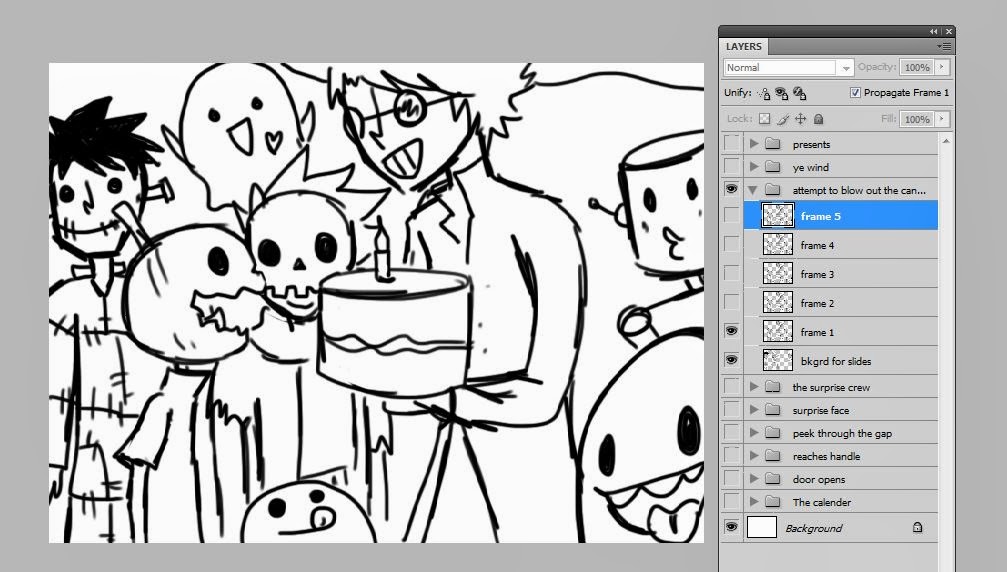
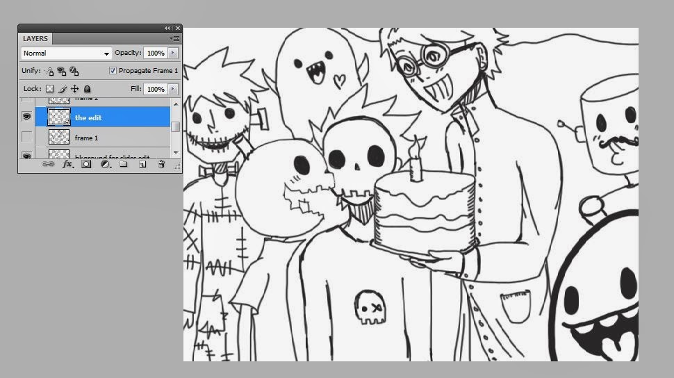
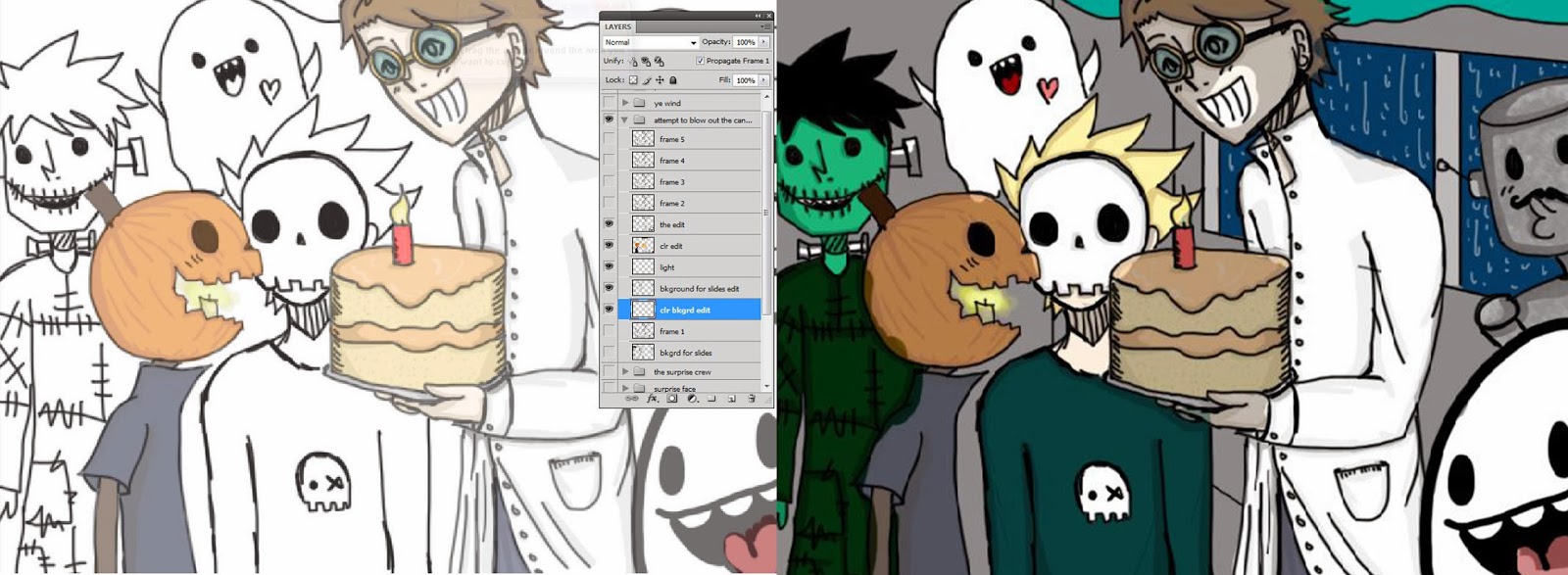
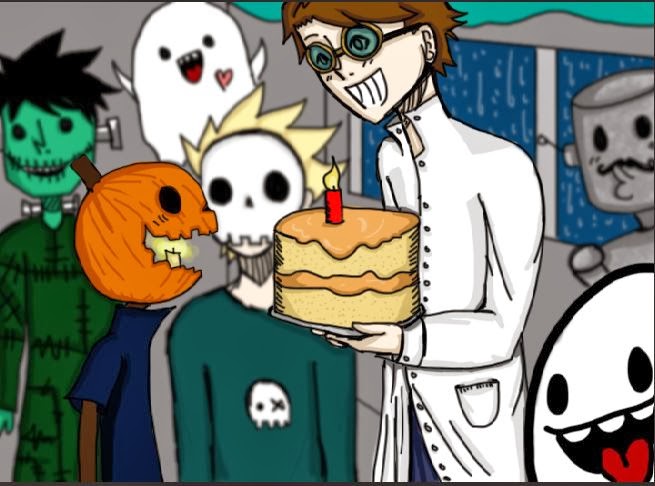
  • Its Leek the Pumpkin's birthday and he's upset as he believes that no one remembers his birthday however he hears something from behind a door which he opens to see his friends with birthday gifts and cake. 

When drawing initial sketches of both of the ideas, I felt that the Longing idea would take more than 10 seconds to give the viewer the full story and would be designed in a more detailed style to show how cold and wintery the scene is.
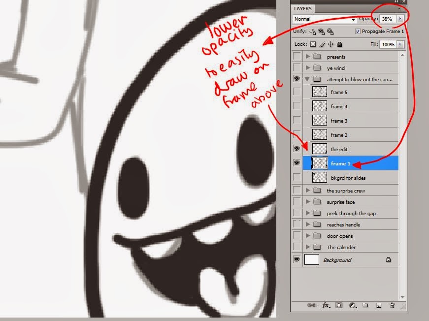
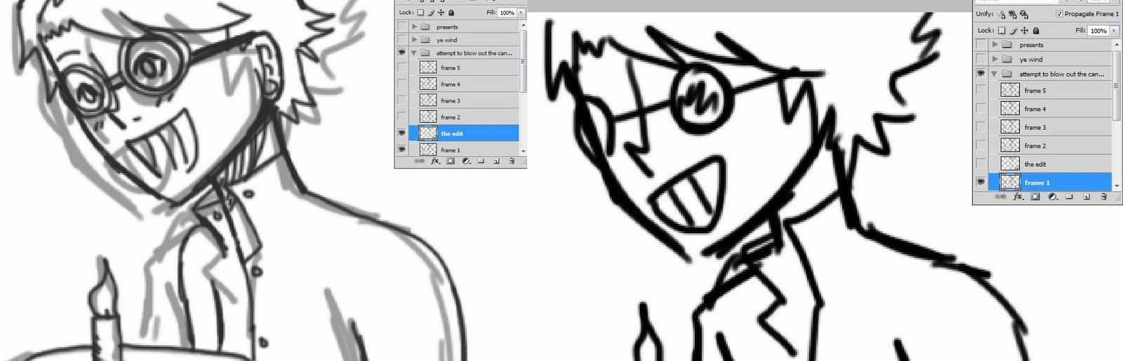
However the Surprise idea would allow me to easily add or remove parts of the story and simplify the illustrations. With this theme and use of my own characters, I felt that I would be able to produce a good animation through the process of Photoshop, Frame by Frame.
This process would allow me to easily add colour and change slight movements through using a graphic tablet.

I first created character sheets of the Scientist, Leek and the Skull boy, before creating the final storyboard. Creating the character sheets first helped me to understand the designs better and keep for reference.


'Leek' the Pumpkin


No one knows his real name
(Nickname: Stein)
The Scientist 

Cyrus
(Nickname 'Peanut')
the Skull boy


I wanted my characters to absorb the same style of characteristics of the two main characters, Leek the pumpkin and The Scientist, through how "halloween" and "Frankenstein" like, that the characters emit to the viewer. I then created another design, of a boy with a skull mask called Cyrus, which I felt matched well with the previous characters through the theme and style of illustration.

Salesman Pete


Salesman Pete from Salesman Pete on Vimeo.

from the steakollective.net

http://steakollective.net


Salesman Pete is an animation created by the Steakollective group, who design short animations full of humour and aesthetically pleasing digital illustrative designs.
(See more of the animations, such as Meet Buck and Dog, on their vimeo.)
The story follows a salesman who is actually a secret agent and has a microprocessor implanted into his brain by some mad scientists, which gives him amazing strength and other qualities such as being able to cook. His steak sidekick joins him on his mission to retrieve this magic stone that can change anything into seafood, which has been stolen by some villains.

This animation holds gorgeous digital painted designs giving a unique style to the short, which makes me love it that much more with the added humour of the piece. The facial expressions of the characters makes the animation that much more fun and intriguing through how it completely portrays the emotion across to the audience without the aid of dialogue.

I would imagine that to be able to create this piece more than one digital animating program would have been used for certain parts of the short, for example mixing After Effects, Photoshop - Frame by Frame and Maya.


Walter Drop - designed by Steakollective

Back to the future redesigns - Steakollective

In the Steakollective group, there are different illustrative designs which are interesting to see as I can imagine each being animated into a short through the cartoony ink and colour of the characters. 

Saturday, 2 November 2013

Undone - Stop Motion by Hayley Morris


The stop motion animation "Undone", portrays the affects of Alzheimer's through the use of the sea and string as it devours an old mans memories and identity. The model of the old man is made with such attention to detail and semi realism which makes the model seem slightly creepy through how the rest of his body is made from similar string to the one that is taking his memories.

- Summary of plot -
An old man at sea fishing at sea, catches a blossom tree, which fades along with what could be a memory.
nostalgia and loss. Catches another memory, which he tries to hold on to but the string takes it away. He keeps catching memories alas the string tears it away, leaving the man confused and sad.
eventually the string and sea engulfs him and he reverts back to being a child.
- End -


I feel that this video beautifully portrays the way Alzheimer's effects people through the use of string as it eats and drags away his memories and the sea, which is distant, desolate and vast. The added sound track aids the animation through how it makes the stop motion feel daunting through the distant obscured voices that seem to echo and unravel into the sound of the sea, making the scene quiet but not peaceful.
In this short, the sea makes the character shown isolated, with suggestions of fear, bewilderment and child like mannerisms as he approaches each memory with confusion.
The sound track includes what I can only describe as a high pitched kettle whistle, distant obscure voices, the sound of crumpled paper which gives me the interpretation of alienation, empty space, unravelling and makes me think of something slowly being chipped away.

Tuesday, 29 October 2013

Eddsworld - Hammer and Nail by Edd Gould


Eddsworld is a youtube channel which posts short animations about 3 main characters in a day of their life. The main characters, Edd, Matt and Tom, all have different personalities which aids the humour of the animations. Edd Gould makes his animations through the use of the program Adobe Flash and Photoshop, this can be seen through the digital illustrations and movements of the characters.

I love the animations of Eddworld, through the amazing short stories that are matched with great humour and simple illustrative style that attracts an older audience, 12 +. A younger audience would not be suitable through some scary images, for example the zombies in 'Zombeh Nation', and the character design. ( A younger audience needs a clear objective, cute drawn young aged character and repetition of the objective with bright and pastel colours). The use of the digital program used to create the animation works well in this short as the characters movements are smooth and change to the next action point easily with out any jagged movement.


In this particular episode Edd and Tom decide to build another floor for all of Matts collection of bits and pieces, and instead of hiring builders, they try to do it themselves. As they begin to build, their neighbours mock them with their extension they built last week. Matt is given the task to buy nails, but buys everything but nails... After the roof has been built and built again, Matt is able to move his stuff into the attic, however when he goes to sleep, he gets attacked by something in the darkness...To be continued in part 2!


In part 2 of the video, Edd and Tom go up to Matts room and discover that Matt has tided his room and Matt has been possessed. After an argument between Matt and the demon, the demon retreats back into the house, not letting anyone else back in. Desperate they ask the neighbours for help but get laughed at instead, then the demon knocks down the neighbours extension, which was actually a cardboard cut out. 
The trio go head first into the house and reason with the demon after a beating from the spirit. The demon realises that he is actually haunting the wrong house and haunts the neighbours instead. 


Carn


- Summary of plot -
A dark tale, which portrays a young boy lost in the woods, cold, tired and hungry, the boy collapses and is greeted by a wolf. The wolf gives him a chance to life, by killing the wolf, wear its fur and eat it's flesh to survive, in return he must look after the wolf's young. The boy accepts and devours the wolf.
It cuts to the boy's parents looking for him, however when they come across their son, all they see is a wolf and the mother shoots the boy dead.
- End -


Carn - Jeff Le Bars from Jeff Le Bars on Vimeo.

I adore this animation, the composition of the 3-D and pose to pose animation fits beautifully within this stylised illustrations which create a tense and chilling atmosphere.
The use of making the character become silhouetted as to emphasise the blood works well as it drags the focus of the audience in and captivates them, making you feel shocked that a scared little boy has turned into this other creature that wears the skin of the young wolf cubs mother.
The music that accompanies the boy as he finally meets his parents again gives a sense of forboding as the realisation of the parents not knowing that it is their son and not the wolf, gives a cringeworthy effect as you wait for the gun to be fired. I found it especially shocking that the mother did not hesitate, grabbed the gun and shot her gun. (Then again they did think they could see a wolf.)
I feel that this animation has a moral behind it, something among the lines of, 'Whos the real monster?' or 'you are what you eat' in the sense of the boy eating the wolf.


Jeff Le Bars Sketch for short

Jeff Le Bars - Carn design

Pendulum - drawing animation with the aid of a light box

After what I thought would take me forever to complete, I created a moving pendulum by using a lightbox to help me draw the arc and plan the main key points of the animation. I first used a light blue pencil to help me to sketch out the arc of the pendulum and then roughly draw where the 25 points of the pendulum would go. (Using a blue pencil for rough sketches and drawing over the top with fineliner or pencil works well as the blue cannot be read when photocopying the work.)

I knew that the 1st, 7th, 13th, 19th and 25th points were the main key points, and I had to plan the inbetween points in such a way that it makes the pendulum slow down nearer the top of the arc and faster near the 7th and 19th mark.

Slowed down to see each individual frame

Normal speed


My attempt at the pendulum worked well through how the swing of the pendulum runs in an arc and gains speed as it swings back to point 7 and 19.
I found this task difficult but interesting at the same time, as I've essentially learnt part of the basics and want to experiment more with different movements.

Monday, 28 October 2013

Louise Bagnell


Louise Bagnell's graduate short, which she made in 2007, portrays a timid girl that doesn't have enough confidence to make friends and decides to go exploring, where she can be herself in her own world. She stumbles across a 'jack in a box' and angers a robot bee which flies out of the box. As she runs away from the bee, she accidentally bumps into another character, and they become friends, exploring together. 
This animated short would be suitable for a young audience through the use of the main characters design, the colouring used, the music and the plot of the story.
In my opinion, I believe that Bagnell uses traditional pose to pose animation through the sketchy design of the characters and the background illustrations. 


Marmalade by Louise Bagnell


 Blogspot     -    Tumblr     

Food - Jan Svankmajer 1992


Jan Svankmajers work is something to be inspired by through the composition of the animation, the plot and how smoothly the pixilation runs. I feel that the pixilation works well with these stories, as it would not be as funny and flow as well if the animation was made traditionally with cel animation, the use of people with in the animation makes the humour and the plot work.

Svankmajers work inspired me through how he used perspective and angles of his frames to his advantage to get the point of the action across to the audience.
The audience of this video would only be suitable for an older audience through the plot used and the more complicated storyline. For a younger audience, a simple story with bright colours is needed to attract the attention of the target market.


- Summary of plot -
This video shows 3 pixilation, animations that suit the theme of Breakfast, Lunch and Tea.

The first part of the video - Breakfast -
Shows a man walk into a room and sit down with another man, he sees that in order to get food, he has to follow a few instructions which is around the sleeping mans neck. The use of the humour merged with the animation well, especially with the model clay face as the man pulls out the other mans tongue to pay for the meal. I love how the plot forever continues through how the next person who comes to eats a meal becomes the next 'serving machine'.

The second part of the video - Lunch -
Two men sit down for a meal at a restaurant and try to get the attention of the waiter. One of the men decides that he can't wait any longer for food, and begins to eat the flowers on the table, in which the other man decides to follow in suit. In the end they begin to eat their clothes, the cutlery and the table, till the man decides to eat the other man.

The third part of the video - Tea -
It begins by showing a man adding different condiments to his food which we cant see yet however from the sounds of the condiments, it makes the audience feel as if the food is vile and disgusting.
It pans out to show him eating an arm, which I believe could have been his own arm, as his left arm is made of wood. It then shows other people eating other limbs, such as legs, boobs etc.
It had a funny approach to self cannibalism but also a suggestion of 'people will eat/try anything', I feel that this also relates to peoples self greed.

- End -


Alex Grigg - Phantom Limb - Late Night Work Club


Late Night Work Club presents GHOST STORIES from Late Night Work Club on Vimeo.

Griggs animation, Phantom Limb, starts at 18:40.

Griggs animation short portrays a woman who has lost her arm and her partner who feels guilty for the loss of her arm. In this short we follow the man as he tries to cope with his guilt, which ends up engulfing him and causing him to drink and see her arm wherever he goes.
He comes back late one evening and realises that he can be there for her and act as her other arm.
The music used in the animation adds to the feeling of loss and dread that both of the characters are coping with at the same time. Matched with these aspects, the form of the digital based animation absorbs a traditional feel to it through the line and solid fill of the illustrations.

The animation runs slowly and is visually stunning through the art portrayal and the plot of the short.
In my opinion, I believe that Grigg has used digital and pose to pose animation through the movement of the characters and colour used in the short. The pose to pose animation would have been used for the movement of the characters and the transport used, the digital side being the application of colour and putting every frame together.


(Griggs part is shown at the start for 10 seconds. Animators were given a set of colours to work with and animate imagery of their favourite show on Cartoon Network.)

Grigg also animated a 10 second short in a collaboration with other animators for the company Cartoon Network. The task was to create a 10 second short of your favourite cartoon on CN and only use a certain set of colours. 

A detailed close up of Griggs part of the video collaboration

In my opinion, Griggs has created this short through the use of a program such as flash and merged that with a part traditional animation of pose to pose. These both work well together as flow smoothly into another and create a different dimension or plane in which the character travels through for a sword.


Alex Grigg   -    Tumblr    -   Twitter

Photography induction


During the Photography sessions, we experimented with lighting within the studio and how we can add light to an image via reflector or introducing a softer/direct light.

Two shadows - needed to move light to create only one primary shadow

over exposed - too much light in image

under exposed - too little light
Almost perfect lighting - rich colour with a good shadow


This image is still too dark, however this lack of lighting would work with a tense atmosphere

Still slightly dark, however the reflection with in the clock face works well.

I desaturated the image and vignette via photoshop to bring attention to the clock face and its reflection.


We then looked into continuous shooting, which we merged with a slow shutter speed, that resulted with a multi exposure image, showing kinetic movement.


Multi Exposure - slow shutter speed


Multi Exposure - slow shutter speed


Using a primary strong source of light that flashes as soon as the shutter takes an image

I also learnt how to change Raw files ( as I was using a Canon SLR the files are called CR2) to Tiff files, which was a surprisingly easy process. In order to export Raw files to Tiff, open the file, set the levels to the correct format, and open this in Photoshop.


Double click on the file and set the levels and click open image

This opens the image in photoshop in which you can then save as the image.

As I am saving a Tiff image I needed to ensure that there was no image compression to avoid loss of pixels/data. 

Lil' Red by Cale Atkinson


Lil' Red from cale atkinson on Vimeo.


Cale Atkinson creates his work through the use of digital media, in my opinion I would guess that Atkinson uses both pose to pose animation and flash/other digital animating aid, e.g Adobe Premiere. 
In this short, I can instantly tell that the animation is digitally produced through the use of rough and variation of line matched with the bright and colourful scenery of the video.

The music matches well with the animation through the use of the xylophone and the upbeat melody of the song. It seems to help portray the distance that the girl has travelled and the speed of the wolf.

The plot of the video runs with an edited and interpreted version of the Brothers Grimm, Little Red Riding Hood, which can be seen through the use of the wolf and girl wearing a red hood. 

Target audience would be acceptable for a young audience from age 10 but not suitable for any younger audiences through the lack of understanding with the plot and the imagery of the wolf.
The wolf is portrayed in a rough sketchy line quality with red backgrounds and speed lines, which adds to the dark atmosphere of the villain in the animation.
When watching the video, you automatically think that the wolf will catch up with Lil' Red and 'gobble' her up, however she beats him up instead and makes the wolf her 'slave', giving a happy ending to the story.


Take a look at his website and twitter....

Pixilation Video - Prey/Predator


Here is my Pixilation video which I created from my previous storyboard and initial ideas. To create this video I used the Photography studio and equipment to easily shoot the amount of photographs I needed for my pixilation animation.

To create a Pixilation animation, I needed to take two photographs of the movement per second of the video.  For example, in my video there is a walk cycle in which I had to take two images per movement of the walk, (I would say I took possibly 30 photographs for the first few seconds of the video, for the walk).

I wanted a plain white background for my video as to show the distance and perspective of the plot easier. The animation portrayed this well, however, I could not get both the hand and the person both in focus, due to the distance of both objects within the image, so the focus changed between characters quite frequently in the animation.


- In order to create this video I used wireless remote shutter and connected the camera to the computer as to see the images better with focus and portrayal, (as I used my right hand within the video and my left to take photography with the shutter remote). -