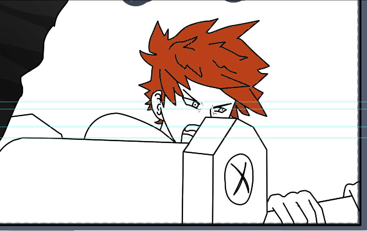
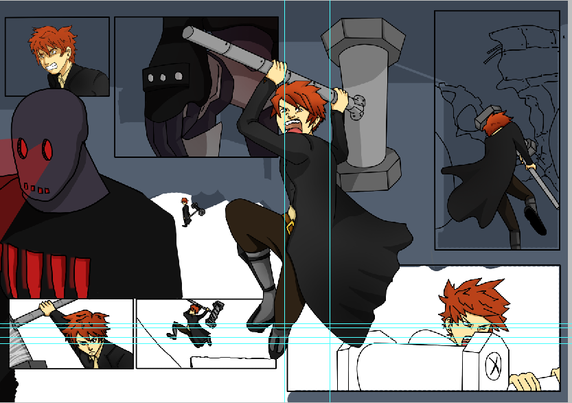
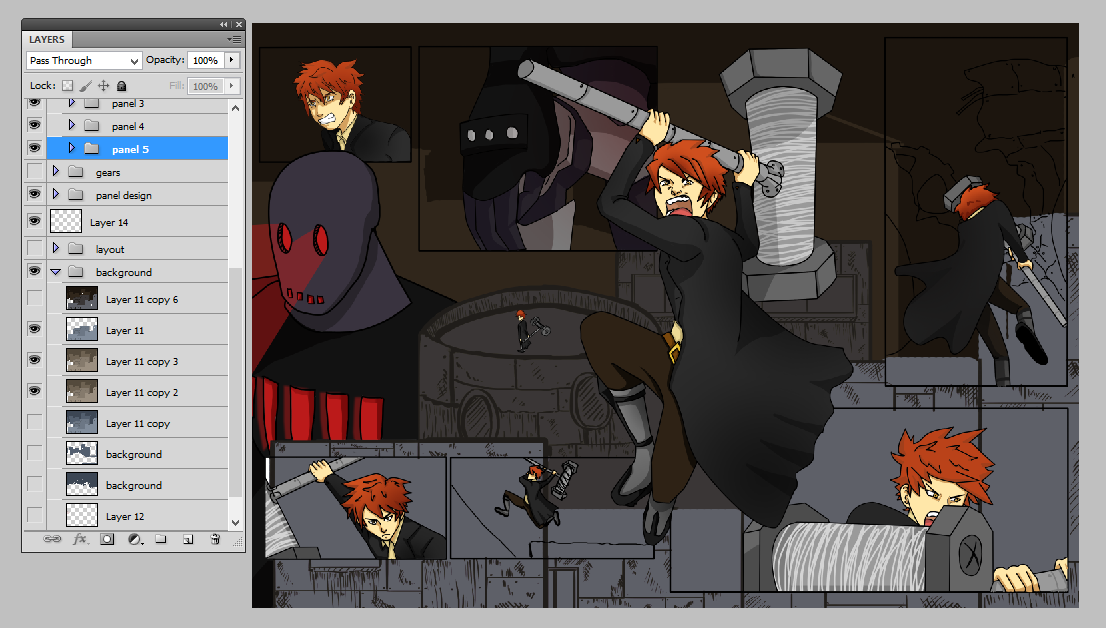
After completing the lineart I was able to add colour to the page, and consider the overall background to the panels and comic. I first began with colouring the content of the panels, starting with the lineart of the character. I based the colour scheme of the character on one that would contrast well with the overall colour of the background, I knew I wanted a blueish tint to the background so I decided that a brown or ginger shade would work well for the character. The rest of the outfit worked with the original colour scheme that myself and Roxanne Shanks initially planned when first debating on the characters for the narrative. I changed a few of the shades to work with the dark brown of the trousers however the overall colour scheme worked with the character and the rest of the composition through how the red of his hair stood out to the audience. I found that colouring the lineart to be tricky at first through how I was using the paint tool to add hues to the piece. I originally used the wand tool to select the area and add colour using the bucket tool however the edges of the selection were extremely pixelated, with the colour abruptly ending before the stroke of the lineart which left a hideous white space between the two elements. Even though this process was quicker I had to use the brush tool to fill in the gaps. When asking peers for advice I found that I could expand the selection made by the wand tool so that it would fill the entire selection, I found that expanding it by 1 pixel worked well and filled the area up to the lineart. Sometimes there would be small areas in the spikes of the hair that would not be filled but compared to the amount of time that I would take to colour the lineart with the brush tool, this technique aided me through out the rest of the production.
 |
| Matte colour |
 |
| Overall colour so far |
To add shading to the colour I first used the brush tool to add a darker shade of the matte colour to the hue to show the direction of the light. In addition to the shadow I then applied a gradient to selection in which the darker area would be relation to the direction of the light. The use of the gradient brought depth to the colour, making it stand out with the greater contrast between the tints and shades of the hue. I used a mixture of two gradients for the shade, the linear and radial selections. The radial gradient allows you to create a soft contour of shadow with the center being the darkest and slowly fading out the larger the path that you have stated for the gradient. The linear gradient is a gradual straight tone that starts from the darkest to the lightest shade of the colour that you have chosen. For both of these gradients I used a low opacity and set with the colour fading to transparent so that the colour underneath the gradient could still be seen.
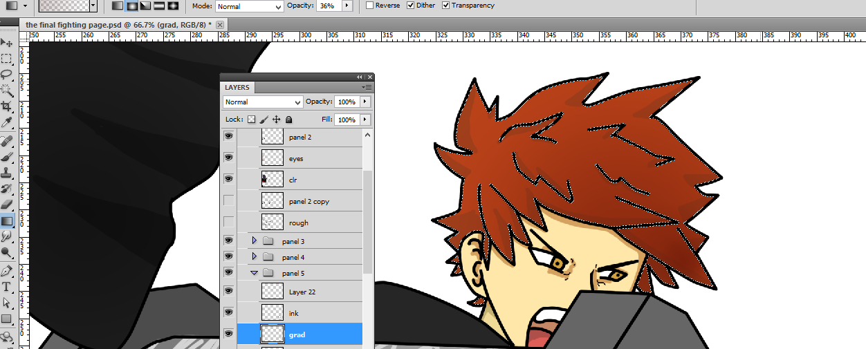 |
| Gradient |
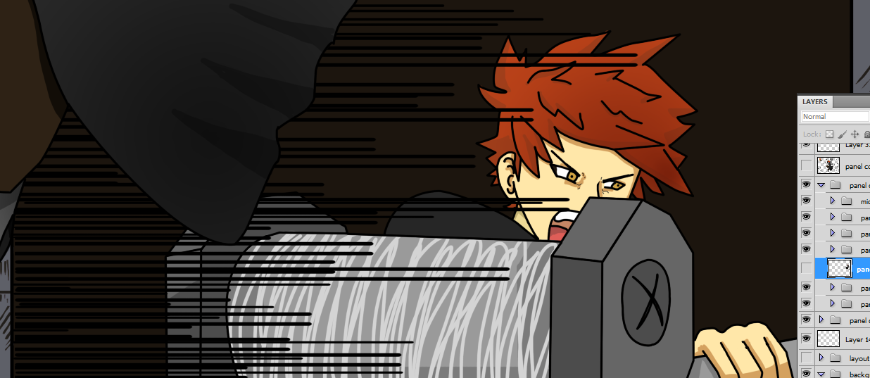 |
| Adding speed lines to the panel for movement |
After completing the colour for the last panel on the right page, I found that the movement still needed something to portray the action with the swing of the hammer. I decided to experiment and added speed lines to the panel overlapping the hammer. I created the speed lines by using the pen tool and shaping the stroke using the brush presets. I needed a stroke that would end quite thin or slightly angular to work with the direction of the speed lines. In order to solve this problem I edited the basic brush preset by using the brush panel and changing the brush tip shape by altering the shape dynamics and the smoothing options. This worked surprisingly well and I obtained positive feedback from my peers when asking for advice on the movement within the composition. I decided to keep the speed lines as to enhance the action in the panel.
 |
| Overall colour so far - background |
For the background I used different shades of the same hue to create the shapes and detail on the buildings. I felt that this worked well as the background did not stand out too much but the audience could see the detail and perceive that these were buildings. I layered the background into foreground, middleground and background before merging them together to create multiple shades on top of the original colour scheme using the blending modes. I mainly used the multiply blending mode to change the saturation of the composition however originally the blending mode made the background too dark and too blue. In order to solve this problem I used the hue and saturation panel to change the colour scheme of the layer. I changed the colour scheme to sepia tones which worked well with the underlying shades of blue as it created a grunge like tone of shade, this merged nicely with the rest of the composition. I wanted the background to be distressed with the materials that the buildings would be made from, most likely scrap pieces of material, which I portrayed through the use of the lines and crosshatch.
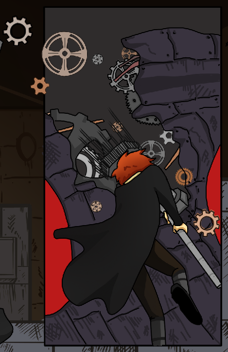 |
| Adding detail - gears |
Lastly I added gears on the top right panel to work with the destruction of the robots head, along with speed lines on the hammer to enhance the action further. I did debate with using motion or radial blur on the hammer to show the speed and power behind the blow but both were unsuccessful through how neither effect worked well with the rest of the composition, it looked out of place and didn't add to the aesthetic of the page. I then worked on the placement of the gears which I created using the pen and brush tool. I originally had the gear outlines with a darker shade of the fill however this didn't work well with the rest of the composition that used dark outlines. I changed the outlines using the 'lock transparent pixels' on the layer panel, this allowed me to only manipulate the outlines of the gears on the layer, making it easier for my to colour the gear outline to black.
No comments:
Post a Comment