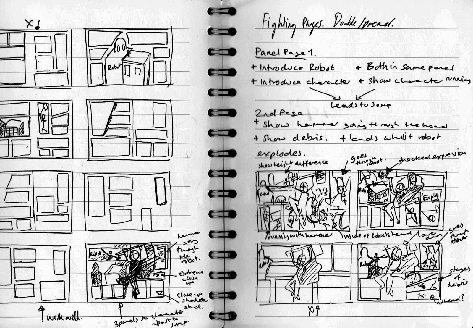
Before I began to continue with the comic layout I first needed to note down the contents of each panel in order to inform the amount and size of the panels. I found it difficult summarising the content without having visualised the movement that would refer to the narrative, I found quickly sketching the double spread with rough lines of the characters and movement helped me to generate ideas for the content. I separated the double spread into two pages so that I could plan both sides accordingly to the middle pose that I originally wanted to overlap both of the pages; to incorporate the rough full page into the comic layout. The left side to the double spread would include the introduction of both the robot and the character leading up to the main action, the overlapping pose, to then continue with the after math of the action on the right side. Knowing a more specific narrative for the panels, I was able to plan new layouts inspired by the sketchbook work that I had created for idea generation. I quickly sketched some new layouts before taking the layout to develop further on Photoshop. With these layouts I experimented with changing the overlapping pose with a different panel content which could have been successful if not for how much space and panels it would take up, this can be seen with the pose that shows the character smashing through the robot. I felt that this would have worked well however I had to enlarge the design so that it would work with the panels which became unsuccessful for the amount of the design that overlaps the panels; the audience wouldn't be able to tell what is happening within each of the designs.
Using the sketches of the layout as a main influence I developed the structure more in Photoshop. This allowed me to see the layouts that I had already created on the correct size canvas instead of thumbnail sizes, in order to see if it would be successful once applied. The first layout that I created worked successfully through how clear and simple the structure was, the audience could easily follow the direction of the images however I found that the left page was too large with the content and the form of the panels. The right page worked well through the use of the overlapping figure and the continuing action that took advantage of the larger panels. I liked the idea of the left side of the page using large panels as well but once placed with the right side, it was too much to the point that it looked cluttered and not very interesting; it became something that the audience would not be that interested with. In order to solve this problem I needed the left side of the page to have smaller panels that worked with the action previous or slightly overlapping a panel situated next to it, in order to bring something different and stylised to the aesthetics.
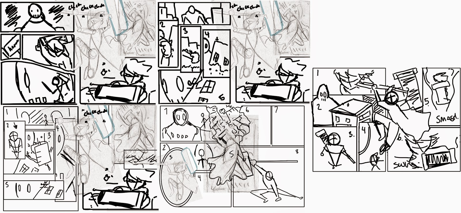 |
| Possible Photoshop Layouts ( 1-5) |
I continued experimenting with the layout for the left page so that it would suit the right side, I quite liked the over lapping panels on the second layout design. The only problem with this structure is that I wouldn't be able to move the overlapping figure too much onto the left page as the smaller panels would mainly be covered with the image. I carried on this idea of overlapping the contents of one panel over another, changing the size of the panels so that the covered panel could still be seen and understood by the audience. The fourth layout design was interesting to create as I thought about incorporating the middle pose into a panel that would refer to the robots eye, as if a reflection, with the overlapping design being the action of the character smashing the robot. I felt that this worked quite well however the use of the oval panel didn't merge well with the rest of the composition as it's appearance was too different compared to the rest of the design. I took this further and tried to incorporate the idea of a reflection in the robots eye within the fifth layout sketch which worked well in a square panel shape. I changed the pose of the character to one before the action portrayed in a high angle too make the character look small; I moved the original action pose back into the middle of the page. I quite liked the idea of the high angle however the panel next to this was boring, as it repeated the visuals but from a different perspective. Another panel that was successful was the second panel in which the robots head overlaps the first panel. I felt that this worked with the rest of the composition and brought depth to the structure, I wanted to make this detail bigger so that the buildings could be seen clearly and become part of the background.
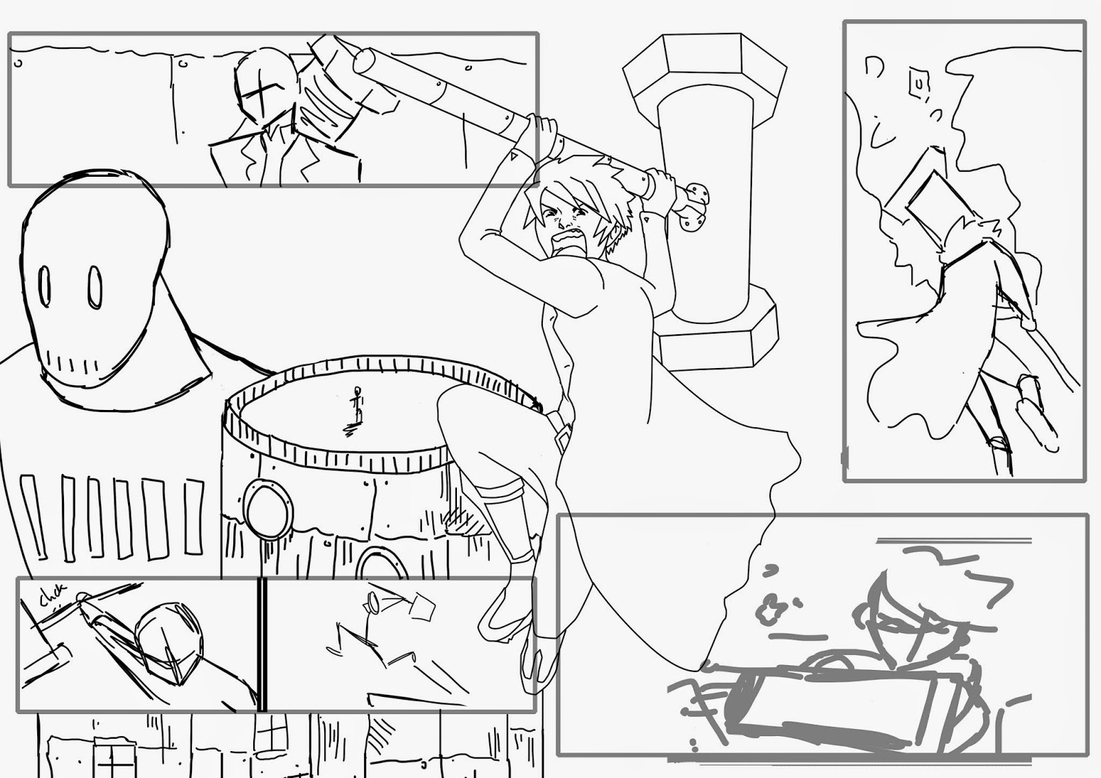 |
| Final layout |
Using different elements from the photoshop layouts I created a refined structure which worked with the panel content and narrative of the page. I liked the idea of the overlapping panels with the second panel on the left side being the overall background for the comic to be situated upon.
No comments:
Post a Comment