Saturday, 31 January 2015

Webtoon - Visual Research

To gain inspiration for the aesthetic and structure of the comic panels that I will be making for the Webtoon brief, I looked into different comic arts such as Emily Carroll and Mike Mignola for influence. Carroll's work incorporates the panels to mix and merge with another with traditional printed textures to the quality of the work, making it tactile and aesthetically pleasing to the audience. I found her work inspiring through not only the layout of her comic pages but through the use of the dialogue that seeps into the other panels. I found inspiration in Mignolas work through the use of the matte bright colours to desaturated tones with a harsh black ink shade to the line art, which works well with the character designs, that range from humans to supernatural beings. Other examples of comics mainly inspired me through the detail and colour used with in the panels; some ranged from using extremely desaturated hues that emphasised the environment and tone of the dialogue, to bright and colourful panels with thick variation of line.

I was quite inspired by the comic Sandman Overture in which the panels became part of the character, the character would be placed on top of the panels, and the way the panels would contort into different shapes. I found that the comic pages were visually stunning as the panels itself were part of the art rather than something to situate the comic panels in. 

Visual moodboard
Sandman Overture

Alice in Wonderland - thumbnail storyboards, book cover

For the peer review feedback, I wanted to show an example of how I wanted the storyboards to appear, how the structure and appearance of the storyboard would look like in the final outcome. As I wanted to use this brief to focus on locating my practice, specifically the use of storyboards and how I can show different depictions of the same narrative, I felt that it was vital for me to at least show a rough storyboard of how the imagery and media would appear with in the storyboard. I felt that using watercolour helped to show the colour and lighting of the environment and how Alice interacts with the frame. Adding Alice's expressions in the frames helped the peers to understand the emotions that the character is portraying and the use of watercolour aided the enhancement of these emotions through adding colour to the hair and dress which made the face standout to the viewer more; the use of white space helped to emphasise the face so that the viewer would focus on this element more. I felt that the narrative I had used worked well with the theme of the front cover as it showed Alice falling through the rabbit hole and how she interacts with the objects. I liked how the rough storyboard ended with Alice running after the white rabbit and finding herself looking at the environment that is called Wonderland. I felt that this was a good point for the animation to then possibly pan up to be able to see the 150th anniversary logo and the title of the book.

Rough Storyboard 1

Rough Storyboard 2
As much as I liked the first rough storyboard, I felt that it needed to relate to the book more with what interactions that Alice does whilst she falls down the rabbit hole. In the book, Alice grabs a jar of orange marmalade and opens the jar lid only to find that the jar is empty, so as she falls further she places the empty jar back on the shelf. I felt that this part of the narrative could work successfully with the young audience through the silliness of the interaction with the jar, her facial expressions could easily be exaggerated to make this more humorous to the viewers. I incorporated this scene into my storyboard, ending the scene with Alice landing on the ground and turning to see the 150th logo, however I felt that this didn't work with the rest of the storyboard as much as the turn to see the logo seemed to end abruptly compared to the rest of the narrative. I asked my peers for feedback on the storyboard so far to see if I could gain some insight on how to improve the narrative to make it feel less abrupt. The feedback I was given was positive however the inclusion of the marmalade jar narrative didn't seem to work with the peers that I showed my work to, this is due to the scene being too complex for a short animation that would be under a minute long. The scene would have been successful if it was a longer animation that included more complex narrative and taking detail from the book.


Thumbnail Storyboard 1

Thumbnail Storyboard 1 part 2
My second storyboard for the cover involved Alice sitting on the grass with her sister and she notices a rabbit jumping into a bush, as she follows the rabbit she finds the rabbit hole and accidentally falls in after the rabbit. As Alice falls she moves to be in line with the cover illustration and then falls past the text and lands into the 150th logo. I felt that this narrative was successful through how the storyboard incorporated the logo and the book cover illustration which would work well with the password that is hidden with in the image. I found myself liking the ending of the storyboard more than the beginning of the narrative in which she notices the rabbit and runs after him. I think this is due to the beginning of the narrative lasting for too long compared to the rest of the storyboard, and it also lasting longer than the short animation that it would be intended for. I asked my peers for feedback on the piece to see if my thoughts were correct. The feedback I obtained from my peers was extremely positive, they loved the idea of the cover illustration and the logo being in the storyboard as it helped to promote both aspects of the brief, including the 150th logo and that it has to be centered around Alice in Wonderland. However they agreed with the beginning of the storyboard not matching the ending of the narrative, they didn't think that it would make the storyboard last longer than the intended duration but it felt that part of the storyboard was missing through the amount of frames that was given to the start compared to the rest.

Thumbnail Storyboard 2

Thumbnail Storyboard 2 part 2
Through the feedback that I had received for both of my storyboards I decided to merge elements of the storyboards together and design these digitally so that I could ensure that I have clean lineart for the final outcome. 

Alice in Wonderland - initial designs of the book illustration

For the book illustration, I found myself taking influence from the designs that I had created for the book cover, especially with the Mad Hatters tea party designs. I felt that the content in the imagery was perfect for a book illustration in which can obtain more objects and characters compared to the front cover design. I noted the strengths and elements that I liked from each design from the book cover compositions and began drawing refined layouts of work that would be successful for the illustration page. I knew that I wanted the illustration to fit inside the page with a white border, rather than take up the entire page, therefore I need to consider if the illustration needs a border to help it blend with in the page. From the feedback I obtain from my peers from the book cover designs, I wanted to absorb the use of the perspective with the table, and add the items that I had included along the table. I took these ideas and began to sketch different portrayals of how the characters would interact in the scene, and whether a different perspective of the table would work more successfully than the original idea for the perspective.

I really enjoyed designing the book illustration, as whilst I was drawing I began to think of ideas to turn the image into a storyboard for a possible animation, much like the idea of the front cover containing a password in which you can then watch the animation on the books website. For the thumbnail designs I felt that 1 and 2 were the most suitable and worked with the narrative of the iconic scene in the book, mad hatters tea party. It allowed the audience to see depth, an inclusion of a foreground, middleground and background that gives the image an aesthetic appeal, for both the young audience and the gift buyers. Design 3 and 4 worked well, being suitable for the the audience and visually appealing however the imagery felt more sequential, a frame from a storyboard/animation in which I wanted to take these designs further to match with the final illustration to make a possible storyboard. Thumbnail 1 did not work well on its own through how distant the Mad Hatter was compared to Alice, in my opinion for a young audience the main characters of the scene need to be clearly visible and to be able to see their facial expressions to keep their attention. Thumbnail 2 worked well but it lacked something and needed extra detail in which merging the design with thumbnail 1 worked successfully; it included both of the main characters which draws in the audience, and then the depth of the image allows you to see the mad hatters table alongside the rest of the characters and the background.

Design for book cover

Designs for Illustration taking influence from book cover design 3


Friday, 30 January 2015

Alice in Wonderland - developing initial designs of front cover - design 4 and 5

For these designs I wanted to experiment with the use of the main character with in the front cover, being the main focus, I considered taking the illustrations to be situated in card portrayals to link with the theme of the Queen of Hearts, creating a deck like structure with the characters in the narrative of the book. I felt that only one of the designs were successful through how the majority of the compositions were minimalistic, being too plain, which would not have worked well with the target audience that I wanted to attract. The 3rd thumbnail design worked well as it incorporated all the characters and filled the cover, becoming visually appealing with room for further refinement with the use of the colour scheme. I did however have to consider whether the cover would attract the young audience as I felt that the cover would suit a slightly older young audience through the structure of the placement of the cards on the design, a possibility of the imagery being to complex for the target market.


For the last development, I looked into using the white rabbits pocket watch as a theme for the imagery. I began designing with the main character Alice and the white rabbit run across the hands of a clock which worked well with relating the theme to the pocket watch. However I felt that the cover themes did not work well with both the narrative and the target market. The imagery was not obvious enough to relate to the narrative especially for the young audience to be able to understand the connection; It needed to be simple and not complex in both visuals and the structure. I felt that this cover theme could possibly work for an older audience, however I still disagree with the visuals as they don't suit the narrative, it doesn't explain or show anything that is obviously relatable to the book. Feedback from Peers:

" I don't think the imagery works well with the book. The use of the characters work well and the style is good but the clocks don't work with the story as much as the Mad Hatters tea party design. I think you need to develop this further so that it would suit the audience you are aiming for." - Eva Lambert

I felt that this feedback was accurate and reflected my thoughts on the design work that I had done for this theme. I decided not to continue with this design and focus on the more iconic scenes that would be easily recognisable to the audience.


Alice in Wonderland - developing initial designs of front cover - design 1, 2 and 3

I developed a few of the initial designs that I considered I would be able to refine further, by focusing on the portrayal of the perspective and placement of the text in relation to the image. I needed to also take into consideration the location of the 150th anniversary logo that needs to be clearly seen and work well with the cover. For the first development I focused on the falling down the rabbit hole illustration, which I needed to consider the perspective of the character and the objects that she would interact with. I felt that the thumbnail design 2 and 3 were the most successful, so I took this further and merged the designs to create the final development. This design was successful as it incorporated a perspective in which you could see the character and main environment that she was situated in, along with objects and the placement of the logo. I felt that I would be able to take this design even further through the use of room to be able to hide a password with in the illustration in which the young audience can find, making the book more interactive and attractive to the target market.
Feedback from Peers:

"Like the design as it suits the target audience. Its fun and interesting to attract the audiences attention. Consider the colour scheme that you will use." - Anna Picariello

"I like the detail added with Alice, it works well with the style that you have used. However the character needs hands as it would work with the style that you have gone for." - Roxanne Shanks

The feedback given from my peers was positive and helped me to consider how I could improve the design further when adding colour and the final detail to the illustration. When applying a colour scheme I need to consider how this can attract the audience, vivid colours and a mixture of pastel colours. With the main proportion and limbs of the character, I need to practice with how detailed they need to be with the style of the illustration, the proportion needs to be simple to match the rest of the design and become aesthetically pleasing to the target market.


I wanted to take the Victorian portrait design further as I felt that it would suit the young audience but also the gift buyers who would be buying the product. I also noted that the design would attract another audience which would be slightly older than the young audience, older primary school audience, through the use of the minimalistic background and the imagery that is on the boarder surrounding Alice. The swirls that were emitted from the frame that Alice was situated in worked well as they acted like a shelf of sorts for the items to hang and rest upon. It also related well to the victorian portrait which I believe works with the era that the book was written. I did struggle with the placement of the logo as it wasn't incorporated with in the image due to the complexity of the swirls, so the placement was in the white space of the cover. It felt more of a sticker rather than part of the design. I considered adding a top hat to the logo as to make it feel like it is part of the design, however it still felt out of place. The only solution I had to this problem was to situate the logo to the top left corner but closer to the design, which worked with the structure of the design, but in my opinion it still felt out of place.


Developing the Mad Hatters tea party design proved to be difficult through the use of the perspective and trying to consider how complex the perspective is may lose the attention of the target market that the illustration is ultimately attracting. I tried to experiment with how far I could push this boundary, whether I needed Alice in the image or just show the back of her compared to a shoulder shot of her. I found that the most successful design was the 1st design in which I depicted Alice in the image with a teapot in front of her. I felt that this image worked due to the perspective in which the title can be read on the teapot, drawing more attention to the character Alice.
Feedback from Peers:

"I Like the teapot at the front of the perspective and Alice being behind instead of the foreground. However I like the perspective that makes the table seem longer, with the Mad Hatter at the end of the table. Possibly experiment more with these perspectives." - Roxanne Shanks

From the feedback given, I felt that the perspective would work well if I incorporated elements from the thumbnail designs, 1 and 3. However I think that this design would be better suited for a book illustration due to the detail in the image and room to add a background environment for a password to be hidden amongst the trees, table and the items placed upon it.


Thursday, 29 January 2015

Alice in Wonderland - initial designs of the front cover

I began generating ideas for my front cover illustration by taking inspiration from my mindmap and iconic scenes from the Alice and Wonderland narrative. I felt that the front cover had to include Alice in the image, so that the book can be identified without having to read the title. I immediately thought that the most iconic scenes with in Alice and Wonderland were, falling down the rabbit hole, Mad Hatters tea party and the game of croquet with the Queen of Hearts. I wanted to experiment with using these scenes as a basis for the front cover so that it can be recognisable to the consumers with the additional change of the character design.

Focusing on the different scenes as influence, I started with the falling down the rabbit hole design for the cover which I felt was the most successful of the initial designs that I had created through the use of the items and structure of the composition. The use of the items helps to set the scene of the bizarre narrative of the book and attract the attention of the young audience and gift buyers that the publishers want for their target market. I felt that the second design that I created using this theme did not work as well, as the perspective was not as successful through the aesthetics of the composition. The audience could possibly tell it was Alice through the blue dress and the blonde hair, however I felt that it would not be as appealing to the target market through how complex the perspective of the items and character were with in the image. Designing with the theme of the Mad Hatters tea party, I felt that the initial designs I created worked well with the theme but a few of the angles were not as successful, through how the main character could not be depicted as well as the other designs and would not work with the young audience that it is aimed at. However one design which includes the Mad Hatter as well as the main character which would work better for a book illustration rather than the front cover due to the complexity of the contents in the image. I generated ideas with the Queen of Hearts theme however the majority felt like it would be more suitable in a book illustration rather than a front cover, through the incorporation of more than one character and the environment that the characters would be in. I did find one of the designs to be possibly suitable for a front cover design, for example the design in which Alice paints the roses red. I liked this composition as it was far more simple and attractive to the target audience through the structure of the image compared to the previous ideas. Looking at the design more critically, I noted that the composition would be more successful if used for a colouring book cover, which would work well for the target audience and to improve my skills further in refining my practice and looking beyond the brief.

I then moved on to experimenting with just including the character Alice on the book cover, with an ornate border to relate to the Victorian era in which Lewis Carroll first wrote the narrative. I liked the design and felt that I could take the design further by refining the imagery by using silhouettes or different shapes and styles of borders. To gain more inspiration I used my visual mood boards for the project, in which I began making designs that focused specific items rather than the character. For example one of the designs incorporated Alices hand which had a label from a bottle that would contain the title of the book. I felt that this worked well for both the cover and the narration of the book however it did not work with the target audience through how it was too minimalistic for the young viewers to be able to associate the front cover with the main narrative. I took this idea of focusing on props rather than the main character further, using designs that involved Alice reading a sign post with the cheshire cat in the background, to the main character running across a hand from a clock. I felt that these designs worked however they were missing something in which to make it more visually appealing to the target audience, which I need to experiment with and refine further.


Wednesday, 28 January 2015

Outcast Odyssey Research

Before I began designing for the Outcast Odyssey, I researched into the themes that would be needed for the creation of the illustrations. I wanted to focus on the warrior and witch designs as to improve my skills further with the use of drawing the human figure. I researched into clothing, accessories and designs that other artists had created as to gain inspiration from their use of medium and stylised approach to the design. I noticed that the steampunk trend is built up with sepia and desaturated tones, that are highlighted with silver, golds and bronze to tie in the clockwork and gear. The style incorporates a Victorian esk attire through the use of corsets, petticoats and other similar clothing.

Using inspiration from the steampunk mood board, I then researched into the warrior and witch theme, merging both of the visual references to see if they would work well as an end result. For the warrior mood board, I researched into both fantasy and realistic imagery from different artists that emphasise their work with lack of or intricate amounts of detail. It was influential with the portrayal of media that each artist used, such as the use of the red inks and water colours for cape that made the fabric feel fluid and light, and another which used ink to make it seem as if the warrior was fading into the mist as it charges towards the viewer. A few of these imagery included work that other artists had submit to the  Odyssey challenge, which helped me to visualise what other artists creative mind set perceived as they research and created their final outcome. One of which did not include armour and absorbed mainly a steampunk effect to its clothing and visuals. I felt that the piece was lacking in a warrior design, as the sword is the only element that shows depiction.

For the witch mood board, I mainly researched into female portrayals as even though it is very stereotypical perception of a witch to be female, I wanted to improve my skill set of drawing the female figure, in which I felt this would be a good challenge. I researched into other artists work as well as book covers and found that the depiction of a witch was mainly shown with a broom stick and a pointed hat, which I found become quite uninspiring as I wanted something that was different. Instead I found myself looking at the style of the image, how the medium and colour portrayed the stance and narrative in the composition.

Steampunk visual mood board


Warrior/knight visual mood board

Witch visual mood board

Outcast Odyssey trading card competition

Outcast Odyssey is an online trading card game, revolving around a fantasy world with monsters, magic and warriors. The main target audience being from 12 year olds to collectors. I felt that this was quite a stretch with how big the target market was however this range is quite accurate taking into account of the amount of collectors that buy and play the online games, that be downloaded to your phone. Having the game as an app on the audiences phone makes it more likely for people to download the game, as your phone is always with you, making it convenient to play the game when going out or even staying at home.

The theme is fantasy based with wizards, monsters and warriors as the main basis of design for the competition. The competition asks you to submit one of these designs for a possible game card design that they would reuse on the mobile game. After reading the terms and conditions, the competition seemed to be both beneficial for the artist and the company, however I didn't want to enter this competition as I felt that it wouldn't help me locate my practice; I wanted to use this competition as a basis and take the competition further with the possible inclusion of backgrounds for the character to be situated in and parts of animation that would enhance the design further. I wanted to use this competition so that I can create more work for my portfolio and showreel. I quite liked the idea of being able to use any medium for the submission, such as photography or even animation. I felt that I could possibly take this further by designing more than one character for the brief, to refine my character design skills, with the possible introduction of creating cards for print.


Saturday, 24 January 2015

Submitting Dandy Design 2

Using the same structure as the previous t-shirt design I submitted, I added the t-shirt design for voting on the site. I felt that the t-shirt preview image worked well, as the blue gradient worked with the close up detail of the design, with the yellow of the star making it stand out even more to the audience. I chose a black shirt for the design as I felt that this would work well with the design through how it would contrast with the bright hue of the yellow and match with the colour of Dandys hair.


So far I felt that the best t-shirt design in the Space Dandy series was the silhouette design rather than the one that included more detail. I believe this is because the silhouette design is more suited for a t-shirt design for the simplicity of the colours and structure. The second Dandy design is far more complex especially with the inclusion of the halftone shading. I found it quite interesting with what design was more popular with the public's vote, which has helped me with experimenting with different portrayals of my designs that will help me locate my practice. With the next design that I will submit to the Qwertee website, I need to take this information and feedback from the work that I have done so far as I consider the layout and structure of the illustration.


Dandy Design 2 - Progress so far

From peer feedback, I noted that I needed to add legs to the design as the arms stood out against the star, it seemed strange that the legs did not. I agreed with the feedback as critically looking at the work that I had done so far, I found that the legs did need to be included in the design. Adding the legs to the design was quite difficult as I was not sure where the position of the legs would be. I first tried quickly sketching the legs to see if the position that I initially thought for the placement of the legs would work. I felt that so far the legs matched the pose, so I continued to ink and complete the design. After I had completed the design, I felt that the legs were still lacking something as they still looked not quite right compared to the rest of the composition. I decided to add shading to the legs to see if this made any difference to the illustration. As I could not add any other colour to the design, I used halftone shading to show the illusion of shadow, which worked well with the star background and the style of the lineart.


After adding the halftone shading, I found that it gave depth to the image which showed the perspective of the leg well, however through peer feedback, I realised that the legs were too long for the main body of the piece. I transformed the legs to shorten them to the right length, but as I was editing the lineart, I noted that the perspective of the legs did not work well with the pose that the main body was like. The right leg needed to be changed to make it seem dynamic like the rest of the lineart. I decided to set the right leg behind the thigh, to see if this perspective would work with the rest of the composition. I felt that the outcome did not work with the left leg due to the position, it needed to compliment the stance that the rest of the body was formatted in.


I then attempted another position in which the right leg could be drawn, and found that the perspective worked quite well. After adding the main lineart, I added halftone shading to the leg to emphasise the perspective that it was in, which was successful as it showed the depth of the piece well, working with the left arm that is also in the background of the piece. As I had added the halftone shade to the leg, I applied more of the shadow to the rest of the composition, including the surface of the star which Dandy was place upon. I felt that the final outcome worked successfully through the inclusion of the halftone shading and the hues, which gave a background, middleground and foreground to the piece.


Final design

A Dandy T-shirt - changing the design

I was really excited with the amount of votes that I was getting for the t-shirt design so far, as I was getting more votes than I anticipated and comments which were full of positive feedback. I was however unsure about the image that I submitted for both the thumbnail and the t-shirt preview, as I was debating about the colour of the t-shirt and I didn't like the use of the white background. I felt that the white background wasn't attractive enough to the viewer. One of the comments that was posted for my t-shirt confirmed the colour of the t-shirt, so I decided to change the design.

Previous Design

I changed the design of the background and the closeup of the space dandy illustration for the environment that the t-shirt would be put against, which I think worked quite well. The gradient worked well as it attracted attention to the main detail of the design through the tonal change of the hue. I then changed the colour of the t-shirt to a grey colour which I think works better than the red as it is a colour that is more likely to be worn by the public. I found this conclusion through looking at the most popular t-shirt designs which mainly uses, black, grey and white.

The updated design

Qwertee submitting a t-shirt

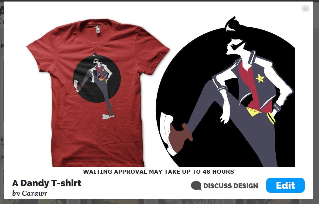
After designing the space dandy t-shirt, I submitted the illustration to the Qwertee website, using the mock up kit, to show the design upon a t-shirt. This would give the public an idea of how the design would look if it was printed. Submitting the design was relatively easy however trying to keep the resolution was difficult due to the file size that was needed, as I didn't want the image to be pixelated.
With the image that I uploaded I wanted to ensure that the design could be clearly seen in a close up and on the t-shirt. After submitting the design, I had to wait 48 hours for the company to approve my design, ensuring that it is up to the correct visual quality and appropriate for the website and public.


Kingdom hearts considering layout

Matched with the initial designs that I had created for the Kingdom hearts composition for Qwertee, I started to consider the layout in which the main focus of the design could be situated in. I considered the main details that are related to the game series apart from the obvious main square enix and disney characters. I mainly worked with the crown, heart and keyblade shape to try and experiment with the structure of the composition. I quite liked drawing part of the character slightly out of the shape as it gave depth and an interesting perspective to the design. I didn't like the second design with the crown shape in which I designed the illustration with in the crown shape because it was exciting, it didn't attract the viewers attention well.


I then began to apply a few other initial layout designs to quick sketches of plain t-shirts as to see how the layout of the composition would look work if applied to the material. I quite liked the three initial designs that I had created, although two of the designs were quite similar with the structure and interaction of the heart shape that they were situated in. However the other design, which was not in a shape, worked quite well with in the t-shirt sketch. I generated ideas on how the main design could absorb the colour of the t-shirt as the background with the falling stars interacting with the environment and the main character standing upon the colour of the t-shirt as well as. I felt that creating more designs that make use of the colour of the t-shirt would work well with my compositions, and take influence from the designs that are popular on the Qwertee website.


Notes on webtoon

Webtoon is an online webcomic publisher that hires artists to create comics for their site. The latest competition involves a submission of a new comic, that is original and has not been published anywhere else, for the grand prize of $30,000 and a three year contract of the continuation of the comic you have submitted for their site only. I felt that this competition would be a fantastic way to not only improve my skill set and locate my practice, but for one of the individual briefs for the responsive module. I scanned through the terms and conditions and the work that you submit would solely belong to you, however after looking at peoples comments on the competition, I began to have second thoughts on actually entering the competition.

Webtoon competition

Webtoon Competition


The comments that I found explained that in the fine print which is really difficult to find on the website, reveal that you give permission for any work that you submit, whether you win the competition or not, can be redistributed accordingly on their website or others; With the terms of the three year contract being the wage of the money you have won. I found this quite sneaky of the terms and conditions, especially the fine print being so hard to locate on the website, to the extent that I can't find it. I felt unsure and not confident about entering the competition, so I will create work that will adhere to the competition specifications but help me locate my practice further, looking beyond what is actually required.

Kingdom Hearts designs 1

I began to design another composition that could suit the Qwertee t-shirt designs that have been quite popular with the public. In particular I decided to design a Kingdom Hearts illustration, as to see if it would become popular with the public. I researched into Kingdom Hears on both game, manga and t-shirt designs. The t-shirt designs were mainly silhouette or a few of just the main character, 'Sora'. The silhouette involve poses much like the game covers or have the rest of the characters from the series alongside the main focus of the composition.

I began the design process by drawing the facial expressions of the main character from the Kingdom Hearts series, Sora. Drawing the expressions helped me to not only generate ideas for the final composition but to gather an understanding of the characters designs so that I could portray the characters personality to the audience.


I then began drawing the main character in different poses and costume design, as to further improve my drawing ability of the character. As the Kingdom Hearts series focuses on battles, I wanted to capture a fighting pose as well as capture his personality through his body language. I did however find this difficult to generate ideas for the battle esk stances as I kept focusing on depicting his personality through more relaxed poses rather than the poses that I intentionally set out to draw.  I did however quite liked the relaxed sat down pose in the first designs that I drew, as I liked the perspective that it was formatted in. However I felt that I could improve the design by changing the facial expressions and include his left arm with in the composition more.


I also liked the design of the portrait stance on one of the last pages of initial designs that I drew. I felt that it captured a fighting like stance, absorbing a sense of caution before a fight. I was able to generate ideas that could involve this design, for example adding the keyblade, the main weapon, as a background, or as his shadow etc.

Wednesday, 21 January 2015

Final outcome

For my final outcome, I made a few changes to the animation sequences, as some of the movement appeared jagged. For example in the first scene where Moom talks to the camera, the head movement jumped to the next turn of his head, which made the animation feel jarred. I solved this by removing the key frame that made his head move up, making a smooth transition to his head moving to the right.

Overall I feel that my animation was successful through both the narrative and the movement. The narrative worked with a young audience through the presentation and phrasing of the dialogue and the props in which Moom interacted with. I felt that the audio was the most successful part of the narrative as it sounded like a young child which the target audience can relate with.

I felt that the animation was successful through the use of the exaggeration that I added to the key poses, which helped with the humour that was incorporated into the narrative. I felt that the majority of the movements were smooth and were positioned well with the sound effects included in the scenes. For future projects I know that I need to concentrate and consider the secondary motion alongside with the overlapping action, to make the act seem more believable.

Tuesday, 20 January 2015

Making titles and credits for my animation

I wanted to add a title and credits to the animation so that the final composition felt completed alongside with the added sound effects and audio. I wanted the titles to also be situated in a white environment to go alongside with the animation, to have a running theme. I felt that the text that would be included with the title and credits, not only needed to be the same font, but needed to hold a vintage or handwritten quality to the aesthetics. The handwritten quality would work well with the child like characteristics to both the narrative and the actions of Moom, whereas the vintage appeal would work well in a more professional aesthetic and work with pre production sketches. I decided to run with the vintage font, being a typewriter esk style, which I felt worked with the imagery that I added into the composition. I then created a few different designs of both imagery and layout for the title and credit images, which I managed to narrow down to two designs for each.


Credits 1

Credits 2
 For the credits, I narrowed down the designs to one which included Moom and Mother Moom set in a digital illustration format, and the other being a scan of an initial sketch in which I added desaturated colour through the use of the software Photoshop. I quite liked the appeal for the Moom design as it worked with the use of the characters being in the animation, however I liked the sketchy appeal to the second credits image with the green bear toy, so I asked my peers for feedback for the design. The feedback was very positive, with the green bear sketch being more favourable with it working with the style of the text and the image doesn't stand out as much as the other design.

Title 1

Title 2
For the title I created two designs much like the credits, one being digitally created and the other being a sketch that I had scanned in, drawn with fineliners and marker pens to create that vivid appeal to match the style of the narrative. I asked for feedback from my peers, and the feedback was aimed at the digitally designed composition, through how it would match with the green bear toy with in the credits design. The text was simpler than the other design as 'Mooms adventure' doesn't work as well, due to the audience who are not familiar with the name of the rig would possibly be confused as to who or even what the word Moom is/means.