Tuesday, 14 April 2015

Animation Workshop: Expressions

For the next stage of the brief I needed to create 4 expressions, using the expressions that I sketched quickly in my sketchbook, I edited the designs on photoshop using the pen tool.  I found that the sketches needed more exaggeration with the squash and stretch of the face as well as the shape of the eyes and mouth. An example of this can be seen in the second design on the sketchbook page, top left. I felt that the expression needed narrower eyes and the mouth didn't work with the eyes through how short and low down the mouth was. I redrew the design in Photoshop, using this sketch as a reference whilst I used the pen tool to create the rest of the head apart from the facial features. When adding the facial features I angled the eyebrows more into the eye and curved the bottom lid of the eye inwards to portray more narrow eyes compared to the previous. This was successful through the addition of extra lines on the bridge of the nose and underneath the eyes which show the audience that he is angry. I then edited the mouth by making it longer and adding a bigger crease line to work with the squashed cheek. This enhanced the angry fed up look that I wanted the character to express to the viewer through the use of the crease lines that work with the narrowness of the eyes. I continued this process with the other three expressions, using the sketch as reference and changing parts of the face by either squashing or stretching the face to exaggerate the emotion portrayed.

Sketch

Ink and reference sketch
The final expressions worked well with the character as each head could easily be related to the previous stance poses that I had created for the character. This can be seen through the use of the hair, face shape and the eyes. I found that the most enjoyable expression was the bottom left design however I did struggle with creating this expression through the use of the mouth and the eyes. I wanted the expression to be scared, confused and slightly disgusted at whatever the character had seen, I felt that not only this would be a challenge but fun to be able to create. I found using a mirror helped me with the shape of the mouth apart from stylising the mouth to suit the character however I wasn't too sure on the straightness of the top lip, so I decided to curve the top lip to see if this would solve my problem with the mouth. In my opinion this helped the expression well and worked with the type of emotion that I wanted the character to portray. I found the eyes were more difficult than the mouth through the size of the iris and how narrow or wide the eyes needed to be, I solved this problem by showing the confusion aspect of the expression through the eyes. I was able to depict this by making one eye wide and the other slightly narrow, making both of the iris's small to work with the scared part of the expression.

The other two expressions were easier than the bottom left, I wanted the sad expression to have a stretched face with squinted eyes to be related to the emotion, and the other being a happy and day dreaming expression. I felt that these designed worked successfully with my peers when asking for feedback as they were able to tell what each expression was. The only criticism that I obtained was the bottom left design with the position of the ear, it was too in line with the jaw. To solve this I moved the ear using the marquee tool to move the selection slightly higher, rejoining lines using the brush tool.

Final Expressions Lineart


Animation Workshop: Photoshop process - lineart 4 stances and considering colour scheme

I took the stances from the developed poses of the character to photoshop and extended the torso which worked successfully in the completed lineart that I had created using the pen tool. I used the pen tool to ensure that my lines would be clean and neat, creating contours and angles easily by manipulating the anchor point. For the 3/4 stance I used the previous face on view lineart and reference from the heads that I had drawn on the sketches to be able to create the perspective. At first I found the stance difficult through the length of the arms and the height of the crotch, in order to ensure that the proportions match, I used the guidelines to be able to pin point the height of the limbs and the overall height of the character. I also found the profile to be difficult with the face through how on the sketch I had made the jaw too wide for the neck, in order to solve this problem I shortened the jaw line by moving the face with the marquee tool slightly inwards into the rest of the face. This worked well as the length of the jaw merged well with the thickness of the neck and the rest of the body proportion. 

4 stances line art

I then worked on the colour scheme for the piece, using the main face on view to experiment with colour. I found it difficult with the colour scheme that I wanted for the character as I wasn't sure on the vividness of the hues, whether I wanted the character to have bright blue hair, making it more cartoony, or just normal hair colours. I felt that either could complement the character, so in order to narrow down the colour scheme I created three sheets with different colour combinations.

The first page focused more on the hair colour and the colour of the jumper rather than the trousers and shoes. In my opinion the colour of the trousers that I had already chosen worked well with the different colours of the jumper however I still need to try a few more variations just in-case another hue would work more successfully with the composition. I didn't like the use of the light blue/light green hair on the page as it didn't work with the rest of the composition however the use of the desaturated blue jumper with the light blue hair did work well. I did immediately like the use of the dark bluey green hair, second character on the first page, as I felt that the whole colour scheme worked well. The only problem with this design was that it made the character look like a vampire with the dark tones enhanced with the cheshire grin that I had given the character. I developed this further taking some of the same hues but with different hair colours. I quite liked the ginger hair with the blue top however it still felt that it was lacking something from the design which could be the shade of the blue jumper. I thought that the crimson shade on the first design on the page could possibly work well with the ginger hair. I also liked the second character, on the second page, with the dark bluey green hair matched with a slightly dark cream jumper. I felt that the colours worked well apart from the eye colour which needed to be a different hue and more vivid.

Page 1
Page 2

Page 3
For the last page I added two different hair colours that were more average hair shades which worked well with the colour of the jumpers. I found that I liked the red and brown shade of hair but I also like the creamy grey jumper with the diamond pattern on the jumper. I asked for feedback from my peers for the colour scheme, the feedback was very positive and suggested to merge the red hair or the ginger hair with the second designs clothing. Even though they liked the different shade of trousers on the third design the grey was more successful with the overall composition. Using the feedback from my peers I added the different hues together on another duplicated lineart; the design was successful as the colours worked well together with the lineart. I added freckles as I quite liked the addition on the previous design with the crimson top and ginger hair, I felt that it added something to the characters personality. Lastly I wanted to add something to the top as it didn't look like a jumper with the matte colour that it currently obtained. With a basic Photoshop brush I used a darker shade of cream and made a plait like pattern, using the main arrow tool whilst holding down the alt button to duplicate the pattern to fill the jumper. In order for this pattern to fit within the jumper I changing the blending mode of the layer to multiply and used the wand tool to select the space next to the lineart before deleting the space on the knit pattern layer. 
Final colour


Animation Workshop: Developing sketches

I continued sketching the possible head designs but with a more refined approach with considering the clothing and the hair as well as the proportion. Whilst I was drawing I wanted to draw a younger character as I normally find myself drawing characters that are in their late teens or 20's as in my opinion they are easier to draw then any other age range when it comes to proportion. Drawing a character with a younger age was difficult at first however after drawing a warm up page of possible character designs I began to feel more comfortable with drawing the proportions. The warm up sketches were interesting through how I tried to give each of the characters a personality through the clothing and the body language that they had. I found that I preferred the right design through the proportion and the clothing that I had drawn as it showed the nerdy quiet personality successfully. This was shown through the large jumper and glasses that the character wore along with the style of hair, it reminded me of the character Dexter from Dexter's Laboratory with the use of the hair and glasses.

From the warm up sketches I drew two quick character sheets, one female and one male. For the female design I took inspiration from Gravity falls through the shapes of the body, and from Lilo and Stitch with the style of the clothing and proportions. I enjoyed drawing this character through the shape of the face and the hair, I liked the flick of hair that I added as I felt that it added to the personality of the character so far. The use of the simple and rounded face shape worked well as it softened the rest of the features and translated well with the 3/4 and profile angles of the character. Drawing the full body of the character did not work as successfully as I had initially hoped through how the proportions were not as different as I would normally draw, I need to incorporate shorter or elongated proportions to make the character style look different.
Warm up designs

Possible character sheet 1
I then began drawing another character ensuring to consider the shape of the face and features as well as the body proportions. I took inspiration from Anna Cattish's work as well as Hewlett's designs with the shapes and style of the facial features. I enjoyed designing this character through the use of the spiky hair and the cheshire grin that I had given the character. I felt that the full body stance that I had given the character did not work with the faces that I had drawn next to it so I decided to continue the full body stance adding more exaggerated proportions. I felt that these designs work through the use of the elongated legs and the square crotch along with the big boots that I had given the character. I felt that the use of the arms being longer than the torso and crotch worked successful. To improve the design I decided that I would extend the torso slightly as the torso was too short for the design would cause problems later on with the active poses that I would have to create later on in the project.

Possible character sheet 2

Turnaround character sheet 

Animation Workshop: Initial sketches

I began to sketch for the brief by drawing my own interpretation of Hewlett's style of illustration, I wanted to practice the proportion of the body with the elongated legs. I tried to absorb this proportion when drawing a profile of a character which I felt worked well apart from the arm which needed to be rotated and elongated slightly. I did however like how I drew the legs which worked with the shortness of the torso. I then tried to simplify the style further by lengthening the torso and making the legs slightly shorter however I didn't think that this worked well as the character looked too big for the legs especially with the length of the arms.

I then decided to focus on a possible face for the design which I could develop further along with the body. I tried to use simple shapes for the face instead of my usual sharp and square points to the chin, I found inspiration for these shapes from cartoons such as Steven Universe and Over the Garden Wall. I really enjoyed using different shapes for the head especially the faces that included more of a cheek on the 3/4 poses. At first I found it quite difficult to draw the typical cartoon eyes, even though they look simple, the iris needs to be a certain size or the whole expression appears terrifying through how the eyes look like they are staring instead of a more relaxed gaze. In order to solve this problem I added eye lids however this made the character look tired; the use of the eye lids would work with different expressions to enhance the emotion but not for the usual design of a character unless the personality of the character was to be tired and lethargic.


Animation Workshop: Visual research

I began my research by looking at character sheets, character designs and art from comics, animations and music. For example Gorillaz, Blood Blockade Battlefront, Over the Garden Wall and other designs from artists I had found on Behance and Pinterest. For this brief I wanted to look at different proportions as to inform my ideas with creating a character. I found Jamie Hewlett's work to be quite inspirational with his use of proportions that can be seen with the band Gorillaz art work and animations. I liked the shortness of the torso and the elongated legs which worked well with the sharpness of the lines and the style of the facial features. I also liked the line shading that complemented the shading on the clothing as it gave it a sketchy but finished approach to the lineart. I researched more into different proportions and found Anna Cattish's designs to inspirational through how she uses clean lines with a mix of angular and curvy lines that include elongated legs. I really liked the style of the facial features and expressions that she could make with the eyes alone; even though the eyes were very simple they still portrayed the emotion that the rest of the body language depicted. I also liked the cheshire cat grin that some of the character designs had which reminded me of Hewletts work. Another artist who used the same proportions with the elongated legs, Kichaa on deviantart. I really liked his style with the simple colouring and intricate detail with the lineart to represent the pattern in the clothing or facial hair. I found that the use of the skinny legs and slightly longer arms worked with the use of varying style of line. I really wanted to create something that absorbed this body proportions as I felt that this would help me to improve my own style.


Saturday, 11 April 2015

Animation Workshop: The brief

I decided to stop drawing for the Loop De Loop competition, as I stumbled across another competition that suited me more with the skill sets that I wanted to improve. The competition I had found was from the Animation Portfolio Workshop, where the brief set was asking for character designs, including 4 views of a standing pose, 3 active poses and 4 facial expressions. The only problem with this brief is that I would not be able to enter the competition due to not being a Canadian Citizen. I was quite disappointed that I wouldn't be able to enter however I knew that the brief would aid me in developing my skills so I wanted to add to the brief by creating character sheets of possible clothing and adding more active poses. Even though I will not be continuing with the Loop De Loop competition I still found the work that I had created so far enjoyable through creating ideas for the theme of faces, having masks represent these faces etc. A change that I would be adding to the brief is drawing digitally for the final outcomes, in order to improve my skills I wanted to create something that I would be able to add to my portfolio, and I find that my traditional skills are more refined compared to my digital skills. I felt that this brief would be fantastic to be able to develop and refine my skills digitally with both drawing the lineart and adding colour to the compositions.

For this brief I wanted to challenge myself by drawing in a different style compared to the normal style that I use. I found that I normally revert to drawing in a manga/anime style with the body proportions and the facial features, so I wanted to draw in a more western style, changing the proportions to be more exaggerated than I would normally be comfortable with. I felt that drawing in a different style will help me to improve my skills and develop my own style further.


Friday, 10 April 2015

Propercorn: The Final Outcomes and Submission

The final outcomes were successful as not only did they suit the target audience but it worked with the company with the way their popcorn is made, with how popcorn is done properly. I felt that this was enhanced through the inclusion of the photography of the popcorn as well as the animation of the lightly sea salted flavouring which was emphasised with the animation of the switch and the movement of the sieve. The quirkiness of the animation worked with the aesthetic especially with the animated water which made it that much more appealing to the audience. The movement of the water was animated well and was enhanced with the audio that we recorded for the post production. The addition of the animatic helped the audience to understand the world of popcorn that we had created, the overall different and quirky style to how popcorn is made, from the corn fields to the packaging. With the addition of the pitch boards the final outcomes were coherent with development work and our descriptions of why we wanted the outcome to have that aesthetic; to refer to the product packaging. 


When submitting the final outcomes I ensured that the folder was labeled correctly including our names and brief before turning it into a zip file. Compressing the file in a zip file ensured that the content would not exceed the 2GB maximum file size, as the rendered animation was quite large due to the render settings. Uploading the zip file to WeTransfer was very easy and simple compared to how difficult I thought it would have been, it took awhile for the file to be uploaded but we were notified by email when the file had been sent to YCN. After adding the link to the submission page we submitted our work to YCN. Overall I really enjoyed this collaborative project, it was interesting with the different skill sets and ideas that helped to design the final idea and how our feedback helped each other to refine our work. More importantly I found that it made me more organised and time efficient as I was able to focus on the pre production stage which is the part that I enjoy the most. 


Propercorn: Editing the animation files in Premiere and the inclusion of sound

For the post production of the animation, Alex sent me the animation files via Google Drive so that I could easily download and import into Premiere. I decided to use Premiere for the post production as it is easy to use for manipulating both video and audio files. The video files did not need that much manipulation as the scenes transitions moved smoothly so I did not need to add any ease out/ease in or cut any any of the video away with the razor tool. For the majority of the sound files I added key frames to the file to be able to add a ease out to the ending of the recording, to stop the audio from stopping so abruptly. This also aided the transition of the next audio file. In order to change the volume of the audio, as some of the sounds needed to be quieter than others, I used the Audio Mixer to change the levels of that particular recording. Sounds taken from free sound and made own sounds using audacity to record. In order to create the salt shaking, we shook a bottle of salt next to the mic and for the dripping water from the sieve as it rises, we used a colander pouring water into it. I felt that these sounds worked well as it replicated the sound that we wanted within the scene and the timing of the sound worked with the movement.

I encountered a problem with the rendering of the final outcome as the rendered file would not take the ratio of 16:9 without being extremely pixelated. I tried many different settings when rendering to the point that I was able to get a high quality image but with no audio. I decided to see if anything would change if I was to render from the Adobe Media Encoder, as I wanted the rendered file to be H264. I imported the file into media encoder and the rendered file was in a gorgeous crisp quality with the sound being perfect as well. I am not entirely sure why the render worked in media encoder and not through premiere but for future projects I will ensure to use this to render to ensure that the work is always in a high standard.


Propercorn: Moving the carts in after effects and importing to edit in photoshop

Whilst Alex was animating the gnomes movement I helped with the movement of the carts using After Effects to the animate the position of the image. Using the transform keys such as the position and rotate keys helped to move the cart from one side of the the frame to another and to move the design in the wheel. Setting the key points was quite simple as I only needed to keyframe one of the wheels before duplicating the keys into the other wheel properties. However doing this sometimes moved the layer in a different place on the frame, I was able to solve this problem by using the anchor point keyframes to move the layer back into its original placement. Another problem I encountered was that the rotation of the wheel would reveal parts of the background. In order to solve this problem I imported the mov file to photoshop, making it into a video layer and coloured in the gaps of the wheel. This was time consuming but it was the only quickest and easiest solution that I could think of, I did find that I could make it even easier for myself by only saving the cart on the mov file and not the background. I found that I couldn't separate the background from the cart so I had to use the clone tool to edit the video layer after I had coloured the wheel and removed some of the colour that had escaped the wheel as it rotated. I also discovered that I could render a transparent background with the movement of the cart in After Effects. In order to render this transparent background in the render settings, changing the channels to RGB + Alpha. This made it easier to paint in the colour of the wheels, adding the background in photoshop in a separate layer.

Using After effects
Using Photoshop


Propercorn: The new pitchboards

I created the new pitch boards using the same layout that Alex used for the previous pitch boards, adding a title to each of the pages. I included a beginning page describing the idea and outcomes that we had made for the submission, I felt that this was necessary as the viewer needed to be able to understand the general theme and idea of the work to be able to hold any interest in the idea being pitched to them. I then went on to adding more pages that involved character designs, backgrounds and the storyboards. The pages for the storyboards were hard to cut down with the description of the boards. I wanted to keep each board with hardly any text, only what would be needed to tell the audience why these were the final designs, etc. For the storyboards I needed to include what was happening in each frame which I found incredibly hard to cut down. In order to solve this problem I wrote down everything that I would have described for each of the page and then crossed out any lines that described too much or was not needed so that the paragraph was to the point. I found that this helped me alot with ensuring that the text was direct to the point and did not clutter the page.


Propercorn: The new storyboards

For the narrative I cleaned up the lines and coherently sketched the sequence in thumbnail detail before creating the final version which would be set in 16:9. The rough storyboards showed the journey of the popcorn as it is made into Propercorn, from the moment it is picked from the fields to it being placed into the packet. As I was drawing the storyboards I realised that a few of the frames could be taken out which would make the narrative run smoother when animated. For example the profile view of the carts going into the furnace and the signposts of the flavours, this text could be outside next to the entrance to the flavour room. I purposely made the beginning frames last longer just incase Alex wanted to add a title or the company logo before the animation/animatic would begin; an ease in beginning. In order to apply the salt to the popcorn we both came up with the idea of a sieve to shake the salt onto the product, in which it gathers the salt from the sea water in the room before heading to the stand where the gnome would twist a switch to lightly shake salt on the popcorn. With Alex's positive feedback and notes on which scenes to cut I took the designs to photoshop and began to make the refined versions.

Rough Storyboard


Rough Storyboard

With the final storyboards I cut out a few of the scenes with Alex's help with timing and how well it would transition to the next scene. I also added more detail to the environment within the frames to give the audience an idea of how the finished design could appear. This can be seen in the second page third frame with the carts traveling to the next destination. I felt that the wall or environment that the carts would be going past to reach the flavour room needed to link to the packaging of that flavour, so I added the illustration from the packet in the background. I wanted this detail to be moving as the carts move, whether the illustration is depicted as graffiti or in the actual location. 
For the ending the narrative I wanted the story to end on the product packaging, showing the flavour that the ident had referred to with the inclusion of the other packets. I visualised the packets making crinkly sounds as they moved into the frame behind the flavour that was advertised. I added blue notes to each of the frames as to show the viewer the movement and direction within the shot. 
  
Final Storyboard

Final Storyboard

Final Storyboard

Propercorn: The background designs and revising the final outcome

Unfortunately with the task that we had set ourselves with making a such a long animation, which had intentionally been an ident at 10-15 seconds, we had to revise what we would be able to make for the submission deadline. After much debate we agreed to make an animation sample with the rest of the animation being depicted through an animatic. We both wanted the narrative that we had created so far to be submitted as we loved the idea and felt it would work well with the target audience through how different it is. Having this animation sample gave Alex the opportunity to focus on one part of the narrative and animate this to the best of her ability. We also decided that the animation sample should show the room in which the flavour is added to the popcorn as that is one of the most important scenes in showing how the popcorn is made and what flavour it would be aimed at.

For the backgrounds I focused on the ending scene with the flavour taking into account the sea like room it would be situated in. I added shells hanging from the ceiling that Alex would later add water falling from the shells and mixing into the sea. I could visualise the water being different shades and mixing together giving that quirky edge to the imagery. I felt that the general aesthetic of the composition referred to the packaging well with the lines and cut out appeal I had added to the edges of the walls and shells; I did not add this to the tracks or the stand that the gnome would be standing on in the next background image as I felt that it would not work successfully making the overall design look cluttered. I purposely made the tracks weave slightly into the water as to show the audience the perspective and distance of the tracks as well as make it level for the stand. For the next background design I zoomed into the stand that the gnome would be mainly working on and which the cart would pull up to for the salt to be lightly sprinkled over the top.

 After gaining Alex's feedback on the backgrounds her only constructive criticism was that the water was too dark, in which she lightened when she began to animate.  The second background image includes a mock up of the cart and photography of the popcorn which we both believe worked really well with the aesthetic of the animation so far. The last background I created was for the exit leading to where the carts would be emptied into the product packaging. I included the company name and slogan on a sign above the exit with two pointing hands that I made on photoshop with the idea that these would be lights and would blink between each other as the popcorn carts disappear into the exit. I felt that this composition worked well as it included the company name and worked with the illustrations from the packets.

Overview

Close up

Exit


Propercorn: The edited character designs

I revisted the character designs, changed the colouring and outfits due to the flavour and the scene that the gnome character would be situated in. The colour of the packet for the lightly sea salted was a light blue which I sourced from the photography pack that came with the brief on the YCN website. After changing the colour of the beards and adding slight crosshatch to the helmets I felt that the design worked well and would appeal to the target audience. I added crosshatch to the design as to match with the illustration on the product packaging with the intricate lineart. For the clothing of the characters there needed to be three variations to suit the job roles that the gnomes would have: the farmer gnome would need dungarees and a flat cap to be recognized as a farmer, the lab gnome would need a lab coat and clip board to suit the scene with ensuring that the popcorn is cooked properly, and lastly the worker gnome which would be adding the flavour by hand next to the popcorn, this gnome needed overalls and a hard hat helmet to ensure safety and to suit his rule. I felt that these character designs worked well with the jobs that they had been given in the scenes for the new narrative. The colour scheme included muted tones which helped the character suit the target audience even more than it did in the previous concept designs.

Alex's feedback was very positive, liking the colour scheme and outfits that I had designed for the characters. I asked her about the overall appearance of the animation, as we wanted to begin to suit the animation to work alongside with the product packaging with the style of the illustrations. We felt that only a few things should be coloured such as the characters, cart and popcorn, in which we wanted the popcorn to be photography of the product to make it stand out to the viewer.


Propercorn: The new concept

From the peer feedback I began sketching new concepts involving a more open world, showing the corn growing in the field to being cooked and adding the flavouring. After talking to Alex about how the popcorn could be transported to each of these scenes, we decided to keep the cart and tracks that we had in the previous concept. We both agreed that it worked with the characters and it helped to tie in the wacky world that we wanted to create. This new concept gave more room for ideas and developing them further.

For the popcorn to be cooked I debated from huge frying pans to a furnace, asking Alex for feedback on these ideas, she decided that the furnace was the best idea. I began to design the furnace thinking of different ways to incorporate the tracks, each of these tracks would represent a different flavour. As the popcorn cooking scene would only be possibly 3 seconds at the longest due to the amount we wanted to show in the short animation we wanted to make, I felt that the furnace needed to be simple and incorporate the gnome characters. I thought that there could be a small window for the gnomes to check on the popcorn to ensure that it is done properly and could also allow more character designs for the gnomes. For example in this scene there could be gnomes dressed in lab coats experimenting with new flavours in the background as gnomes in the foreground control the temperature of the popcorn. After this scene we wanted a room to be dedicated to the addition of the flavour, with this room being the most craziest and interesting scene compared to the previous. I found inspiration for this through the concept art of Charlie and the Chocolate Factory, and Wreck It Ralph with the Sugar Rush game level. As we wanted to focus on one flavour, being the lightly sea salted one, I decided to fill the room with shells and sea weed, the tracks being slightly underwater, and possibly huge shells pouring more sea water into the room.

Corn in the field

The flavour room

Tracks

The flavour room continued

Cooking the popcorn

Propercorn: Pitchboards

For peer assessment we created our pitch boards focusing on the initial pre-production work that we had created so far, with the narrative being clearly described to the audience. Alex created the pitch boards with a good quality finish that incorporated the logo, making it look professional. I created storyboards for the pitch however I didn't allow myself enough time to design them as well as I would have liked. I believe this is due to my time management with the other modules, I felt that I had organised my time efficiently with the other modules, I just did not give myself enough time to create the work; I ended up spending longer on creating the boards then I had originally anticipated. Due to this the peers did find it hard to follow the narrative but they understood the main message towards the work that we wanted to create. The feedback was overall very positive and gave both myself and Alex ideas on the character design and editing the narrative to ensure that it would suit the target audience. We asked the peers questions about the character design with the use of the coloured beards, and the feedback was mixed, some liked the idea of coloured beard and the others felt that the use of the coloured beards made it seem as if it was suited for a younger audience. I agreed with the use of colour targeting a younger audience so we decided to only show colour through the clothing of the characters, keeping the beard grey.

The narrative itself was one that the peers were not sure about, they liked the idea of a gnome as they felt that it was quirky but needed muted tones to make it suit the target market; however with the gnome character, the peers did believe that it would help to widen the target market more. The use of the narrative being kept underground in a mine wasn't popular with the peers through how it could be seen as dismal and not as fun as we intentionally thought. The world that we had created needed to have one skies, possibly showing the corn in the fields before it becomes popcorn. I quite liked this idea and felt that we would be able to make interesting and different scenes for the popcorn to made into the final flavour.


Thursday, 9 April 2015

Propercorn: Character design

I started to develop and refine my ideas for the character a bit more, trying to see if I could use a gnome like character for the final outcome. I began my designs with fairy like characters as at first we debated about using a gnome character but after drawing the fairy creatures, which I felt didn't really differ from a normal human as we didn't want to use wings, I felt that I needed to try to use the gnome creatures as a development in style at the very least. I felt that the fairy like beings would have worked if the wings were added or they continuously floated just to show that they were a supernatural being, referring to how small they are in relation to the popcorn and the crazy world that the popcorn is made in. 


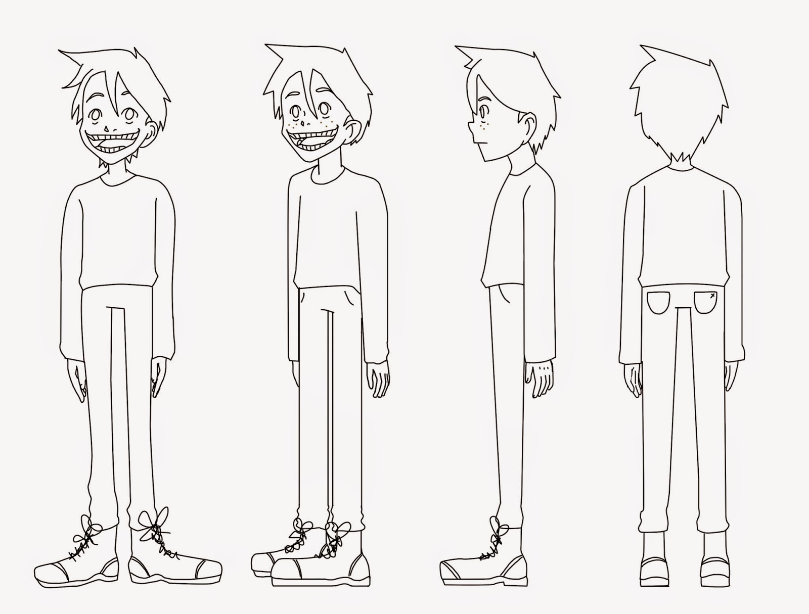
Drawing the gnome designs were extremely fun, drawing the beards and noses were different compared to what I would normally draw which made it a challenge but also enjoyable. I began with a full normal figure before squashing the proportions and the length of the limbs which I felt worked successfully on the first page, last design. I felt that I could develop this further as the placement of the arms didn't look like it worked as well as the rest of the proportions, the arms needed to move back slightly. I continued to draw different body shapes and styles, using designs from Bob the Builder as influence for some of the noses and shapes of the limbs. I liked the head and shoulder design on the second page on the right, I felt that the use of not being able to see the eyes worked quite well; with this I took it further and added different styles of beards to the design. I really liked the different beards and felt that any of these designs would work well to the point that each of these could represent a different flavour or simply just another gnome character in the ident. I took these designs to Alex and she agreed with the last page of beards with the body from the first page of designs that I had made. 


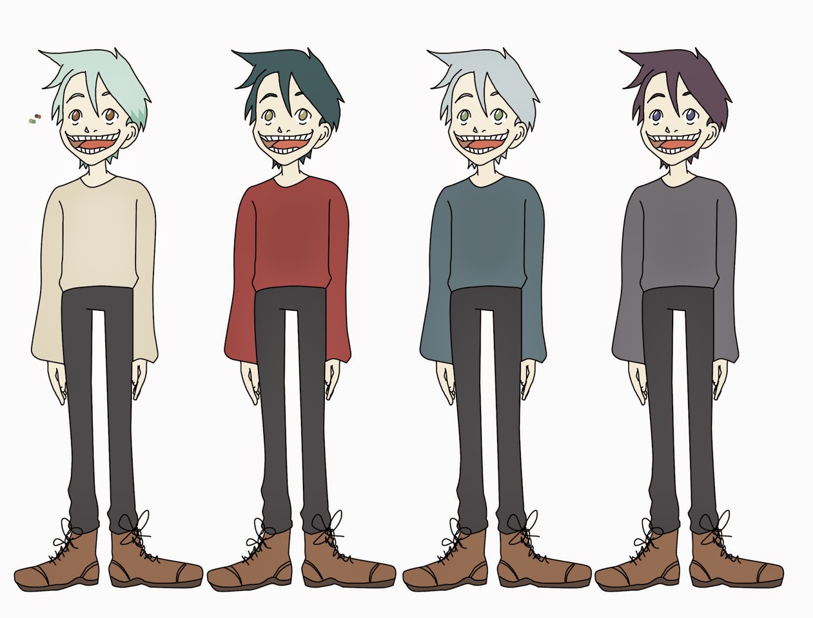
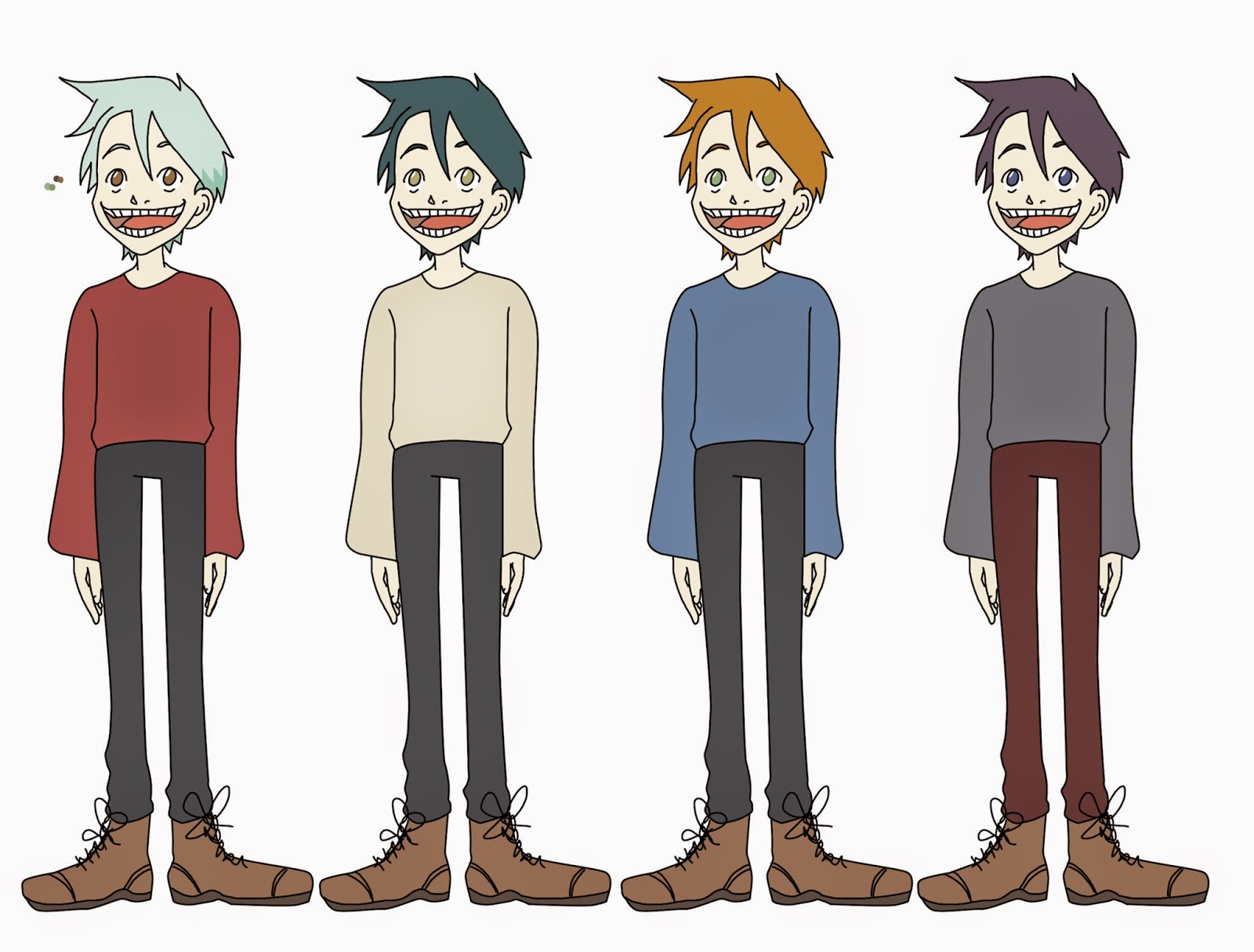
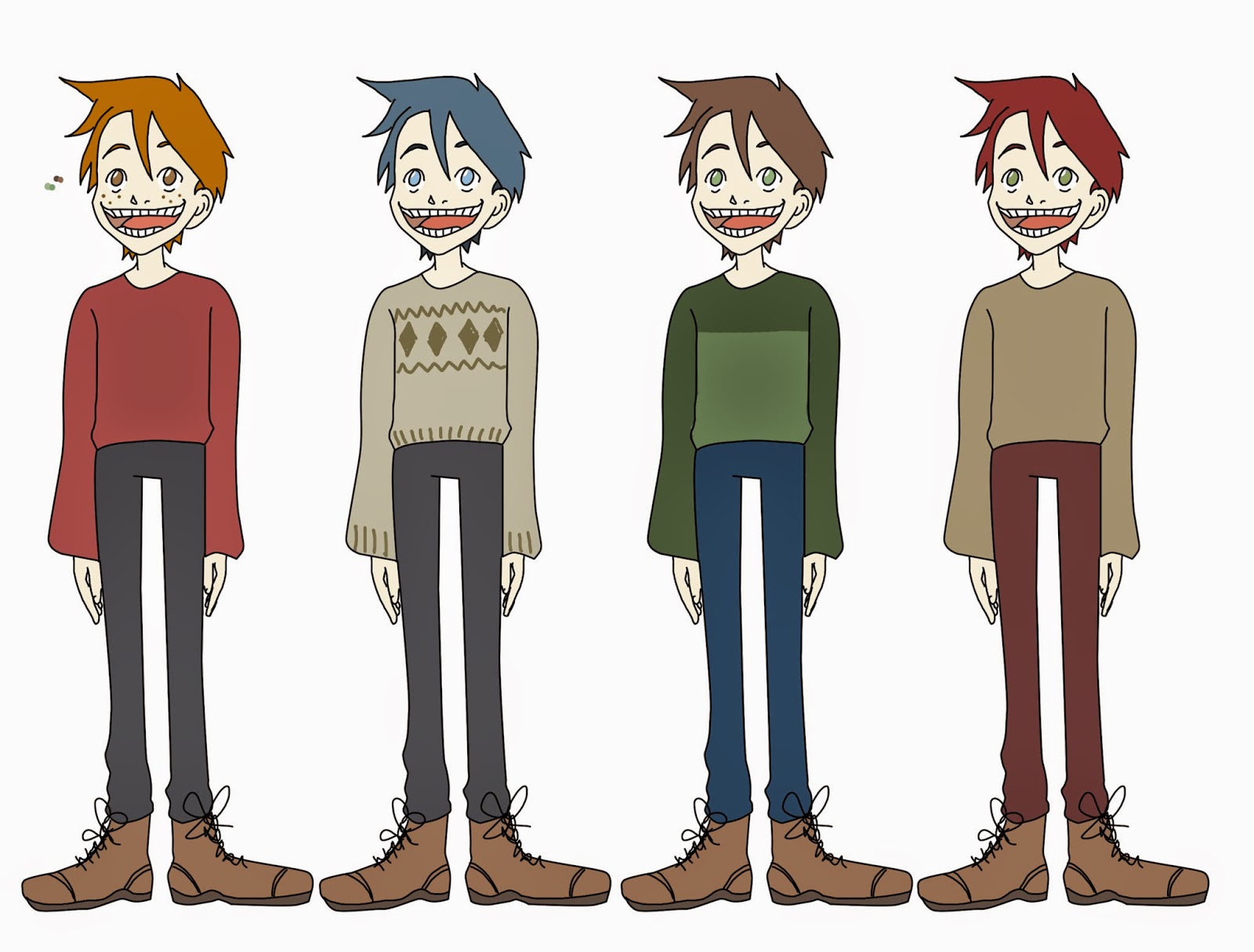
From this I began to add colour to the designs using Photoshop, for the ease of the tools and workspace for drawing. After adding colour to the designs I felt that these were successful as they worked with both the target audience through the use of the character and the colour used, as well as the theme that we had originally intended. I purposely coloured the beards in different colours as I felt that it would be interesting to match the gnomes with the colour of the packet, for example the green beard would relate to the sour cream and chives flavour. Even though I believed it was a good idea I wasn't too sure if it would suit the target audience; it would suit a younger audience through the use of the vibrant colour. Using feedback from Alex, I coloured the full figure of the gnomes with different tops in which the colour would refer to the packets, using the grey beard gnome head as a basis. I quite liked the idea of the tops being a different colour however after considering if the top would be seen well from a distance or for the short amount of time it would be on the screen, we decided that the hard hats could be a different colour as it would be easily seen.