Friday, 3 January 2014

Research into fire

I looked into moving imagery of fire as to give me inspiration for its fluid, flickering movement. I researched into both an illustrative and a real imagery of fire and found similarities. For instance, the way it snakes higher and flickers back down. I also found differences such as the colour, the cartoon version play on vivid reds and orange and yellows, the shape of the fire is more stylised for example adventure time.
The fire is more emphasized with in this cartoon through the mixture of jagged and smooth quality to the shapes. The fire in the animated film "Howls Moving Castle" takes a more realistic approach and makes the flames into one to form the body of the character Calsifer. This in affect makes the fire seem less lively, however the style of the fire works well with the interior backgrounds and the characters who interact with the flame.

Studying fire in real life gave a different perspective on the flames depicted in the cartoon style, in both Adventure Time and Howls Moving Castle. For example the flames were more violent and fast, flickering higher and dancing from side to side as it engulfs the logs. The shape of the fire differs as it bites deeper into the logs therefore the shape of the flames move almost around the shape of the log and connects back to the original body of the flame.

After researching into different imagery of fire, I decided that I wanted to take a cartoon approach but with inspiration from the book, "Elemental Magic" by Joesph Gilland. His stylised fire managed to capture a form of detail that gave the fire life. I wanted to try my own take on this and I began sketching different takes on whether do create jagged or fluid lines, and what effect this would make on the rest of the composition if used in the final animation.



Daft Punk Interstella 5555


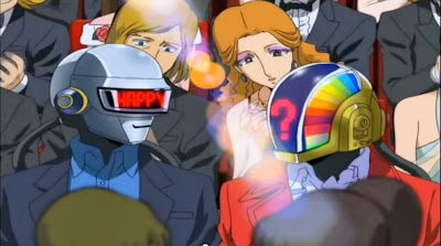
Daft Punk Interstella 5555 is an animated music album, where the animation is based around an alien music band as they are kidnapped by a villain from Earth. The animation style is gorgeous and really inspired me with the brief through the simplicity of the characters and the detailed backgrounds. The audio worked well with the animation as the beats of the music and the change to major or minor worked with the action in the video.
The use of just the music tracks from the band Daft Punk work well, as if the audio included dialogue and background noise it would draw attention away from the music.
I focused at looking at the characters more than the rest of the animation as to look at the subtle movement and the design of the character, colour, line and shade.


Research into Water

I looked into imagery that depicted moving water, in both photography and cartoon portrayals. These moving images gave me inspiration into how a body of water moves, what changes as something interacts with it, such as a splash or a ripple. I found that the sea moves with a main solid wave in one direction with the light reflecting the ripples as the water moves. Still water reminds me of a sheet of glass as the light reflects the imagery surrounding it. It gains an almost threatening look as it stays silent and dormant.

Looking at the Spirited Away gifs of the train moving through the water, causes the water to move, showing the water collide with the front of the train and almost move around it, leaving sprays and ripples as it speeds through. Rain however moves in one direction, creating a small splash and ripple as it collides with a surface, for example rain on a window smashes against the glass and slowly runs down the pane. Droplets of water move significantly slower than rain and have a longer anticipation before it drops from the surface or object, for example an umbrella.


Initial Ideas (Process and Production)


For this new brief, I needed to create an animation that used one of the following elements, fire, air, earth and water as the subject and theme. The final animation being 20 seconds long at 12 fps.
 I first began creating a schedule in which I would use as a rough guideline to work from, in order to balance work from other projects as well as this one.


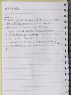
I then immediately wrote down words which I felt related to each element, in order to gain inspiration and think differently in how to portray the element with in the animation.


 From these words, I was able to piece them together to create initial ideas for my animation, which I then could begin to create rough storyboards. I found the water and earth ideas the most interesting as I could visualise characters and movement in which it would involve.


However I found it easier to generate ideas for water and fire as I felt it would be the easiest to portray, through the sea or a volcano, so I gained inspiration for each through primary photography and a book which I found in the Library, Elemental Magic by Joesph Gilland. This book was so informative and aided my thinking of how the movement of the elements actually move, they move in a swerve like fashion much like how a flag moves with the wind. From this I began to draw water and fire with in the flag like motion.

Thursday, 26 December 2013

Message


Message from Animade on Vimeo.

I found this advert on Vimeo and I immediately liked the simplicity of the animation.

For this new project, I wanted to make an animation that was simple in background, in which I could elaborate with small parts of detail, that wouldn't take away the main attention of the animation. With the last project, I made an animation that functioned well however there was too much going on in the background which made the focus differ between different aspects of the animation, the main focus was slowly lost through the duration. 

The advert used only three main hues, red, cyan and black, which held a print grain quality to the illustration of the character. The animation is simple yet effective with the small movements of the head and limbs which flow well with the incorporation of the arcs and secondary action of the movements. The continuation of the rotation of the three sections of the square works well with the animation through the clean transition to the next scene. 
The audio uses a upbeat guitar tune which could be used to imitate a walking cycle with the 4/4 beat, and works with the animation through the rotation of the square sections. 

Avatar : Legend of Korra

I recently watched Avatar: The Legend of Korra which contained a flashback to the very first Avatar, a being that can control the main four elements, fire, wind, water and earth.

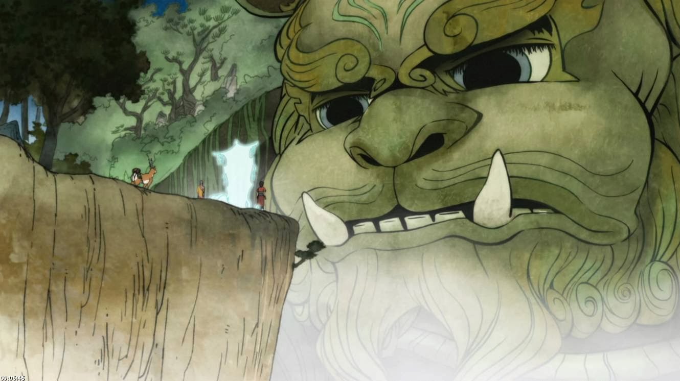
The flashback was portrayed in a gorgeous traditional Japanese inspired art, which can be seen in the quality of line, colour and structure of the object drawn.  It made me think about the variation of line I could achieve by using different brushes and mixed media to portray the object I have drawn in a certain atmosphere or age. I felt I could achieve the same quality of the traditional style by using ink and a soft wash of watercolour to gain that aged feel to the images.


Merging this style with an american cartoon/anime character design worked surprisingly well and helped the plot with the portrayal of the era it was situated in which was aesthetically pleasing to the eye, from the movement of the clouds to the movement of water and fire. 

Disney - Treasure Planet Backgrounds

Treasure Planet has always been one of my favourite films which has inspired me through its beautiful illustrative backgrounds and character designs. The backgrounds hold a painted feel to it, which can be seen through the soft blur on the reflections and shading.

The backgrounds needed to contain a futuristic yet aged twist to link with the pirate theme, they achieved this by using a tudor structure with the houses, the wooden structure that decorates the exterior walls, and the use of cobbled streets. The main town/city in which they situate in, shows the streets of houses ascending into a point, as if built on a mountain. On top of which the place is floating in the sky, which matches well with the flying pirate ships that wait at the docks.


Looking back at the art of Treasure Planet gives me inspiration for drawing different locations in which I could develop further into something that holds a futuristic twist to it or age and decay it to make it look aged.