Monday, 24 February 2014

Sandman historical research

Traditionally the character Sandman would sprinkle sand into children's eyes as to bring dreams, the 'sleep' in the child's eye when they have woken up being evidence of the sand.
The origin of Sandman is believed to have started with in Hans Christian Andersen's folktale, Ole Lukoje in 1841. The Sandman was originally named Ole Lukoje, the "Ole" being a first name and the "Lukoje" meaning closed eye. This character would wait for children to fall asleep, sneak into their room, sprinkling dust into their eyes so that they could not open them, and then place an umbrella decorated with pictures and stories, which would give them good dreams, however if the child had been bad, he would place another umbrella without pictures over there heads, so they would have no dreams.

http://en.wikipedia.org/wiki/Sandman


The Sandman is also related to the Greek God Morpheus, who is the god of dreams, he has the ability to take any human form and appear in dreams, his actual appearance being a winged daemon, looking like his other siblings.
The name Morpheus relates to the word, morphine, the drug that puts patients into a deep sleep.

http://en.wikipedia.org/wiki/Morpheus_(mythology)

Paul Berry created a short film on the character Sandman, which depicts the Sandman as a sinister villain who creeps into children's rooms, sprinkling dust into their eyes, which causes their eyes to fall out, which the Sandman would collect and feed to his children/crows in the moon.
The stop motion animation holds a blend of saturated and desaturated hues, which contrast with the icy blue colours of the Sandman. The introduction of the Sandman is tense and atmospheric through how he tiptoes up the stairs, his body language emitting a sinister movement alongside with the audio that holds onto every step that the character makes. The animation was based on the story "Der Sandman" by E.T.A Hoffman.


Friday, 21 February 2014

Adventure Time Titles


The Adventure Time title sequence starts with a slow introduction to the music and panning/zooming through different landscapes that show other characters before reaching the main characters, Finn and Jake. The style of the characters and the background show that the cartoon is aimed at a young audience along with an adult one through the humour that is portrayed in episodes following the titles. I find the title sequence inspiring through the use of the camera movement as it pans around the world and straight into the main characters den, which transitions to the next scene as they bump fists.
The animation uses an acoustic music track that works well with the introduction of the main characters and explains the main theme of the series.


Many artists have made fan based art of the show and some commissions have been made to make another version of the title sequence, such as the title sequence being entirely made out of Lego. I found this interesting through how the Lego stop motion was matched with footage for the sky and parts of the background. The lighting of the animation is dark to begin with but brightens as it crosses over to the ice kingdom.

Another fan based animation, involves the characters being made from a square with designs being made from which. Each character can be easily recognised by the design, colour and details that are added around the cube. I found this inspiring through the graphic stylisation to the animation along with the smooth transitions between each frame, which was made by using the shapes in the background, the last transition being Gunter the penguin.

Western Cartoon Title sequences

The Gravity Falls title sequence is different compared to other titles that I have looked at through how only the main title and the names of the characters names, not what actors are starring with in the animation. The animation is made up of different scenes that the characters interact with, these scenes are placed together through camera angles, zooming out or with the character walking off the frame. This title sequence inspires me through the detail of the backgrounds and the style of animation which differ but work well together. The audience can automatically tell that the episode is aimed at children through the appearance of the characters, the small introductions which show the personalities and role that each would play with in the series.


This title sequence starts with the main title and introduces the characters separately with a different colour as to represent them, with the character action being small. Through this I can tell that it is aimed at a young audience through the stylisation and the individual introductions of the characters. The animation then cuts to silhouettes as if caught in a film strip, with each image moving, this works well as it has shows off the action genre that the episode would entail. This then blends into still imagery that slightly moves and seems to collide as a dragon illustration engulfs and curls up on the scene. The use of the silhouettes relate to my initial ideas with the Sandman Titles, through the use of the outline of the character moving, which I could adapt with using more than one outline of the figure moving at once on the frame.


The Martin Mystery title sequence uses alot of panning as it moves from one scene to another, with extreme close ups and long shots, that emphasise the genre of the series, sci-fi and mystery. The main title is shown at the end of the sequence which is first hidden by slime before it slithers off the font, this links well to the appearing 'starring' credits through out the animation as it takes the same appearance.
The title sequence is inspiring through the use of colours and how the presentation and composition of the characters tells the viewer that is for a slightly older, young audience. The use of the audio makes it very eerie and sci-fi atmosphere matched to the monsters that appear throughout the title sequence.


The Teen Titans title sequence, is simple and relates to the Xiaolin Showdown opening through the use of colour and small sequence of each character as they are introduced. However this opening is different through how the characters follow the words of the main title which the opening zooms out to view the full text as the vocals sing "Teen Titans". It also varies with the camera shots, though it mainly starts with an extreme close up and medium shot.

Anime titles inspiration

Zettai Karen Children: The Unlimited title sequence through out the short series uses a different approach for each episode, the colouring of the titles changes to the point it becomes multicoloured in the last episode, portraying the state of sanity that the main character has. The imagery flickers and pans as it changes to the next scene, with action movements from certain characters with rotational panning to show the difference between two of the characters. The title sequence ends with the main character turning towards the camera with the main title appearing on the scene. The audio works well with the title sequence through the 4/4 beat and the fast crescendo that correlates with the movement of the imagery depicted in the animation.
This inspired me through how the sequence changes over time and shows the state that the main character is in, which I could adapt into my own sequence, by showing the detail of different characters through out differing episodes. For example, for the first title sequence, all of the characters shown apart from one would be shown in detail rather than an outline with landscapes or objects which depict them, portrayed in a Sunga Park inspired watercolour and dip pen design.


Courtesy of Zettai karen Children - The Unlimited Opening from Paladinum on Vimeo.


Samurai Champloo, shows more than one action and movement of the characters at once, creating a montage during the introduction of the text, as well as keeping a traditional Japanese scroll approach with the background as the digital animation is played over the top. The text slides in from across the screen before going straight into more action, which differentiates between extreme close up to long shot, with the main colour having no sense of shade apart from the thick black lines that are a replacement for which. This works well as it creates a more dramatic stance with that panning and anticipation of each movement. The main title is shown at the end of the title sequence which appears from a merge transition from the sun into a vinyl. 


This title sequence differs from the previous two through how the main title is shown straight away and has the main character walking through a bizarre landscape with other characters in a silhouette outlook, as images slowly move towards the bottom of the scene. The animation inspires me through the use of colour and abstract imagery that merges to make a 1960's feel about it as if it collided with the digital world, along with the future/space genre. The audio goes well with the animation through how it matches the speed of the movements and the comedy approach to the series. The Japanese and American title sequence differ through how the American opening uses a more 60's approach with the use of singular flat colours, and shapes that move as the space ship moves through each transition and lasts for half of the time as the Japanese one; also the audio is different as it has changed completely to a instrumental. The Japanese version has more content and relates more to the program, which I prefer as the audio is much more amusing. 


What is a title sequence?


' A title sequence is the method by which cinematic films or television programs present their title, key production and cast members, or both, utilising conceptual visuals and sound.'  
- Wikipedia definition


A title sequence needs to show the theme, the atmosphere, the starring actors, studio and producers, what genre and base of the plot is.
For example in the BBC One Television series 'Luther', the title sequence shows the main character with in the imagery, a colour scheme which emphasises the insanity of the criminals, the city landscape representing London and almost symbolising the labyrinth state of searching for the people in question. The audio eerily matches the theme and genre of the program, through the singers tone of voice and the xylophone beat, which sound like every footstep the character would make. The imagery appears as droplets of black or darker shade, representing the blood with in the show, the close up of the barbed wire, finger prints and xrays all link to the main character being a detective. Through this title sequence the audience can tell that it is not for a young audience, and is a thriller/drama, through the portrayal of the imagery and audio. 


Another example of a title sequence with in television, is the horror/drama series, The Walking Dead. The title sequence is completely different to the previous, through the movement of the imagery as it holds a multi - exposure and pixilation approach to the movement and transition of the title sequence. The imagery has a slight vignette and sepia, grunge wash that makes the landscapes and objects look old and aged, linking with the lack of life and abandonment of the civilisation as the zombie outbreak spreads. The music is dramatic and keeps to the movement of the imagery and the audience can tell that it is a horror/drama through the serious tone to the title sequence through both audio and the content of the opening.


It was interesting to see what other animators had created in their own version of the title sequence. In this interpretation, the animation uses the traditional style of the graphic novel, using multi-plane camera and panning to create the movement with in the shot. There is hardly any character animation, apart from slight movement such as the fly, and the gun shot. The colour of the titles, is mainly monotone with sight variation of desaturated hues to emphasise parts of the imagery, such as the gun shot. The audio is different compared to the original title sequence, through how the audio includes vocals, which I believe takes away from the dramatic plot with the survival of mankind.


THE WALKING DEAD "Opening Titles" from Daniel Kanemoto on Vimeo.

Another example of a television titles sequence is the program called 'Dexter'. The title sequence immediately tells the audience that it is not suitable for a young audience through the blood splatter text, the beginning sequence being the main character Dexter, watching a mosquito on his arm and then killing it before going to get ready for his day. The routine is normal however it has been cleverly filmed to which relates to the murderess intent of the character, and leaves the audience feeling shocked. The audio suits the title sequence well through the lack of vocals and the warble of the music as certain actions are made. 


Whilst researching I found an animation of the Dexter title sequence adapted into the style of Saul Bass's famous sequences such as 'Its a Mad Mad Mad Mad World', and 'Anatomy of a Murder.'
The stylisation works well with the inclusion of one hue, to emphasise the whiteout imagery against the black background. The animation runs slow and some repetition with the blood drops, however it can easily be related to the Dexter theme. The transitions of each seen work well as it zooms into black or a certain shape which then moves into another shape.


Dexter - Animated Title Sequence from fashionbuddha on Vimeo.

The adapted Dexter animation takes inspiration that is definitely seen in Saul Bass's "Its a Mad Mad Mad Mad World" title sequence, through the movement and shape of the hand and the lack of hues that are used.
The position of the text is also adopted with the illustrative style absorbed as well.


I find the Sherlock Holmes title sequence very inspiring through how the image is slowly drawn on a grunge textured parchment, with a fill of ink/watercolour that starts as a droplet that expands to cover the illustration. The text is presented in a script typeface that matches well with the style of the animation. I believe that I could use this as inspiration for my title sequence for Sandman Overture as I can use Sunga Parks adopted work and animate the movement of the watercolour as it forms the place or object that depicts the character.


Thursday, 13 February 2014

Matthias Brown

Matthias Brown creates these interesting and weird loop animations, of a face looking from side to side in which stretched and distorted facial features are seen. It inspired me through the use of media used to create the loop, and the fade of the loop as if it has been wiped away. It reminds me as if it has been drawn on a white board through the use of the line, which looks as if it has been drawn with a marker pen, however I can tell that it has been drawn on paper through the grain of the background.

Browns work is inspiring through how he purposely distorts the movement of the face as it turns.
He further developed his work by adding more than one of the same animation together in a grid and starting each at a different point works well as it follows a zig zag motion as each row starts slightly after the other. 


Study Task 4 - Disney animation - 360 degree spin

Our next visual language task is to draw an interesting object and draw 12 images of which so that when it is animated it will show a 360 degree spin.
I began by gaining inspiration from animations that use 360 spins, such as Disney films, with the main princess/character spins to show off their dress or simply dancing much like the classic scene in the animation film Beauty and the Beast.
With the character spin, the animation takes into consideration the 12 disciplines, such as follow through, pose to pose, anticipation, arcs and emphasis. Using emphasis with in the spin, gives that classic Disney feel with the stretch of the arms and the movement of the hair and dress that follow the main action of the spin. This can be seen in the Sleeping Beauty line test of Aurora spinning as she talks to another character.
In the Ariel gif, I can see that the movement of her character would involve elongated and stretched anatomy and facial features for it to smoothly work.


Animation backgrounds - Adventure Time

Adventure time is a children's animation program on Cartoon Network created by Pendleton Ward. The style of the characters are simple and minimalistic set in one tone of colour, only shaded when there are drastic changes in light. The backgrounds however are also simplistic but hold more detail through the variation in shade of hues and adding small detail to the area, such as adding a cobbled floor, and blades of grass. This contrasts well against the characters and gives a sense of depth about the area they are in; the audience can have a sense of what type of area that the hero's have wandered to, whether in a dungeon or at a princesses castle. 

Other backgrounds in another children's animation program on Cartoon Network, The amazing world of Gumball is also minimalistic with a sense of detail. The backgrounds differ however through the animation processes used with in the program, for example, Gumball uses CG, traditional and stop motion to create the animation along with the backgrounds, being a mixture of CG and traditional graphics along with the use of photography. The backgrounds feel more realistic through the use of the lighting and shadows as it gives the shape volume and depth, working well with the different characters used with in the show.


Animation backgrounds - Spirited Away

Studio Ghibli are well known for their stunning aesthetics with in the animations and can be seen in the film 'Spirited Away'.  Spirited Away focuses on a Japanese bath house and small clutter of shops that become swamped in spirits as the sun sets.
The first glance of the bath house seems majestic, it seems daunting and emit a strong sense of power, this can be seen through the use of the perspective compared to Chihiro and the dominance of the thick black smoke as it taints the blue sky. The structure of the bath house and colour, the use of the green roofs, matched with gold and red highlights, the design of the windows tells the viewer that it is set in a Japanese town. When the bath house is shown in the dark, the lights make the building come to life, it looks more inviting compared to the first image we see, this can be seen through the glow of the light making the building seem busy and filled with people.

The main market shops before the bath house are filled with pastel colours and shapes, which instantly remind me of arcades and shops you would find at the coast to attract customers. The use of the traditional lanterns and the structure of the shops further tells the audience that the area is absorbed in traditional Japanese culture. I find this sequence of imagery inspiring through the use of neat, crisp lines that detail the brick and texture of the buildings.

The painted style to the imagery portrays the style of Studio Ghibli, the audience can tell through the amount of time that is spent on the backgrounds as well as the animation which would be due to the amount of funding they have been given compared to animations that were created in the 1960's such as Chuck Jones's Bugs Bunny cartoon. The backgrounds were simplistic as to speed up the production process and were linked with the movement of modernism, through the minimalistic style of the cartoons, just leaving the era of the golden age of animation. The minimalistic style however worked well with the animation of the characters and did not take away from the focus of the main action. The simple style of backgrounds can also be seen in The Flintstones, Road Runner and Daffy Duck.


Tuesday, 11 February 2014

Dragon Force Induction notes

What is Dragon Frame? A piece of software that is used to create stop motion animations, which automatically detects the camera and has a timeline to easily see the photography you have taken.
  • When adding camera to rigging, ensure that the camera is attached in the top indent to ensure that if you have to take the camera off the rigging, you can easily align the camera back to its original position.
  • After opening up the software, chose new scene. 
  •  At the top right of the window, there are two buttons, one which looks like a tv screen, is the animation view, the other looks like a camera, which is the cinematography pane.
  • Dragon Frame allows you to change the settings of the camera it is connected to, you can change the shutter speed, aperture and ISO. You can also change the White Balance settings, changing the preset, for example, cloudy, flash and daylight, this changes the light with in the image. 
  • Save files as a high JPEG, as for stop motion it requires alot of imagery and saving the file as a tiff will take alot of memory and may make the program run slow as it tries to comprehend the data. Feature films use RAW files.
  • On the preview pane, the image is flipped, you can flip the image via the rotate button located beneath the preview pane. 
  • You can change the exposure through the aperture in the camera settings. Do not over expose the image as this will cause lack of information and make the image grainy, if you need to make in slightly under expose the image as you can always the lighten the image in a different program, e.g. Photoshop.
  • To check the focus in the image, click Focus Check, which will zoom into the image, and then you can determine whether it is in focus or not. 
  • You can add guide frames, for titles or main action.
  • Interesting for the frame rate, stop motion uses a slower rate at 15 to 10. I thought that this would not make the animation flow compared to 24 fps however it gives that aesthetics to the animation.
  • In the timeline, you can onion skin, insert frame, duplicate and tween. 
  • Scene menu allows you to add notes to the individual frames and also name the frames, much like layers in photoshop.
  • The key pad used along with the software, allows you to take a shot, delete frames and onion skin.
  • When exporting - file - export - export as an image sequence, in the pop up menu you can crop and scale the images. 
  • Open up this image sequence in Premiere which will automatically make it into a movie file.

Dragon Frame Tutorials

Monday, 10 February 2014

Schedule

I then made a rough schedule as a guideline to ensure that I could manage my time with the other projects that I am working on as well as. Creating this schedule helped me to think about realistically when I needed each task to be completed by so that I had enough time to dedicate to creating the animation.


I feel that I work more efficiently with mini daily schedules so that I could easily share my time with not only this project but others as well during the day. Doing parts of different projects during the day makes me feel that I am on track with keeping up to date with each brief, that I have accomplished something that day and making me do work.


Beginning to design - Sunga Park

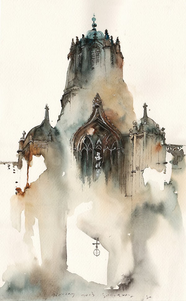
Whilst researching into Simon Prades, with the character outline and inclusion of a landscape or another image captured with in the lineart, I felt that the work of Sunga Park would inspire me with the landscape fill.
Sunga Park creates her work through the use of watercolours, ink, fineliner and a possible addition of dip pen. Her landscapes are partly drawn in detail with the ink and water colour wash depicting the rest of the image. I could visualise the ink wash slowly running through the lineart as it fills it in, and I thought that I could adapt and incorporate it into my own style and this could further influence my Sandman initial sketches. With a character outline from the Sandman Overture comic, and a ink washed based landscape or image, I could visualise both of these elements together as they both move with different actions.


In this piece Park uses a more controlled wash, as the colour stays closer to the detailed lineart, her work reminds me of the title sequence from the feature film Sherlock Holmes, through the media used. The colour used in this piece gives an aged quality to the building portrayed.


Sunga Park  - Tumblr


http://anitaleocadia.tumblr.com/post/68967171460/jeremy-mann-compositions

Beginning to design - Simon Prades

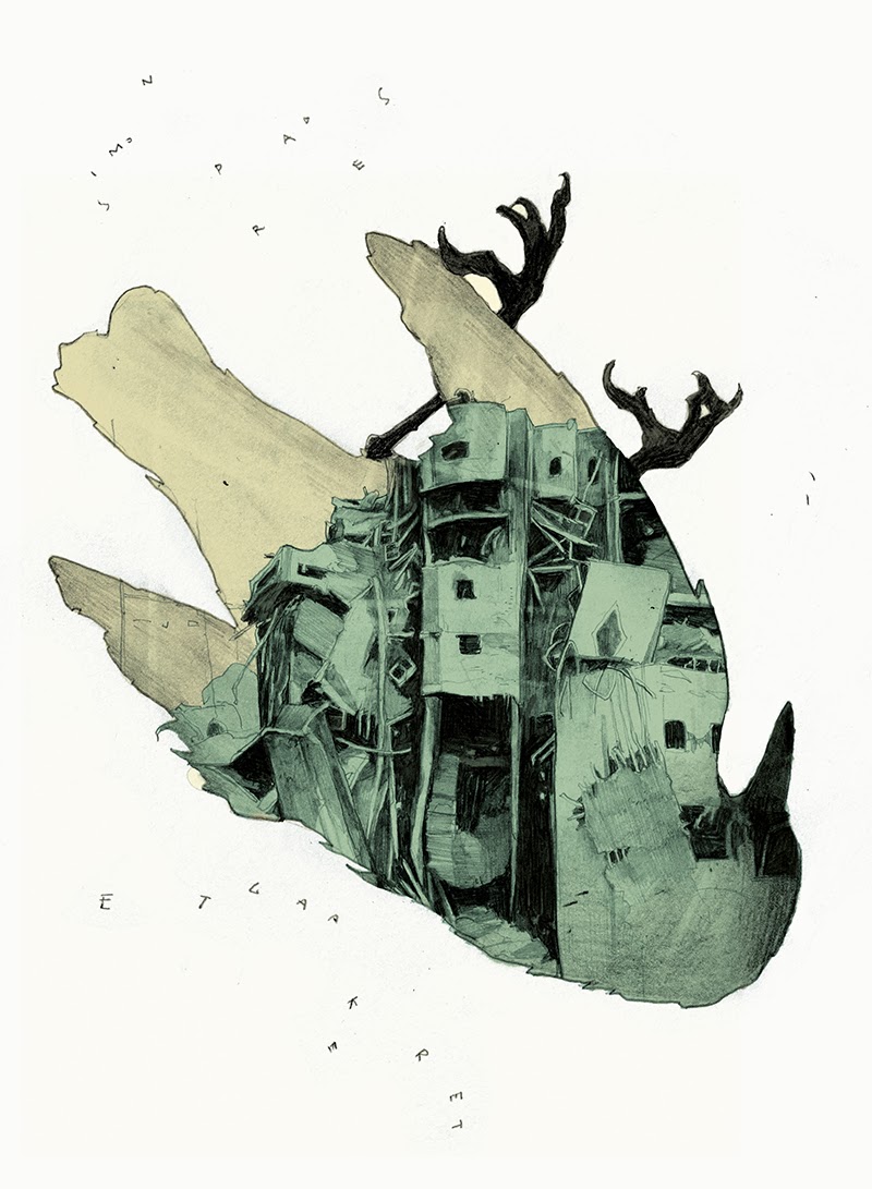
I began to research into illustrators that I already knew and loved, James Jean and Tomer Hanuka, and stumbled across the work of Simon Prades. I loved how the outline of the character was simply used as a container for the detail of a landscape or another image with it. I began generating ideas in which I could further develop this into the Sandman Overture titles, for instance having the outline for each character and having a landscape that portrays the chosen character, which would move with in the lineart, whether the media used drips and fills in the landscape seen in the Sherlock Holmes title sequence, and as this happens the original character outline moves along the screen or does a certain action.


Prades work reminded me of multiple exposure photography such as the work of Dan Mountford.
Mountford merges a landscape with in the image of a person, making them look distorted and disturbed through the formation of the individual parts of the landscape, such as buildings as they take over facial features. My favourite piece of Mountfords work, is an image that depicts an outline of a hand and with in that hand you can see someone covering their face with their hands, their eye staring back at you. The piece has a monotone approach giving an emphasis on the dark atmosphere, in my opinion it feels suffocating through the confinements and restriction of the shape of the hand.


Sunday, 9 February 2014

Choosing a concept for my brief

Initial Ideas 
From the previous blog, I narrowed down the selection of ideas to two of the books/graphic novels, and created ideas from these.

Graphic Novel/Manga

Sandman Overture -

  • Use the dream like states that the comic absorbs, close up of the gas mask, mainly a black background with shapes shifting in and out of focus.
  • Use close ups and extreme long shots of scenes and concept art, possibly make it seem as if played on old fashioned film, set in monotone with certain hues used to portray that particular character, use like a static overlay over the animation to get that old film look. 
  • Use the panel layout in the comics, and run through certain scenes to portray characters and landscapes throughout the sequence.

Uzumaki
  • Use the traditional monotone format of the illustrations and create a paper cut out animation, using panning and multiplane camera to create depth and smooth movement.
  • Could have a character running though spiral shapes, each containing a small scene from the manga, use of only one hue to make more dramatic.
  • Could use a manga panel page and have characters moving to the next panel, breaking out into colour.


Books
Oyster Boy

  • Using a childrens drawing approach, with a mixture of bright and pastel colouring, have the characters walk through the titles, with the background image changing from day to night. 
  • Use a traditional media approach, using a desaturated watercolour fill and dip pen outline, having the characters spell out the cast and the producers. 

Edge Chronicles

  • Use the text of the chapter alongside the illustrations as they move alongside the text with in the titles.
  • Use dip pen for the lineart, with a slightly desaturated fill, painted landscape, using panning as it shows the world and the characters. 

Brief B - Titles


Tale in the Sting - Titles

Brief B sets the task of creating one 40 second animation, that would be a title sequence for either a book, novel, manga, or graphic novel which has not been adapted into media, for example a game or television series. I need to consider the target audience, the purpose/theme of the book, the actors that I would want to be included in the titles.
I also need to ensure that I have permission to use any audio that I will include with the titles, looking into the different copyright licences and how they differ.

Considering the Concept 

Book ideas
  • Melancholy Death of Oyster Boy - A set of poems that take a dark turn from the mind of Tim Burton, The target audience is for older children, 12+, can relate to the childrens program, "Gruesome Tales for Gruesome Kids".  
  • Aesop's Fables - A collection of short moral based children stories. The target audience is for young children and can relate to the childrens program "Rupert Bear", with the different fables in each episode. 
  • Brothers Grimm Fairy Tales - Another collection of short stories, in which some have been adapted into feature animated films, such as Disney's Snow White and Little Mermaid, a feature film, Hansel and Gretel: Witch Hunters and The Brothers Grimm which uses various references to some of the stories. Some of these tales, such as Rumpelstiltskin and the Golden Goose haven't been made into any adaptation apart from slight references such as the animated film "Shrek Forever" and the television series "Once a Upon a time". The original Brother Grimm stories are extremely dark and certainly not for a young audience, in which studios have adapted such as Disney and Dreamworks to suit a young audience. I can however redesign one of these stories which haven't been adapted into media, and make them suit an older audience. 
  • Clarence Bean - A childrens book that was written by Lauren Child who also created Charlie and Lola. The story is amusing for both old and young audiences, involving spies and adventure through out the book. 
  • Edge Chronicles - Created by the same author as Middle Earth, Paul Stewart. Edge Chronicles follows a young boy wondering through the fantasy world as he searches for his family and somewhere he belongs. The book is laced with adventure and pirates.
  • Clockwork Angel - Based in a Victorian London, where people are born with abnormal powers which they use to defend normal humans from supernatural beings.
  • Mortlock - Set in a Victorian London, a dark being craves eternal life, and the whereabouts have been passed down to an orphan who earns her income as a magicians assistant. 
  • Demon Lexicon - Two Brothers who fight demons and monsters as they run away from their past. In this plot people are born with powers or make pacts with demons for powers for a limited amount of time. 

Graphic Novel/Manga ideas
  • Sandman Overture - A prequel to the Sandman comic Series. The world is in a foreboding state as the characters are introduced and the Sandman is needed. The art style is beautifully composed and structured with in the comic panels, I can use these panel layouts with in the titles sequence. Target audience 14+
  • Last Hope - A western take on Manga. A group of students find out that one of them are actually on the run from a parallel world, and his problems find them, forcing them to run by jumping across more parallel worlds. 
  • Uzumaki - A beautifully drawn horror manga that tells the story of a village where people slowly become obsessed with spiral shapes to the point of wanting to become a spiral, following a gruesome death and more horrific incidents follow.
  • Lullaby - A comic that portrays the Alice and Wonderland plot differently as it mixes other fairy tales with it, such as Pinocchio and Little Red Riding Hood.  

Saturday, 8 February 2014

Exploring the colour of noise


The group, Mr Kaplin, created a motion capture animation that shows the relationship bewteen black and white noise exclusively for IdN magazine. Mr Kaplin were contracted by IdN magazine to create a short film for their motion gallery, running with the theme of black and white. The group wanted to make something experimental and decided to research into the colour spectrum of sound, resulting in the final animation.


'We wanted to find a way to capture the color of noise visually, displaying white noise as a constant frequency and the peaks and spikes of black noise within the sound spectrum. We started testing how audio spikes affect geometry in 3d software and by using constraints (or dynamic ropes) we found we could emphasise the pulling and pushing of the audio movement through negative space. This became our style for film.' - Mr Kaplin - Daniel Zucco

I found this motion capture video quite interesting through the portrayal of the differing noises forming bubbles and circles around the frame of the actor and both moving depending on the increase and decrease of the music. The lines connecting them, remind me of thread.


Creative Bloq

Monday, 3 February 2014

A Tale in the Sting


For our new project, I was given three choices of what brief I wanted to animate, all animations would need to be submitted at 24 fps in H264 format;
  • Brief A - Idents - Make 3 idents for 3 very different television companies, each being 10 seconds long, suiting the target audience and including the logo with in the animation or at the end. Freedom to create an animation including anything as long as it relates to what the company are.
  • Brief B - Title - Create a title sequence for a graphic novel, Manga, Journal or Book, which has not had any media adaptation. The title sequence needs to be 40 seconds long and suit the target audience.
  • Brief C - Campaign - create a 40 second charity animation for either Childline or Amnesty International. You can decide whether its directed for people to fund or at the target audience they help. 
Notes on each Brief:

- Brief A, would allow me to create these idents, gain experience with creating commercial animation, with opportunity to send the completed animation to the company with a slight possibility of it being shown on television. The type of animation can be any, I could even create an experimental animation, use mixed media, experiment with direct animation, etc.
- Brief B, would allow me to adapt a book or graphic novel into a title sequence much like the title sequences of feature film such as Paranorman, Ironman and much like the famous Saul Bass sequences, or Television titles much like Luthor, Walking Dead and Lost. Again the style of animation could be any, experimentation, digital or traditional.
- Brief C, would allow me to create a commercial based animation, gain experience with different target markets, taking into consideration of what time the campaign advert would be shown, who it is aimed at, how can you bring the message across with audio emphasising the point, or with less emphasis, hardly any audio, need to make the audience think.

At first glance of these briefs I could tell that it would be between A and B, brief C did not really appeal to me, I believe it would be experience and challenging however I don't believe that I would enjoy creating and designing the animation compared to the other briefs. Even though Brief C does allow freedom with the animation, I feel it is quite restricting through the seriousness of the topic, it would be hard to portray the message to the target market, making it suitable for most audiences and promote the charities.
Briefs A and B allow more freedom in creativity, whether its set in a dark or happy theme, with characters you have created or redesigned and adapted.

I decided to go with Brief B, I felt that this brief would allow me to challenge myself, through design and plot, with storyboarding, taking into consideration of sound and what needs to be in a title.