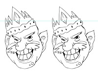
After creating the goblin design for Becky's Stopmotion, I started to draw a King character for her project. This King needed to have authority, a mischievous smile and be quite fat. I quickly sketched a rough body shape for the King and sent it to Becky over Skype. Skype has been extremely useful through both working on this and the goblin design, it has made it easier to revise and edit my designs with instant feedback from Becky. With Becky's feedback being positive with the body shape I took the sketch straight to photoshop and began to design digitally. I decided to go straight to digital, for the ease of drawing and sending the lineart to Becky. Whereas if I had drawn in my sketchbook it would have taken longer with the design process.
I first started with drawing the head, I was inspired by the goblin visual mood board I made on pinterest with the addition of Becky wanting the King to look trollish. The first few designs were very human compared to the end result. The initial head went from being thin faced and bearded to quite chubby cheeks, bulbous nose, bald, warts and pointed ears. I really liked the end result, it was quite extreme when you compare it to the initial head, but it works successfully for the character that Becky wants.
 |
| Quick body shape sketch |
I decided to have the crown at a tilt on the head to add to the evil, mischievous, troll like King. It took awhile to get the crown just right as some of the designs I created looked alittle bit too much like an Ice Queens crown with the shape and amount of the points. After feedback from Becky the crown was chosen and I went straight to costume design. I preferred the left design with the cape over one shoulder as personally I felt it worked with the characters personality, however I felt that something was missing from the overall appearance. I asked Becky which design she liked and if I could refine it further, she liked the left design as well however she felt the same with something was missing from the costume. I decided to design again but with a more medieval king approach with a less cape like top. This worked successfully and gave the character a neck with the ruffle collar.
 |
| Costume design |
 |
| Final costume design |
I then began to add colour the design. Becky wanted a blueish tint to the skin colour as well as rosy cheeks and a rusty crown. I achieved the skin colour by using the multiply blending mode on a normal skin layer and over the rosy cheeks so that it worked with the overall complexion. For the rusted crown, I used burnt and desaturated tones of orange and used a distressed brush to apply on a multiply blending mode layer over the original hue of the crown. I then added additional distressed marks with my normal brush to add to the worn and rust appeal. Becky wanted to give the character yellow teeth, to add to the villain esk king appeal. This worked well as it emphasised the skin colour and worked with the crooked smile.

The final colours for the outfit differed from the original, its initial look was bright red and white however this didn't work with the skin colour or the personality of the character. I then desaturated the colours and changed the white top to a desaturated blue. This worked successfully with both the crimson and the skin colour. I was expecting the skin colour to blend into the blue top however the white collar stops this from happening and makes the face stand out to the audience. Overall I have really enjoyed designing this character. The body shapes and facial features were a lot of fun to draw, it was challenging at times, especially with the 3/4 pose on the final turnaround sheet however despite this I have learnt and developed my style further with these character designs.


No comments:
Post a Comment